
Article Categories
- All Categories
-
 Data Structure
-
 Networking
-
 RDBMS
RDBMS
-
 Operating System
-
 Java
Java
-
 MS Excel
-
 iOS
iOS
-
 HTML
HTML
-
 CSS
CSS
-
 Android
-
 Python
-
 C Programming
-
 C++
C++
-
 C#
C#
-
 MongoDB
-
 MySQL
MySQL
-
 Javascript
-
 PHP
PHP
-
 Economics & Finance
Selected Reading
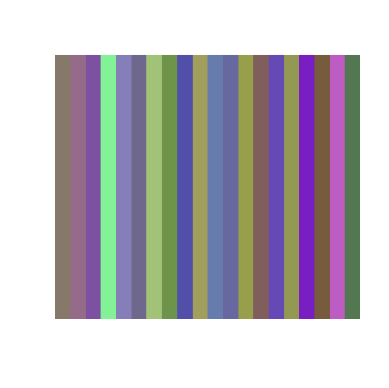
How to create a plot using rgb colors in R?
The rgb colors are referred to red green and blue. This combination helps us to create many different colors. In R, we can use rgb function to create a plot using with different colors along with the image function. If we want to have a plot with rgb colors without any axes title or axes labels then the appropriate arguments should be used inside the image function as shown in the below example.
Example
Consider the below data frame:
> set.seed(9991)
> x1<-rnorm(20,0.5,0.2)
> x2<-rnorm(20,0.5,0.2)
> x3<-rnorm(20,0.5,0.2)
> df<-data.frame(x1,x2,x3)
> df
Output
      x1       x2         x3
1 0.5244507 0.4754375 0.4169833
2 0.5852814 0.4207673 0.5355069
3 0.4890869 0.3131243 0.6362910
4 0.5121207 0.9491096 0.5891787
5 0.5168057 0.4973831 0.7236256
6 0.4330726 0.4104037 0.5496923
7 0.6368670 0.7607583 0.4711013
8 0.4295716 0.5789783 0.2966538
9 0.3173608 0.3091796 0.6647532
10 0.6366242 0.6223271 0.3594197
11 0.3992533 0.4880624 0.6769146
12 0.4074586 0.4095547 0.6276600
13 0.5911152 0.6244891 0.2916734
14 0.4969639 0.3696762 0.3593758
15 0.3967626 0.2896538 0.7099536
16 0.5753286 0.5983690 0.3242723
17 0.4719488 0.1192932 0.7591374
18 0.4677421 0.3553999 0.2393512
19 0.7406508 0.3626482 0.7628945
20 0.3271722 0.4682697 0.3125846
Creation of plot:
Example
> image(1:nrow(df),1,as.matrix(1:nrow(df)),col=rgb(df$x1,df$x2,df$x3),xlab="",ylab="",xaxt="n",yaxt="n",bty="n")
Output:

Updated on: 2026-03-11T22:50:53+05:30
705 Views

Advertisements