
Article Categories
- All Categories
-
 Data Structure
-
 Networking
-
 RDBMS
RDBMS
-
 Operating System
-
 Java
Java
-
 MS Excel
-
 iOS
iOS
-
 HTML
HTML
-
 CSS
CSS
-
 Android
-
 Python
-
 C Programming
-
 C++
C++
-
 C#
C#
-
 MongoDB
-
 MySQL
MySQL
-
 Javascript
-
 PHP
PHP
-
 Economics & Finance
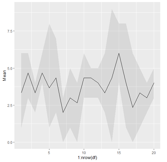
Create line chart for mean covered with minimum and maximum in R.
To create line chart for mean covered with minimum and maximum in R, we first need to create columns for row means, row minimum, and row maximum after that geom_line function can be used along with geom_ribbon function of ggplot2 package as shown in the below example.
Example
Following snippet creates a sample dataframe.
x<-rpois(20,2)
y<-rpois(20,5)
z<-rpois(20,5)
df<-data.frame(x,y,z)
df
Output
The following dataframe is created
   x y z
 1 1 3 6
 2 3 5 6
 3 2 4 4
 4 4 4 6
 5 1 8 2
 6 4 7 2
 7 0 3 3
 8 1 5 3
 9 0 4 4
10 3 4 6
11 3 5 5
12 3 4 5
13 2 2 6
14 0 9 4
15 4 6 8
16 1 3 8
17 0 6 1
18 4 1 5
19 2 3 4
20 3 5 4
Now to create row Mean, row Minimum and row Maximum columns on the above created data frame (df) add the following code to the above snippet
x<-rpois(20,2)
y<-rpois(20,5)
z<-rpois(20,5)
df<-data.frame(x,y,z)

df$Mean<-rowMeans(df)
df$Min<-pmin(x,y,z)
df$Max<-pmax(x,y,z)
df
On executing, the above script generates the below output(this output will vary on your system due to randomization)
   x y z   Mean Min Max
1  1 3 6 3.333333 1 6
2  3 5 6 4.666667 3 6
3  2 4 4 3.333333 2 4
4  4 4 6 4.666667 4 6
5  1 8 2 3.666667 1 8
6  4 7 2 4.333333 2 7
7  0 3 3 2.000000 0 3
8  1 5 3 3.000000 1 5
9  0 4 4 2.666667 0 4
10 3 4 6 4.333333 3 6
11 3 5 5 4.333333 3 5
12 3 4 5 4.000000 3 5
13 2 2 6 3.333333 2 6
14 0 9 4 4.333333 0 9
15 4 6 8 6.000000 4 8
16 1 3 8 4.000000 1 8
17 0 6 1 2.333333 0 6
18 4 1 5 3.333333 1 5
19 2 3 4 3.000000 2 4
20 3 5 4 4.000000 3 5
To load ggplot2 package and to create line chart in for mean covered with minimum and maximum on the above created dataframe, add the following code to the above snippet
library(ggplot2)

ggplot(df,aes(1:nrow(df),Mean))+geom_line()+geom_ribbon(aes(1:nrow(df),ymax=Max,ymin=Min),alpha=0.1)
Output
If you execute all the above given snippets as a single program, it generates the following Output

1K+ Views
