
Article Categories
- All Categories
-
 Data Structure
-
 Networking
-
 RDBMS
RDBMS
-
 Operating System
-
 Java
Java
-
 MS Excel
-
 iOS
iOS
-
 HTML
HTML
-
 CSS
CSS
-
 Android
-
 Python
-
 C Programming
-
 C++
C++
-
 C#
C#
-
 MongoDB
-
 MySQL
MySQL
-
 Javascript
-
 PHP
PHP
-
 Economics & Finance
How to Create Stacked Column Chart from a Pivot Table in Excel
Pivot tables are a powerful feature in Excel that allow you to summarize and analyse large sets of data. By visualizing your pivot table data in the form of a stacked column chart, you can gain valuable insights and effectively communicate your findings to others. In this tutorial, we will walk you through the step-by-step process of creating a stacked column chart using data from a pivot table in Excel. Whether you're a beginner or an experienced user, this guide will provide you with a clear and concise explanation of each step, accompanied by screenshots to help you visualize the process.
By the end of this tutorial, you will have a solid understanding of how to transform your pivot table data into a visually appealing and informative stacked column chart. So let's get started and unlock the power of data visualization in Excel!
Create Stacked Column Chart from a Pivot Table
Here, we will first create a pivot table and then insert the chart in the default way. So let us see a simple process to learn how you can create a stacked column chart from a pivot table in Excel.
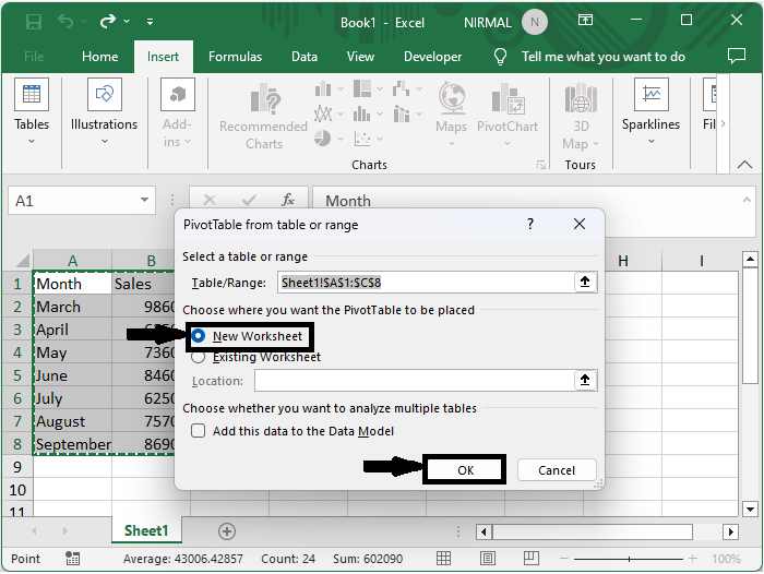
Step 1
Consider an Excel sheet where you have data in table format to complete the task.
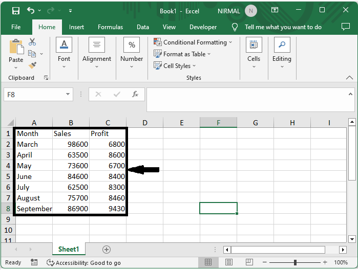
First select the range of cells, then click on insert, select pivot table, click on new sheet, and click OK.
Select cells > Insert > Pivot table > New sheet > Ok.
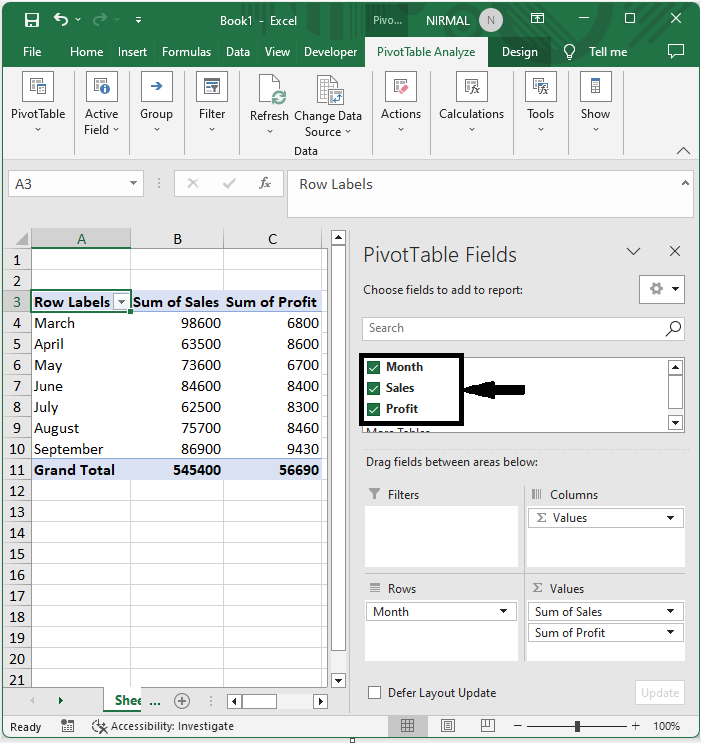
Step 2
Then select all the columns as shown in the below image.
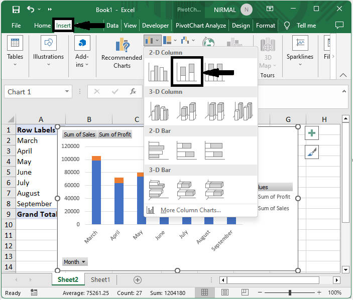
Step 3
Then select the table, click on insert, and select a stacked column chart.
Select table > Insert > Stacked chart.
Conclusion
In this tutorial, we have used a simple example to demonstrate how you can create a stacked column chart from a pivot table in Excel to highlight a particular set of data.

3K+ Views
