
Article Categories
- All Categories
-
 Data Structure
-
 Networking
-
 RDBMS
RDBMS
-
 Operating System
-
 Java
Java
-
 MS Excel
-
 iOS
iOS
-
 HTML
HTML
-
 CSS
CSS
-
 Android
-
 Python
-
 C Programming
-
 C++
C++
-
 C#
C#
-
 MongoDB
-
 MySQL
MySQL
-
 Javascript
-
 PHP
PHP
-
 Economics & Finance
How to Create a Bell Curve Chart Template in Excel?
A bell curve, sometimes referred to as a normal distribution, is a statistical concept that is frequently used to study and visualise data in many different domains. Excel is an ideal platform for making bell curve charts to depict data distribution because to its robust features and functions. We will walk you through the process of making an Excel bell curve chart template in this article. This lesson will give you the skills you need to produce accurate and beautiful bell curve charts, whether you're a student working on a statistics project, a data analyst examining a dataset, or a professional trying to show data visually.
You will have a thorough understanding of how to make a bell curve chart template in Excel at the end of this tutorial, enabling you to examine and present data distributions efficiently. So let's get started and unleash Excel's potential for data visualisation!
Create a Bell Curve Chart Template
Here we will first prepare the data, then create a scatter chart, and finally save the sheet as a template to complete the task. So let us see a simple process to learn how you can create a bell curve chart template in Excel.
Step 1
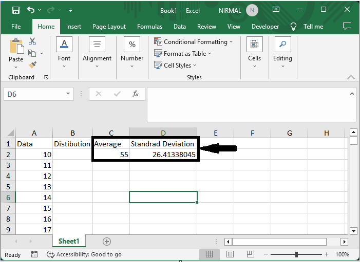
Consider an Excel sheet where you have a list of numbers from 10 to 100.
Then in cell C2, enter the formula as =AVERAGE(A2:A92), and in cell D2, enter the formula as =STDEV(A2:A92), then click enter.
Step 2
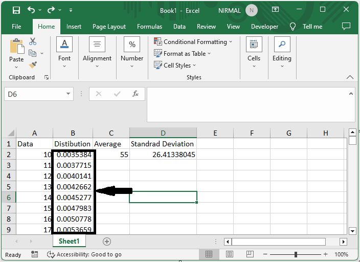
Now in cell B2, enter the formula as =NORM.DIST(A2,$C$2,$D$2,FALSE) and click enter, then drag down using the autofill handle.
Step 3
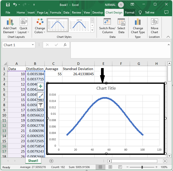
Then select the range of cells, click on insert, and select the scatter with Smooth Lines and Markers chart under scatter chart.
Select Cells > Insert > Scatter Chart > Scatter with Smooth Lines and Markers.
Step 4
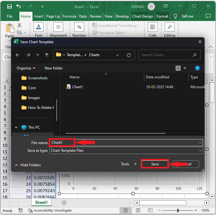
Then right-click on the chart and select Save As Template. Then enter the name, set Save Type to Excel Template, and click Ok.
This is how you can create a bell-curve chart template in Excel.
Conclusion
In this tutorial, we have used a simple example to demonstrate how you can create a bell curve chart template in Excel to highlight a particular set of data.

393 Views
