
Article Categories
- All Categories
-
 Data Structure
-
 Networking
-
 RDBMS
RDBMS
-
 Operating System
-
 Java
Java
-
 MS Excel
-
 iOS
iOS
-
 HTML
HTML
-
 CSS
CSS
-
 Android
-
 Python
-
 C Programming
-
 C++
C++
-
 C#
C#
-
 MongoDB
-
 MySQL
MySQL
-
 Javascript
-
 PHP
PHP
-
 Economics & Finance
How to cover legend in a box using ggplot2 in R?
To cover legend in a box using ggplot2 in R, we can use theme function with legend.box.background and legend.box.margin argument. The legend.box.background will have a rectangular element with the help of element_rect and margin values will be set in legend.box.margin.
Check out the Example given below to understand how it can be done.
Example
Following snippet creates a sample data frame −
Score<-sample(1:100,20)
Rank<-sample(1:10,20,replace=TRUE)
Gender<-sample(c("Male","Female"),20,replace=TRUE)
df<-data.frame(Score,Rank,Gender)
df
The following dataframe is created
 Score Rank Gender
 1 80     9 Male
 2 82     1 Female
 3 13     5 Male
 4 91     1 Female
 5 62     6 Male
 6 52     2 Female
 7 72     7 Male
 8 15     2 Male
 9 44     2 Male
10 78     5 Male
11 5     10 Male
12 22     1 Female
13 92     8 Female
14 94     2 Male
15 40     3 Male
16 73     8 Female
17 66     6 Male
18 70     6 Male
19 69     6 Male
20 47     7 Male
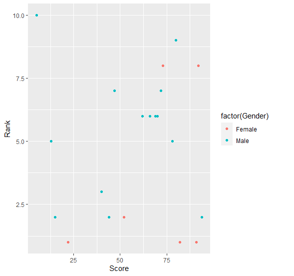
To load ggplot2 package and create scatterplot between Score and Rank with points colored by Gender on the above created data frame, add the following code to the above snippet −
Score<-sample(1:100,20)
Rank<-sample(1:10,20,replace=TRUE)
Gender<-sample(c("Male","Female"),20,replace=TRUE)
df<-data.frame(Score,Rank,Gender)
library(ggplot2)
ggplot(df,aes(Score,Rank))+geom_point(aes(colour=factor(Gender)))
Output
If you execute all the above given snippets as a single program, it generates the following Output −
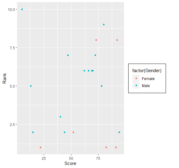
To create scatterplot between Score and Rank with points colored by Gender having legend covered in a box on the above created data frame, add the following code to the above snippet −
Score<-sample(1:100,20)
Rank<-sample(1:10,20,replace=TRUE)
Gender<-sample(c("Male","Female"),20,replace=TRUE)
df<-data.frame(Score,Rank,Gender)
library(ggplot2)
ggplot(df,aes(Score,Rank))+geom_point(aes(colour=factor(Gender)))+theme(legend.
box.background=element_rect(),legend.box.margin=margin(5,5,5,5))
Output
If you execute all the above given snippets as a single program, it generates the following Output −

2K+ Views
