
Article Categories
- All Categories
-
 Data Structure
-
 Networking
-
 RDBMS
RDBMS
-
 Operating System
-
 Java
Java
-
 MS Excel
-
 iOS
iOS
-
 HTML
HTML
-
 CSS
CSS
-
 Android
-
 Python
-
 C Programming
-
 C++
C++
-
 C#
C#
-
 MongoDB
-
 MySQL
MySQL
-
 Javascript
-
 PHP
PHP
-
 Economics & Finance
Selected Reading
How to remove the boxes around legend of a plot created by ggplot2 in R?
When we create a plot with legend using ggplot2, the legend values are covered with a box and that makes an impact on the smoothness of the plot. These boxes around the legend values can be removed so that complete the chart becomes more appealing to the viewer and it can be done with the help of theme function by setting the legend.key element to blank.
Example
Consider the below data frame −
set.seed(1)
x<-rnorm(20)
y<-rpois(20,2)
Group<-rep(c("A","B","C","D"),times=5)
df<-data.frame(x,y,Group)
df
Output
  x    y    Group
1   -0.62645381 3 A
2   0.18364332 2 B
3  -0.83562861 3 C
4   1.59528080 2 D
5   0.32950777 2 A
6  -0.82046838 3 B
7   0.48742905 0 C
8   0.73832471 2 D
9   0.57578135 3 A
10 -0.30538839 3 B
11  1.51178117 2 C
12  0.38984324 4 D
13 -0.62124058 2 A
14 -2.21469989 1 B
15  1.12493092 0 C
16 -0.04493361 0 D
17 -0.01619026 1 A
18  0.94383621 2 B
19  0.82122120 2 C
20  0.59390132 2 D
> library(ggplot2)
Creating the scatter plot with different colors of groups −
ggplot(df,aes(x,y,color=Group))+geom_point()
Output
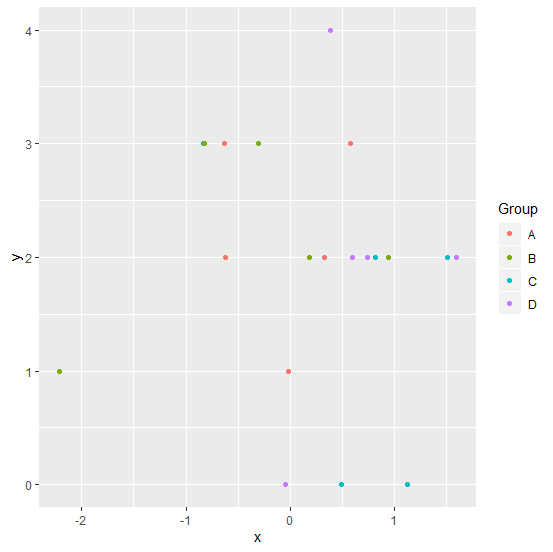
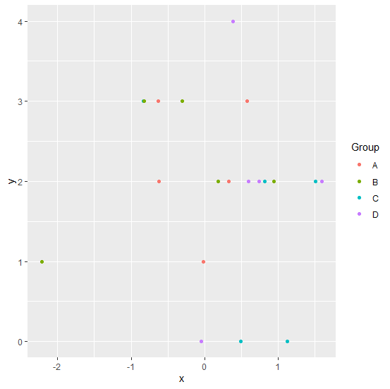
Here, we are getting legend colors in boxes. If we want to get rid of these boxes then we can use theme function as shown below −
ggplot(df,aes(x,y,color=Group))+geom_point()+theme(legend.key=element_blank())
Output

Updated on: 2020-08-21T12:29:10+05:30
3K+ Views

Advertisements