
Article Categories
- All Categories
-
 Data Structure
-
 Networking
-
 RDBMS
RDBMS
-
 Operating System
-
 Java
Java
-
 MS Excel
-
 iOS
iOS
-
 HTML
HTML
-
 CSS
CSS
-
 Android
-
 Python
-
 C Programming
-
 C++
C++
-
 C#
C#
-
 MongoDB
-
 MySQL
MySQL
-
 Javascript
-
 PHP
PHP
-
 Economics & Finance
How change the color of facet title using ggplot2 in R?
To change the color of facet title using ggplot2 in R, we can use theme function with strip.text.x. argument.
For Example, if we have a data frame called df that contains three columns say X, Y and F where F is a factor column then we can create facetted scatterplots between X and Y for values in F having different colored facet title by using the below mentioned command with facet title in different color −
ggplot(df,aes(X,Y))+geom_point()+facet_wrap(~F)+theme(strip.text.x=element_text(colour="red"))
Example
Following snippet creates a sample data frame −
Price<-sample(1:10,20,replace=TRUE)
Demand<-sample(50:100,20)
Region<-sample(c("Plane","Hill"),20,replace=TRUE)
df<-data.frame(Price,Demand,Region)
df
The following dataframe is created
  Price Demand Region
 1 3    62     Plane
 2 4    78     Plane
 3 5    75     Hill
 4 10   64     Hill
 5 2    54     Plane
 6 1    58     Plane
 7 3    81     Plane
 8 6    91     Plane
 9 4    50     Plane
10 5    76     Plane
11 1    63     Hill
12 9    72     Hill
13 9    93     Plane
14 3    88     Plane
15 10   84     Hill
16 1    89     Plane
17 2    82     Plane
18 6    55     Plane
19 7    98     Hill
20 4    67     Hill
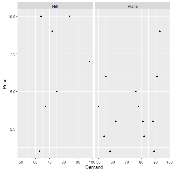
To load ggplot2 package and create scatterplot between Demand and Price with facets based on Region on the above created data frame, add the following code to the above snippet −
Price<-sample(1:10,20,replace=TRUE)
Demand<-sample(50:100,20)
Region<-sample(c("Plane","Hill"),20,replace=TRUE)
df<-data.frame(Price,Demand,Region)
library(ggplot2)
ggplot(df,aes(Demand,Price))+geom_point()+facet_wrap(~Region)
Output
If you execute all the above given snippets as a single program, it generates the following Output −
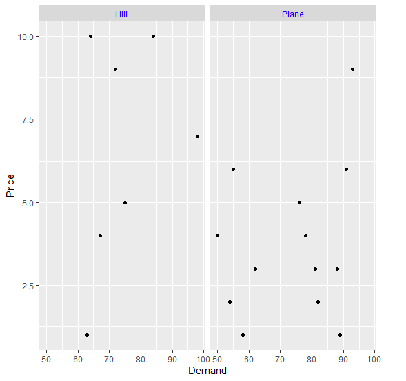
To create scatterplot between Demand and Price with facets in blue color based on Region on the above created data frame, add the following code to the above snippet −
Price<-sample(1:10,20,replace=TRUE)
Demand<-sample(50:100,20)
Region<-sample(c("Plane","Hill"),20,replace=TRUE)
df<-data.frame(Price,Demand,Region)
library(ggplot2)
ggplot(df,aes(Demand,Price))+geom_point()+facet_wrap(~Region)+theme(strip.text.x=element_text(colour="blue"))
Output
If you execute all the above given snippets as a single program, it generates the following Output −

837 Views
