
Article Categories
- All Categories
-
 Data Structure
-
 Networking
-
 RDBMS
RDBMS
-
 Operating System
-
 Java
Java
-
 MS Excel
-
 iOS
iOS
-
 HTML
HTML
-
 CSS
CSS
-
 Android
-
 Python
-
 C Programming
-
 C++
C++
-
 C#
C#
-
 MongoDB
-
 MySQL
MySQL
-
 Javascript
-
 PHP
PHP
-
 Economics & Finance
Selected Reading
How to add an extra point to scatterplot using ggplot2 in R?
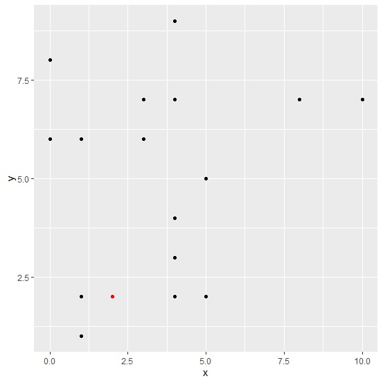
To add an extra point to scatterplot using ggplot2, we can still use geom_point function. We just need to use aes function for quoting with new values for the variables, also we can change the color of this point using colour argument. The display of an extra point will help us to distinguish between a threshold/new value and remaining values.
Consider the below data frame −
Example
x<-rpois(20,5)
y<-rpois(20,5)
df<-data.frame(x,y)
df
Output
   x  y
1  4  7
2  3  7
3  4  4
4  8  7
5  4  2
6  0  6
7  5  2
8  3  6
9  0  8
10 4  9
11 4  3
12 10 7
13 4  3
14 1  6
15 1  1
16 5  5
17 1  2
18 4  7
19 4  3
20 4  3
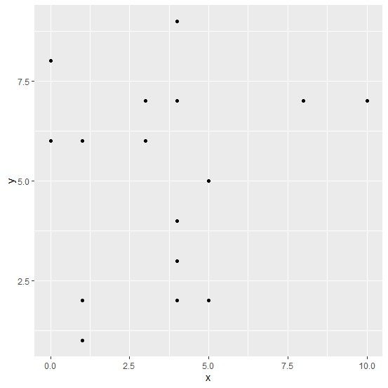
Loading ggplot2 package and creating a scatterplot between x and y −
Example
library(ggplot2)
ggplot(df,aes(x,y))+geom_point()
Output
Adding a new point to the above plot −
Example
ggplot(df,aes(x,y))+geom_point()+geom_point(aes(x=2,y=2),colour="red")
Output

Updated on: 2026-03-11T22:50:55+05:30
14K+ Views

Advertisements