- Google AMP - Home
- Google AMP - Overview
- Google AMP - Introduction
- Google AMP - Images
- Google AMP - Form
- Google AMP - Iframes
- Google AMP - Video
- Google AMP - Button
- Google AMP - Timeago
- Google AMP - Mathml
- Google AMP - Fit Text
- Google AMP - Date Countdown
- Google AMP - Date Picker
- Google AMP - Story
- Google AMP - Selector
- Google AMP - Link
- Google AMP - Font
- Google AMP - List
- Google AMP - User Notification
- Google AMP - Next Page
- Google AMP - Attributes
- Styles And Custom CSS
- Google AMP - Dynamic CSS Classes
- Google AMP - Actions And Events
- Google AMP - Animations
- Google AMP - Data Binding
- Google AMP - Layout
- Google AMP - ADS
- Google AMP - Analytics
- Google AMP - Social Widgets
- Google AMP - Media
- Html Page To Amp Page
- Google AMP - Basic Syntax
- Google AMP - Validation
- Google AMP - Caching
- Google AMP - Custom Javascript
- Google AMP - Cors
- Google AMP Useful Resources
- Google AMP - Quick Guide
- Google AMP - Useful Resources
- Google AMP - Discussion
Google AMP - Story
Amp-story is a amp-component used to display content keeping the user engaged with the story. For example using a series of images telling about a brand.
To get working with amp-story, we need to include the script as shown below −
<script async custom-element = "amp-story"
   src = "https://cdn.ampproject.org/v0/amp-story-1.0.js">
</script>
In this chapter, let us understand what amp-story is and how it works. Assume that we have a image gallery and want to display the same on the page. In the amp page we can make it look beautiful and interactive to the user using amp-story component.
The format of amp-story tag looks like as shown below −
<amp-story standalone> ---> Main story Tag
   <amp-story-page id = "page-1"> ---> Pages inside the story e.g page1
      <amp-story-grid-layer template = "fill"> -->
         Layers for the page1.You can have more than one layer.
         //Add html elements here or amp components
      </amp-story-grid-layer>
      <amp-story-grid-layer template = "fill"> -->
         Layers for the page1.You can have more than one layer.
         //Add html elements here or amp components
      </amp-story-grid-layer>
      ...
   </amp-story-page>

   <amp-story-page id = "page-2"> ---> Pages inside the story e.g page2
      <amp-story-grid-layer template = "fill"> -->
         Layers for the page2.You can have more than one layer.
         //Add html elements here or amp components
      </amp-story-grid-layer>
      ...
   </amp-story-page>
   ...
</amp-story>
There are some additional attributes added for amp-story as follows −
<amp-story standalone title = "My Story"
   publisher = "The AMP Team"
   publisher-logo-src = "publisherlogo image here"
   poster-portrait-src = "poster portrait here"
   poster-square-src = "poster square image here"
   poster-landscape-src = "poster landscape image here">
This feature makes the story telling using amp very interactive.
The following code shows a working example for amp-story. The output for the same is shown for desktop as well as mobile mode.
Example
<!doctype html>
<html amp lang = "en">
   <head>
      <meta charset = "utf-8">
      <script async src = "https://cdn.ampproject.org/v0.js"></script>
      <script async custom-element = "amp-story" src = "https://cdn.ampproject.org/v0/amp-story-1.0.js"></script>
      <title>Google AMP - Story</title>
      <meta name = "viewport" content = "width = device-width,minimum-scale = 1,initial-scale=1">
      <link rel = "canonical" href = "/stories/introduction/amp_story_hello_world/">

      <style amp-boilerplate>
         body{
            -webkit-animation:
            -amp-start 8s steps(1,end) 0s 1 normal both;-moz-animation:
            -amp-start 8s steps(1,end) 0s 1 normal both;-ms-animation:
            -amp-start 8s steps(1,end) 0s 1 normal both;animation:
            -amp-start 8s steps(1,end) 0s 1 normal both
         }
         @-webkit-keyframes
         -amp-start{from{visibility:hidden}to{visibility:visible}}@-moz-keyframes
         -amp-start{from{visibility:hidden}to{visibility:visible}}@-ms-keyframes
         -amp-start{from{visibility:hidden}to{visibility:visible}}@-o-keyframes
         -amp-start{from{visibility:hidden}to{visibility:visible}}@keyframes
         -amp-start{from{visibility:hidden}to{visibility:visible}}
      </style>

      <noscript>
         <style amp-boilerplate>
            body{
               -webkit-animation:
               none;-moz-animation:none;
               -ms-animation:none;
               animation:none}
         </style>
      </noscript>

      <style amp-custom>
         amp-story {
            font-family: Roboto, Helvetica, Arial, sans-serif;
         }
         amp-story-page * {
            color: white;
            text-align: center;
         }
      </style>
   </head>
   <body>
      <amp-story standalone title = "Stories in AMP - Hello World" publisher = "AMP Project">
         <amp-story-page id = "page-1">
            <amp-story-grid-layer template = "fill">
               <amp-img src = "images/christmas1.jpg"
                  width = "300" height = "250"
                  layout = "responsive">
               </amp-img>
            </amp-story-grid-layer>
               <amp-story-grid-layer template = "vertical">
                  <h1>Hello World</h1>
                  <p>This is an AMP Story.</p>
               </amp-story-grid-layer>
            </amp-story-page>

            <amp-story-page id = "page-2">
               <amp-story-grid-layer template = "fill">
                  <amp-img src = "images/christmas5.jpg"
                     width = "300" height = "250"
                     layout = "responsive">
                  </amp-img>
               </amp-story-grid-layer>
               <amp-story-grid-layer template = "vertical">
                  <h1>Hello World</h1>
                  <p>This is an AMP Story.</p>
               </amp-story-grid-layer>
            </amp-story-page>

            <amp-story-page id = "page-3">
               <amp-story-grid-layer template = "fill">
                  <amp-img src = "images/christmas3.jpg"
                     width = "300" height = "250"
                     layout = "responsive">
                  </amp-img>
               </amp-story-grid-layer>
               <amp-story-grid-layer template = "vertical">
                  <h1>Hello World</h1>
                  <p>This is an AMP Story.</p>
               </amp-story-grid-layer>
            </amp-story-page>

            <amp-story-page id = "page-4">
               <amp-story-grid-layer template = "fill">
                  <amp-img src = "images/christmas4.jpg"
                     width = "300" height="250"
                     layout = "responsive">
                  </amp-img>
               </amp-story-grid-layer>
               <amp-story-grid-layer template = "vertical">
                  <h1>Hello World</h1>
                  <p>This is an AMP Story.</p>
              </amp-story-grid-layer>
            </amp-story-page>

            <amp-story-bookend src = "ampstory.json" layout = "nodisplay">
         </amp-story-bookend>
      </amp-story>
   <body>
</html>
ampstory.json
{
   "bookendVersion": "v1.0",
   "shareProviders": [
      "email",
      "twitter",
      "tumblr",
      {
         "provider": "facebook",
         "app_id": "254325784911610"
      }
   ],
      "components": [
      {
         "type": "heading",
         "text": "Introduction"
      },
      {
         "type": "small",
         "title": "Next Story is on Car Brands",
         "url": "ampcarbrand.html",
         "image": "images/audi.jpg"
      }
   ]
}
Output on Desktop
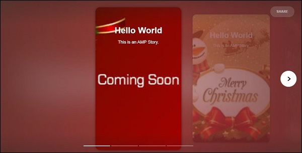

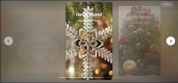

This is how the story section is displayed. You may also add videos, or any other amp component to make the story more interactive.
Once it reaches end of the story it will show what is given in the amp-bookend as shown below −
<amp-story-bookend
   src = "ampstory.json" layout = "nodisplay">
</amp-story-bookend>
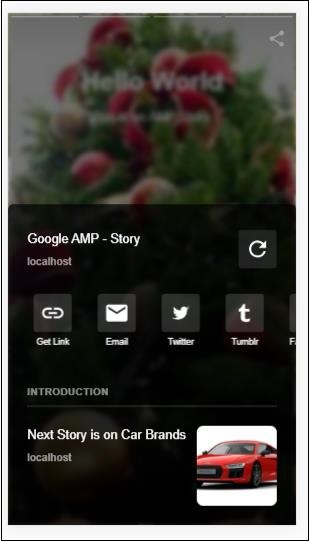
We have given a ampstory.json file to the amp-bookend.The json file has the details of the preview of the next story as shown below. When a user clicks on the three dots shown at right side, the following screen will be displayed −
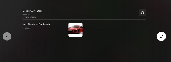
It gives a replay button which will load the story again. You can click the image of the car which will display the story of the car brands.
The output in the mobile mode is as follows −