- Google AMP - Home
- Google AMP - Overview
- Google AMP - Introduction
- Google AMP - Images
- Google AMP - Form
- Google AMP - Iframes
- Google AMP - Video
- Google AMP - Button
- Google AMP - Timeago
- Google AMP - Mathml
- Google AMP - Fit Text
- Google AMP - Date Countdown
- Google AMP - Date Picker
- Google AMP - Story
- Google AMP - Selector
- Google AMP - Link
- Google AMP - Font
- Google AMP - List
- Google AMP - User Notification
- Google AMP - Next Page
- Google AMP - Attributes
- Styles And Custom CSS
- Google AMP - Dynamic CSS Classes
- Google AMP - Actions And Events
- Google AMP - Animations
- Google AMP - Data Binding
- Google AMP - Layout
- Google AMP - ADS
- Google AMP - Analytics
- Google AMP - Social Widgets
- Google AMP - Media
- Html Page To Amp Page
- Google AMP - Basic Syntax
- Google AMP - Validation
- Google AMP - Caching
- Google AMP - Custom Javascript
- Google AMP - Cors
- Google AMP Useful Resources
- Google AMP - Quick Guide
- Google AMP - Useful Resources
- Google AMP - Discussion
Google AMP - Animations
Amp-animation is an amp component which defines animations to be used on other amp components. This chapter discusses them in detail.
To work with amp-animation, we need to add following script −
<script async custom-element = "amp-animation"
   src = "https://cdn.ampproject.org/v0/amp-animation-0.1.js">
</script>
The details of animation are defined inside a json structure.
The basic structure of amp-animation is as shown here −
<amp-animation layout = "nodisplay">
   <script type = "application/json">
      {
         // Timing properties
         ...
         "animations": [
            {
               // animation 1
            },
            ...
            {
               // animation n
            }
         ]
      }
   </script>
</amp-animation>
The animation component consists of the following − Selectors, Variables, Timing Properties, Keyframes etc.
{
   "selector": "#target-id",
   // Variables
   // Timing properties
   // Subtargets
   ...
   "keyframes": []
}
Selector
Here we need to give the class or id of the element on which the animation will be used.
Variables
They are the values which are defined to be used inside keyframes. Variables are defined using var().
Example
{
   "--delay": "0.5s",
   "animations": [
      {
         "selector": "#target1",
         "delay": "var(--delay)",
         "--x": "150px",
         "--y" : "200px",
         "keyframes": {
            "transform": "translate(var(--x), var(--y, 0px)"
         }
      }
   ]
}
Here delay, x and y are variables and the values for the variables are defined in the example shown.
Timing properties
Here you can define the duration and delay for your animation. The following are the timing properties supported −
| Property | Value | Description |
|---|---|---|
| duration | Time property.Value has to be in milliseconds. | The duration used for animation. |
| delay | Time property.Value has to be in milliseconds. | The delay before animation starts executing |
| endDelay | Time property.Value has to be in milliseconds or seconds. | The delay given which applies when the animation completes. |
| iterations | Value has to be a number. | The number of times the animation has to repeat. |
| iterationStart | Value has to be a number. | The time offset at which the effect begins animating. |
| easing | Value is a string | This is used to get the easing effect to the animation.Some examples for easing are linear , ease, ease-in, ease-out , ease-in-out etc |
| direction | Value is a string | One of "normal", "reverse", "alternate" or "alternate-reverse". |
| fill | Value is a string | Values can be "none", "forwards", "backwards", "both", "auto". |
Keyframes
Keyframes can be defined in many ways such as in object form or array form. Consider the following examples.
Example
"keyframes": {"transform": "translate(100px,200px)"}
Example
{
   "keyframes": {

      "opacity": [1, 0],
      "transform": ["scale(1)", "scale(2)"]
   }
}
Example
{
   "keyframes": [
      {"opacity": 1, "transform": "scale(1)"},
      {"opacity": 0, "transform": "scale(2)"}
   ]
}
Example
{
   "keyframes": [
      {"easing": "ease-out", "opacity": 1, "transform": "scale(1)"},
      {"opacity": 0, "transform": "scale(2)"}
   ]
}
Keyframe using CSS
<style amp-custom>
   div {
      width: 100px;
      height: 100px;
      background-color: red;
      position: relative;
      margin: 0 auto;
      transform:scale(3);
   }
   @keyframes example { 0% {transform:scale(3)}
      75% {transform:scale(2)}
      100% {transform:scale(1)}
   }

</style>

<amp-animation layout = "nodisplay">
   <script type = "application/json">
      {
         "duration": "4s",
         "keyframes": "example"
      }
   </script>
</amp-animation>
There are some CSS properties that can be used inside keyframes. The supported ones are called whitelisted properties. The following are the whitelisted properties which can be used inside keyframes −
- opacity
- transform
- visibility
- 'offsetDistance'
Note − Using any other property besides the white listed ones will throw error in the console.
Let us now understand through a simple example which will rotate the image when the animation is applied on it. In this example, we are rotating the image using amp-animation.
Example
<!doctype html>
<html amp lang = "en">
   <head>
      <meta charset = "utf-8">
      <script async src = "https://cdn.ampproject.org/v0.js"></script>
      <title>Google AMP - Amp Video</title>
      <link rel = "canonical" href = "http://example.ampproject.org/article-metadata.html">
      <meta name = "viewport" content = "width = device-width, minimum-scale = 1,initial-scale = 1">

      <style amp-boilerplate>
         body{
            -webkit-animation:
            -amp-start 8s steps(1,end) 0s 1 normal both;-moz-animation:
            -amp-start 8s steps(1,end) 0s 1 normal both;-ms
            -amp-start 8s steps(1,end) 0s 1 normal both;animation:
            -amp-start 8s steps(1,end) 0s 1 normal both
         }
         @-webkit-keyframes
         -amp-start{from{visibility:hidden}to{visibility:visible}}@-moz-keyframes
         -amp-start{from{visibility:hidden}to{visibility:visible}}@-ms-keyframes
         -amp-start{from{visibility:hidden}to{visibility:visible}}@-o-keyframes
         -amp-start{from{visibility:hidden}to{visibility:visible}}@keyframes
         -amp-start{from{visibility:hidden}to{visibility:visible}}
      </style>

      <noscript>
         <style amp-boilerplate>
            body{
               -webkit-animation:none;
               -moz-animation:none;
               -ms-animation:none;
               animation:none
            }
         </style>
      </noscript>

      <script async custom-element = "amp-animation"
         src =" https://cdn.ampproject.org/v0/amp-animation-0.1.js">
      </script>
      <style amp-custom>
         amp-img {
            border: 1px solid black;
            border-radius: 4px;
            padding: 5px;
         }
      </style>
   </head>
   <body>
      <h3>Google AMP - Amp Animation Example</h3>
      <amp-animation id = "anim1" layout = "nodisplay" trigger = "visibility">
         <script type = "application/json">
            {
               "duration": "1s",
               "fill": "both",
               "direction": "alternate",
               "animations": [
                  {
                     "selector": "#image1",
                     "easing": "cubic-bezier(0,0,.21,1)",
                     "keyframes": {
                        "transform": "rotate(20deg)"
                     }
                  }
               ]
            }
         </script>
      </amp-animation>
      <br/>
      <br/>
      <amp-img
         id = "image1"
         src = "images/christmas1.jpg"
         width = 300
         height = 250
         layout = "responsive">
      </amp-img>
      <br/>
   </body>
</html>
Output

The details of amp-animation details used above are given in the code shown below −
<amp-animation id = "anim1" layout = "nodisplay" trigger = "visibility">
   <script type = "application/json">
   {
      "duration": "1s",
      "fill": "both",
      "direction": "alternate",
      "animations": [
         {
            "selector": "#image1",
            "easing": "cubic-bezier(0,0,.21,1)",
            "keyframes": {
               "transform": "rotate(20deg)"
            }
         }
      ]
   }
   </script>
</amp-animation>
The selector here is the id of the image on which the rotate animation is applied −
<amp-img
   id = "image1"
   src = "images/christmas1.jpg"
   width = 300
   height = 250
   layout = "responsive">
</amp-img>
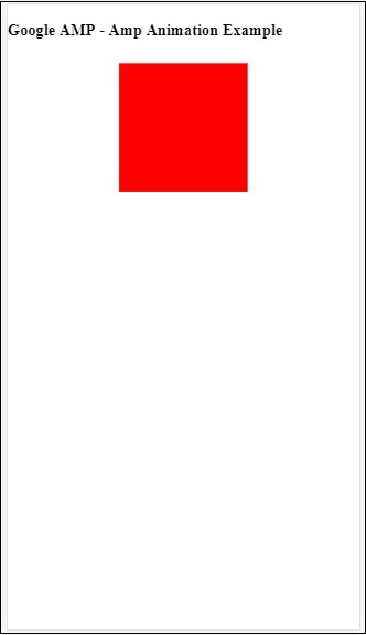
Example using Keyframes from CSS
Example
<!doctype html>
<html amp lang = "en">
   <head>
      <meta charset = "utf-8">
      <script async src = "https://cdn.ampproject.org/v0.js"></script>
      <title>Google AMP - Amp Video</title>
      <link rel = "canonical" href = "http://example.ampproject.org/article-metadata.html">
      <meta name = "viewport" content = "width = device-width,minimum-scale = 1,initial-scale = 1">
      <style amp-boilerplate>
         body{
            -webkit-animation:
            -amp-start 8s steps(1,end) 0s 1 normal both;-moz-animation:
            -amp-start 8s steps(1,end) 0s 1 normal both;-ms-animation:
            -amp-start 8s steps(1,end) 0s 1 normal both;animation:
            -amp-start 8s steps(1,end) 0s 1 normal both
         }
         @-webkit-keyframes
         -amp-start{from{visibility:hidden}to{visibility:visible}}@-moz-keyframes
         -amp-start{from{visibility:hidden}to{visibility:visible}}@-ms-keyframes
         -amp-start{from{visibility:hidden}to{visibility:visible}}@-o-keyframes
         -amp-start{from{visibility:hidden}to{visibility:visible}}@keyframes
         -amp-start{from{visibility:hidden}to{visibility:visible}}
      </style>
      <noscript>
         <style amp-boilerplate>
            body{
               -webkit-animation:none;
               -moz-animation:none;
               -ms-animation:none;
               animation:none
            }
         </style>
      </noscript>
      <script async custom-element = "amp-animation"
         src = "https://cdn.ampproject.org/v0/amp-animation-0.1.js">
      </script>
      <style amp-custom>
         div {
            width: 100px;
            height: 100px;
            background-color: red;
            position: relative;
            margin: 0 auto;
            transform:scale(3);
         }

         @keyframes example {
            0% {transform:scale(3)}
            75% {transform:scale(2)}
            100% {transform:scale(1)}
         }
      </style>
   </head>
   <body>
      <h3>Google AMP - Amp Animation Example</h3>
      <amp-animation id = "anim1" layout = "nodisplay" trigger = "visibility">
         <script type = "application/json">
            {
               "duration": "3s",
               "fill": "both",
               "direction": "alternate",
               "animations": [{
                  "selector": "#image1",
                  "easing": "cubic-bezier(0,0,.21,1)",
                  "keyframes":"example"
               }]
            }
         </script>
      </amp-animation>
      <br/>
      <br/>
      <div id = "image1"></div>
      <br/>
   </body>
</html>
Output
Animation Trigger
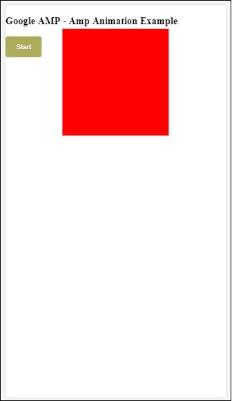
With trigger = visibility, the animation is applied by default. In order to start the animation on a event, we have to remove the trigger = visibility and add the event to start animation as shown in the example below −
Example
<!doctype html>
<html amp lang = "en">
   <head>
      <meta charset = "utf-8">
      <script async src = "https://cdn.ampproject.org/v0.js"></script>
      <title>Google AMP - Amp Video</title>
      <link rel = "canonical" href = "http://example.ampproject.org/article-metadata.html">
      <meta name = "viewport" content = "width = device-width,
      minimum-scale = 1,initial-scale = 1">
      <style amp-boilerplate>
         body{
            -webkit-animation:
            -amp-start 8s steps(1,end) 0s 1 normal both;-moz-animation:
            -amp-start 8s steps(1,end) 0s 1 normal both;-ms-animation:
            -amp-start 8s steps(1,end) 0s 1 normal both;animation:
            -amp-start 8s steps(1,end) 0s 1 normal both
         }
         @-webkit-keyframes
         -amp-start{from{visibility:hidden}to{visibility:visible}}@-moz-keyframes
         -amp-start{from{visibility:hidden}to{visibility:visible}}@-ms-keyframes
         -amp-start{from{visibility:hidden}to{visibility:visible}}@-o-keyframes
         -amp-start{from{visibility:hidden}to{visibility:visible}}@keyframes
         -amp-start{from{visibility:hidden}to{visibility:visible}}
      </style>
      <noscript>
         <style amp-boilerplate>
            body{
               -webkit-animation:none;
               -moz-animation:none;
               -ms-animation:none;
               animation:none}
         </style>
      </noscript>
      <script async custom-element = "amp-animation"
         src = "https://cdn.ampproject.org/v0/amp-animation-0.1.js">
      </script>
      <style amp-custom>
         div {
            width: 100px;
            height: 100px;
            background-color: red;
            position: relative;
            margin: 0 auto;
            transform:scale(2);
         }
         @keyframes example {
            0% {transform:scale(2)}
            75% {transform:scale(1)}
            100% {transform:scale(0.5)}
         }
         button{
            background-color: #ACAD5C;
            color: white;
            padding: 12px 20px;
            border: none;
            border-radius: 4px;
            cursor: pointer;
            float: left;
         }
      </style>
   </head>
   <body>
      <h3>Google AMP - Amp Animation Example</h3>
      <amp-animation id = "anim1" layout = "nodisplay">
         <script type = "application/json">
            {
               "duration": "3s",
               "fill": "both",
               "direction": "alternate",
               "animations": [{
                  "selector": "#image1",
                  "easing": "cubic-bezier(0,0,.21,1)",
                  "keyframes":"example"
               }]
            }
         </script>
      </amp-animation>
      <button on = "tap:anim1.start">Start</button>
      <br/>
      <br/>
      <div id = "image1"></div>
   </body>
</html>
Note that animation will start when the start button is tapped.
Output
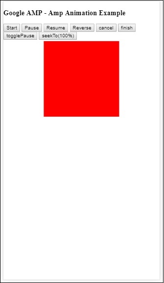
We have used action called start on On to start with the animation. Similarly, there are other actions supported which are as follows −
- start
- pause
- restart
- resume
- togglePause
- seekTo
- reverse
- finish
- cancel
Let us see a working example where we can use the action.
Example
<!doctype html>
<html amp lang = "en">
   <head>
      <meta charset = "utf-8">
      <script async src = "https://cdn.ampproject.org/v0.js"></script>
      <title>Google AMP - Amp Video</title>
      <link rel = "canonical" href = "http://example.ampproject.org/article-metadata.html">
      <meta name = "viewport" content = "width=device-width,minimum-scale = 1,initial-scale = 1">

      <style amp-boilerplate>
         body{
            -webkit-animation:
            -amp-start 8s steps(1,end) 0s 1 normal both;-moz-animation:
            -amp-start 8s steps(1,end) 0s 1 normal both;-ms-animation:
            -amp-start 8s steps(1,end) 0s 1 normal both;animation:
            -amp-start 8s steps(1,end) 0s 1 normal both
         }
         @-webkit-keyframes
         -amp-start{from{visibility:hidden}to{visibility:visible}}@-moz-keyframes
         -amp-start{from{visibility:hidden}to{visibility:visible}}@-ms-keyframes
         -amp-start{from{visibility:hidden}to{visibility:visible}}@-o-keyframes
         -amp-start{from{visibility:hidden}to{visibility:visible}}@keyframes
         -amp-start{from{visibility:hidden}to{visibility:visible}}
      </style>

      <noscript>
         <style amp-boilerplate>
            body{
               -webkit-animation:none;
               -moz-animation:none;
               -ms-animation:none;
               animation:none}
         </style>
      </noscript>
      <script async custom-element = "amp-animation"
         src = "https://cdn.ampproject.org/v0/amp-animation-0.1.js">
      </script>
      <style amp-custom>
         #image1 {
            width: 100px;
            height: 100px;
            background-color: red;
            position: relative;
            margin: 0 auto;
            transform:scale(2);
         }
         @keyframes example {
            0% {transform:scale(2)}
            75% {transform:scale(1)}
            100% {transform:scale(0.5)}
         }
         button1{
            background-color: #ACAD5C;
            color: white;
            padding: 12px 20px;
            border: none;
            border-radius: 4px;
            cursor: pointer;
            float: left;
         }
      </style>
   </head>
   <body>
      <h3>Google AMP - Amp Animation Example</h3>
      <amp-animation id = "anim1" layout = "nodisplay">
         <script type = "application/json">
            {
               "duration": "3s",
               "fill": "both",
               "direction": "alternate",
               "animations": [{
                  "selector": "#image1",
                  "easing": "cubic-bezier(0,0,.21,1)",
                  "keyframes":"example"
               }]
            }
         </script>
      </amp-animation>
      <button on = "tap:anim1.start">Start</button>
      <button on = "tap:anim1.pause">Pause</button>
      <button on = "tap:anim1.resume">Resume</button>
      <button on = "tap:anim1.reverse">Reverse</button>
      <button on = "tap:anim1.cancel">cancel</button>
      <button on = "tap:anim1.finish">finish</button>
      <button on = "tap:anim1.togglePause">togglePause</button>
      <button on = "tap:anim1.seekTo(percent = 1.00)">seekTo(100%)</button>
      <br/>
      <br/>
      <br/>
      <br/>
      <div id="image1"></div>
   </body>
</html>
Output