- Google AMP - Home
- Google AMP - Overview
- Google AMP - Introduction
- Google AMP - Images
- Google AMP - Form
- Google AMP - Iframes
- Google AMP - Video
- Google AMP - Button
- Google AMP - Timeago
- Google AMP - Mathml
- Google AMP - Fit Text
- Google AMP - Date Countdown
- Google AMP - Date Picker
- Google AMP - Story
- Google AMP - Selector
- Google AMP - Link
- Google AMP - Font
- Google AMP - List
- Google AMP - User Notification
- Google AMP - Next Page
- Google AMP - Attributes
- Styles And Custom CSS
- Google AMP - Dynamic CSS Classes
- Google AMP - Actions And Events
- Google AMP - Animations
- Google AMP - Data Binding
- Google AMP - Layout
- Google AMP - ADS
- Google AMP - Analytics
- Google AMP - Social Widgets
- Google AMP - Media
- Html Page To Amp Page
- Google AMP - Basic Syntax
- Google AMP - Validation
- Google AMP - Caching
- Google AMP - Custom Javascript
- Google AMP - Cors
- Google AMP Useful Resources
- Google AMP - Quick Guide
- Google AMP - Useful Resources
- Google AMP - Discussion
Google AMP - Button
Buttons are another feature of AMP. Note that there is no change for buttons in AMP and they are used like standard a HTML button tag. The only difference with buttons in AMP page is the working of events on it.
In this chapter, we will see some examples to show the working of button and how to use it with AMP components.
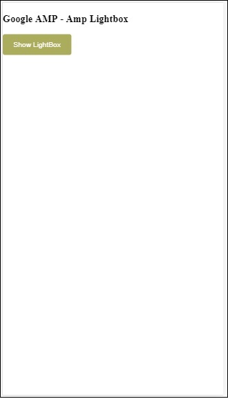
Sample Code for Lightbox
The following example shows us how to use button to show/hide amp-lightbox as shown below −
<!doctype html>
<html amp lang = "en">
   <head>
      <meta charset = "utf-8">
      <script async src = "https://cdn.ampproject.org/v0.js"></script>
      <title>Google AMP - Amp Lightbox</title>
      <link rel = "canonical" href = "http://example.ampproject.org/article-metadata.html">

      <meta name = "viewport" content ="width = device-width,minimum-scale = 1,initial-scale = 1">

      <style amp-boilerplate>
         body{
            -webkit-animation:-amp-start 8s steps(1,end) 0s 1 normal both;-moz-animation:
            -amp-start 8s steps(1,end) 0s 1 normal both;-ms-animation:
            -amp-start 8s steps(1,end) 0s 1 normal both;animation:
            -amp-start 8s steps(1,end) 0s 1 normal both
         }
         @-webkit-keyframes
         -amp-start{from{visibility:hidden}to{visibility:visible}}@-moz-keyframes
         -amp-start{from{visibility:hidden}to{visibility:visible}}@-ms-keyframes
         -amp-start{from{visibility:hidden}to{visibility:visible}}@-o-keyframes
         -amp-start{from{visibility:hidden}to{visibility:visible}}@keyframes
         -amp-start{from{visibility:hidden}to{visibility:visible}}
      </style>
      <noscript>
         <style amp-boilerplate>
            body{
               -webkit-animation:none;-moz-animation:none;-ms-an
               imation:none;animation:none
            }
         </style>
      </noscript>

      <script async custom-element = "amp-lightbox"
         src = "https://cdn.ampproject.org/v0/amp-lightbox-0.1.js">
      </script>

      <style amp-custom>
         amp-img {
            border: 1px solid #ddd;
            border-radius: 4px;
            padding: 5px;
         }
         button{
            background-color:
            #ACAD5C; color: white;
            padding: 12px 20px;
            border: none;
            border-radius: 4px;
            cursor: pointer;
            float: left;
         }

         .lightbox {
            background: rgba(211,211,211,0.8);
            width: 100%;
            height: 100%;
            position: absolute;
            display: flex;
            align-items: center;
            justify-content: center;
         }
      </style>
   </head>
   <body>
      <h3>Google AMP - Amp Lightbox</h3>
      <button on = "tap:my-lightbox">
         Show LightBox
      </button>
      <amp-lightbox id = "my-lightbox" layout = "nodisplay">
         <div class = "lightbox" on = "tap:my-lightbox.close" tabindex = "0">
            <amp-img alt = "Beautiful Flower"
               src = "images/flower.jpg"
               width = "246"
               height = "205">
            </amp-img>
         </div>
      </amp-lightbox>
   </body>
</html>
Output
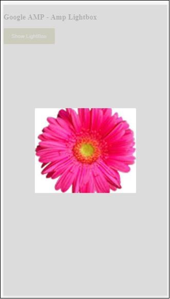
Now, you can click anywhere on the screen to close the lightbox.
In the above example, we have used a button using the code as shown below −
<button on = "tap:my-lightbox">
   Show LightBox
</button>
Next, we have added action on the button using on attribute as shown:
on = "tap:my-lightbox"
The action will take place when you tap on the button. Note that the id of the lightbox is given to it. When the user taps on the button, the lightbox will be opened. Similarly, you can use the button with on action with any component to interact with it.
