- Google AMP - Home
- Google AMP - Overview
- Google AMP - Introduction
- Google AMP - Images
- Google AMP - Form
- Google AMP - Iframes
- Google AMP - Video
- Google AMP - Button
- Google AMP - Timeago
- Google AMP - Mathml
- Google AMP - Fit Text
- Google AMP - Date Countdown
- Google AMP - Date Picker
- Google AMP - Story
- Google AMP - Selector
- Google AMP - Link
- Google AMP - Font
- Google AMP - List
- Google AMP - User Notification
- Google AMP - Next Page
- Google AMP - Attributes
- Styles And Custom CSS
- Google AMP - Dynamic CSS Classes
- Google AMP - Actions And Events
- Google AMP - Animations
- Google AMP - Data Binding
- Google AMP - Layout
- Google AMP - ADS
- Google AMP - Analytics
- Google AMP - Social Widgets
- Google AMP - Media
- Html Page To Amp Page
- Google AMP - Basic Syntax
- Google AMP - Validation
- Google AMP - Caching
- Google AMP - Custom Javascript
- Google AMP - Cors
- Google AMP Useful Resources
- Google AMP - Quick Guide
- Google AMP - Useful Resources
- Google AMP - Discussion
Google AMP - Date Picker
AMP Datepicker is an amp component which displays calendar on the page wherein the user can select dates. AMP datepicker can be displayed like a static calendar or based on input selection, that is with a click of a button.
To get amp-date-picker working we need to add following script to the page −
<script async custom-element = "amp-date-picker"
   src = "https://cdn.ampproject.org/v0/amp-date-picker-0.1.js">
</script>
Amp-date-picker Tag
The tag of amp-date-picker looks as follows −
<amp-date-picker layout = "fixed-height" height = "360"></amp-date-picker>
Supported Attributes
The following attributes are supported for amp-date-picker −
| Sr.No | Attribute & Description |
|---|---|
| 1 | mode Options available are static and overlay. For static, calendar will open by default on the page. For Overlay, the calendar will open upon interaction. |
| 2 | mode Options available are single and range. With single, you can select only one date on the calendar. With range, you can select more than one date but in a continuous range. |
| 3 | input-selector This can be a queryselector for date input. For example, for id is is #nameoftheid for class it is. nameoftheclass. The date will be updated for the tag to which the id is assigned. |
| 4 | start-input-selector This can be a queryselector for date input. For example, for id is is #nameoftheid for class it is .nameoftheclass. The date will be updated for the tag to which the id is assigned. |
| 5 | end-input-selector This can be a queryselector for date input. For example for id is is #nameoftheid for class it is .nameoftheclass. The date will be updated for the tag to which the id is assigned. |
| 6 | min The earliest date that the user may select. This must be formatted as an ISO 8601 date. If no min attribute is present, the current date will be the minimum date. |
| 7 | max The latest date that the user may select. This must be formatted as an ISO 8601 date. If no max attribute is present, the date picker will have no maximum date. |
| 8 | month-format The month format you need to display the date selected. By default, the values are "MMMM YYYY" |
| 9 | format The format in which you want the date to displayed in the input box or any htmlelement whose selector is used. By default it is "YYYY-MM-DD" |
| 10 | week-day-format Format to display day of the week. |
| 11 | locale Locale to display calendar view. By default it is en. |
| 12 | minimum-nights The number of nights that the user must select in a date range. The default is "1". A value of "0" allows users to select the same date for the start and end dates. |
| 13 | number-of-months The number of months to display at one time in the calendar view. The default is "1". |
| 14 | first-day-of-week The day to specify as the first day of the week (0-6). The default value is "0" (Sunday). |
| 15 | day-size The size in px of the date cells in the calendar view table. The default is 39. |
The main attributes are type and mode. For mode, we have static and overlay type calendars. For type we can have single and range options. With type = single we can select only one date from the calendar and for type = range we can select more than one data in a range.
Now, let us understand amp-date-picker for static and overlay type calendars through some working examples.
AMP Static date picker
For static type date picker we need to specify the mode=static as shown in the example below.
Example
<!doctype html>
<html amp lang = "en">
   <head>
      <meta charset = "utf-8">
      <script async src = "https://cdn.ampproject.org/v0.js"></script>
      <title>Google AMP - Amp Date-Picker Static </title>
      <link rel = "canonical" href = " http://example.ampproject.org/article-metadata.html">
      <meta name = "viewport" content = "width = device-width, minimum-scale = 1,initial-scale = 1">

      <style amp-boilerplate>
         body{
            -webkit-animation:
            -amp-start 8s steps(1,end) 0s 1 normal both;-moz-animation:
            -amp-start 8s steps(1,end) 0s 1 normal both;-ms-animation:
            -amp-start 8s steps(1,end) 0s 1 normal both;animation:
            -amp-start 8s steps(1,end) 0s 1 normal both
         }
         @-webkit-keyframes
         -amp-start{from{visibility:hidden}to{visibility:visible}}@-moz-keyframes
         -amp-start{from{visibility:hidden}to{visibility:visible}}@-ms-keyframes
         -amp-start{from{visibility:hidden}to{visibility:visible}}@-o-keyframes
         -amp-start{from{visibility:hidden}to{visibility:visible}}@keyframes
         -amp-start{from{visibility:hidden}to{visibility:visible}}
      </style>
      <noscript>
         <style amp-boilerplate>
            body{-webkit-animation:
            none;-moz-animation:none;-ms-animation:none;animation:none}
         </style>
      </noscript>

      <script async custom-element = "amp-date-picker"
         src = "https://cdn.ampproject.org/v0/amp-date-picker-0.1.js">
      </script>

      <script async custom-element = "amp-bind"
         src = "https://cdn.ampproject.org/v0/amp-bind-0.1.js">
      </script>
      <script async custom-template = "amp-mustache"
         src = "https://cdn.ampproject.org/v0/amp-mustache-0.1.js">
      </script>

      <style>
         input[type = text]{
            width: 50%;
            padding: 12px;
            border: 1px
            solid #ccc;
            border-radius: 4px;
            resize: vertical;
         }
         label {
            padding: 12px 12px 12px 0;display: inline-block;
         }
         .col-label {
            float: left;width: 25%;margin-top: 6px;
         }
         .col-content {
            float: left;width: 75%;margin-top: 6px;
         }
         .row:after {
            content: "";display: table;clear: both;
         }
         .amp_example {
            background-color: #f1f1f1;
            padding: 0.01em 16px;
            margin: 20px 0;
            box-shadow: 0 2px 4px 0
            rgba(0,0,0,0.16),0 2px 10px 0
            rgba(0,0,0,0.12)!important;
         }
         h3{font-family: "Segoe UI",Arial,sans-serif;
         font-weight: 400;margin: 10px 0;}
      </style>
   </head>
   <body>
      <div class = "amp_example">
         <h3>Google AMP - Amp Date-Picker using type = single</h3>
         <amp-date-picker
            id = "static-date"
            type = "single"
            mode = "static"
            layout = "fixed-height"
            height = "600"
            format = "YYYY-MM-DD"
            input-selector = "#date">

            <div class = "row">
               <div class = "col-label">
                  <label for = "start">
                     Date is:
                  </label>
               </div>
               <div class = "col-content">
                  <input type = "text" id = "date" name = "date"
                     placeholder = "Date Selected Is...">
               </div>
            </div>
         </amp-date-picker>
      <div>
   </body>
</html>
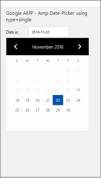
Observe that in this example we are displaying calendar i.e datepicker by default on the screen.
The date selected by the user is shown in the text field as shown in the demo screen shown below −
Output
How to get the date selected from amp-date-picker?
If you check the above example, there is an attribute called input-selector which is given the id of the text field. When user selects the date , it is shown inside the input field.
<amp-date-picker
   id = "static-date"
   type = "single"
   mode = "static"
   layout = "fixed-height"
   height = "600"
   format = "YYYY-MM-DD"
   input-selector = "#date"

   <div class = "row">
      <div class = "col-label">
         <label for = "start">Date is:</label>
      </div>
      <div class = "col-content">
         <input type = "text" id = "date" name = "date"
         placeholder = "Date Selected Is...">
      </div>
   </div>

</amp-date-picker>
You can also give name property to input-selector attribute as follows −
<amp-date-picker
   type = "single"
   mode = "static"
   layout = "container"
   input-selector = "[name = date]">
   <input type = "text" id = "date" name = "date" placeholder = "Date Selected Is...">
</amp-date-picker>
Incase if the input-selector is not given than amp-date-picker creates a hidden input field and gives it a name of date or ${id}-date using the amp-date picker's id.
We will discuss some more examples with different attributes available with date-picker. In the above, we can select the single date as we mentioned type=single and mode as static. We can also select range of dates by giving the type as type=range.
Example
<!doctype html>
<html amp lang = "en">
   <head>
      <meta charset = "utf-8">
      <script async src = "https://cdn.ampproject.org/v0.js"></script>
      <title>Google AMP - Amp Date-Picker Static </title>
      <link rel = "canonical" href = "http://example.ampproject.org/article-metadata.html">
      <meta name = "viewport" content = "width = device-width, minimum-scale = 1,initial-scale = 1">

      <style amp-boilerplate>
         body{-webkit-animation:
            -amp-start 8s steps(1,end) 0s 1 normal both;-moz-animation:
            -amp-start 8s steps(1,end) 0s 1 normal both;-ms-animation:
            -amp-start 8s steps(1,end) 0s 1 normal both;animation:
            -amp-start 8s steps(1,end) 0s 1 normal both
         }
         @-webkit-keyframes
         -amp-start{from{visibility:hidden}to{visibility:visible}}@-moz-keyframes
         -amp-start{from{visibility:hidden}to{visibility:visible}}@-ms-keyframes
         -amp-start{from{visibility:hidden}to{visibility:visible}}@-o-keyframes
         -amp-start{from{visibility:hidden}to{visibility:visible}}@keyframes
         -amp-start{from{visibility:hidden}to{visibility:visible}}
      </style>
      <noscript>
         <style amp-boilerplate>
            body{
            -webkit-animation:
            none;-moz-animation:none;-ms-animation:none;animation:none}
         </style>
      </noscript>

      <script async custom-element = "amp-date-picker"
         src = "https://cdn.ampproject.org/v0/amp-date-picker-0.1.js">
      </script>

      <script async custom-element = "amp-bind"
         src = "https://cdn.ampproject.org/v0/amp-bind-0.1.js">
      </script>

      <script async custom-template = "amp-mustache"
         src = "https://cdn.ampproject.org/v0/amp-mustache-0.1.js">
      </script>

      <style>
         input[type = text]{
            width: 50%;
            padding: 12px;
            border: 1px solid #ccc;
            border-radius: 4px;
            resize: vertical;
         }
         label {padding: 12px 12px 12px 0;display: inline-block;}
         .col-label {float: left;width: 25%;margin-top: 6px;}
         .col-content {float: left;width: 75%;margin-top: 6px;}
         .row:after {content: "";display: table;clear: both;}
         .amp_example {
            background-color: #f1f1f1;
            padding: 0.01em 16px;
            margin: 20px 0;
            box-shadow: 0 2px 4px 0
            rgba(0,0,0,0.16),0 2px 10px 0
            rgba(0,0,0,0.12)!important;
         }
         h3{
            font-family: "Segoe UI",Arial,sans-serif;
            font-weight: 400;margin: 10px 0;
         }
      </style>
   </head>
   <body>
      <div class = "amp_example">
         <h3>Google AMP - Amp Date-Picker Static Multi Select Dates using type = range</h3>
         <amp-date-picker
            id = "static-date"
            type = "range"
            mode = "static"
            layout = "fixed-height"
            height = "600"
            start-input-selector = "#start"
            end-input-selector = "#end"
            format = "YYYY-MM-DD"
            input-selector = "#static-date-input">

            <div class = "row">
               <div class = "col-label">
                  <label for = "start">Start Date:</label>
               </div>
               <div class = "col-content">
                  <input type = "text" id = "start"
                  name = "start" placeholder = "Start Date">
               </div>
            </div>
            <div class = "row">
               <div class = "col-label">
                  <label for = "end">End Date:</label>
               </div>
               <div class = "col-content">
                  <input type = "text" id = "end"
                  name = "end" placeholder = "End Date">
               </div>
            </div>
         </amp-date-picker>
      </div>
   </body>
</html>
Output
The output of the code shown above is as given below −
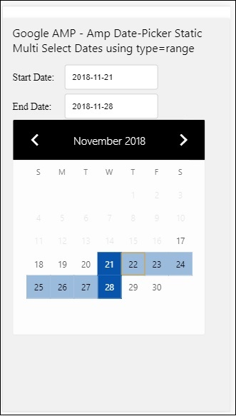
How to get the start and end date using type= range selected from amp-date-picker?
To get the start and end date, we have used amp-date-picker attribute start-input-selector and end-input-selector.
The details of the syntax are shown here −
<amp-date-picker
   id = "static-date"
   type = "range"
   mode = "static"
   layout = "fixed-height"
   height = "600"
   start-input-selector = "#start"
   end-input-selector="#end"
   format = "YYYY-MM-DD"
   input-selector = "#static-date-input">

   <input type = "text" id = "start" name = "start" placeholder="Start Date">
   <input type = "text" id = "end" name = "end" placeholder = "End Date">
</amp-date-picker>
Both the selectors have input field id where we want the start and end date to be displayed. You can also give the name of the input field as discussed here.
AMP Overlay Date Picker
For Overlay mode date picker, the calendar is displayed in response to the input field. We can have overlay with type= single and type=range as we have seen for static date-picker.
Let us now see a working example of selecting date range for Overlay type date-picker.
Example
<!doctype html>
<html amp lang = "en">
   <head>
      <meta charset = "utf-8">
      <script async src = "https://cdn.ampproject.org/v0.js"></script>
      <itle>Google AMP - Amp Date-Picker Static</title>
      <link rel = "canonical" href = "http://example.ampproject.org/article-metadata.html">
      <meta name = "viewport" content = "width = device-width,minimum-scale = 1,initial-scale = 1">
      <style amp-boilerplate>
         body{
            -webkit-animation:
            -amp-start 8s steps(1,end) 0s 1 normal both;-moz-animation:
            -amp-start 8s steps(1,end) 0s 1 normal both;-ms-animation:
            -amp-start 8s steps(1,end) 0s 1 normal both;animation:
            -amp-start 8s steps(1,end) 0s 1 normal both
         }
         @-webkit-keyframes
         -amp-start{from{visibility:hidden}to{visibility:visible}}@-moz-keyframes
         -amp-start{from{visibility:hidden}to{visibility:visible}}@-ms-keyframes
         -amp-start{from{visibility:hidden}to{visibility:visible}}@-o-keyframes
         -amp-start{from{visibility:hidden}to{visibility:visible}}@keyframes
         -amp-start{from{visibility:hidden}to{visibility:visible}}
      </style>
      <noscript>
         <style amp-boilerplate>
            body{
            -webkit-animation:
            none;-moz-animation:none;-ms-animation:none;animation:none}
         </style>
      </noscript>

      <script async custom-element = "amp-date-picker"
         src = "https://cdn.ampproject.org/v0/amp-date-picker-0.1.js">
      </script>
      <script async custom-element = "amp-bind"
         src = "https://cdn.ampproject.org/v0/amp-bind-0.1.js">
      </script>
      <script async custom-template = "amp-mustache"
         src = "https://cdn.ampproject.org/v0/amp-mustache-0.1.js">
      </script>

      <style>
         input[type=text]{
            width: 50%;
            padding: 12px;border:
            1px solid #ccc;
            border-radius: 4px;resize: vertical;
         }
         label {
            padding: 12px 12px 12px 0;
            display: inline-block;
            font-family: "Segoe UI",Arial,sans-serif;
            font-weight: 400;
         }
         .col-label {float: left;width: 25%;margin-top: 6px;}
         .col-content {float: left;width: 75%;margin-top: 6px;}
         .row:after {content: "";display: table;clear: both;}
         .amp_example {
            background-color: #f1f1f1;
            padding: 0.01em 16px;
            margin: 20px 0;
            box-shadow: 0 2px 4px 0
            rgba(0,0,0,0.16),0 2px 10px 0
            rgba(0,0,0,0.12)!important;
         }
         h3{font-family: "Segoe UI",Arial,sans-serif;font-weight: 400;margin: 10px 0;}
         button { background-color: #ACAD5C;
            color: white;
            padding: 12px 20px;
            border: none;
            border-radius: 4px;
            cursor: pointer;
            float: right;
         }
      </style>
   </head>
   <body>
      <div class = "amp_example">
         <h3>Google AMP - Amp Date-Picker Overlay Multi Select Dates using type = rangelt;/h3>
         <amp-date-picker id = "overlay-date"
            type = "range"
            mode = "overlay"
            start-input-selector = "#start"
            end-input-selector = "#end"
            format = "YYYY-MM-DD"
            open-after-select
            input-selector = "#start">

            <div class = "row">
               <div class = "col-label">
                  <label for = "start">Start Date:lt;/label>
               </div>
               <div class = "col-content">
                  <input type = "text" id = "start"
                     name = "start" placeholder = "Start Date">
               </div>
            </div>
            <div class = "row">
               <div class = "col-label">
                  <label for = "end">End Date:lt;/label>
               </div>
               <div class = "col-content">
                  <input type = "text" id="end" name = "end"
                     placeholder = "End Date">
               </div>
            </div>
            <div class = "row">
               <div class = "col-label">
               </div>
               <div class = "col-content">
                  <button class = "ampstart-btn caps" on = "tap:overlay-date.clear">
                     Clear
                  </button>
               </div>
            </div>
        </amp-date-picker>
     </div>
  </body>
</html>
Output
The output of the code shown above is as given below −
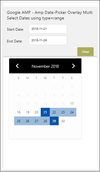
We have already seen how to get the start and the end date. Observe that we have used one more attribute here open-after-select. This attribute will keep the overlay open after selection. If you click outside the date-picker, it will be closed. There is also a button added called clear. Onclick of clear button the dates selected with be cleared.The syntax to perform this is as follows −
<button class = "ampstart-btn caps" on = "tap:overlay-date.clear">
   Clear
</button>
To add event, we have to use on attribute. Further details about events will be discussed in the Events Chapter of this tutorial. We have used the tag behaviour and to that the id of the datepicker is given and clear event, which takes care of clearing the date -range selected.
Next, let us see how to use amp-date-picker as a lightbox.
AMP Lightbox Date Picker
Date-picker can be used inside a modal window. We can also use lightbox date-picker for same. Let us understand this with the help of a working example.
To use date-picker inside lightbox, we need to add the light-box script as shown below −
<script async custom-element = "amp-lightbox"
   src = "https://cdn.ampproject.org/v0/amp-lightbox-0.1.js">
</script>
Example
<!doctype html>
<html amp lang = "en">
   <head>
      <meta charset = "utf-8">
      <script async src = "https://cdn.ampproject.org/v0.js"></script>
      <title>Google AMP - Amp Date-Picker Static </title>
      <link rel = "canonical" href = "http://example.ampproject.org/article-metadata.html">
      <meta name = "viewport" content = "width=device-width,minimum-scale = 1,initial-scale = 1">

      <style amp-boilerplate>
         body{
            -webkit-animation:
            -amp-start 8s steps(1,end) 0s 1 normal both;-moz-animation:
            -amp-start 8s steps(1,end) 0s 1 normal both;-ms-animation:
            -amp-start 8s steps(1,end) 0s 1 normal both;animation:
            -amp-start 8s steps(1,end) 0s 1 normal both
         }
         @-webkit-keyframes
         -amp-start{from{visibility:hidden}to{visibility:visible}}@-moz-keyframes
         -amp-start{from{visibility:hidden}to{visibility:visible}}@-ms-keyframes
         -amp-start{from{visibility:hidden}to{visibility:visible}}@-o-keyframes
         -amp-start{from{visibility:hidden}to{visibility:visible}}@keyframes
         -amp-start{from{visibility:hidden}to{visibility:visible}}
      </style>
      <noscript>
         <style amp-boilerplate>
            body{
               -webkit-animation:none;
               -moz-animation:none;
               -ms-animation:none;
               animation:none}
         </style>
      </noscript>

      <script async custom-element = "amp-date-picker"
         src = "https://cdn.ampproject.org/v0/amp-date-picker-0.1.js">
      </script>

      <script async custom-element = "amp-bind" src = "
      https://cdn.ampproject.org/v0/amp-bind-0.1.js">
      <script>

      <script async custom-template = "amp-mustache"
         src = "https://cdn.ampproject.org/v0/amp-mustache-0.1.js">
      </script>

      <script async custom-element = "amp-lightbox"
         src = "https://cdn.ampproject.org/v0/amp-lightbox-0.1.js">
      </script>

      <style>
         input[type=text]{
            width: 50%;
            padding: 12px;
            border: 1px solid #ccc;
            border-radius: 4px;
            resize: vertical;
         }
         label {
            padding: 12px 12px 12px 0;
            display: inline-block;
            font-family: "Segoe UI",Arial,sans-serif;
            font-weight: 400;
         }
         .col-label {
            float: left;width: 25%;
            margin-top: 6px;
         }
         .col-content {
            float: left;
            width: 75%;
            margin-top: 6px;
         }
         .row:after {
            content: "";
            display: table;clear: both;
         }
         .amp_example {
            background-color: #f1f1f1;
            padding: 0.01em 16px;
            margin: 20px 0;
            box-shadow: 0 2px 4px 0 rgba(0,0,0,0.16),0 2px 10px 0rgba(0,0,0,0.12)!important;
         }
         h3{font-family: "Segoe UI",Arial,sans-serif;
            font-weight: 400;
            margin: 10px 0;
         }
         button {
            background-color: #ACAD5C;
            color: white;
            padding: 12px 20px;
            border: none;
            border-radius: 4px;
            cursor: pointer;
            float: right;
         }
         .lightbox {background-color: rgba(100, 100, 100, 0.5);}
      </style>
   </head>
   <body>
      <div class = "amp_example">
         <h3>Google AMP - Amp Date-Picker Overlay Multi Select Dates using type = range</h3>
         <div class = "row">
            <div class = "col-label">
               <label for = "start">Start Date:</label>
            <div>
            <div class = "col-content">
               <input type = "text" id = "start" name =
               "start" placeholder = "Start Date" on = "tap:lightbox.open">
            </div>
         </div>
         <div class = "row">
            <div class = "col-label">
               <label for = "end">End Date:</label>
            </div>
            <div class = "col-content">
               <input type = "text" id = "end" name =
                  "end" placeholder = "End Date" on = "tap:lightbox.open">
            </div>
         </div>
         <div class = "row">
            <div class = "col-label"></div>
            <div class = "col-content">
            <button class = "ampstart-btn caps" on =
               "tap:overlay-date.clear">Clear</button>
            </div>
         </div>
         <amp-lightbox id = "lightbox" layout = "nodisplay" class = "lightbox">
            <amp-date-picker id = "overlay-date"
               type = "range"
               layout = "fill"
               start-input-selector = "#start"
               end-input-selector = "#end"
               format = "YYYY-MM-DD"
               on = "activate: lightbox.open;deactivate: lightbox.close">
            </amp-date-picker>
         </amp-lightbox>
      </div>
   </body>
</html>
Output
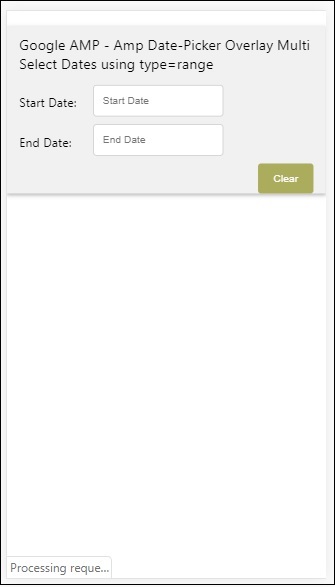
When a user clicks on the input field the date-picker is opened inside the lightbox as shown below −

To perform this, there is a event added on the input field as shown below −
<input type = "text" id = "start" name = "start"
   placeholder = "Start Date" on = "tap:lightbox.open">

<input type = "text" id = "end" name = "end"
   placeholder = "End Date" on = "tap:lightbox.open">
Note that on is the event it calls tap − lightbox.open to open the lightbox.
Here lightbox is the id given to amp-lightbox as shown below. Amp-date-picker is called inside amp-lightbox and it is activated on tap of the input fields.
<amp-lightbox id = "lightbox" layout = "nodisplay" class = "lightbox">
   <amp-date-picker id = "overlay-date"
      type = "range"
      layout = "fill"
      start-input-selector = "#start"
      end-input-selector = "#end"
      format = "YYYY-MM-DD"
      on = "activate: lightbox.open;deactivate: lightbox.close">
   </amp-date-picker>
</amp-lightbox>
