- Google AMP - Home
- Google AMP - Overview
- Google AMP - Introduction
- Google AMP - Images
- Google AMP - Form
- Google AMP - Iframes
- Google AMP - Video
- Google AMP - Button
- Google AMP - Timeago
- Google AMP - Mathml
- Google AMP - Fit Text
- Google AMP - Date Countdown
- Google AMP - Date Picker
- Google AMP - Story
- Google AMP - Selector
- Google AMP - Link
- Google AMP - Font
- Google AMP - List
- Google AMP - User Notification
- Google AMP - Next Page
- Google AMP - Attributes
- Styles And Custom CSS
- Google AMP - Dynamic CSS Classes
- Google AMP - Actions And Events
- Google AMP - Animations
- Google AMP - Data Binding
- Google AMP - Layout
- Google AMP - ADS
- Google AMP - Analytics
- Google AMP - Social Widgets
- Google AMP - Media
- Html Page To Amp Page
- Google AMP - Basic Syntax
- Google AMP - Validation
- Google AMP - Caching
- Google AMP - Custom Javascript
- Google AMP - Cors
- Google AMP Useful Resources
- Google AMP - Quick Guide
- Google AMP - Useful Resources
- Google AMP - Discussion
Google AMP - Attributes
This chapter will discuss all the common attributes used by the amp-components.
The list of common attributes is as follows −
- fallback
- heights
- layout
- media
- noloading
- on
- placeholder
- sizes
- width and height
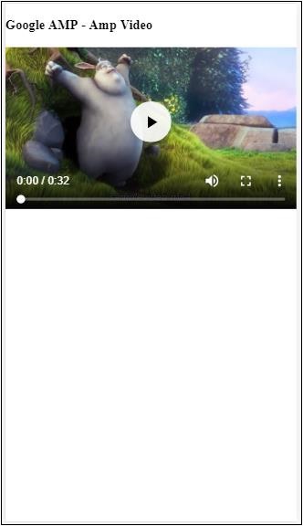
fallback attribute
The fallback attribute is mostly used when the browser does not support the element used or has issues with the file loading or having errors with the file used.
For example, you are using amp-video and the media file is having issues on the browser so in such cases we can specify the fallback attribute and display a message that the media file cannot be played or not supported by the browser, instead of showing the error message on the page.
Fallback used on amp-video
<amp-video controls
   width = "640"
   height = "360"
   layout = "responsive"
   poster = "images/videoposter.png">
   <source src = "video/bunny.webm" type = "video/webm" />
   <source src = "video/samplevideo.mp4" type = "video/mp4" />
   <div fallback>
      <p>This browser does not support the video element.</p>
   </div>
</amp-video>
Let us understand the working os fallback using an example −
Example
<!doctype html>
<html amp lang = "en">
   <head>
      <meta charset = "utf-8">
      <script async src = "https://cdn.ampproject.org/v0.js"></script>
      <title>Google AMP - Amp Video</title>
      <link rel = "canonical" href = "      http://example.ampproject.org/article-metadata.html">
      <meta name = "viewport" content = "width = device-width,minimum-scale = 1,initial-scale = 1">

      <style amp-boilerplate>
         body{
            -webkit-animation:
            -amp-start 8s steps(1,end) 0s 1 normal both;-moz-animation:
            -amp-start 8s steps(1,end) 0s 1 normal both;-ms-animation:
            -amp-start 8s steps(1,end) 0s 1 normal both;animation:
            -amp-start 8s steps(1,end) 0s 1 normal both
         }
         @-webkit-keyframes
         -amp-start{from{visibility:hidden}to{visibility:visible}}@-moz-keyframes
         -amp-start{from{visibility:hidden}to{visibility:visible}}@-ms-keyframes
         -amp-start{from{visibility:hidden}to{visibility:visible}}@-o-keyframes
         -amp-start{from{visibility:hidden}to{visibility:visible}}@keyframes
         -amp-start{from{visibility:hidden}to{visibility:visible}}
      </style>

      <noscript>
         <style amp-boilerplate>
            body{
               -webkit-animation:none;-moz-animation:none;
               -ms-animation:none;animation:none
            }
         </style>
      </noscript>

      <script async custom-element = "amp-video"
         src = "https://cdn.ampproject.org/v0/amp-video-0.1.js">
      </script>
   </head>
   <body>
      <h3>Google AMP - Amp Video</h3>
      <amp-video controls
         width = "640"
         height = "360"
         layout = "responsive"
         poster = "images/videoposter.png">
         <source src = "video/bunny.webm"type="video/webm" />
         <source src = "video/samplevideo.mp4"type = "video/mp4" />
         <div fallback>
            <p>This browser does not support the video element.</p>
         </div>
      </amp-video>
   </body>
</html>
Output
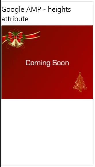
Heights Attribute
This attribute is basically supported for a responsive layout. You can use a media expression to the heights attribute and it applies to the height of the element. It also takes the percent values, so the height is calculated based on the percentage width given.
Example
<!doctype html>
<html amp lang = "en">
   <head>
      <meta charset = "utf-8">
      <script async src = "https://cdn.ampproject.org/v0.js"></script>
      <title>Google AMP - heights attribute</title>
      <link rel = "canonical" href = "http://example.ampproject.org/article-metadata.html">
      <meta name = "viewport" content = "width=device-width,minimum-scale = 1,initial-scale = 1">

      <style amp-boilerplate>
         body{
            -webkit-animation:
            -amp-start 8s steps(1,end) 0s 1 normal both;-moz-animation:
            -amp-start 8s steps(1,end) 0s 1 normal both;-ms-animation:
            -amp-start 8s steps(1,end) 0s 1 normal both;animation:
            -amp-start 8s steps(1,end) 0s 1 normal both
         }
         @-webkit-keyframes
         -amp-start{from{visibility:hidden}to{visibility:visible}}@-moz-keyframes
         -amp-start{from{visibility:hidden}to{visibility:visible}}@-ms-keyframes
         -amp-start{from{visibility:hidden}to{visibility:visible}}@-o-keyframes
         -amp-start{from{visibility:hidden}to{visibility:visible}}@keyframes
         -amp-start{from{visibility:hidden}to{visibility:visible}}
      </style>

      <noscript>
         <style amp-boilerplate>
            body{
               -webkit-animation:none;-moz-animation:none;
               -ms-animation:none;animation:none
            }
         </style>
      </noscript>

      <style amp-custom>
         amp-img {
            border: 1px solid black;
            border-radius: 4px;
            padding: 5px;
         }
         h1{font-family: "Segoe UI",Arial,sans-serif;font-weight: 400;margin: 10px 0;}
      </style>
   </head>
   <body>
      <h1>Google AMP - heights attribute</h1>
      <amp-img src = "images/christmas1.jpg"
         width = "320" height = "256"
         heights = "(min-width:500px) 200px, 80%">
      </amp-img>
   </body>
</html>
Output
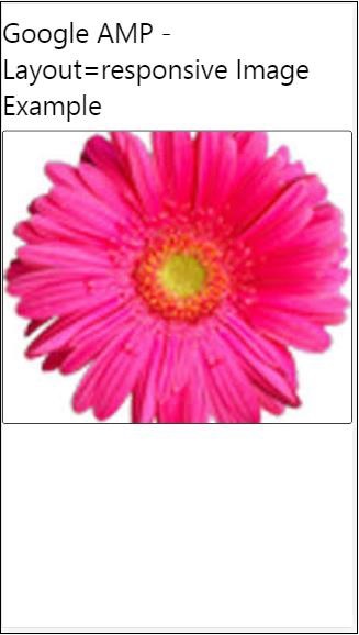
layout attribute
AMP-Layout is one of the important feature available in google-amp. Amp Layout makes sure the amp components are rendered properly when the page is loaded without causing any flicker or scrolling issue. It also checks the page rendering before any other remote resources like http request for images, data calls are done.
The list of layout supported by amp is as follows −
- Not Present
- Container
- fill
- fixed
- fixed-height
- flex-item
- intrinsic
- nodisplay
- Responsive
You will learn in detail about the same in the chapter Google AMP − Layout of this tutorial.
Let is understand the working of layout= responsive with the help of an example as shown −
Example
<!doctype html>
<html amp lang = "en">
   <head>
      <meta charset = "utf-8">
      <script async src = "https://cdn.ampproject.org/v0.js"></script>
      <title>Google AMP - Image>/title>
      <link rel = "canonical" href = "      http://example.ampproject.org/article-metadata.html">
      <meta name = "viewport" content = "width = device-width,minimum-scale = 1,initial-scale = 1">

      <style amp-boilerplate>
         body {
            -webkit-animation:
            -amp-start 8s steps(1,end) 0s 1 normal both;-moz-animation:
            -amp-start 8s steps(1,end) 0s 1 normal both;-ms-animation:
            -amp-start 8s steps(1,end) 0s 1 normal both;animation:
            -amp-start 8s steps(1,end) 0s 1 normal both
         }
         @-webkit-keyframes
         -amp-start{from{visibility:hidden}to{visibility:visible}}@-moz-keyframes
         -amp-start{from{visibility:hidden}to{visibility:visible}}@-ms-keyframes
         -amp-start{from{visibility:hidden}to{visibility:visible}}@-o-keyframes
         -amp-start{from{visibility:hidden}to{visibility:visible}}@keyframes
         -amp-start{from{visibility:hidden}to{visibility:visible}}
      </style>

      <noscript>
         <style amp-boilerplate>
            body {
               -webkit-animation:none;-moz-animation:none;
               -ms-animation:none;animation:none
            }
         </style>
      </noscript>

      <style amp-custom>
         amp-img {
            border: 1px solid black;
            border-radius: 4px;
            padding: 5px;
         }
         displayitem {
            display: inline-block;
            width: 200px;
            height:200px;
            margin: 5px;
         }
         h1{font-family: "Segoe
         UI",Arial,sans-serif;font-weight: 400;margin: 10px 0;}
      </style>
   </head>
   <body>
      <h1>Google AMP - Layout = responsive Image Example>/h1>
      <div class = "displayitem">
         <amp-img alt = "Beautiful Flower"
            src = "images/flower.jpg"
            width = "246"
            height = "205"
            layout = "responsive">
         </amp-img>
      </div>
   </body>
</html>
Output
Media Attribute
This attribute can be used on most of the amp components. It takes a media query and if the value does not match the component will not be rendered.
Let us understand the working of media attribute with the help of an example −
Example
<!doctype html>
<html amp lang = "en">
   <head>
      <meta charset = "utf-8">
      <script async src = "https://cdn.ampproject.org/v0.js"></script>
      <title>Google AMP - Image</title>
      <link rel = "canonical" href = " http://example.ampproject.org/article-metadata.html">
      <meta name = "viewport" content = "width = device-width,minimum-scale = 1,initial-scale = 1">

      <style amp-boilerplate>
         body{
            -webkit-animation:
            -amp-start 8s steps(1,end) 0s 1 normal both;-moz-animation:
            -amp-start 8s steps(1,end) 0s 1 normal both;-ms-animation:
            -amp-start 8s steps(1,end) 0s 1 normal both;animation:
            -amp-start 8s steps(1,end) 0s 1 normal both
         }
         @-webkit-keyframes
         -amp-start{from{visibility:hidden}to{visibility:visible}}@-moz-keyframes
         -amp-start{from{visibility:hidden}to{visibility:visible}}@-ms-keyframes
         -amp-start{from{visibility:hidden}to{visibility:visible}}@-o-keyframes
         -amp-start{from{visibility:hidden}to{visibility:visible}}@keyframes
         -amp-start{from{visibility:hidden}to{visibility:visible}}
      </style>

      <noscript>
         <style amp-boilerplate>
            body {
               -webkit-animation:none;-moz-animation:none;
               -ms-animation:none;animation:none
            }
         </style>
      </noscript>
      <style amp-custom>
         amp-img {
            border: 1px solid black;
            border-radius: 4px;
            padding: 5px;
         }
         h1{font-family: "Segoe
         UI",Arial,sans-serif;font-weight: 400;margin: 10px 0;}
      </style>
   </head>
   <body>
      <h1>Google AMP - Media Attribute</h1>
      <div class = "displayitem">
         <amp-img
            media = "(min-width: 600px)"
            src = "images/christmas1.jpg"
            width = "466"
            height = "355"
            layout = "responsive">
         </amp-img>
      </div>
   </body>
</html>
We have used media attribute on the <amp-img> tag as shown below −
<amp-img
   media = "(min-width: 600px)"
   src = "images/christmas1.jpg"
   width = "466"
   height = "355"
   layout = "responsive">
</amp-img>
Note that the image will not be displayed if the width of the screen is less than 600px. We will use the Google emulator mobile mode to test the example.
Output on Smartphone
We checked on the device the image is not visible as the width of the device is less than 600px. If we check on a tablet, we get the output as shown below −
Output on IPAD

Noloading Attribute
Amp components like <amp-img>, <amp-video>, <amp-facebook> shows a loading indicator before the actual content is loaded and shown to user.
To stop showing the loading indicator, we can use the noloading attribute as follows −
<amp-img src = "images/christmas1.jpg"
   noloading
   height = "300"
   width = "250"
   layout = "responsive">
</amp-img>
On Attribute
The on attribute is used on elements for event handling and the actions on the amp-components. The syntax to use on attribute is as follows −
Syntax −
on = "eventName:elementId[.methodName[(arg1 = value, arg2 = value)]]"
The details passed to the on attribute are as follows −
eventName − This takes the name of the event which is available for the amp-component. For example, for forms we can use submit-success, submit-error eventNames.
elementId − This takes the id of the element on which the event needs to be called. It can be the id of the form for which we want to know about the success or error.
methodName − This takes the name of the method to be called on the event occurrence.
arg=value − This takes the arguments with key=value form passed to the method.
It is also possible to pass multiple events to the On attribute as follows −
on = "submit-success:lightbox;submit-error:lightbox1"
Note − If there are multiple events, they are passed to the on attribute and seperated using semicolon(;).
Actions Attribute
Actions are basically used with the on attribute and the syntax is as follows −
on = "tab:elementid.hide;"
We can pass multiple actions as follows −
on = "tab:elementid.open;tab:elementid.hide;
Elementid is the id of the element on which the action is to be performed.
Amp has some globally defined events and actions which can be used on any amp-component and they are tap events and the actions are hide, show and togglevisibility.
Note − If you want to hide/show or use togglevisibility on any html or amp component, you can use on=tap:elementid.[hide/show/togglevisibility]
Placeholder Attribute
Placeholder attribute can be used on any html element such as an input element and also can be used on an amp-component.The placeholder is the first thing that will be shown on the page and once the content is loaded the placeholder is removed and is made invisible.
Placeholder on input element
<input type = "text" id = "date" name = "date" placeholder = "Start Date">
Placeholder on amp-component
<amp-anim src = "images/loreal.gif" width = "300" height = "250" layout = "responsive">
   <amp-img placeholder src = "images/flower.jpg"
   layout = "fill">
   </amp-img>
</amp-anim>
Sizes Attribute
This is used just like the heights attribute. The value is an expression as shown below −
<amp-img src = "amp.png"
   width = "400" height = "300"
   layout = "responsive"
   sizes = "(min-width: 250px) 250px, 100vw">
</amp-img>
Width and Height Attributes
They are used on almost all the html elements and amp components. The width and height is used to mention the space an amp-element occupies on the page.
Example
<amp-img src = "amp.png"
   width = "400" height = "300"
   layout = "responsive">
</amp-img>
