- Google AMP - Home
- Google AMP - Overview
- Google AMP - Introduction
- Google AMP - Images
- Google AMP - Form
- Google AMP - Iframes
- Google AMP - Video
- Google AMP - Button
- Google AMP - Timeago
- Google AMP - Mathml
- Google AMP - Fit Text
- Google AMP - Date Countdown
- Google AMP - Date Picker
- Google AMP - Story
- Google AMP - Selector
- Google AMP - Link
- Google AMP - Font
- Google AMP - List
- Google AMP - User Notification
- Google AMP - Next Page
- Google AMP - Attributes
- Styles And Custom CSS
- Google AMP - Dynamic CSS Classes
- Google AMP - Actions And Events
- Google AMP - Animations
- Google AMP - Data Binding
- Google AMP - Layout
- Google AMP - ADS
- Google AMP - Analytics
- Google AMP - Social Widgets
- Google AMP - Media
- Html Page To Amp Page
- Google AMP - Basic Syntax
- Google AMP - Validation
- Google AMP - Caching
- Google AMP - Custom Javascript
- Google AMP - Cors
- Google AMP Useful Resources
- Google AMP - Quick Guide
- Google AMP - Useful Resources
- Google AMP - Discussion
Google AMP - Layout
AMP-Layout is one of the important feature available in Google-amp. Amp Layout makes sure the amp components are rendered properly when the page is loaded without causing any flicker or scrolling issue. Google AMP make sure that layout rendering is done on the page before any other remote resources like http request for images, data calls are done.
The list of layout attributes is given below.
width and height
layout
sizes
heights
media
placeholder
fallback
noloading
We will consider the layout attribute in detail in this chapter. The rest attributes are discussed in details in the chapter − Google AMP Attributes of this tutorial.
Layout Attribute
We can use layout attribute on an amp-component which will decide how the component will render inside the page. A list of layouts supported by amp is given below −
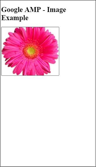
Not Present
Container
fill
fixed
fixed-height
flex-item
intrinsic
nodisplay
Responsive
For each of this layout, we will see a working example which will show how the layout attribute renders the amp-component differently. We will make use of amp-img component in our examples.
Not Present Example
<!doctype html>
<html amp lang = "en">
   <head>
      <meta charset = "utf-8">
      <script async src="https://cdn.ampproject.org/v0.js"></script>
      <title>Google AMP - Image</title>
      <link rel = "canonical" href =
         "http://example.ampproject.org/article-metadata.html">
      <meta name = "viewport" content = "width = device-width,
         minimum-scale = 1,initial-scale = 1">
      <style amp-boilerplate>
         body{
            -webkit-animation:
            -amp-start 8s steps(1,end) 0s 1 normal both;-moz-animation:
            -amp-start 8s steps(1,end) 0s 1 normal both;-ms-animation:
            -amp-start 8s steps(1,end) 0s 1 normal both;animation:
            -amp-start 8s steps(1,end) 0s 1 normal both
         }
         @-webkit-keyframes
         -amp-start{from{visibility:hidden}to{visibility:visible}}@-moz-keyframes
         -amp-start{from{visibility:hidden}to{visibility:visible}}@-ms-keyframes
         -amp-start{from{visibility:hidden}to{visibility:visible}}@-o-keyframes
         -amp-start{from{visibility:hidden}to{visibility:visible}}@keyframes
         -amp-start{from{visibility:hidden}to{visibility:visible}}
      </style>
      <noscript>
         <style amp-boilerplate>
            body{
               -webkit-animation:none;
               -moz-animation:none;
               -ms-animation:none;
               animation:none
            }
         </style>
      </noscript>
      <style amp-custom>
         amp-img {
            border: 1px solid black;
            border-radius: 4px;
            padding: 5px;
         }
      </style>
   </head>
   <body>
      <h1>Google AMP - Image Example</h1>
      <amp-img
         alt = "Beautiful
         Flower"src = "images/flower.jpg"
         width = "246"
         height = "205">
      </amp-img>
   </body>
</html>
Output
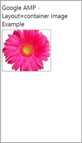
Container Example
Layout=container is mostly given to the parent element and the child element takes the sizes defined.
<!doctype html>
<html amp lang = "en">
   <head>
      <meta charset = "utf-8">
      <script async src = "https://cdn.ampproject.org/v0.js"></script>
      <title>Google AMP - Image</title>
      <link rel = "canonical" href =
         "http://example.ampproject.org/article-metadata.html">
      <meta name = "viewport" content = "width = device-width,
         minimum-scale = 1,initial-scale = 1">
      <style amp-boilerplate>
         body{
            -webkit-animation:
            -amp-start 8s steps(1,end) 0s 1 normal both;-moz-animation:
            -amp-start 8s steps(1,end) 0s 1 normal both;-ms-animation:
            -amp-start 8s steps(1,end) 0s 1 normal both;animation:
            -amp-start 8s steps(1,end) 0s 1 normal both
         }@-webkit-keyframes
         -amp-start{from{visibility:hidden}to{visibility:visible}}@-moz-keyframes
         -amp-start{from{visibility:hidden}to{visibility:visible}}@-ms-keyframes
         -amp-start{from{visibility:hidden}to{visibility:visible}}@-o-keyframes
         -amp-start{from{visibility:hidden}to{visibility:visible}}@keyframes
         -amp-start{from{visibility:hidden}to{visibility:visible}}
      </style>
      <noscript>
         <style amp-boilerplate>
            body{
               -webkit-animation:none;
               -moz-animation:none;
               -ms-animation:none;
               animation:none
            }
         </style>
      </noscript>
      <style amp-custom>
         amp-img {
            border: 1px solid black;
            border-radius: 4px;
            padding: 5px;
         }
         h1{
            font-family: "Segoe UI",Arial,sans-serif;
            font-weight: 400;margin: 10px 0;
         }
      </style>
   </head>
   <body>
      <h1>Google AMP - Layout = container Image Example</h1>
      <amp-accordion layout = "container">
         <amp-img alt = "Beautiful Flower"
            src = "images/flower.jpg"
            width = "246"
            height = "205">
         </amp-img>
      </amp-accordion>
   </body>
</html>
Output
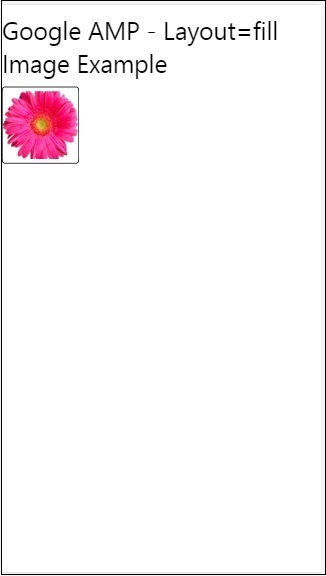
Fill Example
Layout= fill takes the width and height of the parent element.
<!doctype html>
<html amp lang = "en">
   <head>
      <meta charset = "utf-8">
      <script async src = "https://cdn.ampproject.org/v0.js"></script>
      <title>
      Google AMP - Image
      <title>
      <link rel = "canonical" href =
         "http://example.ampproject.org/article-metadata.html">
      <meta name = "viewport" content = "width = device-width,
         minimum-scale = 1,initial-scale = 1">
      <style amp-boilerplate>
         body{
            -webkit-animation:
            -amp-start 8s steps(1,end) 0s 1 normal both;-moz-animation:
            -amp-start 8s steps(1,end) 0s 1 normal both;-ms-animation:
            -amp-start 8s steps(1,end) 0s 1 normal both;animation:
            -amp-start 8s steps(1,end) 0s 1 normal both
         }
         @-webkit-keyframes
         -amp-start{from{visibility:hidden}to{visibility:visible}}@-moz-keyframes
         -amp-start{from{visibility:hidden}to{visibility:visible}}@-ms-keyframes
         -amp-start{from{visibility:hidden}to{visibility:visible}}@-o-keyframes
         -amp-start{from{visibility:hidden}to{visibility:visible}}@keyframes
         -amp-start{from{visibility:hidden}to{visibility:visible}}
      </style>
      <noscript>
         <style amp-boilerplate>
            body{
               -webkit-animation:none;
               -moz-animation:none;
               -ms-animation:none;
               animation:none
            }
         </style>
      </noscript>
      <style amp-custom>
         amp-img {
            border: 1px solid black;
            border-radius: 4px;
            padding: 5px;
         }
         h1{font-family: "Segoe UI",Arial,sans-serif;
         font-weight: 400;margin: 10px 0;}
      </style>
   </head>
   <body>
      <h1>Google AMP - Layout = fill Image Example</h1>
      <div style = "position:relative;width:100px;height:100px;">
         <amp-img alt = "Beautiful Flower"
            src = "images/flower.jpg"
            width = "246"
            height = "205"
            layout = "fill">
         </amp-img>
      </div>
   </body>
</html>
Output
Fixed and fixed-height Example
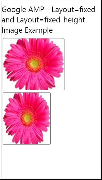
Before understanding the usage of fixed and fixed-height, please note the following two points −
layout=fixed needs to have width and height and the amp-component will be shown in that.
layout=fixed-height needs to have height specified for the component.It will make sure the height is not changed .The width must not be specified when using fixed-height or it can be auto.
<!doctype html>
<html amp lang = "en">
   <head>
      <meta charset = "utf-8">
      <script async src = "https://cdn.ampproject.org/v0.js"></script>
      <title>Google AMP - Image</title>
      <link rel = "canonical" href =
         "http://example.ampproject.org/article-metadata.html">
      <meta name = "viewport" content = "width = device-width,
         minimum-scale = 1,initial-scale = 1">
      <style amp-boilerplate>
         body{
            -webkit-animation:
            -amp-start 8s steps(1,end) 0s 1 normal both;-moz-animation:
            -amp-start 8s steps(1,end) 0s 1 normal both;-ms-animation:
            -amp-start 8s steps(1,end) 0s 1 normal both;animation:
            -amp-start 8s steps(1,end) 0s 1 normal both
         }
         @-webkit-keyframes
         -amp-start{from{visibility:hidden}to{visibility:visible}}@-moz-keyframes
         -amp-start{from{visibility:hidden}to{visibility:visible}}@-ms-keyframes
         -amp-start{from{visibility:hidden}to{visibility:visible}}@-o-keyframes
         -amp-start{from{visibility:hidden}to{visibility:visible}}@keyframes
         -amp-start{from{visibility:hidden}to{visibility:visible}}
      </style>
      <noscript>
         <style amp-boilerplate>
            body{
               -webkit-animation:none;
               -moz-animation:none;
               -ms-animation:none;
               animation:none
            }
         </style>
      </noscript>
      <style amp-custom>
         amp-img {
            border: 1px solid black;
            border-radius: 4px;
            padding: 5px;
         }
         div{
            display: inline-block;
            width: 200px;
            height:200px;
            margin: 5px;
         }
         h1{font-family: "Segoe UI",Arial,sans-serif;
         font-weight: 400;margin: 10px 0;}
      </style>
   </head>
   <body>
      <h1>Google AMP - Layout = fixed and
         Layout = fixed-height Image Example
      </h1>
      <div>
         <amp-img alt = "Beautiful Flower"
            src = "images/flower.jpg"
            width = "246"
            height = "205"
            layout = "fixed">
         </amp-img>
      </div>
      <div>
         <amp-img alt = "Beautiful Flower"
            src = "images/flower.jpg"
            height = "205"
            layout = "fixed-height">
         </amp-img>
      </div>
   </body>
</html>
Output
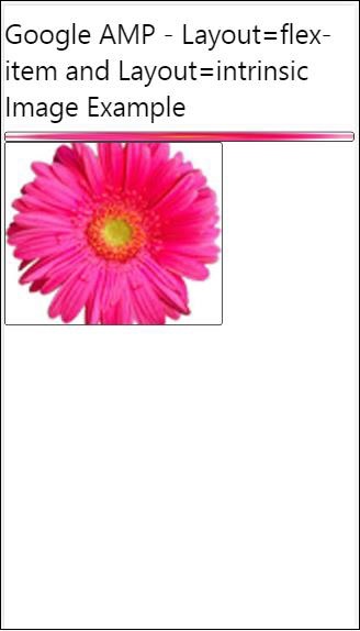
Flex-item and intrinsic
<!doctype html>
<html amp lang = "en">
   <head>
      <meta charset = "utf-8">
      <script async src ="https://cdn.ampproject.org/v0.js"></script>
      <title>Google AMP - Image</title>
      <link rel = "canonical" href ="
         http://example.ampproject.org/article-metadata.html">
      <meta name = "viewport" content = "width = device-width,
         minimum-scale = 1,initial-scale = 1">
      <style amp-boilerplate>
         body{
            -webkit-animation:
            -amp-start 8s steps(1,end) 0s 1 normal both;-moz-animation:
            -amp-start 8s steps(1,end) 0s 1 normal both;-ms-animation:
            -amp-start 8s steps(1,end) 0s 1 normal both;animation:
            -amp-start 8s steps(1,end) 0s 1 normal both
         }
         @-webkit-keyframes
         -amp-start{from{visibility:hidden}to{visibility:visible}}@-moz-keyframes
         -amp-start{from{visibility:hidden}to{visibility:visible}}@-ms-keyframes
         -amp-start{from{visibility:hidden}to{visibility:visible}}@-o-keyframes
         -amp-start{from{visibility:hidden}to{visibility:visible}}@keyframes
         -amp-start{from{visibility:hidden}to{visibility:visible
      <style>
         <noscript>
      <style amp-boilerplate>
      body{
         -webkit-animation:none;
         -moz-animation:none;
         -ms-animation:none;
         animation:none
      }
      </style>
      </noscript>
      <style amp-custom>
         amp-img {
            border: 1px solid black;
            border-radius: 4px;
            padding: 5px;
         }
         displayitem {
            display: inline-block;
            width: 200px;
            height:200px;
            margin: 5px;
         }
         h1{font-family: "Segoe UI",Arial,sans-serif;
         font-weight: 400;margin: 10px 0;}
      </style>
   </head>
   <body>
      <h1>Google AMP - Layout = flex-item and
         Layout = intrinsic Image Example
      </h1>
      <div class = "displayitem">
         <amp-img alt = "Beautiful Flower"
            src = "images/flower.jpg"
            layout = "flex-item">
         </amp-img>
      </div>
      <div class = "displayitem">
         <amp-img alt = "Beautiful Flower"
            src = "images/flower.jpg"
            width = "246"
            height = "205"
            layout = "intrinsic">
         </amp-img>
      </div>
   </body>
</html>
Output
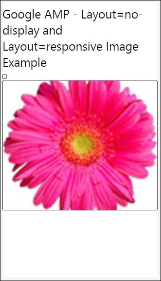
nodisplay and responsive
Amp component with layout = nodisplay will not take up any space on the page, just like display:none. There is no need to add any width and height property to such layout.
Amp component with layout = responsive will take up the space available or width of the page and height is resized maintaining the aspect ratio of the element.
<!doctype html>
<html amp lang = "en">
   <head>
      <meta charset = "utf-8">
      <script async src = "https://cdn.ampproject.org/v0.js">
      </script>
      <title>Google AMP - Image</title>
      <link rel = "canonical" href =
      "http://example.ampproject.org/article-metadata.html">
      <meta name = "viewport" content="width=device-width,
      minimum-scale = 1,initial-scale = 1">

      <style amp-boilerplate>
         body{
            -webkit-animation:
            -amp-start 8s steps(1,end) 0s 1 normal both;-moz-animation:
            -amp-start 8s steps(1,end) 0s 1 normal both;-ms-animation:
            -amp-start 8s steps(1,end) 0s 1 normal both;animation:
            -amp-start 8s steps(1,end) 0s 1 normal both}
         @-webkit-keyframes
         -amp-start{from{visibility:hidden}to{visibility:visible}}@-moz-keyframes
         -amp-start{from{visibility:hidden}to{visibility:visible}}@-ms-keyframes
         -amp-start{from{visibility:hidden}to{visibility:visible}}@-o-keyframes
         -amp-start{from{visibility:hidden}to{visibility:visible}}@keyframes
         -amp-start{from{visibility:hidden}to{visibility:visible}}
      </style>

      <noscript>
         <style amp-boilerplate>
            body{
               -webkit-animation:none;
               -moz-animation:none;
               -ms-animation:none;
               animation:none}
         </style>
      </noscript>
      <style amp-custom>
         amp-img {
            border: 1px solid black;
            border-radius: 4px;
            padding: 5px;
         }
         displayitem {
            display: inline-block;
            width: 200px;
            height:200px;
            margin: 5px;
         }
         h1{font-family: "Segoe UI",Arial,sans-serif;
         font-weight: 400;margin: 10px 0;}
      </style>
   </head>
   <body>
      <h1>Google AMP - Layout=no-display and
      Layout = responsive Image Example</h1>
      <div class = "displayitem">
         <amp-img alt = "Beautiful Flower"
            src = "images/flower.jpg"
            layout = "no-display">
         </amp-img>
      </div>
      <div class = "displayitem">
         <amp-img alt = "Beautiful Flower"
            src = "images/flower.jpg"
            width = "246"
            height = "205"
            layout = "responsive">
         </amp-img>
      </div>
   </body>
</html>
Output
The list of layouts supported in Google AMP are as follows
Accordion
Carousel
Lightbox
Slider
Sidebar
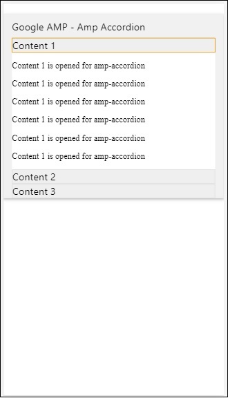
Amp- Accordion
Amp-accordion is an amp component used to display the content in the expand-collapse format. It becomes easy for users to view it on mobile devices where they can select the section as per their choice from the accordion.
To work with amp-accordion you need to add the following script −
<script async custom-element = "amp-accordion"
   src = "https://cdn.ampproject.org/v0/amp-accordion-0.1.js">
</script>
Amp-accordion tag
<amp-accordion>
   <section class = "seca">
      <h3>Content 1</h3>
      <div>
         <p>Content 1 is opened for amp-accordion</p>
         <p>Content 1 is opened for amp-accordion</p>
         <p>Content 1 is opened for amp-accordion</p>
         <p>Content 1 is opened for amp-accordion</p>
         <p>Content 1 is opened for amp-accordion</p>
         <p>Content 1 is opened for amp-accordion</p>
      </div>
   </section>

</amp-accordion>
Let us see a working example of amp-accordion.
<!doctype html>
<html amp lang = "en">
   <head>
      <meta charset = "utf-8">
      <script async src = "https://cdn.ampproject.org/v0.js">
      </script>
      <title>Google AMP - Amp Accordion </title>
      <link rel = "canonical" href=
      "http://example.ampproject.org/article-metadata.html">
      <meta name = "viewport" content = "width = device-width,
      minimum-scale = 1,initial-scale = 1">

      <style amp-boilerplate>
         body{
            -webkit-animation:
            -amp-start 8s steps(1,end) 0s 1 normal both;-moz-animation:
            -amp-start 8s steps(1,end) 0s 1 normal both;-ms-animation:
            -amp-start 8s steps(1,end) 0s 1 normal both;animation:
            -amp-start 8s steps(1,end) 0s 1 normal both
         }
         @-webkit-keyframes
         -amp-start{from{visibility:hidden}to{visibility:visible}}@-moz-keyframes
         -amp-start{from{visibility:hidden}to{visibility:visible}}@-ms-keyframes
         -amp-start{from{visibility:hidden}to{visibility:visible}}@-o-keyframes
         -amp-start{from{visibility:hidden}to{visibility:visible}}@keyframes
         -amp-start{from{visibility:hidden}to{visibility:visible}}
      </style>

      <noscript>
         <style amp-boilerplate>
            body{
               -webkit-animation:none;
               -moz-animation:none;
               -ms-animation:none;
               animation:none}
         </style>
      </noscript>
      <script async custom-element = "amp-accordion" src =
         "https://cdn.ampproject.org/v0/amp-accordion-0.1.js">
      </script>
      <style>
         input[type = text]{
            width: 50%;
            padding: 12px;
            border: 1px solid #ccc;
            border-radius: 4px;
            resize: vertical;
         }
         label {
            padding: 12px 12px 12px 0;
            display: inline-block;
            font-family: "Segoe UI",Arial,sans-serif;
            font-weight: 400;
         }
         .col-label {
            float: left;
            width: 25%;
            margin-top: 6px;
         }
         .col-content {
            float: left;
            width: 75%;
            margin-top: 6px;
         }
         .row:after {
            content: "";
            display: table;
            clear: both;
         }
         .amp_example {
            background-color: #f1f1f1;
            padding: 0.01em 16px;
            margin: 20px 0;
            box-shadow: 0 2px 4px 0
            rgba(0,0,0,0.16),0 2px 10px 0
            rgba(0,0,0,0.12)!important;
         }
         h3{
            font-family: "Segoe UI",Arial,sans-serif;
            font-weight: 400;margin: 10px 0;
         }
         input[type=submit] {
            background-color: #ACAD5C;
            color: white;
            padding: 12px 20px;
            border: none;
            border-radius: 4px;
            cursor: pointer;
            float: right;
         }
         .lightbox {background-color: rgba(100, 100, 100, 0.5);}
         .seca {background-color:#fff;}
      </style>
   </head>
   <body>
      <div class = "amp_example">
         <h3>Google AMP - Amp Accordion</h3>
         <amp-accordion>
            <section class = "seca">
               <h3>Content 1</h3>
               <div>
                  <p>Content 1 is opened for amp-accordion</p>
                  <p>Content 1 is opened for amp-accordion</p>
                  <p>Content 1 is opened for amp-accordion</p>
                  <p>Content 1 is opened for amp-accordion</p>
                  <p>Content 1 is opened for amp-accordion</p>
                  <p>Content 1 is opened for amp-accordion</p>
               </div>
            </section>
            <section expanded class = "seca">
               <h3>Content 2</h3>
               <div>
                  <p>Content 2 is opened for amp-accordion</p>
                  <p>Content 2 is opened for amp-accordion</p>
                  <p>Content 2 is opened for amp-accordion</p>
                  <p>Content 2 is opened for amp-accordion</p>
                  <p>Content 2 is opened for amp-accordion</p>
               </div>
            </section>
            <section class="seca">
               <h3>Content 3</h3>
               <div>
                  <p>Content 3 is opened for amp-accordion</p>
                  <p>Content 3 is opened for amp-accordion</p>
                  <p>Content 3 is opened for amp-accordion</p>
                  <p>Content 3 is opened for amp-accordion</p>
                  <p>Content 3 is opened for amp-accordion</p>
               </div>
            </section>
         </amp-accordion>
      </div>
   </body>
</html>
Output
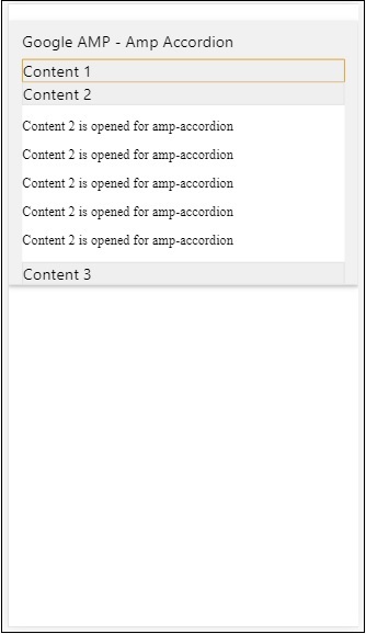
Amp-accordion has sections inside it. Each section can have 2 children and more than 2 will display an error in the browser console. You can add a container in section and can have multiple elements in it.
By default, we have kept one section in an expanded mode using the attribute expanded to the section.
Auto-collapsing Accordions
For auto-collapsing, we are using attribute expand-single-section on amp-accordion as shown in the example.The section which user opens will only remain in expanded rest others will close using expand-single-section attribute.
<!doctype html>
<html amp lang = "en">
   <head>
      <meta charset = "utf-8">
      <script async src = "https://cdn.ampproject.org/v0.js">
      </script>
      <title>Google AMP - Amp Accordion </title>
      <link rel = "canonical" href=
      "http://example.ampproject.org/article-metadata.html">
      <meta name = "viewport" content = "width = device-width,
      minimum-scale = 1,initial-scale = 1">

      <style amp-boilerplate>
         body{
            -webkit-animation:
            -amp-start 8s steps(1,end) 0s 1 normal both;-moz-animation:
            -amp-start 8s steps(1,end) 0s 1 normal both;-ms-animation:
            -amp-start 8s steps(1,end) 0s 1 normal both;animation:
            -amp-start 8s steps(1,end) 0s 1 normal both
         }
         @-webkit-keyframes
         -amp-start{from{visibility:hidden}to{visibility:visible}}@-moz-keyframes
         -amp-start{from{visibility:hidden}to{visibility:visible}}@-ms-keyframes
         -amp-start{from{visibility:hidden}to{visibility:visible}}@-o-keyframes
         -amp-start{from{visibility:hidden}to{visibility:visible}}@keyframes
         -amp-start{from{visibility:hidden}to{visibility:visible}}
      </style>

      <noscript>

         <style amp-boilerplate>
            body{
               -webkit-animation:none;
               -moz-animation:none;
               -ms-animation:none;
               animation:none}
         </style>
      </noscript>
      <script async custom-element = "amp-accordion" src =
         "https://cdn.ampproject.org/v0/amp-accordion-0.1.js">
      </script>
      <style>
         input[type = text]{
            width: 50%;
            padding: 12px;
            border: 1px solid #ccc;
            border-radius: 4px;
            resize: vertical;
         }
         label {
            padding: 12px 12px 12px 0;
            display: inline-block;
            font-family: "Segoe UI",Arial,sans-serif;
            font-weight: 400;
         }
         .col-label {
            float: left;
            width: 25%;
            margin-top: 6px;
         }
         .col-content {
            float: left;
            width: 75%;
            margin-top: 6px;
         }
         .row:after {
            content: "";
            display: table;
            clear: both;
         }
         .amp_example {
            background-color: #f1f1f1;
            padding: 0.01em 16px;
            margin: 20px 0;
            box-shadow: 0 2px 4px 0
            rgba(0,0,0,0.16),0 2px 10px 0
            rgba(0,0,0,0.12)!important;
         }
         h3{
            font-family: "Segoe UI",Arial,sans-serif;
            font-weight: 400;
            margin: 10px 0;
         }
         input[type=submit] {
            background-color: #ACAD5C;
            color: white;
            padding: 12px 20px;
            border: none;
            border-radius: 4px;
            cursor: pointer;
            float: right;}
         .lightbox {background-color: rgba(100, 100, 100, 0.5);}
         .seca {background-color:#fff;}
      </style>
   <head>
   <body>
      <div class = "amp_example">
         <h3>Google AMP - Amp Accordion</h3>
         <amp-accordion expand-single-section>
            <section class = "seca">
               <h3>Content 1</h3>
               <div>
                  <p>Content 1 is opened for amp-accordion</p>
                  <p>Content 1 is opened for amp-accordion</p>
                  <p>Content 1 is opened for amp-accordion</p>
                  <p>Content 1 is opened for amp-accordion</p>
                  <p>Content 1 is opened for amp-accordion</p>
                  <p>Content 1 is opened for amp-accordion</p>
               </div>
            </section>
            <section class = "seca">
               <h3>Content 2</h3>
               <div>
                  <p>Content 2 is opened for amp-accordion</p>
                  <p>Content 2 is opened for amp-accordion</p>
                  <p>Content 2 is opened for amp-accordion</p>
                  <p>Content 2 is opened for amp-accordion</p>
                  <;p>Content 2 is opened for amp-accordion</p>
               </div>
            </section>
            <section class = "seca">
               <h3>Content 3</h3>
               <div>
                  <p>Content 3 is opened for amp-accordion</p>
                  <p>Content 3 is opened for amp-accordion</p>
                  <p>Content 3 is opened for amp-accordion</p>
                  <p>Content 3 is opened for amp-accordion</p>
                  <p>Content 3 is opened for amp-accordion</p>
               </div>
            </section>
         </amp-accordion>
      </div>
   </body>
</html>
Output
Animation on Accordions
Using the animate attribute, we can add animation for the expand-collapse of accordion. Take a look at the example below −
<!doctype html>
<html amp lang = "en">
   <head>
      <meta charset = "utf-8">
      <script async src = "https://cdn.ampproject.org/v0.js">
      </script>
      <title>Google AMP - Amp Accordion </title>
      <link rel = "canonical" href = "http://example.ampproject.org/article-metadata.html>
      <meta name = "viewport" content = "width = device-width,minimum-scale = 1,initial-scale = 1">

      <style amp-boilerplate>
         body{
            -webkit-animation:
            -amp-start 8s steps(1,end) 0s 1 normal both;-moz-animation:
            -amp-start 8s steps(1,end) 0s 1 normal both;-ms-animation:
            -amp-start 8s steps(1,end) 0s 1 normal both;animation:
            -amp-start 8s steps(1,end) 0s 1 normal both
         }
         @-webkit-keyframes
         -amp-start{from{visibility:hidden}to{visibility:visible}}@-moz-keyframes
         -amp-start{from{visibility:hidden}to{visibility:visible}}@-ms-keyframes
         -amp-start{from{visibility:hidden}to{visibility:visible}}@-o-keyframes
         -amp-start{from{visibility:hidden}to{visibility:visible}}@keyframes
         -amp-start{from{visibility:hidden}to{visibility:visible}}
      </style>

      <noscript>
         <style amp-boilerplate>
            body{
               -webkit-animation:none;
               -moz-animation:none;
               -ms-animation:none;animation:none
            }
         </style>
      </noscript>
      <script async custom-element = "amp-accordion" src =
         "https://cdn.ampproject.org/v0/amp-accordion-0.1.js">
      </script>
      <style>
         input[type = text]{
            width: 50%;
            padding: 12px;
            border: 1px solid #ccc;
            border-radius: 4px;
            resize: vertical;
         }
         label {
            padding: 12px 12px 12px 0;
            display: inline-block;
            font-family: "Segoe UI",Arial,sans-serif;
            font-weight: 400;
         }
         .col-label {
            float: left;
            width: 25%;
            margin-top: 6px;
         }
         .col-content {
            float: left;
            width: 75%;
            margin-top: 6px;
         }
         .row:after {
            content: "";
            display: table;
            clear: both;
         }
         .amp_example {
            background-color: #f1f1f1;
            padding: 0.01em 16px;
            margin: 20px 0;
            box-shadow: 0 2px 4px 0 rgba(0,0,0,0.16),
            0 2px 10px 0 rgba(0,0,0,0.12)!important;
         }
         h3{
            font-family: "Segoe UI",Arial,sans-serif;
            font-weight: 400;margin: 10px 0;
         }
         input[type=submit] {
            background-color: #ACAD5C;
            color: white;
            padding: 12px 20px;
            border: none;
            border-radius: 4px;
            cursor: pointer;
            float: right;
         }
         .lightbox {background-color: rgba(100, 100, 100, 0.5);}
         .seca {background-color:#fff;}
      </style>
   </head>
   <body>
      <div class = "amp_example">
         <h3>Google AMP - Amp Accordion</h3>
         <amp-accordion animate expand-single-section>
            <section class = "seca">
               <h3>Content 1</h3>
               <div>
                  <p>Content 1 is opened for amp-accordion</p>
                  <p>Content 1 is opened for amp-accordion</p>
                  <p>Content 1 is opened for amp-accordion</p>
                  <p>Content 1 is opened for amp-accordion</p>
                  <p>Content 1 is opened for amp-accordion</p>
                  <p>Content 1 is opened for amp-accordion</p>
               </div>
            </section>
            <section class = "seca">
               <h3>Content 2</h3>
               <div>
                  <p>Content 2 is opened for amp-accordion</p>
                  <p>Content 2 is opened for amp-accordion</p>
                  <p>Content 2 is opened for amp-accordion</p>
                  <p>Content 2 is opened for amp-accordion</p>
                  <p>Content 2 is opened for amp-accordion</p>
               </div>
            </section>
            <section class="seca">
               <h3>Content 3</h3>
               <div>
                  <p>Content 3 is opened for amp-accordion</p>
                  <p>Content 3 is opened for amp-accordion</p>
                  <p>Content 3 is opened for amp-accordion</p>
                  <p>Content 3 is opened for amp-accordion</p>
                  <p>Content 3 is opened for amp-accordion</p>
               </div>
            </section>
         </amp-accordion>
      </div>
   </body>
</html>
Output
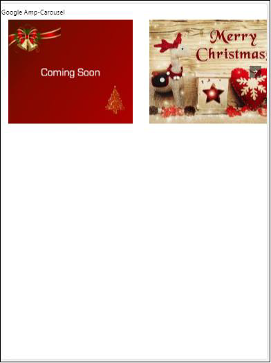
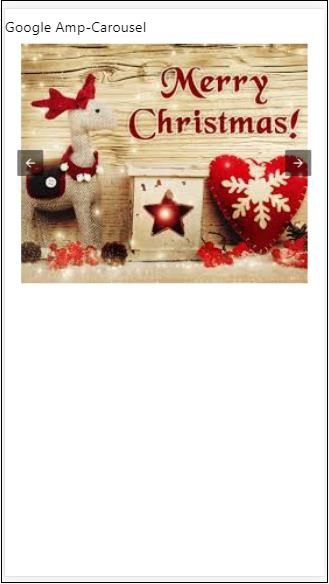
AMP Carousel
Amp-carousel is an amp-component to show a set of similar contents on the screen and using the arrows to shift between the content.
To work with amp-carousel, we need to add the following script −
<script async custom-element = "amp-carousel" src = "https://cdn.ampproject.org/v0/amp-carousel-0.1.js"></script>
Amp-carousel tag
The amp-carousel tag is as shown below −
<amp-carousel height="300" layout="fixed-height" type="carousel">
      <amp-img src="images/christmas1.jpg" width="400" height="300" alt="a sample image"></amp-img>
   .
</amp-carousel>
Attributes available for amp-carousel
The attributes available for amp-carousel are listed in the table shown below −
| Sr.No | Attribute & Description |
|---|---|
| 1 | type
We can display carousel items as carousel and slides |
| 2 | height
Height of carousel in pixels |
| 3 | controls (optional)
It displays left /right arrow on the screen.IT disappears after few seconds on devices.Css can be used to make the arrows visible all the time. |
| 4 | data-next-button-aria-label (optional)
Use to set the label for next carousel. |
| 5 | data-prev-button-aria-label (optional)
Use to set the label for previous carousel. |
| 6 | autoplay (optional)
Use to show the next slide after 5000ms .IT can overwritten using delay attribute with no of miiliseconds on amp-carousel.It will add loop attribute to the carousel and the slides will play again once it reaches the end.Used only for type=slides and need at least 2 slides for autoplay to work. |
Now, let us work on examples to display carousels in different ways.
Amp Carousel type as carousel
With carousel type, the items are scrollable horizontally.
Example
<!doctype html>
<html amp lang = "en">
   <head>
      <meta charset = "utf-8">
      <title>amp-carousel</title>
      <script async src = "https://cdn.ampproject.org/v0.js">
      </script>
      <!-- ## Setup -->
      <!-- Import the carousel component in the header. -->
      <script async custom-element = "amp-carousel" src =
         "https://cdn.ampproject.org/v0/amp-carousel-0.1.js">
      </script>
      <link rel = "canonical" href="
      https://ampbyexample.com/components/amp-carousel/">
      <meta name = "viewport" content = "width = device-width,
      minimum-scale = 1,initial-scale = 1">

      <style amp-boilerplate>
         body{
            -webkit-animation:
            -amp-start 8s steps(1,end) 0s 1 normal both;-moz-animation:
            -amp-start 8s steps(1,end) 0s 1 normal both;-ms-animation:
            -amp-start 8s steps(1,end) 0s 1 normal both;animation:
            -amp-start 8s steps(1,end) 0s 1 normal both
         }
         @-webkit-keyframes
         -amp-start{from{visibility:hidden}to{visibility:visible}}@-moz-keyframes
         -amp-start{from{visibility:hidden}to{visibility:visible}}@-ms-keyframes
         -amp-start{from{visibility:hidden}to{visibility:visible}}@-o-keyframes
         -amp-start{from{visibility:hidden}to{visibility:visible}}@keyframes
         -amp-start{from{visibility:hidden}to{visibility:visible}}
      </style>

      <noscript>
         <style amp-boilerplate>
            body{
               -webkit-animation:none;
               -moz-animation:none;
               -ms-animation:none;
               animation:none
            }
         </style>
      </noscript>
      <style amp-custom>
         h3{
            font-family: "Segoe UI",Arial,sans-serif;
            font-weight: 400;
            margin: 10px 0;
         }
      </style>
   </head>
   <body>
      <h3>Google Amp-Carousel</h3>
      <amp-carousel height = "300" layout = "fixed-height" type = "carousel">
         <amp-img
            src = "images/christmas1.jpg"
            width = "400"
            height = "300"
            alt = "a sample image">
         </amp-img>
         <amp-img src = "images/christmas2.jpg"
            width = "400"
            height = "300"
            alt = "another sample image">
         </amp-img>
         <amp-img
            src = "images/christmas3.jpg"
            width = "400"
            height = "300"
            alt = "and another sample image">
         </amp-img>
      </amp-carousel>
   </body>
</html>
Output
Amp Carousel type as slides
Amp carousel type = slides shows single item at a time.You can use layout as fill, fixed, fixed-height, flex-item, nodisplay, and responsive.
Example
<!doctype html>
<html amp lang = "en">
   <head>
      <meta charset = "utf-8">
      <title>amp-carousel</title>
      <script async src = "https://cdn.ampproject.org/v0.js">
      </script>
      <!-- ## Setup -->
      <!-- Import the carousel component in the header. -->
      <script async custom-element = "amp-carousel" src =
         "https://cdn.ampproject.org/v0/amp-carousel-0.1.js">
      </script>
      <link rel = "canonical" href=
      "https://ampbyexample.com/components/amp-carousel/">
      <meta name = "viewport" content = "width = device-width,
      minimum-scale = 1,initial-scale = 1">

      <style amp-boilerplate>
         body{
            -webkit-animation:
            -amp-start 8s steps(1,end) 0s 1 normal both;-moz-animation:
            -amp-start 8s steps(1,end) 0s 1 normal both;-ms-animation:
            -amp-start 8s steps(1,end) 0s 1 normal both;animation:
            -amp-start 8s steps(1,end) 0s 1 normal both
         }
         @-webkit-keyframes
         -amp-start{from{visibility:hidden}to{visibility:visible}}@-moz-keyframes
         -amp-start{from{visibility:hidden}to{visibility:visible}}@-ms-keyframes
         -amp-start{from{visibility:hidden}to{visibility:visible}}@-o-keyframes
         -amp-start{from{visibility:hidden}to{visibility:visible}}@keyframes
         -amp-start{from{visibility:hidden}to{visibility:visible}}
      </style>

      <noscript>
         <style amp-boilerplate>
            body{
               -webkit-animation:none;
               -moz-animation:none;
               -ms-animation:none;
               animation:none}
         </style>
      </noscript>
      <style amp-custom>
         h3{
            font-family: "Segoe UI",Arial,sans-serif;
            font-weight: 400;margin: 10px 0;}
      </style>
   </head>
   <body>
      <h3>Google Amp-Carousel</h3>
         <amp-carousel
            width = "400"
            height = "300"
            layout = "responsive"
            type = "slides">
               <amp-img
                  src = "images/christmas1.jpg"
                  width = "400"
                  height = "300"
                  layout = "responsive"
                  alt = "a sample image">
               </amp-img>
               <amp-img
                  src = "images/christmas2.jpg"
                  width = "400"
                  height = "300"
                  layout = "responsive"
                  alt="another sample image">
               </amp-img>
               <amp-img
                  src = "images/christmas3.jpg"
                  width = "400"
                  height = "300"
                  layout = "responsive"
                  alt = "and another sample image">
               </amp-img>
      </amp-carousel>
   </body>
</html>
Output

Amp carousel using autoplay
In the example given below, we have added autoplay attribute with a delay of 2000 milliseconds (2seconds). This will change the slides after a delay of 2seconds. By default, the delay is 5000 milliseconds (5seconds).
Example
<!doctype html>
<html amp lang = "en">
   <head>
      <meta charset = "utf-8">
      <title>amp-carousel</title>
      <script async src = "https://cdn.ampproject.org/v0.js">
      </script>
      <!-- ## Setup -->
      <!-- Import the carousel component in the header. -->
      <script async custom-element = "amp-carousel" src =
         "https://cdn.ampproject.org/v0/amp-carousel-0.1.js">
      </script>
      <link rel = "canonical" href =
      "https://ampbyexample.com/components/amp-carousel/">
      <meta name = "viewport" content = "width = device-width,
      minimum-scale = 1,initial-scale = 1">

      <style amp-boilerplate>
         body{
            -webkit-animation:
            -amp-start 8s steps(1,end) 0s 1 normal both;-moz-animation:
            -amp-start 8s steps(1,end) 0s 1 normal both;-ms-animation:
            -amp-start 8s steps(1,end) 0s 1 normal both;animation:
            -amp-start 8s steps(1,end) 0s 1 normal both
         }
         @-webkit-keyframes
         -amp-start{from{visibility:hidden}to{visibility:visible}}@-moz-keyframes
         -amp-start{from{visibility:hidden}to{visibility:visible}}@-ms-keyframes
         -amp-start{from{visibility:hidden}to{visibility:visible}}@-o-keyframes
         -amp-start{from{visibility:hidden}to{visibility:visible}}@keyframes
         -amp-start{from{visibility:hidden}to{visibility:visible}}
      </style>

      <noscript>
         <style amp-boilerplate>
            body{
               -webkit-animation:none;
               -moz-animation:none;
               -ms-animation:none;
               animation:none}
         </style>
      </noscript>
      <style amp-custom>
         h3{
            font-family: "Segoe UI",Arial,sans-serif;
            font-weight: 400;
            margin: 10px 0;
         }
      </style>
   </head>
   <body>
      <h3>Google Amp-Carousel</h3>
      <amp-carousel
         width = "400"
         height = "300"
         layout = "responsive"
         type = "slides"
         autoplay delay = "2000">
            <amp-img
               src = "images/christmas1.jpg"
               width = "400"
               height = "300"
               layout = "responsive"
               alt = "a sample image">
            </amp-img>
            <amp-img
               src = "images/christmas2.jpg"
               width = "400"
               height = "300"
               layout = "responsive"
               alt = "another sample image">
            </amp-img>
            <amp-img
               src = "images/christmas3.jpg"
               width = "400"
               height = "300"
               layout = "responsive"
               alt = "and another sample image">
            </amp-img>
      </amp-carousel>
   </body>
</html>
Output
AMP Lightbox
Amp-lightbox is an amp component that will take up the full viewport and display like a overlay.
To work with amp-lightbox, add the following script −
<script async custom-element = "amp-lightbox" src = "https://cdn.ampproject.org/v0/amp-lightbox-0.1.js">
</script>
Attributes available for amp-lightbox
The list of attributes for amp-lightbox is given below −
| Sr.no | Attributes & Description |
|---|---|
| 1 | animate-in (optional)
Here you can specify style of animation for opening the lightbox.By default it is fade-in .Values supported for stying are fade-in, fly-in-bottom and fly-in-top |
| 2 | close-button (required on AMPHTML ads)
When used for amphtmlads we can specify close button for the lightbox. |
| 3 | id (required)
Unique identifier for lightbox |
| 4 | layout (required)
The value for layout will be nodisplay |
| 5 | Scrollable (optional)
With this attribute on amp-lightbox the content of the lightbox can be scrolled , overflowing height of the lightbox. |
Example of Lightbox
<!doctype html>
<html amp lang = "en">
<head>
<meta charset = "utf-8">
<script async src = "https://cdn.ampproject.org/v0.js">
</script>
<title>Google AMP - Amp Lightbox</title>
<link rel = "canonical" href =
"http://example.ampproject.org/article-metadata.html">
<meta name = "viewport" content = "width = device-width,
minimum-scale = 1,initial-scale = 1">
<style amp-boilerplate>
body{
-webkit-animation:
-amp-start 8s steps(1,end) 0s 1 normal both;-moz-animation:
-amp-start 8s steps(1,end) 0s 1 normal both;-ms-animation:
-amp-start 8s steps(1,end) 0s 1 normal both;animation:
-amp-start 8s steps(1,end) 0s 1 normal both
}
@-webkit-keyframes
-amp-start{from{visibility:hidden}to{visibility:visible}}@-moz-keyframes
-amp-start{from{visibility:hidden}to{visibility:visible}}@-ms-keyframes
-amp-start{from{visibility:hidden}to{visibility:visible}}@-o-keyframes
-amp-start{from{visibility:hidden}to{visibility:visible}}@keyframes
-amp-start{from{visibility:hidden}to{visibility:visible}}
</style>
<noscript>
<style amp-boilerplate>
body{
-webkit-animation:none;
-moz-animation:none;
-ms-animation:none;
animation:none}
</style>
</noscript>
<script async custom-element = "amp-lightbox" src =
"https://cdn.ampproject.org/v0/amp-lightbox-0.1.js">
</script>
<style amp-custom>
amp-img {
border: 1px solid #ddd;
border-radius: 4px;
padding: 5px;
}
button{
background-color: #ACAD5C;
color: white;
padding: 12px 20px;
border: none;
border-radius: 4px;
cursor: pointer;
float: left;
}
.lightbox {
background: rgba(211,211,211,0.8);
width: 100%;
height: 100%;
position: absolute;
display: flex;
align-items: center;
justify-content: center;
}
</style>
</head>
<body>
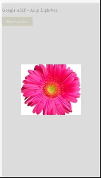
<h3>Google AMP - Amp Lightbox</h3>
<button on = "tap:my-lightbox">
Show LightBox
</button>
<amp-lightbox id = "my-lightbox" layout = "nodisplay">
<div class = "lightbox" on="tap:my-lightbox.close" tabindex = "0">
<amp-img
alt = "Beautiful Flower"
src = "images/flower.jpg"
width = "246"
height = "205">
</amp-img>
</div>
</amp-lightbox>
</body>
</html>
Output
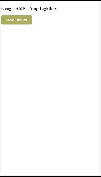
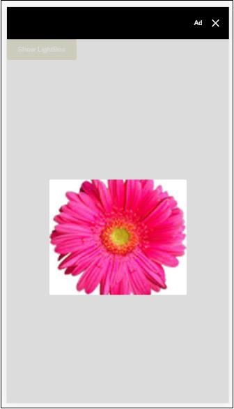
Click anywhere on the screen to close the lightbox.
You can add close button to the lightbox which is mostly used when overlay type ads are shown. Observe the following example −
Example
<!doctype html>
<html amp lang = "en">
   <head>
      <meta charset = "utf-8">
      <script async src = "https://cdn.ampproject.org/v0.js">
      </script>
      <title>Google AMP - Amp Lightbox</title>
      <link rel = "canonical" href =
      "http://example.ampproject.org/article-metadata.html">
      <meta name = "viewport" content = "width = device-width,
      minimum-scale = 1,initial-scale = 1">

      <style amp-boilerplate>
         body{
            -webkit-animation:
               -amp-start 8s steps(1,end) 0s 1 normal both;-moz-animation:
               -amp-start 8s steps(1,end) 0s 1 normal both;-ms-animation:
               -amp-start 8s steps(1,end) 0s 1 normal both;animation:
            -amp-start 8s steps(1,end) 0s 1 normal both
         }
         @-webkit-keyframes
         -amp-start{from{visibility:hidden}to{visibility:visible}}@-moz-keyframes
         -amp-start{from{visibility:hidden}to{visibility:visible}}@-ms-keyframes
         -amp-start{from{visibility:hidden}to{visibility:visible}}@-o-keyframes
         -amp-start{from{visibility:hidden}to{visibility:visible}}@keyframes
         -amp-start{from{visibility:hidden}to{visibility:visible}}
      </style>
      <noscript>
         <style amp-boilerplate>
            body{
               -webkit-animation:none;
               -moz-animation:none;
               -ms-animation:none;
               animation:none}
         </style>
      </noscript>
      <script async custom-element = "amp-lightbox" src =
         "https://cdn.ampproject.org/v0/amp-lightbox-0.1.js">
      </script>
      <style amp-custom>
         amp-img {
            border: 1px solid #ddd;
            border-radius: 4px;
            padding: 5px;
         }
         button{
            background-color: #ACAD5C;
            color: white;
            padding: 12px 20px;
            border: none;
            border-radius: 4px;
            cursor: pointer;
            float: left;
         }
         .lightbox {
            background: rgba(211,211,211,0.8);
            width: 100%;
            height: 100%;
            position: absolute;
            display: flex;
            align-items: center;
            justify-content: center;
         }
      </style>
   </head>
   <body>
      <h3>Google AMP - Amp Lightbox</h3>
      <button on = "tap:my-lightbox">
         Show LightBox
      </button>
      <amp-lightbox id = "my-lightbox" layout = "nodisplay" close-button>
         <div class = "lightbox" on = "tap:my-lightbox.close">
            <amp-img
               alt = "Beautiful Flower"
               src = "images/flower.jpg"
               width = "246"
               height = "205">
            </amp-img>
         </div>
      </amp-lightbox>
   </body>
</html>
Output
Amp Sidebar
Amp sidebar is amp component used to display content which slides from the sides of the window on tap of a button.
To work with amp-sidebar we need to add following script −
<script async custom-element = "amp-sidebar" src = "
   https://cdn.ampproject.org/v0/amp-sidebar-0.1.js">
</script>
Amp-sidebar tag
<amp-sidebar id = "sidebar" layout = "nodisplay" side = "right">
   <span on = "tap:sidebar.close">X</span>
   Html content here..
</amp-sidebar>
The list of attributes available on amp-sidebar is given below −
| Sr.no | Attributes & Description |
|---|---|
| 1 | side
This attribute will open the sidebar in the direction specified. Example left/right |
| 2 | layout
Nodisplay will be used for sidebar layout |
| 3 | open
This attribute is added when side bar is open. |
| 4 | data-close-button-aria-label
Used to set label for close button. |
We will work with sidebar using above attributes. Observe the example shown below −
Example
<!doctype html>
<html amp lang = "en">
   <head>
      <meta charset = "utf-8">
      <script async src = "https://cdn.ampproject.org/v0.js">
      </script>
      <title>Google AMP - Amp Sidebar</title>
      <link rel = "canonical" href="
      http://example.ampproject.org/article-metadata.html">
      <meta name = "viewport" content = "width = device-width,
      minimum-scale = 1,initial-scale = 1">

      <style amp-boilerplate>
         body{
            -webkit-animation:
            -amp-start 8s steps(1,end) 0s 1 normal both;-moz-animation:
            -amp-start 8s steps(1,end) 0s 1 normal both;-ms-animation:
            -amp-start 8s steps(1,end) 0s 1 normal both;animation:
            -amp-start 8s steps(1,end) 0s 1 normal both
         }
         @-webkit-keyframes
         -amp-start{from{visibility:hidden}to{visibility:visible}}@-moz-keyframes
         -amp-start{from{visibility:hidden}to{visibility:visible}}@-ms-keyframes
         -amp-start{from{visibility:hidden}to{visibility:visible}}@-o-keyframes
         -amp-start{from{visibility:hidden}to{visibility:visible}}@keyframes
         -amp-start{from{visibility:hidden}to{visibility:visible}}
      </style>
      <noscript>
         <style amp-boilerplate>
            body{
               -webkit-animation:none;
               -moz-animation:none;
               -ms-animation:none;
               animation:none}
         </style>
      </noscript>
      <script async custom-element = "amp-sidebar" src =
         "https://cdn.ampproject.org/v0/amp-sidebar-0.1.js">
      </script>
      <style amp-custom>
         amp-img {
            border: 1px solid #ddd;
            border-radius: 4px;
            padding: 5px;
         }
         button{
            background-color: #ACAD5C;
            color: white;
            padding: 12px 20px;
            border: none;
            border-radius: 4px;
            cursor: pointer;
            float: left;
         }
      </style>
   </head>
   <body>
      <h3>Google AMP - Amp Sidebar</h3>
      <button on = "tap:sidebar">
         Show Sidebar
      </button>
      <amp-sidebar id = "sidebar" layout = "nodisplay" side = "right">
         <span on = "tap:sidebar.close">X</span>
         <ul>
            <li><a href = "/">About</a></li>
            <li><a href = "/">Services</a></li>
            <li><a href = "/">Contact US</a></li>
         </ul>
      </amp-sidebar>
   </body>
</html>
Output
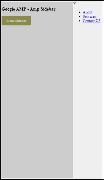
We have used side attribute to open the sidebar on right side. You can use left value to side attribute to open it on left side. The layout attribute has to nodisplay.Open attribute is present when the sidebar is opened.
data-close-button-aria-label
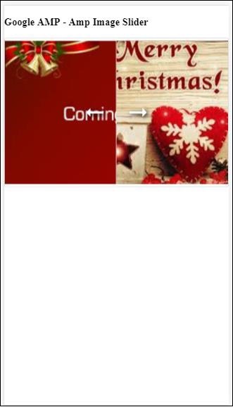
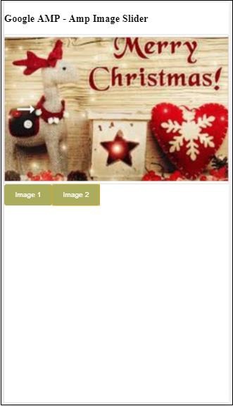
attribute is used to add close button.It is optional one and not mandatory to be used.Amp Image Slider
Amp-image-slider is an amp component used to compare two images by adding slider on moving it vertically over the image.
To work with amp-img-slider add following script −
<script async custom-element = "amp-image-slider" src = "
   https://cdn.ampproject.org/v0/amp-image-slider-0.1.js">
</script>
Amp-img-slider tag
<amp-image-slider width = "300" height = "200" layout = "responsive">
   <amp-img src = "images/christmas1.jpg" layout = "fill">
   </amp-img>
   <amp-img src = "images/christmas2.jpg" layout = "fill">
   </amp-img>
</amp-image-slider>
An example of amp-img-slider is shown here. Here we have added 2 images inside amp-img-slider, where the first image acts like a slider and you can slide in on the top on the 2nd image.
Example
<!doctype html>
<html amp lang = "en">
   <head>
      <meta charset = "utf-8">
      <script async src = "https://cdn.ampproject.org/v0.js">
      </script>
      <title>Google AMP - Amp Image Slider</title>
      <link rel = "canonical" href =
      "http://example.ampproject.org/article-metadata.html">
      <meta name = "viewport" content = "width = device-width,
      minimum-scale = 1,initial-scale = 1">

      <style amp-boilerplate>
         body{
            -webkit-animation:
            -amp-start 8s steps(1,end) 0s 1 normal both;-moz-animation:
            -amp-start 8s steps(1,end) 0s 1 normal both;-ms-animation:
            -amp-start 8s steps(1,end) 0s 1 normal both;animation:
            -amp-start 8s steps(1,end) 0s 1 normal both
         }
         @-webkit-keyframes
         -amp-start{from{visibility:hidden}to{visibility:visible}}@-moz-keyframes
         -amp-start{from{visibility:hidden}to{visibility:visible}}@-ms-keyframes
         -amp-start{from{visibility:hidden}to{visibility:visible}}@-o-keyframes
         -amp-start{from{visibility:hidden}to{visibility:visible}}@keyframes
         -amp-start{from{visibility:hidden}to{visibility:visible}}
      </style>
      <noscript>
         <style amp-boilerplate>
            body{
               -webkit-animation:none;
               -moz-animation:none;
               -ms-animation:none;
               animation:none}
         </style>
      </noscript>
      <script async custom-element = "amp-image-slider" src =
         "https://cdn.ampproject.org/v0/amp-image-slider-0.1.js">
      </script>
      <style amp-custom>
         amp-img {
            border: 1px solid #ddd;
            border-radius: 4px;
            padding: 5px;
         }
      </style>
   </head>
   <body>
      <h3>Google AMP - Amp Image Slider</h3>
      <amp-image-slider
         width = "300"
         height = "200"
         layout = "responsive">
            <amp-img
               src = "images/christmas1.jpg"
               layout = "fill">
            </amp-img>
            <amp-img
               src = "images/christmas2.jpg"
               layout = "fill">
            </amp-img>
      </amp-image-slider>
   </body>
</html>
Output
Amp-image-slider has action called seekTo using which you can change the image as shown in the example below −
Example
<!doctype html>
<html amp lang = "en">
   <head>
      <meta charset = "utf-8">
      <script async src = "https://cdn.ampproject.org/v0.js">
      </script>
      <title>Google AMP - Amp Image Slider</title>
      <link rel = "canonical" href ="
      http://example.ampproject.org/article-metadata.html">
      <meta name = "viewport" content = "width = device-width,
      minimum-scale = 1,initial-scale = 1">

      <style amp-boilerplate>
         body{
            -webkit-animation:
            -amp-start 8s steps(1,end) 0s 1 normal both;-moz-animation:
            -amp-start 8s steps(1,end) 0s 1 normal both;-ms-animation:
            -amp-start 8s steps(1,end) 0s 1 normal both;animation:
            -amp-start 8s steps(1,end) 0s 1 normal both
         }
         @-webkit-keyframes
         -amp-start{from{visibility:hidden}to{visibility:visible}}@-moz-keyframes
         -amp-start{from{visibility:hidden}to{visibility:visible}}@-ms-keyframes
         -amp-start{from{visibility:hidden}to{visibility:visible}}@-o-keyframes
         -amp-start{from{visibility:hidden}to{visibility:visible}}@keyframes
         -amp-start{from{visibility:hidden}to{visibility:visible}}
      </style>
      <noscript>
         <style amp-boilerplate>
            body{
               -webkit-animation:none;
               -moz-animation:none;
               -ms-animation:none;
               animation:none}
         </style>
      </noscript>
      <script async custom-element = "amp-image-slider" src =
         "https://cdn.ampproject.org/v0/amp-image-slider-0.1.js">
      </script>
      <style amp-custom>
         amp-img {
            border: 1px solid #ddd;
            border-radius: 4px;
            padding: 5px;
         }
         button{
            background-color: #ACAD5C;
            color: white;
            padding: 12px 20px;
            border: none;
            border-radius: 4px;
            cursor: pointer;
            float: left;
         }
         .amp-sidebar-toolbar-target-shown {
            display: none;
         }
      </style>
   </head>
   <body>
      <h3>Google AMP - Amp Image Slider</h3>
      <amp-image-slider
         width = "300"
         id="slider1"
         height = "200"
         layout = "responsive">
         <amp-img src = "images/christmas1.jpg" layout = "fill">
         </amp-img>
         <amp-img src = "images/christmas2.jpg" layout = "fill">
         </amp-img>
      </amp-image-slider>
      <button on = "tap:slider1.seekTo(percent = 1)">
         Image 1
      </button>
      <button on = "tap:slider1.seekTo(percent = 0)">
         Image 2
      </button>
   </body>
</html>
Output
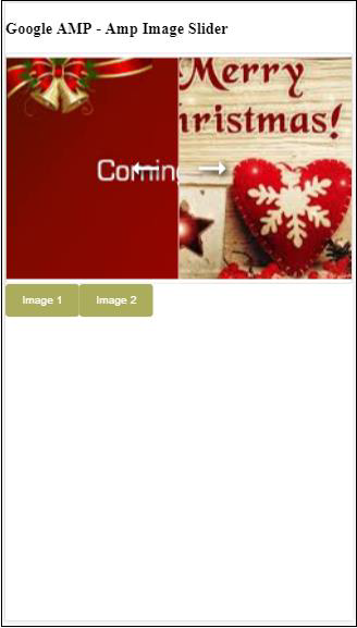
You can change the images by tapping the button.
<button on = "tap:slider1.seekTo(percent = 1)">Image 1</button>
<button on = "tap:slider1.seekTo(percent = 0)">Image 2</button>
</div>
