- Google AMP - Home
- Google AMP - Overview
- Google AMP - Introduction
- Google AMP - Images
- Google AMP - Form
- Google AMP - Iframes
- Google AMP - Video
- Google AMP - Button
- Google AMP - Timeago
- Google AMP - Mathml
- Google AMP - Fit Text
- Google AMP - Date Countdown
- Google AMP - Date Picker
- Google AMP - Story
- Google AMP - Selector
- Google AMP - Link
- Google AMP - Font
- Google AMP - List
- Google AMP - User Notification
- Google AMP - Next Page
- Google AMP - Attributes
- Styles And Custom CSS
- Google AMP - Dynamic CSS Classes
- Google AMP - Actions And Events
- Google AMP - Animations
- Google AMP - Data Binding
- Google AMP - Layout
- Google AMP - ADS
- Google AMP - Analytics
- Google AMP - Social Widgets
- Google AMP - Media
- Html Page To Amp Page
- Google AMP - Basic Syntax
- Google AMP - Validation
- Google AMP - Caching
- Google AMP - Custom Javascript
- Google AMP - Cors
- Google AMP Useful Resources
- Google AMP - Quick Guide
- Google AMP - Useful Resources
- Google AMP - Discussion
Google AMP - Selector
Amp-selector is an amp component which displays menu of options and the user can select between the options. The options displayed can be text, images or any other amp-component. In this chapter, let us discuss this in detail.
To work with amp-selector, we need to include following javascript files −
<script async custom-element = "amp-selector"
   src = "https://cdn.ampproject.org/v0/amp-selector-0.1.js">
</script>
Format of amp-selector
The following code shows the sample for format of amp-selector −
<amp-selector layout = "container">
   <amp-img src = "images/christmas1.jpg"
      width = "60"
      height = "40"
      option = "1">
   <amp-img src = "images/christmas2.jpg"
      width = "60"
      height = "40"
      option = "2">
   </amp-img>
   <amp-img src = "images/christmas3.jpg"
      width = "60"
      height = "40"
      option = "3">
   </amp-img>
   <amp-img src = "images/christmas4.jpg"
      width = "60"
      height = "40"
      option = "4">
   </amp-img>
</amp-selector>
You can use standard html tags or amp components inside amp-selector.The contents are displayed like menu on the screen and the user can select between them.The menus displayed can be a single select or multiselect.
Let us understand this with the help of an example of single and multi select as given below.
Amp Selector Single Select
The following code is a sample for amp-selector single select −
<!doctype html>
<html amp lang = "en">
   <head>
      <meta charset = "utf-8">
      <script async src = "https://cdn.ampproject.org/v0.js"></script>
      <title>Google AMP - Amp Selector</title>
      <link rel = "canonical" href = "http://example.ampproject.org/article-metadata.html">
      <meta name="viewport" content="width=device-width,minimum-scale = 1,initial-scale = 1">

      <style amp-boilerplate>
         body{-
            webkit-animation:-amp-start 8s steps(1,end) 0s 1 normal both;-moz-animation:
            -amp-start 8s steps(1,end) 0s 1 normal both;-ms-animation:
            -amp-start 8s steps(1,end) 0s 1 normal both;animation:
            -amp-start 8s steps(1,end) 0s 1 normal both
         }
         @-webkit-keyframes
         -amp-start{from{visibility:hidden}to{visibility:visible}}@-moz-keyframes
         -amp-start{from{visibility:hidden}to{visibility:visible}}@-ms-keyframes
         -amp-start{from{visibility:hidden}to{visibility:visible}}@-o-keyframes
         -amp-start{from{visibility:hidden}to{visibility:visible}}@keyframes
         -amp-start{from{visibility:hidden}to{visibility:visible}}
      </style>
      <noscript>
         <style amp-boilerplate>
            body{
            -webkit-animation:none;-moz-animation:none;
            -ms-animation:none;animation:none}
         </style>
      </noscript>

      <script async custom-element="amp-selector"
         src = "https://cdn.ampproject.org/v0/amp-selector-0.1.js">
      </script>
      <style amp-custom>
         amp-selector:not([disabled])
         amp-img[option][selected]:not([disabled]) {
            outline-color: #b6A848;
            outline-width: 2px;
         }
      </style>
   </head>
   <body>
      <h3>Google AMP - Amp Selector</h3>
      <amp-selector layout = "container">
         <amp-img src = "images/christmas1.jpg"
            width = "60"
            height = "40"
            option="1">
         </amp-img>
         <amp-img src="images/christmas2.jpg"
            widt h = 60"
            height = "40"
            option = "2">
         </amp-img>
         <amp-img src = "images/christmas3.jpg"
            width = "60"
            height = "40"
            option = "3">
         </amp-img>
         <amp-img src = "images/christmas4.jpg"
            width = "60"
            height = "40"
            option = "4">
         </amp-img>
      </amp-selector>
   </body>
</html>
Output
The output of the above given code is as shown below −
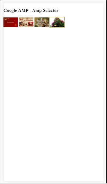
Note that in the above example we have used amp-selector and used images inside to show the options. It is a single select selector so you can select any one image as shown in the output.
Amp Selector Multiple Select
In this example, let us display amp-selector with images using multiple attributes, we can select multiple options from the selector.
Example
<!doctype html>
<html amp lang = "en">
   <head>
      <meta charset = "utf-8 ">
      <script async src = "https://cdn.ampproject.org/v0.js"></script>
      <title>Google AMP - Amp Selector</title>
      <link rel = "canonical" href = "http://example.ampproject.org/article-metadata.html">
      <meta name = "viewport" content = "width = device-width,minimum-scale = 1,initial-scale =1">

      <style amp-boilerplate>
         body{-webkit-animation:
            -amp-start 8s steps(1,end) 0s 1 normal both;-moz-animation:
            -amp-start 8s steps(1,end) 0s 1 normal both;-ms-animation:
            -amp-start 8s steps(1,end) 0s 1 normal both;animation:
            -amp-start 8s steps(1,end) 0s 1 normal both}
         @-webkit-keyframes
         -amp-start{from{visibility:hidden}to{visibility:visible}}@-moz-keyframes
         -amp-start{from{visibility:hidden}to{visibility:visible}}@-ms-keyframes
         -amp-start{from{visibility:hidden}to{visibility:visible}}@-o-keyframes
         -amp-start{from{visibility:hidden}to{visibility:visible}}@keyframes
         -amp-start{from{visibility:hidden}to{visibility:visible}}
      </style>

      <noscript>
         <style amp-boilerplate>
            body{
               -webkit-animation:none;-moz-animation:none;
               -ms-animation:none;animation:none
            }
         </style>
      </noscript>

      <script async custom-element = "amp-selector"
         src = "https://cdn.ampproject.org/v0/amp-selector-0.1.js">
      </script>

      <style amp-custom>
         amp-selector:not([disabled])
         amp-img[option][selected]:not([disabled]) {
            outline-color: blue;
            outline-width: 2px;
         }
      </style>
   </head>
   <body>
      <h3>Google AMP - Amp Selector</h3>
      <amp-selector layout = "container" multiple>
         <amp-img src = "images/christmas1.jpg"
            width = "60"
            height ="40"
            option = "1">
         </amp-img>
         <amp-img src="images/christmas2.jpg"
            width = "60"
            height = "40"
            option = "2">
         </amp-img>
         <amp-img src ="images/christmas3.jpg"
            width = "60"
            height = "40"
            option = "3">
         </amp-img>
         <amp-img src = "images/christmas4.jpg"
            width = "60"
            height = "40"
            option = "4">
         </amp-img>
      </amp-selector>
   </body>
</html>
Output
The output of the code shown above is given below −
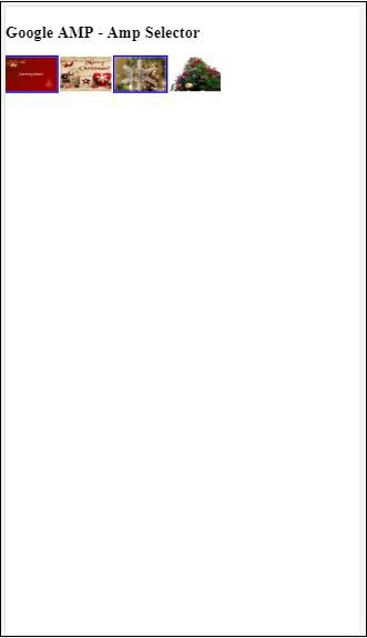
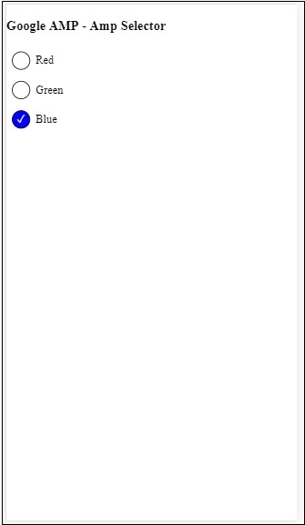
We can also use amp-selector to show radio buttons as shown in the code given below −
Example
<!doctype html>
<html amp lang = "en">
   <head>
      <meta charset = "utf-8">
      <script async src = "https://cdn.ampproject.org/v0.js"></script>
      <title>Google AMP - Amp Selector</title>
      <link rel = "canonical" href = "http://example.ampproject.org/article-metadata.html">
      <meta name = "viewport" content ="width = device-width,minimum-scale = 1,initial-scale = 1">

      <style amp-boilerplate>
         body{
            -webkit-animation:
            -amp-start 8s steps(1,end) 0s 1 normal both;-moz-animation:
            -amp-start 8s steps(1,end) 0s 1 normal both;-ms-animation:
            -amp-start 8s steps(1,end) 0s 1 normal both;animation:
            -amp-start 8s steps(1,end) 0s 1 normal both
         }
         @-webkit-keyframes
         -amp-start{from{visibility:hidden}to{visibility:visible}}@-moz-keyframes
         -amp-start{from{visibility:hidden}to{visibility:visible}}@-ms-keyframes
         -amp-start{from{visibility:hidden}to{visibility:visible}}@-o-keyframes
         -amp-start{from{visibility:hidden}to{visibility:visible}}@keyframes
         -amp-start{from{visibility:hidden}to{visibility:visible}}
      </style>

      <noscript>
         <style amp-boilerplate>
            body{
               -webkit-animation:none;
               -moz-animation:none;
               -ms-animation:none;
               animation:none}
         </style>
      </noscript>
      <script async custom-element = "amp-selector"
         src = "https://cdn.ampproject.org/v0/amp-selector-0.1.js">
      </script>
      <style amp-custom>
         .radio-menu {
            list-style: none;
         }
         .radio-menu [option][selected] {
            outline: none;
         }
         .radio-menu [option] {
            display: flex;
            align-items: center;
         }
         .radio-menu [option]:before {
            transition: background 0.25s ease-in-out;
            content: "";
            display: inline-block;
            width: 24px;
            height: 24px;
            margin: 8px;
            border-radius: 100%;
            border: solid 1px black;
         }
         .radio-menu [option  = red][selected]:before {
            text-align: center;
            content: "";
            color: white;
            background: red;
         }
         .radio-menu [option  = green][selected]:before {
            text-align: center;
            content: "";
            color: white;
            background: green;
         }
         .radio-menu [option  = blue][selected]:before {
            text-align: center;
            content: "";
            color: white;
            background: blue;
         }
      </style>
   </head>
   <body>
      <h3>Google AMP - Amp Selector</h3>
      <amp-selector class = "radio-menu" layout = "container" name = "my-selector">
         <div option = "red">Red</div>
         <div option = "green">Green</div>
         <div option = "blue">Blue</div>
      </amp-selector>
   </body>
</html>
Output