- Silverlight Tutorial
- Silverlight - Home
- Silverlight - Overview
- Silverlight - Environment Setup
- Silverlight - Getting Started
- Silverlight - XAML Overview
- Silverlight - Project Types
- Silverlight - Fixed Layouts
- Silverlight - Dynamic Layout
- Constrained vs. Unconstrained
- Silverlight - CSS
- Silverlight - Controls
- Silverlight - Buttons
- Silverlight - Content Model
- Silverlight - ListBox
- Silverlight - Templates
- Silverlight - Visual State
- Silverlight - Data Binding
- Silverlight - Browser Integration
- Silverlight - Out-of-Browser
- Silverlight - Applications, Resources
- Silverlight - File Access
- Silverlight - View Model
- Silverlight - Input Handling
- Silverlight - Isolated Storage
- Silverlight - Text
- Silverlight - Animation
- Silverlight - Video and Audio
- Silverlight - Printing
- Silverlight Useful Resources
- Silverlight - Quick Guide
- Silverlight - Useful Resources
- Silverlight - Discussion
Silverlight - Fixed Layouts
Layout of controls is very important and critical for application usability. It is used to arrange a group of GUI elements in your application. There are certain important things to consider while selecting layout panels. They are −
- Positions of the child elements.
- Sizes of the child elements.
- Layering of overlapping child elements on top of each other.
A fixed pixel arrangement of controls does not work if the application has been used on different screen resolutions. XAML provides a rich set of built-in layout panels to arrange the GUI elements in an appropriate way.
We will start by looking at simple fixed layouts. Then we will look at the Dynamic layout scenarios, which Silverlight has designed to support. We will see the layout-related properties and concepts that permeate all user interface elements.
Fixed Layout
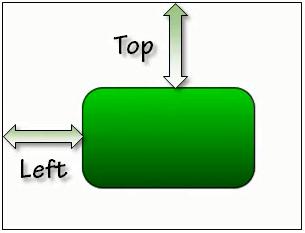
The simplest kind of layout is offered by the Canvas element. The Canvas panel is the basic layout panel in which the child elements can be positioned explicitly using the coordinates that are relative to any side of the Canvas such as left, right, top and bottom.
Typically, the Canvas is used for 2D graphic elements (such as Ellipse, Rectangle etc.). It is not used for UI elements because specifying absolute coordinates give trouble when you resize, localize or scale your XAML application.
Given below are the commonly used properties of Canvas class.
| Sr. No. | Property & Description |
|---|---|
| 1 | Background Gets or sets a Brush that fills the panel content area. (Inherited from Panel) |
| 2 | Children Gets a UIElementCollection of child elements of this Panel. (Inherited from Panel.) |
| 3 | Height Gets or sets the suggested height of the element. (Inherited from FrameworkElement.) |
| 4 | ItemHeight Gets or sets a value that specifies the height of all items that are contained within a WrapPanel. |
| 5 | ItemWidth Gets or sets a value that specifies the width of all items that are contained within a WrapPanel. |
| 6 | LogicalChildren Gets an enumerator that can iterate the logical child elements of this Panel element. (Inherited from Panel.) |
| 7 | LogicalOrientation The Orientation of the panel, if the panel supports layout in only a single dimension. (Inherited from Panel.) |
| 8 | LeftProperty Identifies the Canvas.Left XAML attached property. |
| 9 | Margin Gets or sets the outer margin of an element. (Inherited from FrameworkElement.) |
| 10 | Name Gets or sets the identifying name of the element. The name provides a reference so that code-behind, such as event handler code, can refer to a markup element after it is constructed during processing by a XAML processor. (Inherited from FrameworkElement.) |
| 11 | Orientation Gets or sets a value that specifies the dimension in which child content is arranged. |
| 12 | Parent Gets the logical parent element of this element. (Inherited from FrameworkElement.) |
| 13 | Resources Gets or sets the locally-defined resource dictionary. (Inherited from FrameworkElement.) |
| 14 | Style Gets or sets the style used by this element when it is rendered. (Inherited from FrameworkElement.) |
| 15 | TopProperty Identifies the Canvas.Top XAML attached property. |
| 16 | Width Gets or sets the width of the element. (Inherited from FrameworkElement.) |
| 17 | ZIndexProperty Identifies the Canvas.ZIndex XAML attached property. |
Given below are the commonly used methods of Canvas.
| Sr. No. | Method & Description |
|---|---|
| 1 | GetLeft Gets the value of the Canvas.Left XAML attached property for the target element. |
| 2 | GetTop Gets the value of the Canvas.Top XAML attached property for the target element. |
| 3 | GetZIndex Gets the value of the Canvas.ZIndex XAML attached property for the target element. |
| 4 | SetLeft Sets the value of the Canvas.Left XAML attached property for a target element. |
| 5 | SetTop Sets the value of the Canvas.Top XAML attached property for a target element. |
| 6 | SetZIndex Sets the value of the Canvas.ZIndex XAML attached property for a target element. |
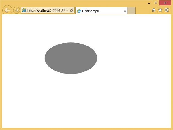
The following example shows how to add child elements into a Canvas. Below is the XAML implementation in which an Ellipse is created inside a Canvas with different offset properties.
<UserControl x:Class = "FirstExample.MainPage"
   xmlns = "http://schemas.microsoft.com/winfx/2006/xaml/presentation"
   xmlns:x = "http://schemas.microsoft.com/winfx/2006/xaml"
   xmlns:d = "http://schemas.microsoft.com/expression/blend/2008"
   xmlns:mc = "http://schemas.openxmlformats.org/markup-compatibility/2006"
   mc:Ignorable = "d"
   d:DesignHeight = "300" d:DesignWidth = "400">

   <Grid x:Name = "LayoutRoot" Background = "White">
      <Canvas Width = "380" Height = "280" >
         <Ellipse Canvas.Left = "30" Canvas.Top = "30"
            Fill = "Gray" Width = "200" Height = "120" />
      </Canvas>
   </Grid>

</UserControl>
When the above code is compiled and executed, you will see the following output.