- Silverlight Tutorial
- Silverlight - Home
- Silverlight - Overview
- Silverlight - Environment Setup
- Silverlight - Getting Started
- Silverlight - XAML Overview
- Silverlight - Project Types
- Silverlight - Fixed Layouts
- Silverlight - Dynamic Layout
- Constrained vs. Unconstrained
- Silverlight - CSS
- Silverlight - Controls
- Silverlight - Buttons
- Silverlight - Content Model
- Silverlight - ListBox
- Silverlight - Templates
- Silverlight - Visual State
- Silverlight - Data Binding
- Silverlight - Browser Integration
- Silverlight - Out-of-Browser
- Silverlight - Applications, Resources
- Silverlight - File Access
- Silverlight - View Model
- Silverlight - Input Handling
- Silverlight - Isolated Storage
- Silverlight - Text
- Silverlight - Animation
- Silverlight - Video and Audio
- Silverlight - Printing
- Silverlight Useful Resources
- Silverlight - Quick Guide
- Silverlight - Useful Resources
- Silverlight - Discussion
Silverlight - Content Model
The buttons offer a form of content to the model content. Models crop up a lot in controls. The idea is simple. It will accept any content and not just text. If you want to create a truly exotic button, you could even place other content controls such as text boxes and buttons inside (and nest still elements inside these). It is doubtful that such an interface would make much sense, but it is possible.
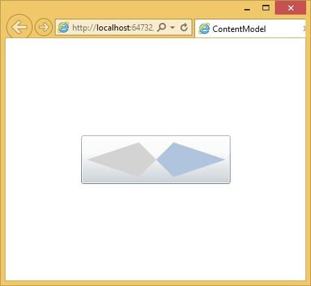
Let us have a look at a simple example with button, inside button other content controls.
<UserControl x:Class = "ContentModel.MainPage"
   xmlns = "http://schemas.microsoft.com/winfx/2006/xaml/presentation"
   xmlns:x = "http://schemas.microsoft.com/winfx/2006/xaml"
   xmlns:d = "http://schemas.microsoft.com/expression/blend/2008"
   xmlns:mc = "http://schemas.openxmlformats.org/markup-compatibility/2006"
   mc:Ignorable = "d"
   d:DesignHeight = "300" d:DesignWidth = "400">

   <Grid x:Name = "LayoutRoot" Background = "White">

      <Button Margin = "3" Height = "70" Width = "215">
         <Grid Margin = "5">
            <Polygon Points = "100,25 125,0 200,25 125,50" Fill = "LightSteelBlue" />
            <Polygon Points = "100,25 75,0 0,25 75,50" Fill = "LightGray"/>
         </Grid>
      </Button>

   </Grid>

</UserControl>
When the above code is compiled and executed, you will see the following button.
RangeControl
The scrollbar and slider controls are closely related. They both allow the user to choose an input value from a particular range. Conventionally, these controls signify different things. Scrollbars are normally used to set the position into a scrotal area whereas, the slider is used to specify some value or setting. These are just conventions; the controls have similar behaviors and APIs.
The range controls are simple to use. You specify the minimum and maximum values to indicate the range of values you would like the slider to represent. The Value property will vary as the use of drags varies.
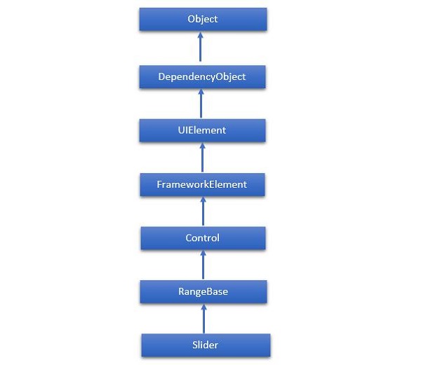
The hierarchical inheritance of Slider class is as follows −
Given below are the commonly used properties of Slider.
| Sr. No. | Property & Description |
|---|---|
| 1 | Header Gets or sets the content for the control's header. |
| 2 | HeaderProperty Identifies the Header dependency property. |
| 3 | HeaderTemplate Gets or sets the DataTemplate used to display the content of the control's header. |
| 4 | HeaderTemplateProperty Identifies the HeaderTemplate dependency property. |
| 5 | IntermediateValue Gets or sets the value of the Slider while the user is interacting with it, before the value is snapped to either the tick or step value. The SnapsTo property specifies the value of slider. |
| 6 | IntermediateValueProperty Identifies the IntermediateValue dependency property. |
| 7 | IsDirectionReversed Gets or sets a value that indicates the direction of increasing value. |
| 8 | IsDirectionReversedProperty Identifies the IsDirectionReversed dependency property. |
| 9 | IsThumbToolTipEnabled Gets or sets a value that determines whether the slider value is shown in a tool tip for the Thumb component of the Slider. |
| 10 | IsThumbToolTipEnabledProperty Identifies the IsThumbToolTipEnabled dependency property. |
| 11 | Orientation Gets or sets the orientation of a Slider. |
| 12 | OrientationProperty Identifies the Orientation dependency property. |
| 13 | StepFrequency Gets or sets the value part of a value range that steps should be created for. |
| 14 | StepFrequencyProperty Identifies the StepFrequency dependency property. |
| 15 | ThumbToolTipValueConverter Gets or sets the converter logic that converts the range value of the Slider into tool tip content. |
| 16 | ThumbToolTipValueConverterProperty Identifies the ThumbToolTipValueConverter dependency property. |
| 17 | TickFrequency Gets or sets the increment of the value range that ticks should be created for. |
| 18 | TickFrequencyProperty Identifies the TickFrequency dependency property. |
| 19 | TickPlacement Gets or sets a value that indicates where to draw tick marks in relation to the track. |
| 20 | TickPlacementProperty Identifies the TickPlacement dependency property. |
Given below are the commonly used events in Slider class.
| Sr. No. | Event & Description |
|---|---|
| 1 | ManipulationCompleted Occurs when a manipulation on the UIElement is complete. (Inherited from UIElement) |
| 2 | ManipulationDelta Occurs when the input device changes position during a manipulation. (Inherited from UIElement) |
| 3 | ManipulationInertiaStarting Occurs when the input device loses contact with the UIElement object during a manipulation and inertia begins. (Inherited from UIElement) |
| 4 | ManipulationStarted Occurs when an input device begins a manipulation on the UIElement. (Inherited from UIElement) |
| 5 | ManipulationStarting Occurs when the manipulation processor is first created. (Inherited from UIElement) |
| 6 | ValueChanged Occurs when the range value changes. (Inherited from RangeBase) |
Given below are the commonly used methods in Slider class.
| Sr. No. | Method & Description |
|---|---|
| 1 | OnManipulationCompleted Called before the ManipulationCompleted event occurs. (Inherited from Control) |
| 2 | OnManipulationDelta Called before the ManipulationDelta event occurs. (Inherited from Control) |
| 3 | OnManipulationInertiaStarting Called before the ManipulationInertiaStarting event occurs. (Inherited from Control) |
| 4 | OnManipulationStarted Called before the ManipulationStarted event occurs. (Inherited from Control) |
| 5 | OnManipulationStarting Called before the ManipulationStarting event occurs. (Inherited from Control) |
| 6 | OnMaximumChanged Called when the Maximum property changes. (Inherited from RangeBase) |
| 7 | OnMinimumChanged Called when the Minimum property changes. (Inherited from RangeBase) |
| 8 | OnValueChanged Fires the ValueChanged routed event. (Inherited from RangeBase) |
| 9 | SetBinding Attaches a binding to a FrameworkElement, using the provided binding object. (Inherited from FrameworkElement) |
| 10 | SetValue Sets the local value of a dependency property on a DependencyObject. (Inherited from DependencyObject) |
Example
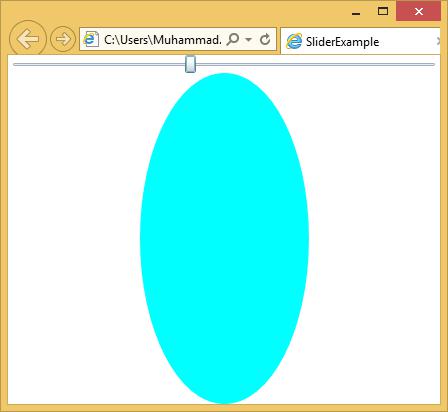
Let us have a look at a simple example in which a slider and an ellipse are added and the slider controls the width of the ellipse.
<UserControl x:Class = "SliderExample.MainPage"
   xmlns = "http://schemas.microsoft.com/winfx/2006/xaml/presentation"
   xmlns:x = "http://schemas.microsoft.com/winfx/2006/xaml"
   xmlns:d = "http://schemas.microsoft.com/expression/blend/2008" xmlns:mc = "
   http://schemas.openxmlformats.org/markup-compatibility/2006"
   mc:Ignorable = "d" d:DesignWidth = "640" d:DesignHeight = "480">

   <Grid x:Name = "LayoutRoot">

      <Grid.RowDefinitions>
         <RowDefinition Height = "Auto" />
         <RowDefinition />
      </Grid.RowDefinitions>

      <Slider Minimum = "1" Maximum = "400" Value = "1"
         ValueChanged = "Slider_ValueChanged" />

      <Ellipse Grid.Row = "1" Fill = "Aqua" Width = "1" x:Name = "myEllipse" />

   </Grid>

</UserControl>
Given below is the value changed event implementation is C#.
using System.Windows;
using System.Windows.Controls;

namespace SliderExample {

   public partial class MainPage : UserControl {

      public MainPage() {
         InitializeComponent();
      }

      private void Slider_ValueChanged(object sender,
         RoutedPropertyChangedEventArgs<double> e) {

            if (myEllipse != null) {
               myEllipse.Width = e.NewValue;
            }
      }
   }
}
When the above code is compiled and executed, you will see the following output. As you can see, when you move the slider from left to right, the ellipse width increases.