- Silverlight Tutorial
- Silverlight - Home
- Silverlight - Overview
- Silverlight - Environment Setup
- Silverlight - Getting Started
- Silverlight - XAML Overview
- Silverlight - Project Types
- Silverlight - Fixed Layouts
- Silverlight - Dynamic Layout
- Constrained vs. Unconstrained
- Silverlight - CSS
- Silverlight - Controls
- Silverlight - Buttons
- Silverlight - Content Model
- Silverlight - ListBox
- Silverlight - Templates
- Silverlight - Visual State
- Silverlight - Data Binding
- Silverlight - Browser Integration
- Silverlight - Out-of-Browser
- Silverlight - Applications, Resources
- Silverlight - File Access
- Silverlight - View Model
- Silverlight - Input Handling
- Silverlight - Isolated Storage
- Silverlight - Text
- Silverlight - Animation
- Silverlight - Video and Audio
- Silverlight - Printing
- Silverlight Useful Resources
- Silverlight - Quick Guide
- Silverlight - Useful Resources
- Silverlight - Discussion
Silverlight - Visual State
It is good if your user can tell which bit of an application is likely to respond to the input. To some extent, this can be done by making buttons just look like buttons. If something looks clickable, it probably is.
However, a convention in modern user interface design is that a user interface element should also signal a willingness to respond by changing their parents when the mouse moves over them.
For example, the built in button control changes its background slightly, when the mouse moves over, to hint that it is interactive and then changes the parents further when clicked to make it look like its selected. Almost all controls need to do this and the designers need a way to create and edit the animations to make it happen.
State & State Group
Let us look at an example of visual state in action. Consider a checkbox. It may be unchecked or checked and if you choose, it can support a third indeterminate state. The control needs to look different for all the three cases. Therefore, we have three Visual States.
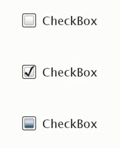
In order to demonstrate that it is ready to respond to the user input, the checkbox changes its appearance slightly when the mouse moves over it and it changes further when the mouse is held there. A fourth state has to be considered if the checkbox is disabled, it looks great out and signals that its not going to respond to the user input.
So, we have another four states here. At any given time, the visual state of a checkbox must be either Normal, Mouse over, Checked or Disabled. At the same time, it must be either checked, unchecked or indeterminate.
Visual State Manager
Since its templates define the appearance of the controls, the template needs to define what happens to each of the Visual States. The templates we have looked at so far do not contain such information. As a result, the appearance of the controls remain static, regardless of its current state.
To add visual states to a template, you begin by adding a property element.
The simplest thing you can do for visual state handling is to define animation that will run when the control enters a particular state.
The controls notify the visual state manager class whenever they change state.
The visual state manager then looks in this section of the template and figures out what animation to run.
So, when the checkbox enters the mouse overstate, this animation will run, changing the color of some part of a template.
Let us have a look at a simple example by using the visual state mechanisms to make a custom template for a checkbox that reflects state changes.
Given below is the XAML code for custom template of check box with visual state.
<UserControl
   xmlns = "http://schemas.microsoft.com/winfx/2006/xaml/presentation"
   xmlns:x = "http://schemas.microsoft.com/winfx/2006/xaml"
   x:Class = "CheckboxVisualState.Page"
   Width = "640" Height="480"
   xmlns:vsm = "clrnamespace:System.Windows;assembly = System.Windows"
   xmlns:d = "http://schemas.microsoft.com/expression/blend/2008"
   xmlns:mc = "http://schemas.openxmlformats.org/markup-compatibility/2006"
   mc:Ignorable = "d">

   <UserControl.Resources>
      <ControlTemplate x:Key = "CheckBoxControlTemplate1" TargetType = "CheckBox">

         <Grid>

            <vsm:VisualStateManager.VisualStateGroups>

               <vsm:VisualStateGroup x:Name = "FocusStates">
                  <vsm:VisualState x:Name = "ContentFocused"/>
                  <vsm:VisualState x:Name = "Focused"/>
                  <vsm:VisualState x:Name = "Unfocused"/>
               </vsm:VisualStateGroup>

               <vsm:VisualStateGroup x:Name = "CommonStates">

                  <vsm:VisualStateGroup.Transitions>
                     <vsm:VisualTransition GeneratedDuration = "00:00:00.5000000"/>
                  </vsm:VisualStateGroup.Transitions>

                  <vsm:VisualState x:Name = "MouseOver">

                     <Storyboard>

                        <ColorAnimationUsingKeyFrames BeginTime = "00:00:00"
                           Duration = "00:00:00.0010000" Storyboard.TargetName = "background"
                           Storyboard.TargetProperty = "(Shape.Fill).
                           (SolidColorBrush.Color)">

                              <SplineColorKeyFrame KeyTime = "00:00:00" Value = "#FFFF0000"/>
                        </ColorAnimationUsingKeyFrames>

                     </Storyboard>

                  </vsm:VisualState>

                  <vsm:VisualState x:Name = "Pressed">

                     <Storyboard>

                        <ColorAnimationUsingKeyFrames BeginTime = "00:00:00"
                           Duration = "00:00:00.0010000" Storyboard.TargetName = "background"
                           Storyboard.TargetProperty = "(Shape.Fill).
                           (SolidColorBrush.Color)">

                              <SplineColorKeyFrame KeyTime = "00:00:00" Value = "#FFCEFF00"/>
                        </ColorAnimationUsingKeyFrames>

                     </Storyboard>

                  </vsm:VisualState>

                  <vsm:VisualState x:Name = "Disabled"/>
                  <vsm:VisualState x:Name = "Normal"/>

               </vsm:VisualStateGroup>

               <vsm:VisualStateGroup x:Name = "CheckStates">

                  <vsm:VisualStateGroup.Transitions>
                     <vsm:VisualTransition GeneratedDuration = "00:00:00.5000000"/>
                  </vsm:VisualStateGroup.Transitions>

                  <vsm:VisualState x:Name = "Checked">

                     <Storyboard>

                        <DoubleAnimationUsingKeyFrames BeginTime = "00:00:00"
                           Duration = "00:00:00.0010000" Storyboard.TargetName = "checkPath"
                           Storyboard.TargetProperty = "(UIElement.Opacity)">

                              <SplineDoubleKeyFrame KeyTime = "00:00:00" Value = "1"/>
                        </DoubleAnimationUsingKeyFrames>

                     </Storyboard>

                  </vsm:VisualState>

                  <vsm:VisualState x:Name = "Unchecked"/>
                  <vsm:VisualState x:Name = "Indeterminate"/>

               </vsm:VisualStateGroup>

            </vsm:VisualStateManager.VisualStateGroups>

            <Grid.ColumnDefinitions>

               <ColumnDefinition Width = "Auto"/>
                  <ColumnDefinition Width = "3.61782296696066"/>
               <ColumnDefinition Width = "Auto"/>

            </Grid.ColumnDefinitions>

            <Canvas Height = "50" HorizontalAlignment = "Left" VerticalAlignment = "Top"
               Width = "50">

               <Rectangle Height = "33.746" x:Name = "background" Width = "33.746"
                  Canvas.Left = "8.452" Canvas.Top = "7.88" Fill = "#FFFFFFFF"
                  Stroke = "#FF000000"
                  RadiusX = "5.507" RadiusY = "5.507"/>

               <Path Height = "40.25" x:Name = "checkPath" Width = "39.75" Opacity = "0"
                  Canvas.Left = "5.959" Canvas.Top = "7.903" Stretch = "Fill"
                  Stroke = "#FF1F9300" StrokeThickness = "3"
                  Data = "M1.5,1.5 C15.495283,8.7014561 27.056604,18.720875 33.75,33.75
                  M36,3.75 C22.004717,10.951456 10.443395,20.970875 3.7499986,36"/>

            </Canvas>

            <ContentPresenter HorizontalAlignment = "Left"
               Margin = "{TemplateBinding Padding}"
               VerticalAlignment = "{TemplateBinding VerticalContentAlignment}"
               Grid.Column = "2" Grid.ColumnSpan = "1" d:LayoutOverrides = "Height"/>

         </Grid>

      </ControlTemplate>

   </UserControl.Resources>

   <Grid x:Name = "LayoutRoot" Background = "White" >
      <CheckBox HorizontalAlignment = "Left"
         Margin = "52.5410003662109,53.5970001220703,0,0" VerticalAlignment = "Top"
         Template = "{StaticResource CheckBoxControlTemplate1}"
         Content = "CheckBox"/>
   </Grid>

</UserControl>
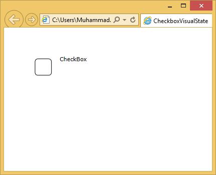
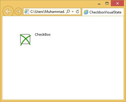
When the above code is compiled and executed, you will see the following web page, which contains one checkbox.
When the curser enters the checkbox region, it will change the state.
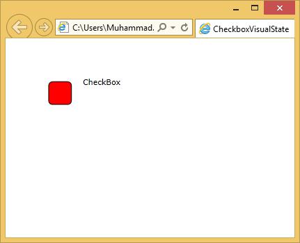
When you click the checkbox, you will see the following state.
We recommend you to execute the above example for a better understanding.