
Article Categories
- All Categories
-
 Data Structure
-
 Networking
-
 RDBMS
RDBMS
-
 Operating System
-
 Java
Java
-
 MS Excel
-
 iOS
iOS
-
 HTML
HTML
-
 CSS
CSS
-
 Android
-
 Python
-
 C Programming
-
 C++
C++
-
 C#
C#
-
 MongoDB
-
 MySQL
MySQL
-
 Javascript
-
 PHP
PHP
-
 Economics & Finance
How to create a Native Select in Material UI?
Material UI is a framework, for React that offers a Select component. This component allows users to pick options from a menu. Today we will explore how to create a Native Select in Material UI. One of the components in Material UI is the "Native Select." It plays a role, in creating menus with native select functionality, giving users the ability to choose from various options.
How is Native Select different from Select Component?
The Native Select and Select components have some differences. Native Select offers a user interface on platforms by rendering a native HTML <select> element. It provides a standard dropdown with customization options, ensuring accessibility compliance. On the other hand, the Select component is a custom dropdown created using JavaScript and CSS by Material UI. It offers a great design and a highly customizable user interface, but it requires additional effort to ensure accessibility compliance.
NativeSelect API
<NativeSelect> This API is used to add the native select component to select data from a list of options in the Material UI.
Steps to create a Native Select
Here are the steps for creating a native select component
Step 1: Create a React Application. Install MUI
Begin by opening your terminal and executing the command to create a new React application project.
npx create react app selectproject
Once the project is created, navigate to its directory by running
cd selectproject
Now install Material UI using this command
npm install @mui/material @emotion/react @emotion/styled
Step 2: Import Dependencies
Let?s first import the required dependencies from Material UI.
import { NativeSelect } from "@mui/material";
Step 3: Create a NativeSelect Component
After we have imported the dependencies, now it's time to use the component and render the options in it with the list of data.
<NativeSelect>
   <option value="1">First</option>
   <option value="2">Second</option>
   <option value="3">Third</option>
   <option value="4">Fourth</option>
   ?
</NativeSelect>
Props Used
children The "children" property allows you to include a list of content specifically intended for children. These contents are presented as options, in this scenario.
classes By using the "classes" property we can expand upon the existing styles provided by Material UI.
IconComponent To display the arrow icon, utilize the "IconComponent" property.
input To add an input element that is not based on the Material UI Input component, make use of the "input" property.
inputProps For adding attributes to select components, utilize the "inputProps" property.
onChange This prop is used to trigger a callback function when the select is selected.
sx The custom styles for Material UI components can be added using the sx prop.
value This property is utilized to specify the input value.
variant This property determines the options for selection.
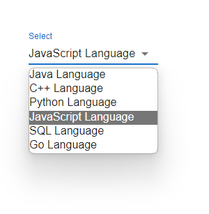
Example
In this instance, we've developed a select component using Material UI that caters to native functionality. Here we render the NativeSelect component, alongside the option input component to showcase a range of choices. The NativeSelect component differs from the Select component in Material UI as it enhances the user experience across platforms, including devices.
import React from "react";
import FormControl from "@mui/material/FormControl";
import { Box, InputLabel, NativeSelect } from "@mui/material";

const App = () => {

   return (
      <div>
         <Box sx={{ p: 10 }}>
            <FormControl variant="standard" size="large" sx={{ m: 1, minWidth: 120 }}>
               <InputLabel variant="standard">
                  Select
               </InputLabel>
               <NativeSelect variant="outlined" defaultValue={4}>
                  <option value="1">Java Language</option>
                  <option value="2">C++ Language</option>
                  <option value="3">Python Language</option>
                  <option value="4">JavaScript Language</option>
                  <option value="5">SQL Language</option>
                  <option value="6">Go Language</option>
               </NativeSelect>
            </FormControl>
         </Box>
      </div>
   );
};

export default App;
Output
Example
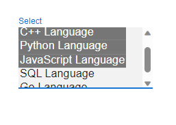
In this example, we've utilized the native prop to create a native select component within Material UI. Here we display the Select component along with the option input element to present a selection of options that users can choose from.
import React from "react";
import FormControl from "@mui/material/FormControl";
import { Box, InputLabel, Select } from "@mui/material";

const App = () => {
   return (
      <div>
         <Box sx={{ p: 10 }}>
            <FormControl variant="standard" size="large" sx={{ m: 1, minWidth: 120 }}>
               <InputLabel variant="standard">
                  Select
               </InputLabel>
               <Select multiple native variant="standard" >
                  <option value="1">Java Language</option>
                  <option value="2">C++ Language</option>
                  <option value="3">Python Language</option>
                  <option value="4">JavaScript Language</option>
                  <option value="5">SQL Language</option>
                  <option value="6">Go Language</option>
               </Select>
            </FormControl>
         </Box>
      </div>
   );
};

export default App;
Output
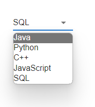
Example
For this scenario, our focus was on creating a native select component using Material UI. Here we render the NativeSelect component alongside the option input element to exhibit an array of options. Additionally, in order to display sets of data lists effectively, we leverage the map() function for rendering purposes. It's worth noting that the NativeSelect component offers a better user experience on platforms such as mobile devices when compared to the Select component within Material UI.
import React from "react";
import { useState } from "react";
import FormControl from "@mui/material/FormControl";
import { Box, NativeSelect } from "@mui/material";

const language = ["Java", "Python", "C++", "JavaScript", "SQL"];

const App = () => {
   const [state, setState] = useState([]);
   const handleSelect = (e) => {
      const {
         target: { value },
      } = e;
      setState(
         typeof value === "string" ? value.split(",") : value
      );
   };

   return (
      <div>
         <Box sx={{ p: 10 }}>
            <FormControl
               variant="standard"
               size="large"
               sx={{ m: 1, minWidth: 120 }}>
               <NativeSelect
                  variant="outlined"
                  value={state}
                  onChange={handleSelect}
                  >
                  {language.map((lang) => (
                     <option key={lang} value={lang}>
                        {lang}
                     </option>
                  ))}
               </NativeSelect>
            </FormControl>
         </Box>
      </div>
   );
};

export default App;
Output
Conclusion
In this article, you've gained knowledge on building a Native Select component using Material UI. We discussed the process of setting up a React project, importing the dependencies, creating the Native Select component with options, and ultimately displaying it within your application. By following these instructions, you can effortlessly incorporate a menu with select capabilities into your React application powered by Material UI. To have a better understanding of creating a Native select component, we have also demonstrated different examples, including basic native select, allowing multiple selections of options, etc. Don't hesitate to personalize the options and styling according to your project's needs.

881 Views
