
Article Categories
- All Categories
-
 Data Structure
-
 Networking
-
 RDBMS
RDBMS
-
 Operating System
-
 Java
Java
-
 MS Excel
-
 iOS
iOS
-
 HTML
HTML
-
 CSS
CSS
-
 Android
-
 Python
-
 C Programming
-
 C++
C++
-
 C#
C#
-
 MongoDB
-
 MySQL
MySQL
-
 Javascript
-
 PHP
PHP
-
 Economics & Finance
How to handle multiple select in Material UI?
Material UI is a used React UI framework that offers a robust Select component, which allows users to make selections, from a dropdown menu. In certain situations, you may require the ability to select items from the dropdown. Similar to selection, you can retrieve the value by accessing event.target.value within the onChange callback, and it will always be in array format.
In this article, we will explore how to manage options using the Material UI. The Select component supports multiple selections by enabling the "multiple" prop.
Steps to Handle Multiple Select Items
Here are the steps for using various props with the Select component
Step 1: Create a React Application. Install MUI
Begin by opening your terminal and executing the command to create a new React application project.
npx create react app selectproject
Once the project is created, navigate to its directory by running
cd selectproject
Now install Material UI using this command
npm install @mui/material @emotion/react @emotion/styled
Step 2: Import and handle multiple selections in Select
To handle multiple selections, we will use the "multiple" prop
<Select
   multiple
   value={state}
   onChange={handleMultiple}>
   {language.map((lang) => (
      <MenuItem key={lang} value={lang}>
         ?
      </MenuItem>
   ))}
</Select>
Select API
<Select> This API is used to add the Select component to select data from a list of options in Material UI.
Props
autoWidth This property is used to set the width.
children This property defines the options, for the menu items.
classes This property is used to customize or add styles to an element.
defaultOpen This property opens the component by default.
defaultValue This property defines the default value.
displayEmpty This property is used to display a value even if no item is selected.
IconComponent This property is used to display an arrow icon.
id This property is used to define the ID of the element.
input This property adds an input field.
inputProps This property defines props, for the input field.
label This property labels the input field.
labelId This property adds an ID to label associated with select.
MenuProps This property defines additional props for the menu.
multiple This prop supports multiple selection.
native This property adds a native Select.
onChange This prop triggers a callback function on input change.
onClose This prop closes the select component.
onOpen This prop opens the select component.
open This prop shows the Select Component.
renderValue This prop renders The Selected Value.
sx The custom styles for Material UI components can be added using the sx prop.
value This property is utilized to specify the input value.
variant This property determines the options for selection.
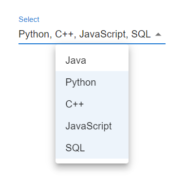
Example
In this example, we have used the select component to handle multiple selections. To handle multiple selections, we have used the "multiple" prop. Here, when the user chooses any option from the given options, the multiple prop will allow selecting one or more selections.
import React from "react";
import { useState } from "react";
import InputLabel from "@mui/material/InputLabel";
import MenuItem from "@mui/material/MenuItem";
import { Box } from "@mui/material";
import FormControl from "@mui/material/FormControl";
import Select from "@mui/material/Select";

const language = ["Java", "Python", "C++", "JavaScript", "SQL"];

const App = () => {
   const [state, setState] = useState([]);

   const handleMultiple = (e) => {
      const {
         target: { value },
      } = e;
      setState(
         typeof value === "string" ? value.split(",") : value
      );
   };

   return (
      <div>
         <Box sx={{ p: 10 }}>
            <FormControl
               variant="standard"
               size="large"
               sx={{ m: 1, minWidth: 120 }}>
               <InputLabel id="select" label="Lang">
                  Select
               </InputLabel>
               <Select
                  multiple
                  value={state}
                  onChange={handleMultiple}>
                  {language.map((lang) => (
                     <MenuItem key={lang} value={lang}>
                        {lang}
                     </MenuItem>
                  ))}
               </Select>
            </FormControl>
         </Box>
      </div>
   );
};

export default App;
Output
Example
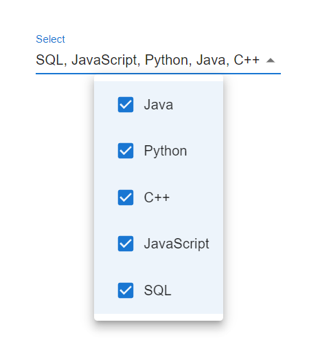
In this example, we have used checkbox in the select component to handle multiple selections. To handle multiple selections, we have used the "multiple" prop. Here, the checkbox input is used to make it more attractive, and when the user chooses any option from the given options, the multiple prop will allow selecting one or more selections.
import React from "react";
import { useState } from "react";
import InputLabel from "@mui/material/InputLabel";
import MenuItem from "@mui/material/MenuItem";
import { Box, Checkbox, ListItemText } from "@mui/material";
import FormControl from "@mui/material/FormControl";
import Select from "@mui/material/Select";

const language = ["Java", "Python", "C++", "JavaScript", "SQL"];

const App = () => {
   const [state, setState] = useState([]);

   const handleMultiple = (e) => {
      const {
         target: { value },
      } = e;
      setState(
         typeof value === "string" ? value.split(",") : value
      );
   };

   return (
      <div>
         <Box sx={{ p: 10 }}>
            <FormControl
               variant="standard"
               size="large"
               sx={{ m: 1, minWidth: 120 }}>
               <InputLabel id="select" label="Lang">
                  Select
               </InputLabel>
               <Select
                  multiple
                  value={state}
                  onChange={handleMultiple}
                  renderValue={(selected) => selected.join(', ')}>
                  {language.map((lang) => (
                     <MenuItem key={lang} value={lang}>
                        <Checkbox checked={language.indexOf(lang) > -1} />
                        <ListItemText primary={lang} />
                     </MenuItem>
                  ))}
               </Select>
            </FormControl>
         </Box>
      </div>
   );
};
export default App;
Output
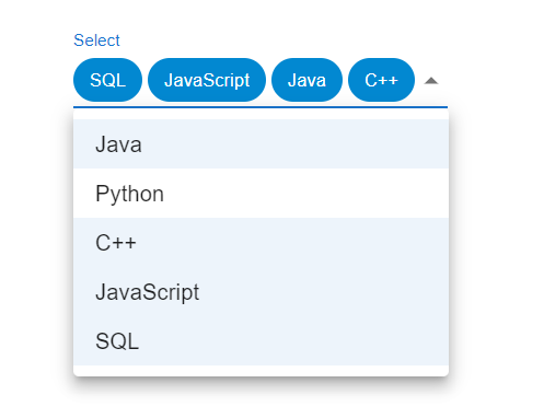
Example
In this example we've utilized the component to manage multiple selections. To cater to the scenario of selections we have employed the "multiple" prop. In this case when a user chooses an option, from the choices the select component renders the prop which displays a chip.
import React from "react";
import { useState } from "react";
import InputLabel from "@mui/material/InputLabel";
import MenuItem from "@mui/material/MenuItem";
import { Box, Chip } from "@mui/material";
import FormControl from "@mui/material/FormControl";
import Select from "@mui/material/Select";

const language = ["Java", "Python", "C++", "JavaScript", "SQL"];

const App = () => {
   const [state, setState] = useState([]);

   const handleMultiple = (e) => {
      const {
         target: { value },
      } = e;
      setState(
         typeof value === "string" ? value.split(",") : value
      );
   };

   return (
      <div>
         <Box sx={{ p: 10 }}>
            <FormControl
               variant="standard"
               size="large"
               sx={{ m: 1, minWidth: 120 }}
               >
               <InputLabel id="select" label="Lang">
                  Select
               </InputLabel>
               <Select
                  multiple
                  value={state}
                  onChange={handleMultiple}
                  renderValue={(selLang) => (
                     <Box sx={{ display: 'flex', flexWrap: 'wrap', gap: 0.5 }}>
                        {selLang.map((value) => (
                           <Chip key={value} color="info" label={value} />
                        ))}
                     </Box>
                  )}
                  >
                  {language.map((lang) => (
                     <MenuItem key={lang} value={lang}>
                        {lang}
                     </MenuItem>
                  ))}
               </Select>
            </FormControl>
         </Box>
      </div>
   );
};
export default App;
Output
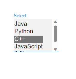
Example
In this example, we have utilized the element to manage multiple selections. To enable selections, we have included the multiple property. The native select element displays a list of options from which the user can choose their option.
import React from "react";
import { useState } from "react";
import InputLabel from "@mui/material/InputLabel";
import { Box, Chip } from "@mui/material";
import FormControl from "@mui/material/FormControl";
import Select from "@mui/material/Select";

const language = ["Java", "Python", "C++", "JavaScript", "SQL"];

const App = () => {
   const [state, setState] = useState([]);

   const handleMultiple = (e) => {
      const {
         target: { value },
      } = e;
      setState(
         typeof value === "string" ? value.split(",") : value
      );
   };

   return (
      <div>
         <Box sx={{ p: 10 }}>
            <FormControl
               variant="standard"
               size="large"
               sx={{ m: 1, minWidth: 120 }}
               >
               <InputLabel id="select" label="Lang">
                  Select
               </InputLabel>
               <Select
                  multiple
                  native
                  value={state}
                  onChange={handleMultiple}
                  renderValue={(selLang) => (
                     <Box sx={{ display: 'flex', flexWrap: 'wrap', gap: 0.5 }}>
                        {selLang.map((value) => (
                           <Chip key={value} color="info" label={value} />
                        ))}
                     </Box>
                  )}
                  >
                  {language.map((lang) => (
                     <option key={lang} value={lang}>
                        {lang}
                     </option>
                  ))}
               </Select>
            </FormControl>
         </Box>
      </div>
   );
};
export default App;
Output
Conclusion
The ability to handle options, in Material UI is a valuable feature that allows users to make multiple choices from a dropdown menu. By utilizing the value property and effectively managing the selected options using state you can easily work with selections, in your React application. Furthermore, you have the flexibility to customize their behavior by setting default choices limiting the number of selections or clearing them as needed.

2K+ Views
