
Article Categories
- All Categories
-
 Data Structure
-
 Networking
-
 RDBMS
RDBMS
-
 Operating System
-
 Java
Java
-
 MS Excel
-
 iOS
iOS
-
 HTML
HTML
-
 CSS
CSS
-
 Android
-
 Python
-
 C Programming
-
 C++
C++
-
 C#
C#
-
 MongoDB
-
 MySQL
MySQL
-
 Javascript
-
 PHP
PHP
-
 Economics & Finance
How to add buttons with icons and labels in Material UI?
If you are developing a React web application, it is likely that the icons will be used. Icons represent the concept, idea, file, program, application, business, and so on. To define the identity of a feature, you can use icons. An appropriate icon can stand in for a program or application when you do not want to write out its name, so that it is easy to identify.
Icons are available in Material UI for use in our applications when building. Icons can also be added with buttons in the Material UI. Now, we?ll be learning how to add buttons with icons and labels in Material UI using different approaches.
Steps to Add Button with Icons and Labels
Below are the complete steps for adding button with icons and labels in Material UI using React
Step 1: Create a New React App and Install MUI
To begin with, we first must have a React app with Material UI installed. Let?s create a new React app and install Mui by running the following command
npx create-react-app myproject
cd myproject
npm install @mui/material @emotion/react @emotion/styled
Step 2: Define a React Component
Now, when the new React app is created, in the src folder there is a main App.js file. Open it, and add the below code
import React from "react";
export default function App() {
   return (
      ?
   )
}
Step 3: Import the Button or IconButton Component
Once, we have defined the new component, it's time to import the button or IconButton component. Below is the syntax for how to import a button group
import Button from "@mui/material/Button";
Or
import IconButton from "@mui/material/IconButton";
Step 4: Split the ButtonGroup Component
<Button aria-label="contained" variant="contained" startIcon={<IconName />}>
   Label
</Button>
Or
<IconButton aria-label="small" size="small">
   <TextIncrease fontSize="small" />
</IconButton>
API
<IconButton> The IconButton API is used to use the Icon buttons with labels in Material UI. It has different props used to modify the icons colors, sizes, etc things.
<Button> The Button API is used to add the buttons in Material UI. It has different props used to modify the icon's colors, sizes, variants, etc things.
Props
startIcon This prop is used to add a starting element before the children like placing an icon before the text label.
color This prop is used to add different colors to the icon including, primary, secondary, success, warning, error, info, etc.
size This prop is used to add different sizes of icons like small, and large.
area-label This prop is used in giving a descriptive label to elements lacking visible text.
fontSize This prop is used to change the font size.
variant This prop is used to check the predefined styles for components, enabling easy customization of their appearance and behavior.
Approach 1: Icon Button with Label
The first approach to adding buttons with icons and labels in Material UI is to use the IconButton component. Frequently, toolbars and app bars contain icon buttons. Icons are also appropriate for toggle buttons that allow a single choice to be selected or deselected, such as adding or removing a star to an item.
Syntax
Below is the syntax for adding an Icon button with labels in Material UI.
<IconButton aria-label="add" color="info">
   <PlusIcon />
</IconButton>
Example
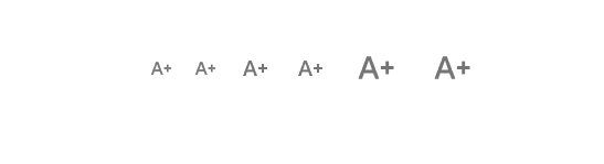
The below example demonstrates the Icon Button in different sizes. There are different sizes one can use to change the Icon button component including small, medium, and large.
import React from "react";
import IconButton from '@mui/material/IconButton';
import { TextIncrease } from "@mui/icons-material";

export default function App() {
   return (
      <>
         <h1>Icon Button</h1>
         <div
            style={{
               display: "flex",
               marginTop: 30,
               flexDirection: "row",
               alignItems: "center",
               justifyContent: "center",
               gap: 10,
            }}>
            <IconButton aria-label="small" size="small">
               <TextIncrease fontSize="small" />
            </IconButton>
            <IconButton aria-label="small" size="small">
               <TextIncrease fontSize="small" />
            </IconButton>
            <IconButton aria-label="default">
               <TextIncrease fontSize="medium" />
            </IconButton>
            <IconButton aria-label="default">
               <TextIncrease fontSize="medium" />
            </IconButton>
            <IconButton aria-label="large" size="large">
               <TextIncrease fontSize="large" />
            </IconButton>
            <IconButton aria-label="large" size="large">
               <TextIncrease fontSize="large" />
            </IconButton>
         </div>
      </>
   );
}
Output
Example
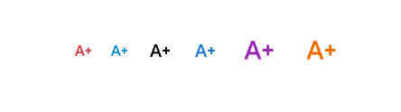
The below example demonstrates the Icon Button in different colors. We can also customize our Icon Button component by adding different colors to buttons which will modify both the icon and text color.
import React from "react";
import IconButton from '@mui/material/IconButton';
import { TextIncrease } from "@mui/icons-material";

export default function App() {
   return (
      <>
         <h1>Icon Button</h1>
         <div
            style={{
               display: "flex",
               marginTop: 30,
               flexDirection: "row",
               alignItems: "center",
               justifyContent: "center",
               gap: 10,
            }}>
            <IconButton aria-label="small" size="small" color="error">
               <TextIncrease fontSize="small" />
            </IconButton>
            <IconButton aria-label="small" size="small" color="info">
               <TextIncrease fontSize="small" />
            </IconButton>
            <IconButton aria-label="default" color="inherit">
               <TextIncrease fontSize="medium" />
            </IconButton>
            <IconButton aria-label="default" color="primary">
               <TextIncrease fontSize="medium" />
            </IconButton>
            <IconButton aria-label="large" size="large" color="secondary">
               <TextIncrease fontSize="large" />
            </IconButton>
            <IconButton aria-label="large" size="large" color="warning">
               <TextIncrease fontSize="large" />
            </IconButton>
         </div>
      </>
   );
}
Output
Approach 2: Button with icons and label
Another approach to adding buttons with icons and labels in Material UI is to use the Button component with the startIcon prop. The startIcon is a node type of prop that is used to place an element before the children like placing an Icon before the text as given below.
Syntax
Below is the syntax for adding buttons with icons and labels in Material UI.
<Button variant="outlined" startIcon={<PlusIcon />}>
   Add
</Button>
Example
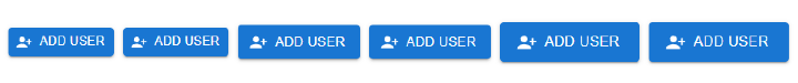
The below example demonstrates the Button with icons and labels in different sizes.
import React from "react";
import Button from "@mui/material/Button";
import PersonAddAlt1Icon from "@mui/icons-material/PersonAddAlt1";

export default function App() {
   return (
      <>
         <h1>Icon Button</h1>
         <div
            style={{
               display: "flex",
               marginTop: 30,
               flexDirection: "row",
               alignItems: "center",
               justifyContent: "center",
               gap: 10,
            }}>
            <Button
               aria-label="contained"
               variant="contained"
               startIcon={<PersonAddAlt1Icon fontSize="small" />}
               size="small">
               Add user
            </Button>
            <Button
               aria-label="contained"
               variant="contained"
               startIcon={<PersonAddAlt1Icon />}
               size="small" >
               Add user
            </Button>
            <Button
               aria-label="contained"
               variant="contained"
               startIcon={<PersonAddAlt1Icon />}>
               Add user
            </Button>
            <Button
               aria-label="contained"
               variant="contained"
               startIcon={<PersonAddAlt1Icon />}>
               Add user
            </Button>
            <Button
               aria-label="contained"
               variant="contained"
               startIcon={<PersonAddAlt1Icon fontSize="large" />}
               size="large">
               Add user
            </Button>
            <Button
               aria-label="contained"
               variant="contained"
               startIcon={<PersonAddAlt1Icon fontSize="large" />}
               size="large">
               Add user
            </Button>
         </div>
      </>
   );
}
Output
Example
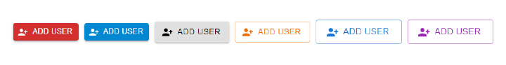
The below example demonstrates the Button with icons and labels in different colors and variants.
import React from "react";
import Button from "@mui/material/Button";
import PersonAddAlt1Icon from "@mui/icons-material/PersonAddAlt1";

export default function App() {
   return (
      <>
         <h1>Icon Button</h1>
         <div
            style={{
               display: "flex",
               marginTop: 30,
               flexDirection: "row",
               alignItems: "center",
               justifyContent: "center",
               gap: 10,
            }} >
            <Button
               aria-label="contained"
               variant="contained"
               startIcon={<PersonAddAlt1Icon fontSize="small" />}
               color="error"
               size="small">
               Add user
            </Button>
            <Button
               aria-label="contained"
               variant="contained"
               startIcon={<PersonAddAlt1Icon />}
               color="info"
               size="small">
               Add user
            </Button>
            <Button
               aria-label="contained"
               variant="contained"
               startIcon={<PersonAddAlt1Icon />}
               color="inherit">
               Add user
            </Button>
            <Button
               aria-label="outline"
               variant="outlined"
               startIcon={<PersonAddAlt1Icon />}
               color="warning">
               Add user
            </Button>
            <Button
               aria-label="outline"
               variant="outlined"
               startIcon={<PersonAddAlt1Icon fontSize="large" />}
               color="primary"
               size="large">
               Add user
            </Button>
            <Button
               aria-label="outline"
               variant="outlined"
               startIcon={<PersonAddAlt1Icon fontSize="large" />}
               size="large"
               color="secondary">
               Add user
            </Button>
         </div>
      </>
   );
}
Output

3K+ Views
