
Article Categories
- All Categories
-
 Data Structure
-
 Networking
-
 RDBMS
RDBMS
-
 Operating System
-
 Java
Java
-
 MS Excel
-
 iOS
iOS
-
 HTML
HTML
-
 CSS
CSS
-
 Android
-
 Python
-
 C Programming
-
 C++
C++
-
 C#
C#
-
 MongoDB
-
 MySQL
MySQL
-
 Javascript
-
 PHP
PHP
-
 Economics & Finance
How to add Icons with TextField using Input Adornments in Material UI?
In this article, we will learn How to add Icons to text fields using input adornments in Material UI. But before we learn adding icons to text-field using input adornments, we must know what input adornments are? Input adornments are nothing but extra text or icons that are added to text fields. These are positioned in three different positions, including prefix, suffix, and action.
InputAdornment API
<InputAdornment> - This API is used to add a prefix, a suffix, or an action to an input element in React MUI.
Props
position This prop is used to set the input adornment position to either the end or start.
children This prop is used to add the children's components and/or the IconButton component.
classes This prop allows you to customize or add styles to the components.
component This prop is used for the root node.
disablePointerEvents This prop is used to disable the pointer events in the root.
disableTypography This prop is used to disable wrapping the typography component if only the child is a string type.
sx This prop is used to add styles in Material UI.
variant This prop is used to add different variants like standard, filled, or outlined.
Steps to Add Icons with TextField
Below are the steps for adding icons along with the input adornments in Material UI, with their respective syntaxes
Step 1: Create a React Application
Before we move further to add icons as input adornments, we must have a React application. To create a new, React app, run the below commands in your terminal
npx create react app sliderproject
Once the project is created, navigate to its directory by running
cd sliderproject
Step 2: Install the material UI
Once you have created the react app, it's time to install the Material UI into the react application. To install MUI, run the following command
npm install @mui/material @emotion/react @emotion/styled
Step 3: Adding Icons with TextField
Now, let?s import and add Icons with textField using the Input adornments. To add adornment in the text fields or normal input components, we use the InputAdornment component from MUI. Below is how the same component is used along with the input component.
<Input
   id="input-with-adorn"
   endAdornment={
      <InputAdornment position="position">
         <IconComponent color="red" />
      </InputAdornment>
   }
/>
Step 4: Run the project
To run the react MUI application, run the below command in the terminal
npm run start
That?s all! Now we have successfully learned the steps to add icons with text fields using the input adornments in MUI.
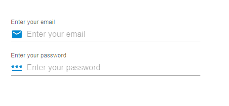
Example
In this example, we have created email and password input fields. Here, we have added the icons with the text field as the prefix input adornments or we can say at the start of the input component.
import React from "react";
import { FormControl, Input, InputAdornment, InputLabel } from "@mui/material";
import { Mail, PasswordOutlined } from "@mui/icons-material";

const App = () => {

   return (
      <div style={{
         padding: 40,
         width: '70%',
         display: 'flex',
         flexDirection: 'column',
         gap: 20
      }}>
         <FormControl variant="standard">
            <InputLabel htmlFor="label-suffix-adornment">
               Enter your email
            </InputLabel>
            <Input
               id="suffix-adornment"
               placeholder="Enter your email"
               startAdornment={
                  <InputAdornment position="start">
                     <Mail color="info" />
                  </InputAdornment>
               }
            />
         </FormControl>
         <FormControl variant="standard">
            <InputLabel htmlFor="label-suffix-adornment">
               Enter your password
            </InputLabel>
            <Input
               id="suffix-adornment"
               placeholder="Enter your password"
               startAdornment={
                  <InputAdornment position="start">
                     <PasswordOutlined color="info" />
                  </InputAdornment>
               }
            />
         </FormControl>
      </div>
   );
};
export default App;
Output
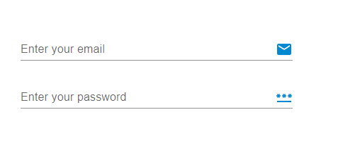
Example
In this example also, we have created email and password input fields. But here, we have added the icons with the text field as the suffix input adornments or we can say at the end of the input component.
import React from "react";
import { FormControl, Input, InputAdornment, InputLabel } from "@mui/material";
import { Mail, PasswordOutlined } from "@mui/icons-material";

const App = () => {

   return (
      <div style={{
         padding: 40,
         width: '70%',
         display: 'flex',
         flexDirection: 'column',
         gap: 20
      }}>
         <FormControl variant="standard">
            <InputLabel htmlFor="label-prefix-adornment">
               Enter your email
            </InputLabel>
            <Input
               id="prefix-adornment"
               placeholder="Enter your email"
               endAdornment={
                  <InputAdornment position="end">
                     <Mail color="info" />
                  </InputAdornment>
               }
            />
         </FormControl>
         <FormControl variant="standard">
            <InputLabel htmlFor="label-prefix-adornment">
               Enter your password
            </InputLabel>
            <Input
               id="prefix-adornment"
               placeholder="Enter your password"
               endAdornment={
                  <InputAdornment position="end">
                     <PasswordOutlined color="info" />
                  </InputAdornment>
               }
            />
         </FormControl>
      </div>
   );
};
export default App;
Output
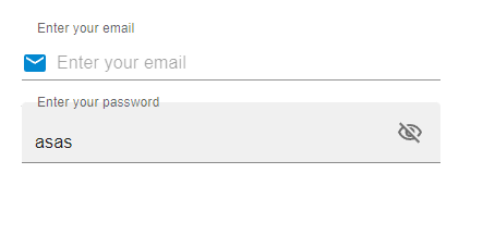
Example
In this example, we have created email and password input fields. But here, we have created an action for the password input field. When the user enters the password into the input field and wants to see the password, the visibility icon in the button allows them to see the password, as it hides or unhides the text from the text field input.
import React from "react";
import { FilledInput, FormControl, IconButton, Input, InputAdornment, InputLabel } from "@mui/material";
import { Mail, VisibilityOffOutlined, VisibilityOutlined } from "@mui/icons-material";
import { useState } from "react";

const App = () => {
   const [psw, setPsw] = useState(false);
   const handleShowPsw = () => setPsw((show) => !show);
   const handleHidePsw = (e) => {
      e.preventDefault();
   };

   return (
      <div style={{
         padding: 40,
         width: '70%',
         display: 'flex',
         flexDirection: 'column',
         gap: 20
      }}>
         <FormControl variant="outlined">
            <InputLabel htmlFor="label-prefix-adornment">
               Enter your email
            </InputLabel>
            <Input
               id="suffix-adornment"
               placeholder="Enter your email"
               startAdornment={
                  <InputAdornment variant="outlined" position="start">
                     <Mail color="info" />
                  </InputAdornment>
               }
            />
         </FormControl>
         <FormControl variant="outlined">
            <InputLabel htmlFor="label-prefix-adornment">
               Enter your password
            </InputLabel>
            <FilledInput
               type={psw ? 'text' : 'password'}
               endAdornment={
                  <InputAdornment position="start">
                     <IconButton
                        onClick={handleShowPsw}
                        onMouseDown={handleHidePsw}
                        edge="end"
                     >
                        {psw ? <VisibilityOffOutlined /> : <VisibilityOutlined />}
                     </IconButton>
                  </InputAdornment>
               }
            />
         </FormControl>
      </div>
   );
};
export default App;
Output
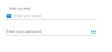
Example
In this example, we have added both a prefix and suffixes to the input text fields. The startAdornment and the endAdornment prop allow the users to add those adornments. Here the icons at the start and at the end work as prefixes and the suffix.
import React from "react";
import { FormControl, Input, InputAdornment, InputLabel } from "@mui/material";
import { Mail, PasswordOutlined } from "@mui/icons-material";

const App = () => {
   return (
      <div style={{
         padding: 40,
         width: '80%',
         display: 'flex',
         flexDirection: 'column',
         gap: 20
      }}>
      <FormControl variant="outlined">
         <InputLabel htmlFor="label-prefix-adornment">
            Enter your email
         </InputLabel>
         <Input
            id="suffix-adornment"
            placeholder="Enter your email"
            startAdornment={
               <InputAdornment variant="outlined" position="start">
                  <Mail color="info" />
               </InputAdornment>
            }
         />
      </FormControl>
      <FormControl variant="standard">
         <InputLabel htmlFor="label-prefix-adornment">
            Enter your password
         </InputLabel>
         <Input
            id="prefix-adornment"
            placeholder="Enter your password"
            endAdornment={
               <InputAdornment position="end">
                  <PasswordOutlined color="info" />
               </InputAdornment>
            }
         />
      </FormControl>
      </div>
   );
};
export default App;
Output
Conclusion
In this article, we have learned the complete step-by-step process to add icons with text fields using the input adornments in MUI. We have seen the API used and its related props to add Icons as input adornments. Apart from this, we have seen multiple examples and their outputs to add icons like adding adornments as a prefix, or suffix, adding actions to the adornments, and using both at the same time. These input adornments help in providing a good user interface and also help the users easily identify what type of input is asked to be filled in the input field.

2K+ Views
