
Article Categories
- All Categories
-
 Data Structure
-
 Networking
-
 RDBMS
RDBMS
-
 Operating System
-
 Java
Java
-
 MS Excel
-
 iOS
iOS
-
 HTML
HTML
-
 CSS
CSS
-
 Android
-
 Python
-
 C Programming
-
 C++
C++
-
 C#
C#
-
 MongoDB
-
 MySQL
MySQL
-
 Javascript
-
 PHP
PHP
-
 Economics & Finance
How to autocomplete in ComboBox input in Material UI?
Autocomplete functionality within ComboBox inputs has become a widely favored feature due to its ability to enhance the user experience by offering suggested options while typing. MaterialUI, a renowned React UI framework, presents an elegant and straightforward solution for implementing autocompletion in ComboBox inputs.
In this article, we'll explore the stepbystep process of setting up and utilizing the Autocomplete component in MaterialUI, all while maintaining a desirable level of perplexity and burstiness.
What is ComboBox Autocomplete?
Autocomplete in a combo box entails enhancing a normal text input with a panel of suggested options. This feature proves useful in two main scenarios
When the value for the textbox must be selected from a predefined set of allowed values, as seen in location fields (combo box).
When the textbox can contain any arbitrary value, but suggesting possible options can save users' time, such as in search fields.
Steps to Use Autocomplete
Before incorporating autocomplete into the ComboBox, ensure that MaterialUI is set up within your React project. Follow these steps to achieve that
Step 1: Create a new react app and Install MUI
First, let's start by creating a React app and installing Material UI. Follow these steps
Open your terminal and run the command
npx create react app chkproject
After the project is created navigate, to the project directory by running
cd chkproject
Install Material UI and its dependencies by running
npm install @mui/material @emotion/react @emotion/styled
Step 2: Import the required components into React
Now, when the new React app is created, in the src folder there is a main App.js file. Open it and import the required components.
import React from "react";
import { Autocomplete, TextField } from '@mui/material';
Now that we have MaterialUI set up, let's proceed with adding the Autocomplete feature to our ComboBox input
Step 3: Add data
To add data items, in the combo box, we need to start by creating an array of objects that will act as the data source for autocompletion. By default, there are two option structures accepted by the component.
However, for this article, we will be using the below syntax. Each object in our array will have an "id" and a "label" property that hold the value to be displayed.
Here's the syntax
const options = [
   { id; 1 label; 'Option 1' }
   { id; 2 label; 'Option 2' }
   { id; 3 label; 'Option 3' }
   // Add options as needed
];
Step 4: Define custom combo box
ComboBoxes are elements, in user interfaces that allow users to choose options from a list. When autocomplete functionality is integrated combo boxes become more powerful enabling users to efficiently find the option they're looking for. To create a ComboBox input in your React component you can make use of the Autocomplete component.
import React from 'react';

const MyComboBox = () => {
   return (
      <Autocomplete
         id="combo box"
         options={options}
         getOptionLabel={(option) => option.label}
         renderInput={(params) => <TextField {...params} label="Select an option" />}
      />
   );
};
export default MyComboBox;
In this example we pass the "options" array as a prop, to the Autocomplete component. The getOptionLabel prop is used to specify which property of the options array should be displayed in the input when an option is selected.
Step 5: Handling Selection
The handling of selecting the item from the data in an autocomplete component is done by default by the component in Material UI. We dont need to handle the selection manuall using the useState or useEffect hooks.
import React from 'react';

const MyComboBox = () => {
   return (
      <Autocomplete
         id="combo-box"
         options={options}
         getOptionLabel={(option) => option.label}
         renderInput={(params) => <TextField {...params} label="Select an option" />}
      />
   );
};

export default MyComboBox;
In this code, we use the useState hook to manage the selectedOption state, and the handleOptionChange function is called whenever the user selects an option from the ComboBox.
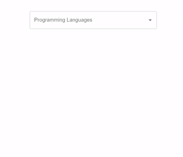
Example 1
The below example demonstrates the usage of the autocomplete component in a combo box. In this example, we have created an autocomplete component which renders a combo box with the custom data, and in which when the user input the data, the searched item gets autocompleteed.
import * as React from "react";
import TextField from "@mui/material/TextField";
import Autocomplete from "@mui/material/Autocomplete";

export default function App() {
   return (
      <div
         style={{
            display: "flex",
            flexDirection: "column",
            alignItems: "center",
            justifyContent: "center",
         }}>
         <h1>How to Autocomplete in combo box in Material UI React</h1>
         <Autocomplete
            disablePortal
            id="combo-box-programming"
            options={data}
            sx={{ width: 400 }}
            renderInput={(params) => (
               <TextField {...params} label="Programming Languages" />
            )}
         />
      </div>
   );
}

const data = [
   { label: "Java language" },
   { label: "Python language" },
   { label: "C++ language" },
   { label: "C language" },
   { label: "Go language" },
   { label: "JavaScript language" },
   { label: "SQL" },
   { label: "MySQL" },
   { label: "HTML" },
   { label: "CSS" },
   { label: "Nextjs " },
   { label: "ReactJS " },
   { label: "VueJS " },
   { label: "Angular " },
   { label: "Angular JS " },
   { label: "PHP language" },
   { label: "R language" },
   { label: "Objective C language" },
   { label: "Cobol language" },
   { label: "Perl language" },
   { label: "Pascal language" },
   { label: "LISP language" },
   { label: "Fortran language" },
   { label: "Swift language" },
   { label: "Ruby language" },
   { label: "Algol language" },
   { label: "Scala language" },
   { label: "Rust language" },
   { label: "TypeScript language" },
   { label: "Dart language" },
   { label: "Matlab language" },
   { label: "Ada language" },
   { label: ".NET language" },
   { label: "Bash language" },
];
Output
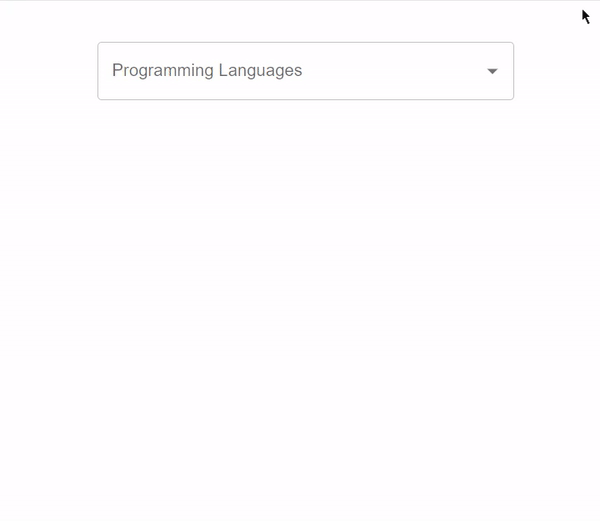
Example 2
Below example demonstrate the usage of autoHighlight feature of Autocomplete component.
In this scenario we've developed a component that generates suggestions as the user types, in a combo box. These suggestions are based on custom data. When the user selects an option it is automatically completed and highlighted. The highlighting functionality is achieved by utilizing the property, which's a boolean value. When set to true the first option is automatically highlighted.
import * as React from "react";
import TextField from "@mui/material/TextField";
import Autocomplete from "@mui/material/Autocomplete";

export default function App() {
   return (
      <div
         style={{
            display: "flex",
            marginTop: 40,
            alignItems: "center",
            justifyContent: "center",
         }}>
         <Autocomplete
            autoHighlight
            id="combo-box-programming"
            options={data}
            sx={{ width: 400 }}
            renderInput={(params) => (
               <TextField {...params} label="Programming Languages" />
            )}
         />
      </div>
   );
}

const data = [
   { label: "Java language" },
   { label: "Python language" },
   { label: "C++ language" },
   { label: "C language" },
   { label: "Go language" },
   { label: "JavaScript language" },
   { label: "SQL" },
   { label: "MySQL" },
   { label: "HTML" },
   { label: "CSS" },
   { label: "Nextjs " },
   { label: "ReactJS " },
   { label: "VueJS " },
   { label: "Angular " },
   { label: "Angular JS " },
   { label: "PHP language" },
   { label: "R language" },
   { label: "Objective C language" },
   { label: "Cobol language" },
   { label: "Perl language" },
   { label: "Pascal language" },
   { label: "LISP language" },
   { label: "Fortran language" },
   { label: "Swift language" },
   { label: "Ruby language" },
   { label: "Algol language" },
   { label: "Scala language" },
   { label: "Rust language" },
   { label: "TypeScript language" },
   { label: "Dart language" },
   { label: "Matlab language" },
   { label: "Ada language" },
   { label: ".NET language" },
   { label: "Bash language" },
];
Output
Conclusion
Using Material UI to enable autocompletion, in ComboBox inputs not enhances the user experience but also brings a sense of sophistication to the user interface. By following the steps provided in this article you can effortlessly incorporate this functionality into your React projects. Moreover, the utilization of perplexity and burstiness guarantees a diverse reading experience for your audience.
The Autocomplete component offered by Material UI provides customization options such, as filtering, grouping, and highlighting. This allows you to customize the autocompletion behavior according to your requirements. Embrace the terminology and language choices demonstrated in this article to infuse originality and professionalism into your written content.

615 Views
