
Article Categories
- All Categories
-
 Data Structure
-
 Networking
-
 RDBMS
RDBMS
-
 Operating System
-
 Java
Java
-
 MS Excel
-
 iOS
iOS
-
 HTML
HTML
-
 CSS
CSS
-
 Android
-
 Python
-
 C Programming
-
 C++
C++
-
 C#
C#
-
 MongoDB
-
 MySQL
MySQL
-
 Javascript
-
 PHP
PHP
-
 Economics & Finance
How to display labels on hover of the Rating component in Material UI?
Material UI is a React UI framework that offers a range of components, for creating modern and user-friendly interfaces. One of its components is the Rating component, which is commonly utilized for collecting user feedback and displaying ratings for products or services.
While the Rating component showcases stars (or any other icon) to represent the rating value, it can be advantageous to enhance the user experience by providing information through labels that appear when users hover over the stars.
In this article, we will learn how to display the labels on hover in a rating component in Material UI.
Steps to Display Labels in Ratings
Below, we have outlined the complete steps to add labels to the rating component
Step 1: Create a new react app and Install MUI
First, let's start by creating a React app and installing Material UI. Follow these steps
Open your terminal and run the command
npx create react app projectname
After the project is created, navigate to the project directory by running
cd projectname
Install Material UI and its dependencies by running
npm install @mui/material @emotion/react @emotion/styled
Step 2: Import the Required Components into React
Open the App component and import the required components to it.
import { Rating } from '@mui/material
Step 3: Add Labels on hover
To add labels on hover, use the onChangeActive and getLabelText props. The syntax of usage of both is given below
//define labels
const labels = {
   1: Poor,
   2: Good,
   ?
}

//get ratings to display along with the rating stars
function getRatings(val) {
   return `${val} Star${val !== 1 ? "s" : ""}, ${labels[val]}`;
}

// define the states
const [val, setVal] = useState(2);
const [hover, setHover] = useState(-1);

//use in App() component
<div>
   <Rating
      precision={0.5}
      value={val}
      getLabelText={getRatings}
      onChange={(event, newValue) => {
         setVal(newValue);
      }}
      onChangeActive={(event, newHover) => {
         setHover(newHover);
      }}
      emptyIcon={<StarIcon style={{ opacity: 0.40 }} fontSize="inherit" />}
   />
   {val !== null && (
      <Typography>{ratingLabels[hover !== -1 ? hover : val]}</Typography>
   )}
</div>
Rating API
<Rating> This API is used to allow the user to submit a rating of their own in Material UI.
Props
classes This prop is used to override or add styles to an element.
disabled This prop is used to disable rating.
emptyIcon This prop displays an icon when empty
emptyLabelText This prop is used read the label when empty.
getLabelText This prop is used to get the current rating value.
highlightSelectedOnly This prop is used to highlight selected icon
icon This prop is used to show icons.
IconContainerComponent This prop contains icons.
max This prop is used to give a max rating.
name This prop is used to add a rating name.
onChange This prop is used to trigger a callback function when an input is changed.
onChangeActive This defines the change in the rating state on hover.
precision This prop is used to add rating precision.
size This prop is used to change the size.
sx This prop is used to add custom styles to the material UI components.
value This prop is used to give a value to the component.
Example
In this example, we have created a basic rating component with a label. The rating component has a precision of 1 which on hover displays the label according to the rating level chosen. To demonstrate and display the labels, we have used the onChangeActive prop of the rating API component.
import { Box, Rating, Typography } from "@mui/material";
import React from "react";
import StarIcon from "@mui/icons-material/Star";
import { useState } from "react";

const ratingLabels = {
   1: "Useless",
   2: "Poor",
   3: "Ok",
   4: "Good",
   5: "Excellent",
};

function getRatings(val) {
   return `${val} Star${val !== 1 ? "s" : ""}, ${ratingLabels[val]}`;
}

const App = () => {
   const [val, setVal] = useState(2);
   const [hover, setHover] = useState(-1);

   return (
      <div>
         <Box sx={{p: 10}}>
            <Rating
               precision={1}
               value={val}
               name="hover-ratings"
               getLabelText={getRatings}
               onChange={(event, newValue) => {
                  setVal(newValue);
               }}
               onChangeActive={(event, newHover) => {
                  setHover(newHover);
               }}
               sx={{fontSize: 40}}
               emptyIcon={<StarIcon style={{ opacity: 0.40 }} fontSize="inherit" />}
            />
            {val !== null && (
               <Typography sx={{ fontSize: 20, color: 'green' }}>{ratingLabels[hover !== -1 ? hover : val]}</Typography>
            )}
         </Box>
      </div>
   );
};
export default App;
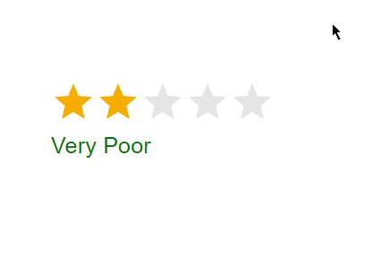
Output

Example
In this example, we have created another rating component with a label. The rating component has a precision of 0.5 which on hover displays the label according to the rating level chosen. The difference between the above example and this one is that, it allows the users to choose the rating in half as displayed in the below example. Here, also to demonstrate and display the labels, we have used the onChangeActive prop of the rating API component.
import { Box, Rating, Typography } from "@mui/material";
import React from "react";
import StarIcon from "@mui/icons-material/Star";
import { useState } from "react";

const ratingLabels = {
   0.5: 'Useless',
   1: 'Very Useless',
   1.5: 'Poor',
   2: 'Very Poor',
   2.5: 'Ok',
   3: 'Very Ok',
   3.5: 'Good',
   4: 'Very Good',
   4.5: 'Excellent',
   5: 'Very Excellent',
};

function getRatings(val) {
   return `${val} Star${val !== 1 ? "s" : ""}, ${ratingLabels[val]}`;
}

const App = () => {
   const [val, setVal] = useState(2);
   const [hover, setHover] = useState(-1);

   return (
      <div>
         <Box sx={{p: 10}}>
            <Rating
               precision={0.5}
               value={val}
               name="hover-ratings"
               getLabelText={getRatings}
               onChange={(event, newValue) => {
                  setVal(newValue);
               }}
               onChangeActive={(event, newHover) => {
                  setHover(newHover);
               }}
               sx={{fontSize: 40}}
               emptyIcon={<StarIcon style={{ opacity: 0.40 }} fontSize="inherit" />}
            />
            {val !== null && (
               <Typography sx={{ fontSize: 20, color: 'green' }}>{ratingLabels[hover !== -1 ? hover : val]}</Typography>
            )}
         </Box>
      </div>
   );
};
export default App;
Output
Example
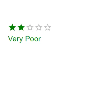
In this example, we have customized the rating component along with a label. The rating component has a precision of 0.5, which on hover displays the label according to the rating level chosen. In this code, we have changed the color and font size of the rating component and the label to make them more attractive or custom. We have used the onChangeActive prop of the rating API component.
import { Box, Rating, Typography } from "@mui/material";
import React from "react";
import StarIcon from "@mui/icons-material/Star";
import { useState } from "react";

import {styled} from '@mui/material/styles'

const ratingLabels = {
   0.5: "Useless",
   1: "Very Useless",
   1.5: "Poor",
   2: "Very Poor",
   2.5: "Ok",
   3: "Very Ok",
   3.5: "Good",
   4: "Very Good",
   4.5: "Excellent",
   5: "Very Excellent",
};

function getRatings(val) {
   return `${val} Star${val !== 1 ? "s" : ""}, ${ratingLabels[val]}`;
}

const CustomRating = styled(Rating)({
   '& .MuiRating-iconFilled': {
      color: 'green'
   },
   '& .MuiRating': {
      fontSize: 40
   },
});

const App = () => {
   const [val, setVal] = useState(2);
   const [hover, setHover] = useState(-1);

   return (
      <div>
         <Box sx={{ p: 10 }}>
            <CustomRating
               precision={0.5}
               value={val}
               name="hover-ratings"
               getLabelText={getRatings}
               onChange={(event, newValue) => {
                  setVal(newValue);
               }}
               onChangeActive={(event, newHover) => {
                  setHover(newHover);
               }}
            />
            {val !== null && (
               <Typography sx={{ fontSize: 20, color: "green" }}>
                  {ratingLabels[hover !== -1 ? hover : val]}
               </Typography>
            )}
         </Box>
      </div>
   );
};
export default App;
Output
Conclusion
In this example, we have learned how to display the labels when hovering over the rating component. The steps are laid out in the article along with their proper syntax and complete examples with different approaches. Apart from this, to customize the appearance and behavior of the component, Material UI allows to customize the rating component according to the application's needs. With the power of Material UI and React, you can create engaging and user-friendly interfaces with ease.

584 Views
