
Article Categories
- All Categories
-
 Data Structure
-
 Networking
-
 RDBMS
RDBMS
-
 Operating System
-
 Java
Java
-
 MS Excel
-
 iOS
iOS
-
 HTML
HTML
-
 CSS
CSS
-
 Android
-
 Python
-
 C Programming
-
 C++
C++
-
 C#
C#
-
 MongoDB
-
 MySQL
MySQL
-
 Javascript
-
 PHP
PHP
-
 Economics & Finance
Selected Reading
Create bar plot for grouped data of two columns in base R.
To create bar plot for grouped data in base R, we can create the table for both the columns and then use beside argument of barplot function to create the bar plot. To differentiate between the bars, we need to set legend argument to TRUE as well. To understand how it can be done check out the below Example.
Example
Following snippet creates a sample data frame −
G<-sample(c("Male","Female"),20,replace=TRUE)
Glucose<-sample(c("Low","Medium","High"),20,replace=TRUE)
df<-data.frame(G,Glucose)
df
The following dataframe is created
     G    Glucose
1  Female High
2  Female Medium
3  Male   Medium
4  Male   High
5  Female Low
6  Female Medium
7  Male   Medium
8  Male   Medium
9  Female High
10 Female High
11 Female High
12 Male   High
13 Female Medium
14 Male   Medium
15 Female High
16 Female Medium
17 Male   High
18 Female Medium
19 Female Medium
20 Female Low
To create table for columns in df on the above created data frame, add the following code to the above snippet −
G<-sample(c("Male","Female"),20,replace=TRUE)
Glucose<-sample(c("Low","Medium","High"),20,replace=TRUE)
df<-data.frame(G,Glucose)
Table<-with(df,table(Glucose,G))
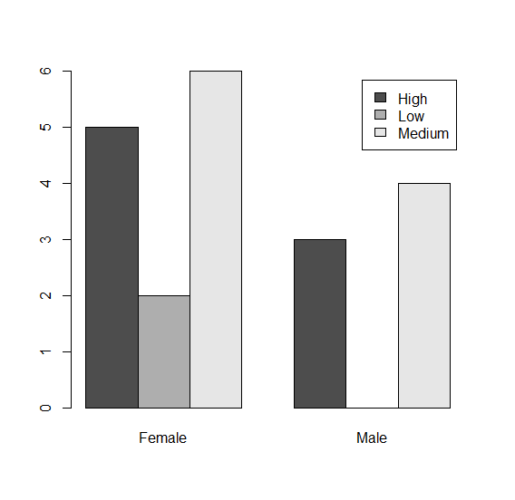
To create bar plot for both columns in df on the above created data frame, add the following code to the above snippet −
G<-sample(c("Male","Female"),20,replace=TRUE)
Glucose<-sample(c("Low","Medium","High"),20,replace=TRUE)
df<-data.frame(G,Glucose)
Table<-with(df,table(Glucose,G))
barplot(Table,beside=TRUE,legend=TRUE)
Output
If you execute all the above given snippets as a single program, it generates the following Output −

Updated on: 2021-11-03T10:02:16+05:30
4K+ Views

Advertisements