
Article Categories
- All Categories
-
 Data Structure
-
 Networking
-
 RDBMS
RDBMS
-
 Operating System
-
 Java
Java
-
 MS Excel
-
 iOS
iOS
-
 HTML
HTML
-
 CSS
CSS
-
 Android
-
 Python
-
 C Programming
-
 C++
C++
-
 C#
C#
-
 MongoDB
-
 MySQL
MySQL
-
 Javascript
-
 PHP
PHP
-
 Economics & Finance
Selected Reading
How to create a plot with tick marks between X-axis labels in base R?
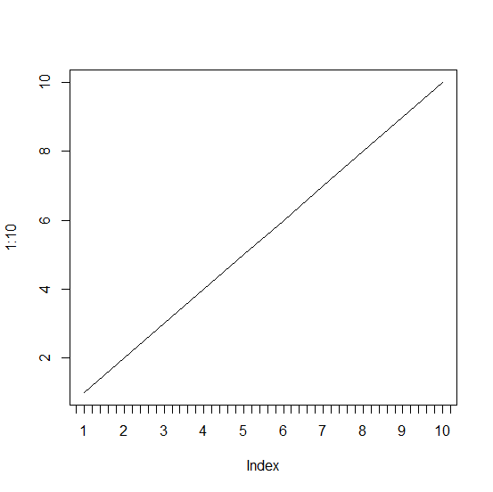
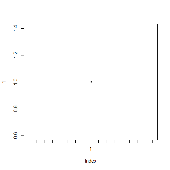
To create a plot with tick marks manually between X-axis values in base R, we first need to create the plot without X-axis labels then add the axis values using axis function with appropriate labels, this will create tick marks as well as labels. After this step, we would need to use the axis function again to add the tick marks without labels.
Example
plot(1:10,xaxt='n',type="l")
axis(1,at=1:10)
axis(1,at=seq(0,11,0.2),labels=NA)
Output
Example
plot(1,xaxt='n')
axis(1,at=1)
axis(1,at=seq(0,2,0.05),labels=NA)
Output

Updated on: 2026-03-11T22:50:54+05:30
4K+ Views

Advertisements