
Article Categories
- All Categories
-
 Data Structure
-
 Networking
-
 RDBMS
RDBMS
-
 Operating System
-
 Java
Java
-
 MS Excel
-
 iOS
iOS
-
 HTML
HTML
-
 CSS
CSS
-
 Android
-
 Python
-
 C Programming
-
 C++
C++
-
 C#
C#
-
 MongoDB
-
 MySQL
MySQL
-
 Javascript
-
 PHP
PHP
-
 Economics & Finance
Selected Reading
How to create a graph in R using ggplot2 with all the four quadrants?
The default graph created by using ggplot2 package shows the axes labels depending on the starting and ending values of the column of the data frame or vector but we might want to visualize it just like we do in paper form of graphs that shows all of the four quadrants. This can be done by using xlim, ylim, geom_hline, and geom_vline functions with ggplot function of ggplot2 package.
Consider the below data frame −
Example
x<-1:5
y<-5:1
df<-data.frame(x,y)
df
Output
  x y
1 1 5
2 2 4
3 3 3
4 4 2
5 5 1
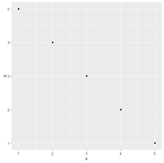
Loading ggplot2 package and creating point chart between x and y−
Example
library(ggplot2) ggplot(df,aes(x,y))+geom_point()
Output
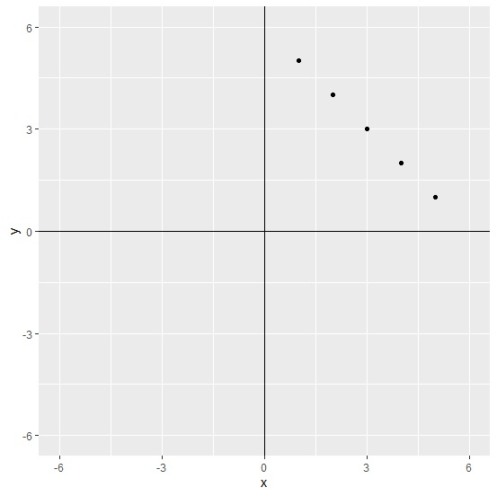
Creating point chart between x and y by showing all four quadrants −
Example
ggplot(df,aes(x,y))+geom_point()+xlim(-6,6)+ylim(-6,6)+geom_hline(yintercept=0)+geom_vline(xintercept=0)
Output

Updated on: 2026-03-11T22:50:52+05:30
3K+ Views

Advertisements