
Article Categories
- All Categories
-
 Data Structure
-
 Networking
-
 RDBMS
RDBMS
-
 Operating System
-
 Java
Java
-
 MS Excel
-
 iOS
iOS
-
 HTML
HTML
-
 CSS
CSS
-
 Android
-
 Python
-
 C Programming
-
 C++
C++
-
 C#
C#
-
 MongoDB
-
 MySQL
MySQL
-
 Javascript
-
 PHP
PHP
-
 Economics & Finance
How to Create a Circle Within Circle Chart in Excel?
Circle charts, also known as bubble charts, are a great way to visualize data that involves two sets of values. By creating a circle within circle chart, you can effectively represent and compare multiple data points within a single chart. In this tutorial, we will walk you through the step-by-step process of creating a circle within circle chart in Excel. Whether you are a beginner or have some experience with Excel, this tutorial will provide you with the necessary guidance to create visually appealing and informative circle charts.
To make your chart more comprehensible, you will learn how to alter the chart's features, change the circles' size and appearance, and add labels. By the time you finish this video, you will be able to use Excel to make stunning circle within circle charts that will help you convey and evaluate your data successfully. So let's get going and explore the world of Excel circle charts!
Create a Circle Within Circle Chart
Here we will first make changes to the source data, then create an empty bubble chart, and then add the data to the chart to complete the task. So let us see a simple process to learn how you can create a circle within a circle chart in Excel.
Step 1
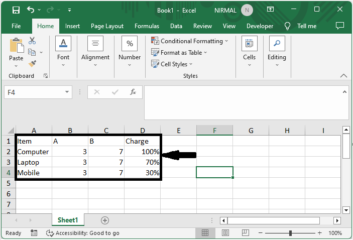
Consider an Excel sheet where the data in the sheet is similar to the below image.
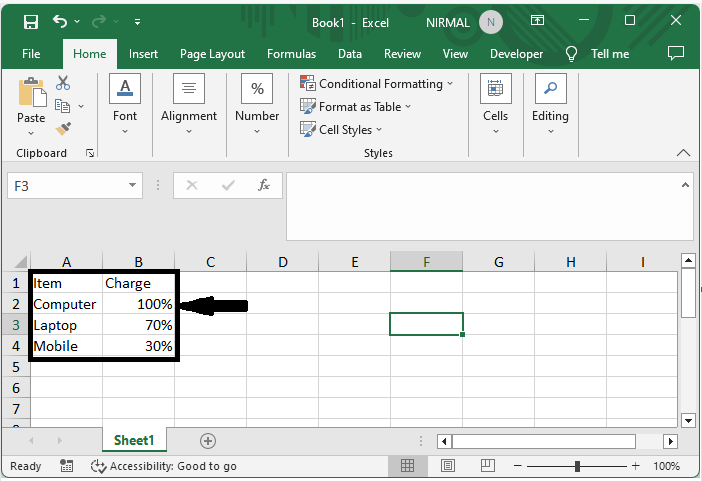
First, add two new columns with the same values in the whole column.
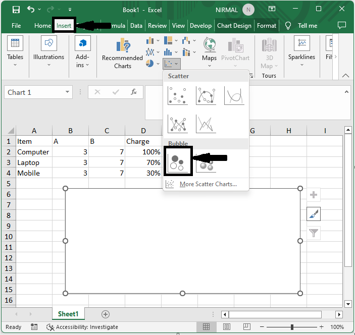
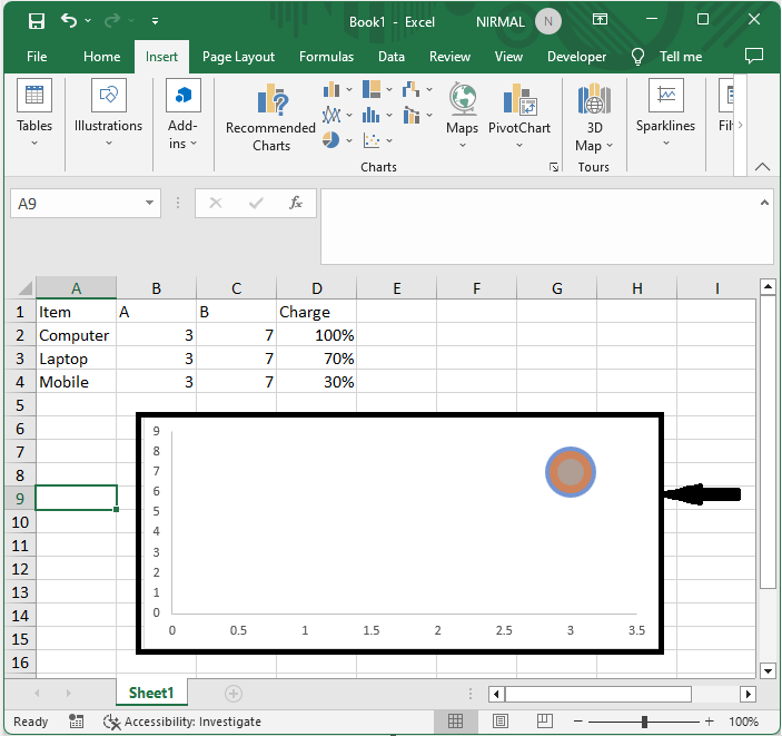
Step 2
Then click on Insert and select the bubble chart without selecting any data.
Insert > Bubble Chart.
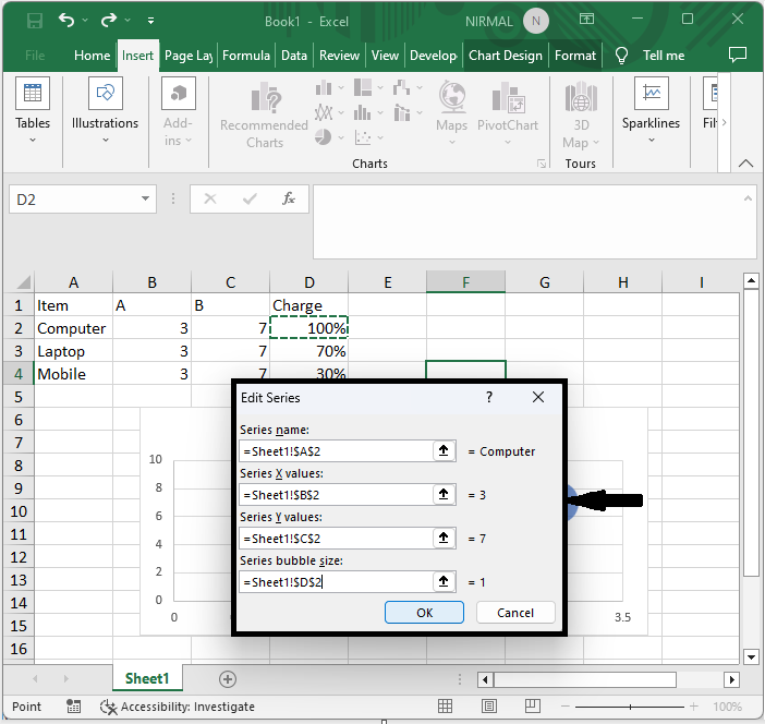
Step 3
Then right-click on the chart and click on select data, then add under legend entries, and make the below changes.
Specify the first product as the series name.
Specify the first value in the X column as the Series X value.
Specify the first value in the Y column as Series Y values.
Specify the first percentage as the series bubble size.
Click the OK button.
Step 4
Then repeat the above step for all the items.
Step 5
Then click on the grid lines and click Delete.
Then you will see that a circle will be created within a circle chart.
Conclusion
In this tutorial, we have used a simple example to demonstrate how you can create a circle within a circle chart in Excel to highlight a particular set of data.

2K+ Views
