
Article Categories
- All Categories
-
 Data Structure
-
 Networking
-
 RDBMS
RDBMS
-
 Operating System
-
 Java
Java
-
 MS Excel
-
 iOS
iOS
-
 HTML
HTML
-
 CSS
CSS
-
 Android
-
 Python
-
 C Programming
-
 C++
C++
-
 C#
C#
-
 MongoDB
-
 MySQL
MySQL
-
 Javascript
-
 PHP
PHP
-
 Economics & Finance
How to control Badge visibility in Material UI?
Badges play an important role in designing a web UI, whether you are building a social media site, a messaging app, or anything else that requires the use of badges. Material UI provides an easy way to accomplish this task with just one component called the Badge API.
So, in this article, we are going to learn how to control Badge visibility in the Material UI.
But before we dive into the steps of controlling badge visibility in MUI, let?s first understand what exactly a badge is.
What is a Badge?
A badge is a small element that is attached mostly at the top-right of a component called a child component. The badge may contain a number, text, or simply a dot. In React MUI, these badges can also be controlled, like when they should be displayed, what to display, incrementing the text, etc.
Badge API
The BadgeAPI is utilized to add a badge to different components of React MUI. It comes with props
anchorOrigin This prop defines the anchor of the badge component.
badgeContent To render the content of the badge, the badgeContent prop is used.
children We can use the "children" prop to add any desired content within the badge.
classes The classes prop is used to override the styles of the component.
color The color prop allows to customize the badge colors.
component This renders the component for the root in the badge.
components This renders the other badge components inside the badge or root component.
componentsProps These are the props of badge components.
Invisible To make the badge invisible, use this prop.
max It shows the maximum number of counts in a badge. The max value is 99.
overlap It allows the badge to overlap.
showZero When the count is 0, this prop is used for value control.
slotProps The other props of the slot are rendered using this prop.
slots These are the components used for each slot inside the badge.
sx To add custom styles to this component, utilize the "sx" prop.
variant To add different variants of the badges, the variant prop is used.
Steps required to control badge visibility
Below are the steps for controlling the badge's visibility in Material UI
Step 1: Create a react application
The very first step to controlling badge visibility in MUI is to create a react application. To create a new React app, run the below commands in your terminal
npx create react app badgeproject
Once the project is created, navigate to its directory by running
cd badgeproject
Step 2: Add MUI to React
Once you have created the react app, it's time to install the Material UI into the react application. To install MUI, run the following command
npm install @mui/material @emotion/react @emotion/styled
Step 3: Creating a Badge
To add or create a badge, we use the <Badge> component. Below is the syntax for the same
//To make the badge visible
<Badge badgeContent={count}>
   <IconName />
</Badge>

//To hide the badge
<Badge badgeContent={1} showZero>
   <IconName />
</Badge>
Example
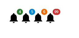
This is a very basic example showing different badges with different colors and values. In the badge component, we can only have a max value of 99 as shown in the last icon of below output.
import React from "react";
import { Badge } from "@mui/material";
import Notification from "@mui/icons-material/Notifications";

const App = () => {
   return (
      <div style={{padding: 40,gap: 40,}}>
         <Badge badgeContent={4} color="success">
            <Notification sx={{ fontSize: 40 }} />
         </Badge>
         <Badge badgeContent={5} color="info">
            <Notification sx={{ fontSize: 40 }} />
         </Badge>
         <Badge badgeContent={6} color="warning">
            <Notification sx={{ fontSize: 40 }} />
         </Badge>
         <Badge badgeContent={99} color="error">
            <Notification sx={{ fontSize: 40 }} />
         </Badge>
      </div>
   );
};

export default App;
Output
Example
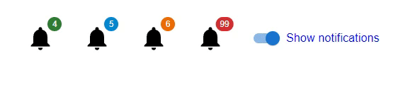
In this example, we have created different icons that show the badges. Here, the badges are displayed when the user selects the switch button.
import React from "react";
import { Badge, FormControlLabel, Switch } from "@mui/material";
import Notification from "@mui/icons-material/Notifications";
import { useState } from "react";

const App = () => {
   const [visibility, setVisibility] = useState(false);
   const handleBadgeVisibility = () => {
      setVisibility(!visibility);
   };
   return (
      <div style={{padding: 40, gap: 40, display: 'flex', flexDirection: 'row'}}>
         <Badge badgeContent={4} color="success" invisible={visibility}>
            <Notification sx={{ fontSize: 40 }} />
         </Badge>
         <Badge badgeContent={5} color="info" invisible={visibility}>
            <Notification sx={{ fontSize: 40 }} />
         </Badge>
         <Badge badgeContent={6} color="warning" invisible={visibility}>
            <Notification sx={{ fontSize: 40 }} />
         </Badge>
         <Badge badgeContent={99} color="error" invisible={visibility}>
            <Notification sx={{ fontSize: 40 }} />
         </Badge>
         <FormControlLabel
            sx={{ color: 'blue' }}
            control={<Switch checked={!visibility} onChange={handleBadgeVisibility} />}
            label="Show notifications"
         />
      </div>
   );
};

export default App;
Output
Example
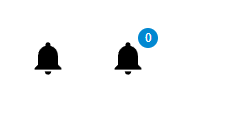
In this example, we have created a badge that has no value in MUI React. Here, in the first icon, there is no badge as the badgeCount is set with a value of 0 whereas in the second icon, the badge has a 0 value. Here you will notice a change in that we have used the showZero prop to display the badge with the 0 value as well.
import React from "react";
import { Badge } from "@mui/material";
import Notification from "@mui/icons-material/Notifications";
const App = () => {
   return (
      <div
         style={{
            padding: 40,
            gap: 40,
            display: 'flex',
            flexDirection: 'row'
         }}>
         <Badge badgeContent={0} color="success">
            <Notification sx={{ fontSize: 40 }} />
         </Badge>
         <Badge badgeContent={0} color="info" showZero={true}>
            <Notification sx={{ fontSize: 40 }} />
         </Badge>
      </div>
   );
};
export default App;
Output
Example
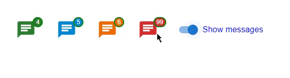
In this example, we have created a custom badge using the &. MuiBadge-badge property is available in MUI React. Here, we have also created a custom function using react state with the help of a switch, which, when selected, makes the badge visible. Here the badges are customized using different properties like background color, border, padding, etc.
import React from "react";
import { Badge, FormControlLabel, Switch } from "@mui/material";
import {styled} from "@mui/material/styles";
import { useState } from "react";
import { Chat } from "@mui/icons-material";

const MyCustomBadge = styled(Badge)(() => ({
   '& .MuiBadge-badge': {
      right: -3,
      top: 5,
      border: `2px solid green`,
      padding: '0 4px',
   },
}));

const App = () => {
   const [visibility, setVisibility] = useState(false);

   const handleBadgeVisibility = () => {
      setVisibility(!visibility);
   };

   return (
      <div
         style={{
            padding: 40,
            gap: 40,
            display: 'flex',
            flexDirection: 'row'
         }}>
         <MyCustomBadge badgeContent={4} color="success" invisible={visibility}>
            <Chat sx={{ fontSize: 40 }} color="success" />
         </MyCustomBadge>
         <MyCustomBadge badgeContent={5} color="info" invisible={visibility}>
            <Chat sx={{ fontSize: 40 }} color="info" />
         </MyCustomBadge>
         <MyCustomBadge badgeContent={6} color="warning" invisible={visibility}>
            <Chat sx={{ fontSize: 40 }} color="warning" />
         </MyCustomBadge>
         <MyCustomBadge badgeContent={99} color="error" invisible={visibility}>
            <Chat sx={{ fontSize: 40 }} color="error" />
         </MyCustomBadge>
         <FormControlLabel
            sx={{ color: 'blue' }}
            control={<Switch checked={!visibility} onChange={handleBadgeVisibility} />}
            label="Show messages"
         />
      </div>
   );
};
export default App;
Output
Conclusion
In this article, we have learned the complete process of controlling badge visibility using MUI in React. We have seen the complete steps to control the badge visibility and also seen the props used by the Badge API. Different examples with different approaches have also been discussed in the article for a better understanding of the complete process.

224 Views
