
Article Categories
- All Categories
-
 Data Structure
-
 Networking
-
 RDBMS
RDBMS
-
 Operating System
-
 Java
Java
-
 MS Excel
-
 iOS
iOS
-
 HTML
HTML
-
 CSS
CSS
-
 Android
-
 Python
-
 C Programming
-
 C++
C++
-
 C#
C#
-
 MongoDB
-
 MySQL
MySQL
-
 Javascript
-
 PHP
PHP
How to group checkboxes in Material UI?
Material UI is a React component library that provides a wide range of pre designed and customizable UI components. When it comes to creating forms or applications that require users to choose items from a menu of options, checkboxes play a role, as an essential UI component.
In this article, we are going to learn how to group checkboxes in Material UI. Grouping of checkboxes helps in various terms like getting a better user experience, a great user interface, managing multiple selections, etc.
Creating a React project and adding the Material UI to it are prerequisites before continuing with the article. Let us begin and see how to set the indeterminate state in its entirety.
Steps for grouping checkboxes
To group checkboxes, you can organize them together to enhance their appeal and improve the overall user experience. Grouping allows users to select one or more options from a category, making it easier for them to understand and make their choices. Below, we have outlined the step, by step process for grouping checkboxes in Material UI using React.
Step 1: Create a new react app and Install MUI
First, let's start by creating a React app and installing Material UI. Follow these steps
Open your terminal and run the command
npx create react app chkproject
After the project is created navigate, to the project directory by running
cd chkproject
Install Material UI and its dependencies by running
npm install @mui/material @emotion/react @emotion/styled
Step 2: Import the required components into React
Now, when the new React app is created, in the src folder there is a main App.js file. Open it and import the required components.
import React from "react";
import { FormControlLabel, Checkbox } from '@mui/material
Step 3: Define the states
Now, we first need to define the states for managing the multiple checkbox selections.
const [state, setState] = useState({
   state1: false,
   state2: false,
   state3: false,
});
Step 4: Create a function
Next, we need to create a function to handle the changes to checkboxes.
const handleGrouping = (e) => {
   setState({
      ...state,
      [e.target.name]: e.target.checked,
   });
};
Now we have gone through all the steps, to group checkboxes with the assistance of Material UI in React. Let's explore some examples that illustrate approaches to achieving this.
FormGroup API
The <FormGroup> API serves as a container, for checkboxes allowing us to group selection control components.
Props
classes This prop allows for overriding or adding styles to an element.
children This prop defines the content or children of the checkbox component.
sx Use this prop to apply custom styles to Material UI components
row By using this prop you can compactly arrange the checkbox elements in a row.
Example
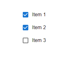
In this example, we have grouped the three basic checkboxes using the FormGroup component. Here, the labels of checkboxes are also added using the FormContolLabel component that renders the checkbox too.
import { FormControlLabel, FormGroup } from "@mui/material";
import Checkbox from "@mui/material/Checkbox";
import React from "react";

export default function App() {

   return (
      <div
         style={{
            display: "flex",
            marginTop: 30,
            flexDirection: "column",
            alignItems: "center",
            justifyContent: "center",
            gap: 10,
         }}>
         <FormGroup>
            <FormControlLabel
               control={<Checkbox />}
               label="Item 1"
               color="success"
            />
            <FormControlLabel
               control={<Checkbox />}
               label="Item 2"
               color="success"
            />
            <FormControlLabel
               control={<Checkbox />}
               label="Item 3"
               color="success"
            />
         </FormGroup>
      </div>
   );
}
Output
Example
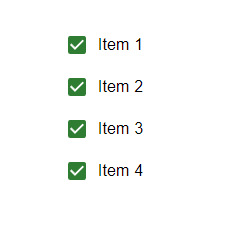
In this example, we've organized the four checkboxes by utilizing the FormGroup component. Additionally we've incorporated the FormContolLabel component to include labels, for each checkbox. By implementing this code whenever a user interacts with these checkboxes by clicking on them their checked status will alter accordingly. Update the checkedItems state. When a checkbox is selected its corresponding value, within the state will be marked as true. When its deselected it will be marked as false.
import { FormControlLabel, FormGroup } from "@mui/material";
import Checkbox from "@mui/material/Checkbox";
import React from "react";

export default function App() {
   const [state, setState] = React.useState({
      chkItemOne: false,
      chkItemTwo: false,
      chkItemThree: false,
      chkItemFour: false,
   });

   const handleGrouping = (e) => {
      setState({
         ...state,
         [e.target.name]: e.target.checked,
      });
   };

   return (
      <div
         style={{
            display: "flex",
            marginTop: 30,
            flexDirection: "column",
            alignItems: "center",
            justifyContent: "center",
            gap: 10,
         }}>
         <FormGroup>
            <FormControlLabel
               control={<Checkbox color="success" />}
               label="Item 1"
               checked={state.chkItemOne}
               onChange={handleGrouping}
               name="chkItemOne"
            />
            <FormControlLabel
               control={<Checkbox color="success" />}
               label="Item 2"
               checked={state.chkItemTwo}
               onChange={handleGrouping}
               name="chkItemTwo"
            />
            <FormControlLabel
               control={<Checkbox color="success" />}
               label="Item 3"
               checked={state.chkItemThree}
               onChange={handleGrouping}
               name="chkItemThree"
            />
            <FormControlLabel
               control={<Checkbox color="success" />}
               label="Item 4"
               checked={state.chkItemFour}
               onChange={handleGrouping}
               name="chkItemFour"
            />
         </FormGroup>
      </div>
   );
}
Output
Example
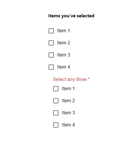
In this example, we have created two groups of four checkboxes each using the FormGroup component. The code provided consists of two groups. The first group displays the selected items while the second group requires the user to choose three items. As the user checks or unchecks items the state of the selection is updated accordingly. However, if the user fails to select three items in the group an error message will be displayed.
import { FormControl, FormControlLabel, FormGroup, FormLabel } from "@mui/material";
import Checkbox from "@mui/material/Checkbox";
import React from "react";

export default function App() {
   const [state, setState] = React.useState({
      chkItemOne: false,
      chkItemTwo: false,
      chkItemThree: false,
      chkItemFour: false,
   });

   const handleGrouping = (e) => {
      setState({
         ...state,
         [e.target.name]: e.target.checked,
      });
   };

   const { chkItemOne, chkItemTwo, chkItemThree, chkItemFour } = state;
   const showError = [chkItemOne, chkItemTwo, chkItemThree, chkItemFour ].filter((v) => v).length !== 3;

   return (
      <div
         style={{
            display: "flex",
            marginTop: 30,
            flexDirection: "column",
            alignItems: "center",
            justifyContent: "center",
            gap: 10,
         }}>
         <FormControl component="fieldset" variant="outlined">
            <h4>Items you've selected</h4>
            <FormGroup>
               <FormControlLabel
                  control={
                     <Checkbox checked={chkItemOne} onChange={handleGrouping} name="chkItemOne" />
                  }
                  label="Item 1"
               />
               <FormControlLabel
                  control={
                     <Checkbox checked={chkItemTwo} onChange={handleGrouping} name="chkItemTwo" />
                  }
                  label="Item 2"
               />
               <FormControlLabel
                  control={
                     <Checkbox checked={chkItemThree} onChange={handleGrouping} name="chkItemThree" />
                  }
                  label="Item 3"
               />
               <FormControlLabel
                  control={
                     <Checkbox checked={chkItemFour} onChange={handleGrouping} name="chkItemFour" />
                  }
                  label="Item 4"
               />
            </FormGroup>
         </FormControl>
         <FormControl
            required
            error={showError}
            component="fieldset"
            variant="outlined">
            <FormLabel >Select any three</FormLabel>
            <FormGroup>
               <FormControlLabel
                  control={
                     <Checkbox checked={chkItemOne} onChange={handleGrouping} name="chkItemOne" />
                  }
                  label="Item 1"
               />
               <FormControlLabel
                  control={
                     <Checkbox checked={chkItemTwo} onChange={handleGrouping} name="chkItemTwo" />
                  }
                  label="Item 2"
               />
               <FormControlLabel
                  control={
                     <Checkbox checked={chkItemThree} onChange={handleGrouping} name="chkItemThree" />
                  }
                  label="Item 3"
               />
               <FormControlLabel
                  control={
                     <Checkbox checked={chkItemFour} onChange={handleGrouping} name="chkItemFour" />
                  }
                  label="Item 4"
               />
            </FormGroup>
         </FormControl>
      </div>
   );
}
Output
Conclusion
In Material UI we can group checkboxes to help organize options and enhance the user experience. This article provides step, by step instructions on how to group checkboxes, in Material UI. By following these instructions you'll be able to create and manage checkbox groups in your React applications using Material UIs components. We'll explore examples of grouping checkboxes including selecting checkboxes while managing states and doing so without states. Checkboxes are particularly handy when working with forms, filtering options or any situation where users need to make selections from a list of choices.

2K+ Views
