
Article Categories
- All Categories
-
 Data Structure
-
 Networking
-
 RDBMS
RDBMS
-
 Operating System
-
 Java
Java
-
 MS Excel
-
 iOS
iOS
-
 HTML
HTML
-
 CSS
CSS
-
 Android
-
 Python
-
 C Programming
-
 C++
C++
-
 C#
C#
-
 MongoDB
-
 MySQL
MySQL
-
 Javascript
-
 PHP
PHP
-
 Economics & Finance
How to align and overlap Badge in Material UI?
Badges play an important role in designing a web UI, whether you are building a social media site, a messaging app, or anything else that requires the use of badges. Material UI provides an easy way to accomplish this task with just one component called the Badge API.
So, in this article, we are going to learn how to align and overlap badges in Material UI.
But before we dive into the steps to align and overlap the badges in MUI, let?s first understand what exactly a badge is.
What is a Badge?
A badge is a small component mostly aligned at the top-right of a component known as a child component. The badge may contain a number, text, or simply a dot. In React MUI, these badges can be aligned at different positions like top, bottom, right, left, etc., and different badges can also overlap with some other elements.
Badge API
The BadgeAPI is utilized to add a badge to different components of the React MUI. It comes with props
anchorOrigin This prop defines the anchor of the badge component.
badgeContent To render the content of the badge, the badgeContent prop is used.
children We can use the "children" prop to add any desired content within the badge.
classes The classes prop is used to override the styles of the component.
color The color prop allows to customize the badge colors.
component This renders the component for the root in the badge.
components This renders the other badge components inside the badge or root component.
componentsProps These are the props of badge components.
Invisible To make the badge invisible, use this prop.
max It shows the maximum number of counts in a badge. The max value is 99.
overlap It allows the badge to overlap.
showZero When the count is 0, this prop is used for value control.
slotProps The other props of the slot are rendered using this prop.
slots These are the components used for each slot inside the badge.
sx To add custom styles to this component, utilize the "sx" prop.
variant To add different variants of the badges, the variant prop is used.
Steps required to align and overlap badges
Below are the steps for aligning and overlapping the badges in Material UI
Step 1: Create a react application
The very first step to overlap and align the badges in MUI is to create a react application. To create a new React app, run the below commands in your terminal
npx create react app badgedesignproject
Once the project is created, navigate to its directory by running
cd badgedesignproject
Step 2: Add MUI to React
Once you have created the react app, it's time to install the Material UI into the react application. To install MUI, run the following command
npm install @mui/material @emotion/react @emotion/styled
Step 3: Creating a Badge
To add or create a badge, we use the <Badge> API component. Below is the syntax for the same
<Badge>
   <IconName />
</Badge>
Step 4: Align and overlap the badges
Aligning the badge in MUI is very easy, and the same is true for the overlapping. To align the badge, we do it in 4 positions: top right, top left, bottom right, and bottom left. The usage of both is shown below
<Badge anchorOrigin={{ vertical: 'bottom', horizontal: 'left' }} >
   <IconName />
</Badge>
Let?s now see some examples of the align and overlap with different approaches.
Example
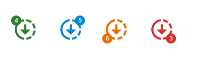
In this example, we have overlapped the different badges in four different positions: top left, top right, bottom left, and bottom right, respectively. The overlap prop is used to do this, and we can define either a circular or rectangular value in it. The circular creates a circular overlap on the element, whereas the rectangular creates a rectangle shape of overlap.
import React from "react";
import { Badge } from "@mui/material";
import { Downloading } from "@mui/icons-material";

const App = () => {
   return (
      <div
         style={{
            padding: 40,
            gap: 40,
            display: "flex",
            flexDirection: "row"
         }}>
         <Badge
            overlap="circular"
            badgeContent={4}
            color="success"
            anchorOrigin={{
               vertical: "top",
               horizontal: "left"
            }}>
            <Downloading sx={{ fontSize: 50 }} color="success" />
         </Badge>
         <Badge
            overlap="circular"
            badgeContent={5}
            color="info"
            anchorOrigin={{
               vertical: "top",
               horizontal: "right"
            }}>
            <Downloading sx={{ fontSize: 50 }} color="info" />
         </Badge>
         <Badge
            overlap="circular"
            badgeContent={6}
            color="warning"
            anchorOrigin={{
               vertical: "bottom",
               horizontal: "left"
            }}>
            <Downloading sx={{ fontSize: 50 }} color="warning" />
         </Badge>
         <Badge
            overlap="circular"
            badgeContent={3}
            color="error"
            anchorOrigin={{
               vertical: "bottom",
               horizontal: "right"
            }}>
            <Downloading sx={{ fontSize: 50 }} color="error" />
         </Badge>
      </div>
   );
};
export default App;
Output
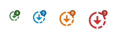
Example
Another example with a different approach is given below along with its code
In this example, we have created a custom badge that overlaps with the other elements. Here, the badges are customized using the &.MuiBadge-badge property, in which we define the custom styles.
import React from "react";
import { Badge } from "@mui/material";
import { styled } from "@mui/material/styles";
import { Downloading } from "@mui/icons-material";

const MuiBadgeCust = styled(Badge)(() => ({
   "& .MuiBadge-badge": {
      right: 10,
      top: 10,
      padding: "0 4px",
      border: "2px dotted black"
   }
}));

const App = () => {
   return (
      <div
         style={{
            padding: 40,
            gap: 40,
            display: "flex",
            flexDirection: "row"
         }}>
         <MuiBadgeCust badgeContent={4} color="success">
            <Downloading sx={{ fontSize: 40 }} color="success" />
         </MuiBadgeCust>
         <MuiBadgeCust badgeContent={5} color="info">
            <Downloading sx={{ fontSize: 50 }} color="info" />
         </MuiBadgeCust>
         <MuiBadgeCust badgeContent={6} color="warning">
            <Downloading sx={{ fontSize: 60 }} color="warning" />
         </MuiBadgeCust>
         <MuiBadgeCust badgeContent={3} color="error">
            <Downloading sx={{ fontSize: 70 }} color="error" />
         </MuiBadgeCust>
      </div>
   );
};
export default App;
Output
Conclusion
In this article, we have learned how to align and overlap the badges with other elements in the React MUI. The complete steps are explained to perform this task, and along with this, different examples have been shown to get a better understanding.

641 Views
