
Article Categories
- All Categories
-
 Data Structure
-
 Networking
-
 RDBMS
RDBMS
-
 Operating System
-
 Java
Java
-
 MS Excel
-
 iOS
iOS
-
 HTML
HTML
-
 CSS
CSS
-
 Android
-
 Python
-
 C Programming
-
 C++
C++
-
 C#
C#
-
 MongoDB
-
 MySQL
MySQL
-
 Javascript
-
 PHP
PHP
-
 Economics & Finance
How to Create a Chart with Date and Time on X Axis in Excel?
An effective method for examining time-series data is to create a chart in Excel with date and time on the X-axis. It's crucial to accurately format your data first. This entails making sure Excel can correctly recognise and enter your date and time information. Excel will correctly read and display the data on the chart if you enter the date and time in the proper format. You can start making the chart once your data has been structured correctly. While there are many different chart styles available in Excel, a line chart is frequently the best solution for time-series data.
These instructions will show you how to use Excel to build a chart that has the date and time listed on the X-axis. Your ability to properly visualise and analyse time-series data will make it simpler for you to spot patterns, trends, and correlations throughout the course of time.
Create a Chart with Date and Time on X Axis
Here we will format the axis to complete the task. So let us see a simple process to learn how you can create a chart with date and time on the X axis in Excel.
Step 1
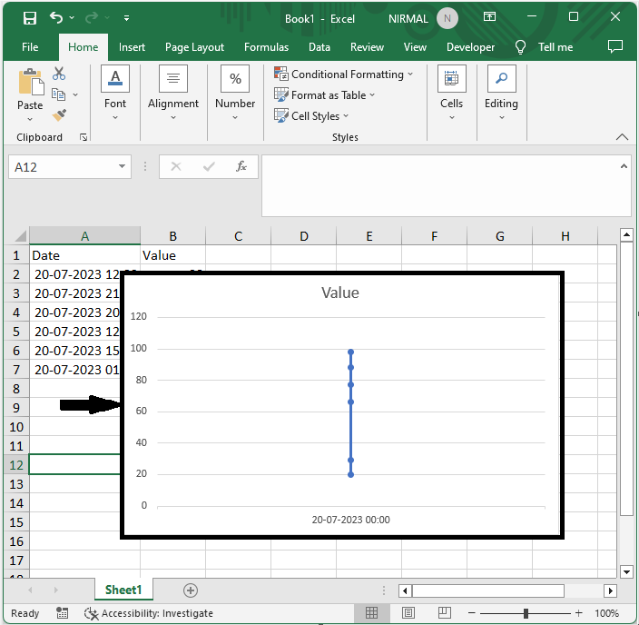
Consider an Excel sheet where you have a chart similar to the below image.
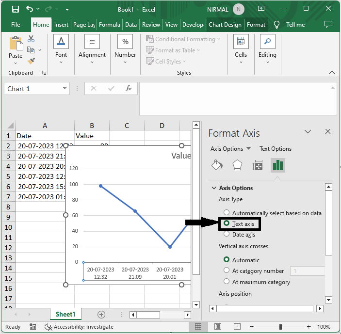
First, right-click on the x axis and select Format Axis.
Right-click > Format Axis.
Step 2
Then select Text Axis under Axis Options to complete the task, then close the format.
Axis Options > Text Axis > Close.
This is how you can create a chart with date and time on the x axis in Excel.
Conclusion
In this tutorial, we have used a simple example to demonstrate how you can create a chart with date and time on the X axis in Excel to highlight a particular set of data.

10K+ Views
