
Article Categories
- All Categories
-
 Data Structure
-
 Networking
-
 RDBMS
RDBMS
-
 Operating System
-
 Java
Java
-
 MS Excel
-
 iOS
iOS
-
 HTML
HTML
-
 CSS
CSS
-
 Android
-
 Python
-
 C Programming
-
 C++
C++
-
 C#
C#
-
 MongoDB
-
 MySQL
MySQL
-
 Javascript
-
 PHP
PHP
-
 Economics & Finance
How do group (two-level) axis labels in a chart in Excel?
Excel is a popular spreadsheet software that allows users to develop, organize and analyze data, by using different available options such as tables, charts, and graphs. The most common benefit of using the chart is that it allows the user to analyze data easily, compare data becomes easy, and make conclusions fast and easy to understand by all. Nowadays, many interactive ways are available in Excel to make a presentable chart within a few seconds. In this article, grouping axis labels in a chart by using Excel, can be done by using two examples. The first example uses a chart, while the second example uses a "pivot chart" to perform the same task.
Example 1: To group the two-level axis label in Excel by using the chart
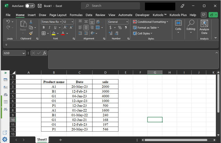
Step1
To create a group of the (two-level) axis, by using the chart in Excel. Consider the below provided Excel spreadsheet. This worksheet contains three columns with the name "product name", "date", and "sale".
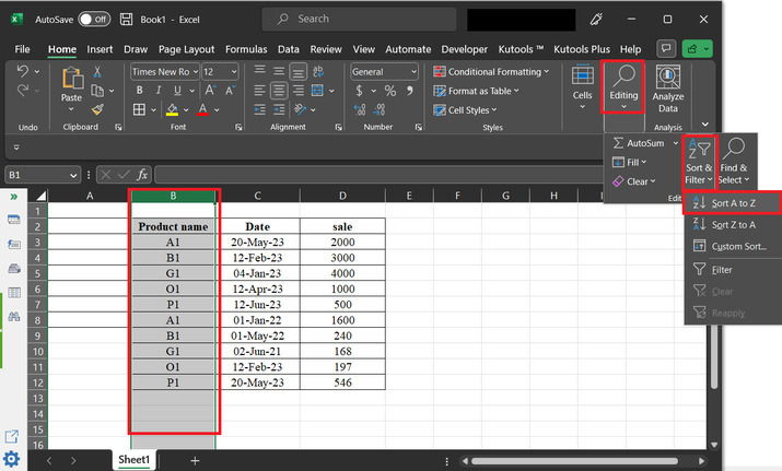
Step 2
Before, creating a graph sorting data is necessary. To do so, go to the "Home" tab, and click on the "Editing" option. Under this option select the "Sort and filter" option and select "Sort A to Z". consider below-given image for proper reference ?
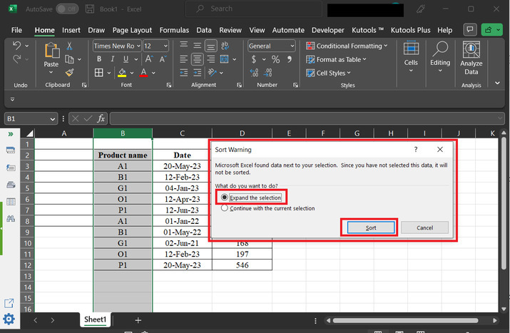
Step 3
This will open a "Sort Warning" dialog box. In this dialog box, select the first option ?Expand the selection, and then click on "Sort" option.
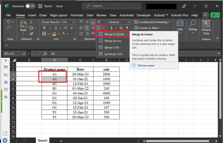
Step 4
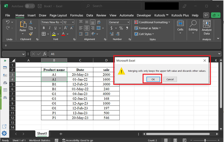
In the provided data Product A1 is written in two rows. So, to clarify the data in the graph user need to merge the name of cells containing the same product name. To do so, go to the "Alignment" section, and click on the "Merge & Center" option. This will merge the two same rows.
Step 5
This will display a "Microsoft Excel" dialog box, with a warning for merging cells. simply click on the "OK" button, to merge the same name records.
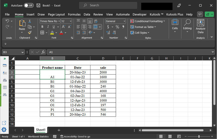
Step 6
Check the obtained results below. Perform the same for other available products as well.
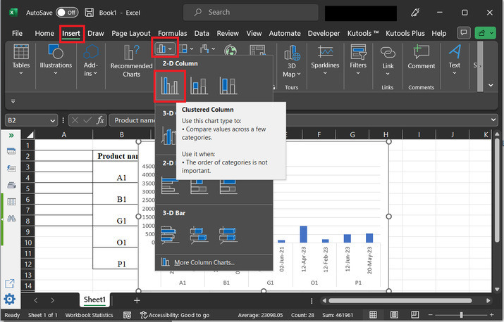
Step 7
In the "Insert" tab, click on the chart section, and from the "2D" section select the first graph option. Consider the below image for proper understanding ?
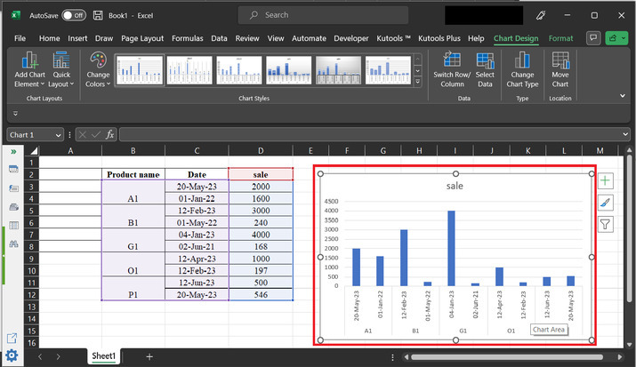
Step 8
This will display the graph, as shown below. Please note that the user can drag the graph to any required space and label and axis style and color can be modified by using the different available chart styles.
Example 2: To group the two-level axis label in Excel by using the pivot table
Step 1
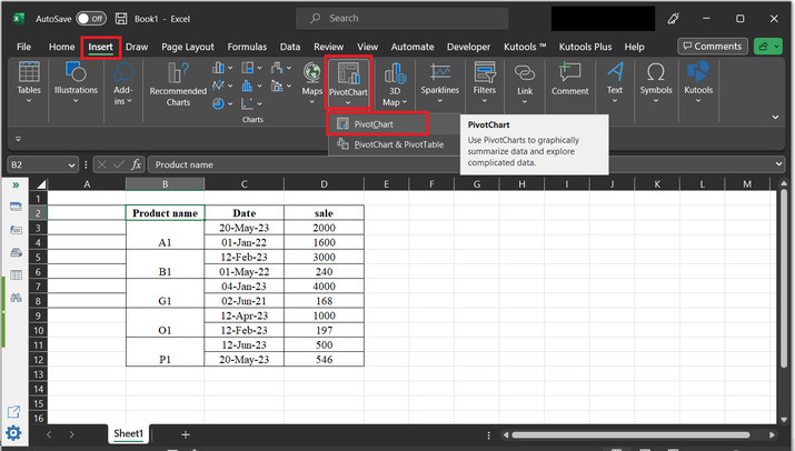
To create a group of (two-level) axis, by using the pivot table and chart option in Excel. Consider the below provided Excel spreadsheet. This worksheet contains three columns with the name "product name", "date", and "sale". For, this example consider the merged data, as provided below. Go to the "Insert" tab, select the pivot chart, and choose the first available option, as depicted below ?
Step 2
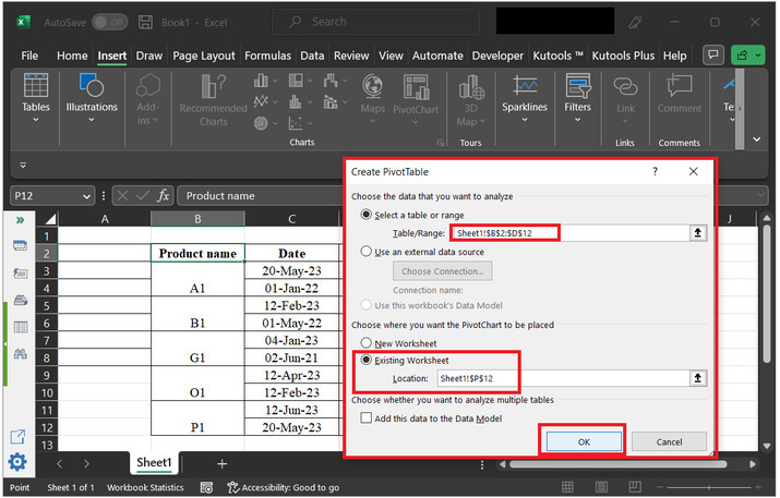
This will open a "Create PivotTable" dialog box. Tick on the "Select a table or range" option, and select the table data from the sheet. After that select the "Existing sheet" option. This will display the graph on the existing sheet. Finally, click on the "OK" button.
Step 3
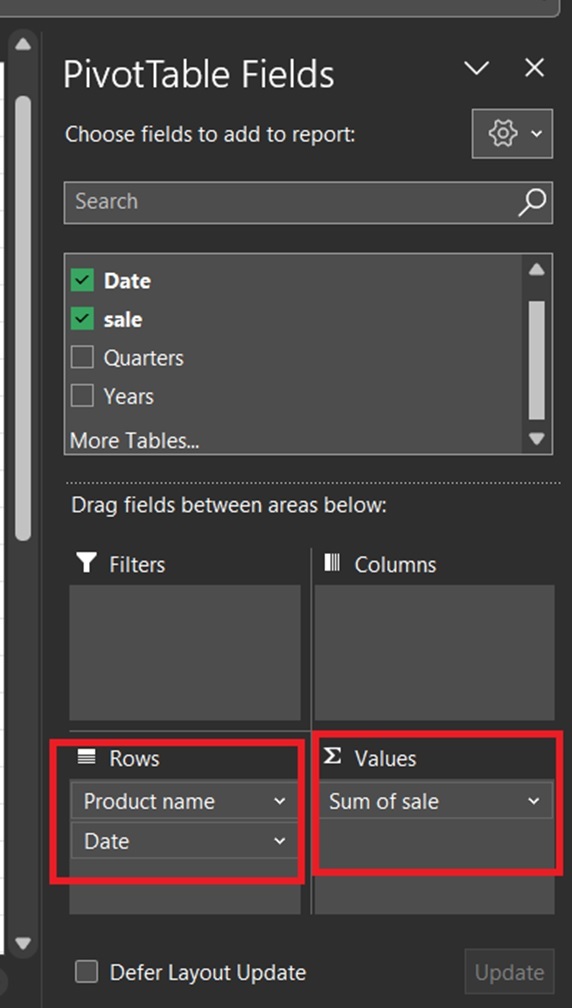
This will open the "PivotTable Fields" dialog box, as depicted below. After that in the "Rows" section drag the column values for "product name", and "date". Finally, in the "values" option select the "sum of sales" option.
Step 4
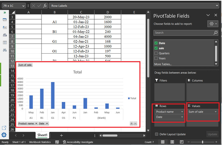
After setting all the previous options the below-provided graph will be displayed. Please note that the user can drag the graph to any required space and label and axis style and color can be modified by using the different available chart styles.
Conclusion
The examples provided in this article are based on the use of two different strategies to create the same graph. This article contains two examples so that learners will understand all the possible ways to do the provided task.

5K+ Views
