
Article Categories
- All Categories
-
 Data Structure
-
 Networking
-
 RDBMS
RDBMS
-
 Operating System
-
 Java
Java
-
 MS Excel
-
 iOS
iOS
-
 HTML
HTML
-
 CSS
CSS
-
 Android
-
 Python
-
 C Programming
-
 C++
C++
-
 C#
C#
-
 MongoDB
-
 MySQL
MySQL
-
 Javascript
-
 PHP
PHP
-
 Economics & Finance
How to change Toggle Button orientation with color and sizes in Material UI?
To provide a great user experience, the colors and sizes of different components added to a website play an important role. The React MUI allows you to change the orientation, color, and size of the toggle buttons easily by using some props given in the documentation. In this article, we are going to learn how to change Toggle Button orientation with color and size in Material UI.
But before we dive into the steps of changing the given properties, let?s first understand what exactly a Toggle Button is.
What is a Toggle Button?
Toggle buttons are a very popular component not only in MUI but also in various other CSS frameworks like Bootstrap, etc., and they provide a way to choose between two or more options. These buttons are collectively referred to as the toggle button group in MUI. A group of connected Toggle buttons should be highlighted by sharing a container.
ToggleButton API
The ToggleButton API is utilized to incorporate toggle buttons into the React MUI. It comes with props:
value It is essential as it establishes a connection, between the button and its selected state.
children We can use the "children" prop to add any desired content within the toggle button.
classes The classes prop is used to override the styles of the component
color The color prop is used to add different toggle buttons colors.
disabled By setting this prop, we can disable the toggle button functionality.
disableFocusRipple The disabledFocusRipple prop is used to disable keyboard focus ripple effect.
fullWidth The fullWidth prop is used to add the full width to the toggle button.
onChange It allows you to define a callback function that alters button states when triggered.
onClick Use onClick prop for specifying a callback function that executes upon clicking on the button.
selected The selected prop is used to render the active toggle state.
size The size prop is used to change the toggle button sizes.
sx To add custom styles to this component utilize the "sx" prop.
Steps required to change the features
Below are the steps for changing the toggle button orientation with color and size in Material UI
Step 1: Create a react application
The very first step to changing the given features of toggle button in MUI is to create a react application. To create a new React app, run the below commands in your terminal
npx create react app togglebuttonsproject
Once the project is created, navigate to its directory by running
cd togglebuttonsproject
Step 2: Add MUI to React
Once you have created the react app, it's time to install the Material UI into the react application. To install MUI, run the following command
npm install @mui/material @emotion/react @emotion/styled
Step 3: Changing the features
To change the orientation, size, and color of a toggle button, we are going to use some props like orientation, size, and color with their respective values. Below is the syntax for the same
<ToggleButtonGroup orientation="vertical">
   <ToggleButton color="success" >
      <IconName />
   </ToggleButton>
   <ToggleButton size="medium" color="success" >
      <IconName />
   </ToggleButton>
</ToggleButtonGroup>
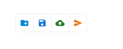
Example
In this example, we have changed just the color of the toggle buttons. To change the colors, we have used the 'color' prop which allows to change the color and it includes, success, primary, secondary, info, standard, warning, and error. To change the toggle buttons colors, we have to use color prop in the
import React from "react";
import { ToggleButton, ToggleButtonGroup } from "@mui/material";
import CreateNewFolder from "@mui/icons-material/CreateNewFolder";
import Save from "@mui/icons-material/Save";
import CloudUpload from "@mui/icons-material/CloudUpload";
import Send from "@mui/icons-material/Send";

const App = () => {

   return (
      <div
         style={{
            padding: 40,
            display: "flex",
            flexDirection: "column",
            gap: 20,
         }}>
         <ToggleButtonGroup aria-label="file creation" color="primary">
            <ToggleButton color="info" value="create-new" aria-label="create">
               <CreateNewFolder color="info" />
            </ToggleButton>
            <ToggleButton color="primary" value="save" aria-label="save">
               <Save color="primary" />
            </ToggleButton>
            <ToggleButton color="success" value="cloud-upload" aria-label="cloud-upload">
               <CloudUpload color="success" />
            </ToggleButton>
            <ToggleButton color="warning" value="send" aria-label="send">
               <Send color="warning" />
            </ToggleButton>
         </ToggleButtonGroup>
      </div>
   );
};

export default App;
Output
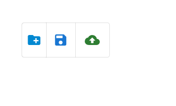
Example
In this example, we have changed both the color and sizes of the toggle buttons. To change the sizes, we have used the 'size' prop which allows to change the sizes and it includes, small, medium, and large. To change the toggle buttons sizes, we have to use size prop in the
import React from "react";
import { ToggleButton, ToggleButtonGroup } from "@mui/material";
import CreateNewFolder from "@mui/icons-material/CreateNewFolder";
import Save from "@mui/icons-material/Save";
import CloudUpload from "@mui/icons-material/CloudUpload";

const App = () => {
   return (
      <div
         style={{
            padding: 40,
            display: "flex",
            flexDirection: "column",
            gap: 20,
         }}>
         <ToggleButtonGroup aria-label="file creation" color="primary">
            <ToggleButton color="info" size="small" value="create-new" aria-label="create">
               <CreateNewFolder color="info" />
            </ToggleButton>
            <ToggleButton color="primary" size="medium" value="save" aria-label="save">
               <Save color="primary" />
            </ToggleButton>
            <ToggleButton color="success" size="large" value="cloud-upload" aria-label="cloud-upload">
               <CloudUpload color="success" />
            </ToggleButton>
         </ToggleButtonGroup>
      </div>
   );
};

export default App;
Output
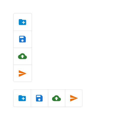
Example
In this example, we have changed the orientation of the toggle buttons. To change the orientation, we have used the ?orientation? prop, which allows us to change the orientation either in a vertical or horizontal direction. We use this prop only in the ToggleButtonGroup component, as in this there are multiple toggle buttons grouped, which makes it easier to change the orientation at once.
//App.js file
import React from "react";
import { ToggleButton, ToggleButtonGroup } from "@mui/material";
import CreateNewFolder from "@mui/icons-material/CreateNewFolder";
import Save from "@mui/icons-material/Save";
import CloudUpload from "@mui/icons-material/CloudUpload";
import Send from "@mui/icons-material/Send";

function App() {
   return (
      <div
         style={{
            padding: 40,
            display: "flex",
            flexDirection: "column",
            gap: 20,
            width: 50
         }}>
         <ToggleButtonGroup orientation="vertical" aria-label="file-vertical" color="primary">
            <ToggleButton color="info" value="create-new" aria-label="create">
               <CreateNewFolder color="info" />
            </ToggleButton>
            <ToggleButton color="primary" value="save" aria-label="save">
               <Save color="primary" />
            </ToggleButton>
            <ToggleButton color="success" value="cloud-upload" aria-label="cloud-upload">
               <CloudUpload color="success" />
            </ToggleButton>
            <ToggleButton color="warning" value="send" aria-label="send">
               <Send color="warning" />
            </ToggleButton>
         </ToggleButtonGroup>
         <ToggleButtonGroup orientation="horizontal" aria-label="horizontal" color="primary">
            <ToggleButton color="info" value="create-new" aria-label="create">
               <CreateNewFolder color="info" />
            </ToggleButton>
            <ToggleButton color="primary" value="save" aria-label="save">
               <Save color="primary" />
            </ToggleButton>
            <ToggleButton color="success" value="cloud-upload" aria-label="cloud-upload">
               <CloudUpload color="success" />
            </ToggleButton>
            <ToggleButton color="warning" value="send" aria-label="send">
               <Send color="warning" />
            </ToggleButton>
         </ToggleButtonGroup>
      </div>
   );
};
Output
Conclusion
In this article, we have learned how to change the toggle button orientation with color and sizes in React MUI. The article shows the complete steps to change the given features along with the syntaxes. We have also seen the different examples showing how to change the color, size, and orientation in a toggle button.

1K+ Views
