
Article Categories
- All Categories
-
 Data Structure
-
 Networking
-
 RDBMS
RDBMS
-
 Operating System
-
 Java
Java
-
 MS Excel
-
 iOS
iOS
-
 HTML
HTML
-
 CSS
CSS
-
 Android
-
 Python
-
 C Programming
-
 C++
C++
-
 C#
C#
-
 MongoDB
-
 MySQL
MySQL
-
 Javascript
-
 PHP
PHP
-
 Economics & Finance
How to change the size and color of Floating action buttons in Material UI?
Floating Action Buttons or FABs in every application works as a prominent call-to-action button that performs a specific action, such as creating a new item or triggering an essential function. Material UI, a popular UI framework for React, offers a flexible and customizable way to implement FABs with ease.
In this article, we will learn how to change the size and color of Floating action buttons in Material UI using React.
What is a Floating Action Button?
Before moving further, let?s understand what is a Floating action button or FAB. These buttons are included in an app's user interface to represent actions that are prioritized by the developer. It is important to use a FAB only if it is truly the best way to present the main action of a screen.
Typically, it's recommended to have one FAB per screen for the common action. There are two types of FABs: circular and extended. It's worth noting that floating action buttons differ slightly from buttons.
Syntax
To change the size and color of a Floating action button, we use two props: size and color. The syntax is as below
<Fab color="error" size="small">
   +
</Fab>
Steps to change the color and size of FAB
Below, we have outlined the step, by step process for changing the color and sizes of Floating action buttons in Material UI using React.
Step 1: Create a new react app and Install MUI
First, let's start by creating a React app and installing Material UI. Follow these steps
Open your terminal and run the command
npx create react app projectname
After the project is created, navigate to the project directory by running
cd projectname
Install Material UI and its dependencies by running
npm install @mui/material @emotion/react @emotion/styled
Step 2: Import the required components into React
Now, when the new React app is created, in the src folder there is a main App.js file. Open it and import the required components.
import React from "react";
import { Fab } from '@mui/material

export default function App() {
   return (

   )
}
Now we have gone through all the steps to create and import the required components. Let's explore some examples that illustrate changing the size and color of Floating action buttons with different approaches.
Floating Action button API
<Fab> This API is used to add a Floating action button to the project using Material UI.
Props
children This prop defines the content of FAB.
classes This prop is used to override or add styles to an element.
color This prop is used to add color to the floating action buttons. It includes primary, secondary, success, info, error, warning, etc.
component This prop defines the component of FAB.
disableFocusRipple If this prop is set to true, the keyboard focus will ripple.
disabled This prop is used to disable the FAB.
disableRipple This prop is used to disable the FAB ripple effect.
href This defines the URL to which the FAB when clicked, will go.
size This prop is used to change the FAB size.
sx This prop is used to add custom styles to the material UI components.
variant This prop is used to choose which FAB to use, like circular, string, or string.
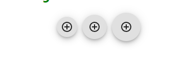
Example
In this example, we have created some basic Floating action buttons with different sizes that include small, medium, and large (which is the default and not mandatory to be used in the size prop).
import { AddCircleOutline } from "@mui/icons-material";
import { Fab } from "@mui/material";
import * as React from "react";

const App = () => {
   return (
      <div>
         <div style={{
            display: "flex",
            flexDirection: "row",
            gap: 10,
            justifyContent: "center",
            alignItems: "center",
         }}>
            <Fab size="small" aria-label="add">
               <AddCircleOutline />
            </Fab>
            <Fab size="medium" aria-label="add">
               <AddCircleOutline />
            </Fab>
            <Fab aria-label="add">
               <AddCircleOutline />
            </Fab>
         </div>
      </div>
   );
};
export default App;
Output
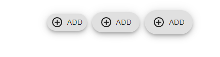
Example
In this example, we have created the "extended" variant of Floating action buttons with different sizes that include small, medium, and large (which is the default and not mandatory to be used in the size prop).
import { AddCircleOutline } from "@mui/icons-material";
import { Fab } from "@mui/material";
import * as React from "react";

const App = () => {
   return (
      <div>
         <h2 style={{ color: "green" }}>How to change size and colors of Floating Action Button in Material UI
         using React</h2>
         <div
            style={{
               display: "flex",
               flexDirection: "row",
               gap: 10,
               justifyContent: "center",
               alignItems: "center",
            }}>
            <Fab size="small" aria-label="add" variant="extended">
               <AddCircleOutline sx={{pr: 1}} />
               Add
            </Fab>
            <Fab size="medium" aria-label="add" variant="extended">
               <AddCircleOutline sx={{pr: 1}} />
               Add
            </Fab>
            <Fab aria-label="add" variant="extended" >
               <AddCircleOutline sx={{pr: 1}} />
               Add
            </Fab>
         </div>
      </div>
   );
};

export default App;
Output
Example
In this example we've designed a version of Floating action buttons called the "variant. It comes in sizes and colors including small, medium and large (although the default size doesn't have to be used). The colors available are info, error and success.
import { AddCircleOutline, Send } from "@mui/icons-material";
import { Fab } from "@mui/material";
import * as React from "react";

const App = () => {
   return (
      <div>
         <h2 style={{ color: "green" }}>
         How to change size and colors of Floating Action Button in Material UI
         using React
         </h2>
         <div
            style={{
               display: "flex",
               gap: 10,
               justifyContent: "center",
               alignItems: "center",
            }}>
            <Fab size="small" color="info" aria-label="add" variant="circular">
               <Send />
            </Fab>
            <Fab size="medium" color="error" aria-label="add" variant="circular">
               <Send />
            </Fab>
            <Fab aria-label="add" color="success" variant="circular" >
               <Send />
            </Fab>
         </div>
      </div>
   );
};

export default App;
Output

Example
In this example we have created a variation of floating action buttons that come in colors such, as info, error, default, primary, secondary, warning and success.
import { AddCircleOutline, Send } from "@mui/icons-material";
import { Fab } from "@mui/material";
import * as React from "react";

const App = () => {
   return (
      <div>
         <h2 style={{ color: "green" }}>
            How to change size and colors of Floating Action Button in Material UI using React
         </h2>
         <div
            style={{
               display: "flex",
               gap: 10,
               justifyContent: "center",
               alignItems: "center",
            }}>
            <Fab color="default" aria-label="add" variant="extended">
               <Send sx={{pr: 1}} />
               Send message
            </Fab>
            <Fab color="error" aria-label="add" variant="extended">
               <Send sx={{pr: 1}} />
               Send message
            </Fab>
            <Fab color="info" aria-label="add" variant="extended" >
               <Send sx={{pr: 1}} />
               Send message
            </Fab>
            <Fab color="inherit" aria-label="add" variant="extended">
               <Send sx={{pr: 1}} />
               Send message
            </Fab>
            <Fab color="primary" aria-label="add" variant="extended">
               <Send sx={{pr: 1}} />
               Send message
            </Fab>
            <Fab color="secondary" aria-label="add" variant="extended" >
               <Send sx={{pr: 1}} />
               Send message
            </Fab>
            <Fab color="warning" aria-label="add" variant="extended" >
               <Send sx={{pr: 1}} />
               Send message
            </Fab>
         </div>
      </div>
   );
};

export default App;
Output

Conclusion
In todays user interface design floating action buttons are an element that can be used within an app with animations. This article provides a guide and examples, on how to change the color and size of these buttons. Material UI offers customization options to ensure that the floating action buttons match the look and feel of your application. By modifying the size and color of Material UIs Floating Action Buttons according to your project needs you can provide your users with a simple yet visually appealing user experience.

659 Views
