
Article Categories
- All Categories
-
 Data Structure
-
 Networking
-
 RDBMS
RDBMS
-
 Operating System
-
 Java
Java
-
 MS Excel
-
 iOS
iOS
-
 HTML
HTML
-
 CSS
CSS
-
 Android
-
 Python
-
 C Programming
-
 C++
C++
-
 C#
C#
-
 MongoDB
-
 MySQL
MySQL
-
 Javascript
-
 PHP
PHP
-
 Economics & Finance
How to handle multiple selection of Toggle Button in Material UI?
In this article, we are going to handle multiple selections of the toggle button in Material UI. To ensure a seamless and understandable user experience, handling the selection of multiple toggle buttons within a Toggle Button Group requires careful implementation.
What is a Toggle Button?
Toggle buttons are a very popular component not only in MUI but also in various other CSS frameworks like Bootstrap, etc., and it provide a way to choose between two or more options. These buttons are collectively referred to as the ToggleButtonGroup in MUI. A group of connected Toggle buttons should be highlighted by sharing a container. When given its own value prop, the ToggleButtonGroup regulates the selected state of the buttons that make up its children.
ToggleButton API
The ToggleButton API is utilized to incorporate toggle buttons into React MUI. It comes with props
value It is essential as it establishes a connection, between the button and its selected state.
children We can use the "children" prop to add any desired content within the toggle button.
classes The classes prop is used to override the styles of the component
color The color prop is used to add different toggle buttons colors.
disabled By setting this prop, we can disable the toggle button functionality.
disableFocusRipple The disabledFocusRipple prop is used to disable keyboard focus ripple effect.
fullWidth The fullWidth prop is used to add the full width to the toggle button.
onChange It allows you to define a callback function that alters button states when triggered.
onClick Use onClick prop for specifying a callback function that executes upon clicking on the button.
selected The selected prop is used to render the active toggle state.
size The size prop is used to change the toggle button sizes.
sx To add custom styles to this component utilize the "sx" prop.
Steps Required for Multiple Selections
Below are the steps for handling the multiple selections of the toggle button in Material UI
Step 1: Create a React Application
The very first step to handle multiple selections of toggle button in MUI is to create a react application. To create a new React app, run the below commands in your terminal
npx create react app togglebuttonsproject
Once the project is created, navigate to its directory by running
cd togglebuttonsproject
Step 2: Add MUI to React
Once you have created the react app, it's time to install the Material UI into the react application. To install MUI, run the following command
npm install @mui/material @emotion/react @emotion/styled
Step 3: Create a Handler
To manage selections, in React MUI we'll start by setting up the state using the hook. Then we'll create a function to handle the selections and keep track of the toggle button states. Here's an example of how you can do this
const [multiple, setMultiple] = useState(() => ['icon1', 'icon2']);
const handleMultiple = (e, newMultiple) => {
   setMultiple(newMultiple);
};
Step 4: Render the Function
After creating the function, we will now use it in our ToggleButtonGroup component.
<ToggleButtonGroup value={multiple} onChange={handleMultiple} >
   <ToggleButton value="bold" aria-label="github">
      <GitHub />
   </ToggleButton>
   ?
   //Add more toggle buttons here
   ?
</ToggleButtonGroup>
Example
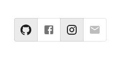
In this example, we have created a basic toggle button that handles multiple selections in MUI. Here, the user can choose or select multiple toggle buttons at once. When the button is selected the background color of the button gets highlighted, and vice versa.
import { useState } from "react";
import React from "react";
import { ToggleButton, ToggleButtonGroup } from "@mui/material";
import { Facebook, GitHub, Instagram, Mail } from "@mui/icons-material";

// App.js main function
export default function App() {

   const [multiple, setMultiple] = useState(() => ['github', 'facebook']);

   const handleMultiple = (e, newMultiple) => {
      setMultiple(newMultiple);
   };

   return (
      <div
         style={{
            padding: 40,
            display: "flex",
            flexDirection: "column",
            gap: 20,
         }}>
         <ToggleButtonGroup
            value={multiple}
            onChange={handleMultiple}
            aria-label="social media icons"
            >
            <ToggleButton value="bold" aria-label="github">
               <GitHub />
            </ToggleButton>
            <ToggleButton value="italic" aria-label="facebook">
               <Facebook />
            </ToggleButton>
            <ToggleButton value="underlined" aria-label="instagram">
               <Instagram />
            </ToggleButton>
            <ToggleButton value="color" aria-label="mail" disabled>
               <Mail />
            </ToggleButton>
         </ToggleButtonGroup>
      </div>
   );
};
Output
Example
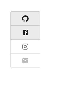
In this example, we have created a vertical aligned toggle button that handles multiple selections in MUI. Here, the user can choose or select between the vertical multiple toggle buttons at once. When the button is selected the background color of the button gets highlighted, and vice versa.
import React from "react";
import { ToggleButton, ToggleButtonGroup } from "@mui/material";
import { useState } from "react";
import { Facebook, GitHub, Instagram, Mail } from "@mui/icons-material";

export default function App() {
   const [multiple, setMultiple] = useState(() => ['github', 'facebook']);
   const handleMultiple = (e, newMultiple) => {
      setMultiple(newMultiple);
   };

   return (
      <div
         style={{
            padding: 40,
            display: "flex",
            flexDirection: "column",
            gap: 20,
         }}>
         <ToggleButtonGroup
            value={multiple}
            onChange={handleMultiple}
            sx={{ width: 100}}
            aria-label="social media icons vertical"
            orientation="vertical"
            >
            <ToggleButton value="bold" aria-label="github">
               <GitHub />
            </ToggleButton>
            <ToggleButton value="italic" aria-label="facebook">
               <Facebook />
            </ToggleButton>
            <ToggleButton value="underlined" aria-label="instagram">
               <Instagram />
            </ToggleButton>
            <ToggleButton value="color" aria-label="mail" disabled>
               <Mail />
            </ToggleButton>
         </ToggleButtonGroup>
      </div>
   );
};
Output
Example
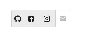
In this example, we have created toggle button group of different sizes, like small, medium, and large and can handle multiple selections in the MUI. Here, the user can choose to select multiple toggle buttons of different sizes at once. When the button is selected the background color of the button gets highlighted, and vice versa.
import React from "react";
import { ToggleButton, ToggleButtonGroup } from "@mui/material";
import { Facebook, GitHub, Instagram, Mail } from "@mui/icons-material";
import { useState } from "react";

const App = () => {

   const [multiple, setMultiple] = useState(() => ['github', 'facebook']);

   const handleMultiple = (e, newMultiple) => {
      setMultiple(newMultiple);
   };

   return (
      <div
         style={{
            padding: 40,
            display: "flex",
            flexDirection: "column",
            gap: 20,
         }}>
         <ToggleButtonGroup
            value={multiple}
            onChange={handleMultiple}s
            aria-label="social media icons vertical"
            >
            <ToggleButton value="bold" aria-label="github" size="small">
               <GitHub />
            </ToggleButton>
            <ToggleButton value="italic" aria-label="facebook" size="medium">
               <Facebook />
            </ToggleButton>
            <ToggleButton value="underlined" aria-label="instagram" size="large">
               <Instagram />
            </ToggleButton>
            <ToggleButton value="color" aria-label="mail"  disabled>
               <Mail />
            </ToggleButton>
         </ToggleButtonGroup>
      </div>
   );
};

export default App;
Output
Example
In this example, we have created the custom toggle button that handles multiple selections in MUI. Here, the background color and border radius of the toggle buttons have been changed using the MuiToggleButtonGroup-grouped property of ToggleButton which allows to customize the toggle buttons.
import React from "react";
import { ToggleButton, ToggleButtonGroup } from "@mui/material";
import { styled } from "@mui/material/styles";
import { Facebook, GitHub, Instagram, Mail } from "@mui/icons-material";
import { useState } from "react";

const MyCustomToggleComponentContainer = styled(ToggleButtonGroup)(({ theme }) => ({
   '& .MuiToggleButtonGroup-grouped': {
      margin: theme.spacing(0.5),
      border: 0,
      '&.Mui-disabled': {
         border: 0,
      },
      color: 'white',
      '&:not(:first-of-type)': {
         borderRadius: theme.shape.borderRadius,
      },
      '&:first-of-type': {
         borderRadius: theme.shape.borderRadius,
      },
   },
}));

const App = () => {

   const [multiple, setMultiple] = useState(() => ['github', 'facebook']);

   const handleMultiple = (e, newMultiple) => {
      setMultiple(newMultiple);
   };

   return (
      <div
         style={{
            padding: 40,
            display: "flex",
            flexDirection: "column",
            gap: 20,
         }}>
         <MyCustomToggleComponentContainer
            value={multiple}
            onChange={handleMultiple}s
            aria-label="social media icons vertical"
            sx={{backgroundColor: 'lightgreen', padding: 5}}
            >
            <ToggleButton value="bold" aria-label="github" size="medium">
               <GitHub />
            </ToggleButton>
            <ToggleButton value="italic" aria-label="facebook" size="medium">
               <Facebook />
            </ToggleButton>
            <ToggleButton value="underlined" aria-label="instagram" size="medium">
               <Instagram />
            </ToggleButton>
            <ToggleButton value="color" aria-label="mail" size="medium" >
               <Mail />
            </ToggleButton>
         </MyCustomToggleComponentContainer>
      </div>
   );
};
export default App;
Output

Conclusion
This article discusses how to handle multiple selections of toggle buttons in the Material UI using React. We have shown the complete steps to handle the selections, and along with this, different examples have also been discussed with different approaches.

1K+ Views
