
Article Categories
- All Categories
-
 Data Structure
-
 Networking
-
 RDBMS
RDBMS
-
 Operating System
-
 Java
Java
-
 MS Excel
-
 iOS
iOS
-
 HTML
HTML
-
 CSS
CSS
-
 Android
-
 Python
-
 C Programming
-
 C++
C++
-
 C#
C#
-
 MongoDB
-
 MySQL
MySQL
-
 Javascript
-
 PHP
PHP
-
 Economics & Finance
How to modify different sizes of autocomplete in Material UI?
Popular React UI framework Material UI offers an array of components with a contemporary and minimalistic design. One of its features is autocomplete, which offers users beneficial suggestions as they work with input fields. Due to its adaptability, this component can be easily customized, including having its size changed to better suit the application's particular design needs.
In this article, we will concentrate on comprehending how to resize the Material UI's Autocomplete component. However, this adaptable component offers a wide variety of customization options in addition to size adjustments. You can change the component's look, behavior, and style to suit the requirements of your application. The color, shape, and layout of the Autocomplete, for example, can be customized to match the desired aesthetic. We will only look at the resizing aspect of the autocomplete component in this article.
Steps to change sizes
Below are the steps required to use React to change the sizes in the Material UI autocomplete component
Step 1. Import the material and its modules
To utilize values, in Material UI the crucial step is to import the necessary components and modules. In this case, we need to import the TextField component for rendering input and the Autocomplete component from MUI for utilizing functionality.
import TextField from "@mui/material/TextField";

// This imports the text field component used to display user input.
import Autocomplete from "@mui/material/Autocomplete";

// Here we are importing the functionality, from MUI.
Step 2. Use Autocomplete component
After importing the component into our React project we can proceed to define the component within our React application.
<Autocomplete
   multiple
   options={data}
   renderInput={(params) => (
      <TextField
         {...params}
         label="add your label"
         placeholder="add your placeholder"
      />
   )}
/>
Step 3. Add size prop
The "size" prop must be used in order to change the sizes in the autocomplete component. There are two sizes in which the component can be altered, as we can see from the size prop up top. The syntax below demonstrates the usage of the size prop
<Autocomplete
   multiple
   options={data}
   size="small | medium"
   renderInput={(params) => (
      <TextField
         {...params}
         label="add your label"
         placeholder="add your placeholder"
      />
   )}
/>
Size Prop
The "size" prop plays a pivotal role in the customization process of the material ui autocomplete component. There are two different options available in the size prop to modify the autocomplete size of the input, Let?s see both options in detail
Small In this option, the size of the autocomplete component gives a small input box as compared to the normal size. It is mostly used to add responsiveness to the application.
<Autocomplete size="small"? />
Medium The medium option of the size prop is used by default in Material UI, and is commonly used by every application built using Material UI.
<Autocomplete size="medium"? />
It's important to note that the medium size is the default setting for the autocomplete component, and it is widely employed in various applications for its wellrounded appeal.
Example
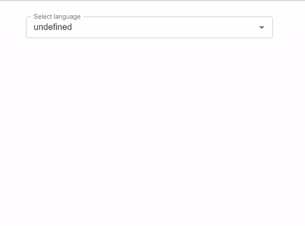
In this example, we have used the size prop with the small option to modify the autocomplete component. The given component can select only one value in the smaller size.
import React from "react";
import TextField from "@mui/material/TextField";
import Autocomplete from "@mui/material/Autocomplete";

const data = [
   { label: "Java language" },
   { label: "Python language" },
   { label: "C++ language" },
   { label: "C language" },
   { label: "Go language" },
   { label: "JavaScript language" },
   { label: "SQL" },
   { label: "MySQL" },
   { label: "HTML" },
   { label: "CSS" },
   { label: "Nextjs " },
   { label: "ReactJS " },
   { label: "VueJS " },
   { label: "Angular " },
   { label: "Angular JS " },
   { label: "PHP language" },
   { label: "R language" },
   { label: "Objective C language" },
   { label: "Cobol language" },
   { label: "Perl language" },
   { label: "Pascal language" },
   { label: "LISP language" },
   { label: "Fortran language" },
   { label: "Swift language" },
   { label: "Ruby language" },
   { label: "Algol language" },
   { label: "Scala language" },
   { label: "Rust language" },
   { label: "TypeScript language" },
   { label: "Dart language" },
   { label: "Matlab language" },
   { label: "Ada language" },
   { label: ".NET language" },
   { label: "Bash language" },
];

export default function App() {

   const [value, setValue] = React.useState("");

   return (
      <div
         style={{
            display: "flex",
            marginTop: 30,
            flexDirection: "column",
            alignItems: "center",
            justifyContent: "center",
         }}>
         <Autocomplete
            sx={{ width: "30%" }}
            options={data}
            size="small"
            getOptionLabel={(options) => options.label}
            renderInput={(params) => (
               <TextField
                  {...params}
                  label="Select language"
                  placeholder="Programming languages"
               />
            )}
         />
      </div>
   );
}
Output
Example
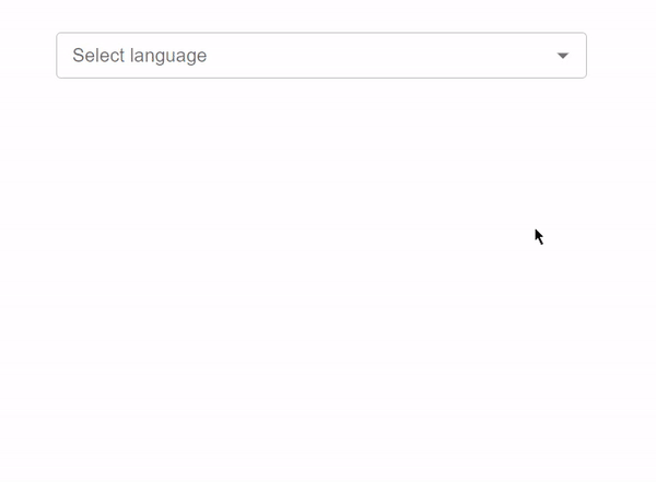
In this example, we have used the size prop with the small option to modify the autocomplete component. The given component selects multiple values in the smaller size using the "multiple" prop.
import React from "react";
import TextField from "@mui/material/TextField";
import Autocomplete from "@mui/material/Autocomplete";

const data = [
   { label: "Java language" },
   { label: "Python language" },
   { label: "C++ language" },
   { label: "C language" },
   { label: "Go language" },
   { label: "JavaScript language" },
   { label: "SQL" },
   { label: "MySQL" },
   { label: "HTML" },
   { label: "CSS" },
   { label: "Nextjs " },
   { label: "ReactJS " },
   { label: "VueJS " },
   { label: "Angular " },
   { label: "Angular JS " },
   { label: "PHP language" },
   { label: "R language" },
   { label: "Objective C language" },
   { label: "Cobol language" },
   { label: "Perl language" },
   { label: "Pascal language" },
   { label: "LISP language" },
   { label: "Fortran language" },
   { label: "Swift language" },
   { label: "Ruby language" },
   { label: "Algol language" },
   { label: "Scala language" },
   { label: "Rust language" },
   { label: "TypeScript language" },
   { label: "Dart language" },
   { label: "Matlab language" },
   { label: "Ada language" },
   { label: ".NET language" },
   { label: "Bash language" },
];

export default function App() {
   return (
      <div
         style={{
            display: "flex",
            marginTop: 30,
            flexDirection: "column",
            alignItems: "center",
            justifyContent: "center",
         }}>
         <Autocomplete
            sx={{ width: "30%" }}
            multiple
            options={data}
            size="small"
            getOptionLabel={(options) => options.label}
            renderInput={(params) => (
               <TextField
                  {...params}
                  label="Select language"
                  placeholder="Programming languages"
               />
            )}
         />
      </div>
   );
}
Output
Conclusion
This article showed us how to change the various sizes of the Material UI's Autocomplete component. We began by building a straightforward Autocomplete component, after which we changed its size using the TextField component's "size" prop. You can further explore these options in the official documentation. Material UI offers a wide range of customization options for the Autocomplete component.

2K+ Views
