
Article Categories
- All Categories
-
 Data Structure
-
 Networking
-
 RDBMS
RDBMS
-
 Operating System
-
 Java
Java
-
 MS Excel
-
 iOS
iOS
-
 HTML
HTML
-
 CSS
CSS
-
 Android
-
 Python
-
 C Programming
-
 C++
C++
-
 C#
C#
-
 MongoDB
-
 MySQL
MySQL
-
 Javascript
-
 PHP
PHP
-
 Economics & Finance
How to change size, color, and direction of Radio buttons in Material UI?
Implementing radio buttons, in Material UI, a used UI framework for React is straightforward. You can effortlessly customize the size, color, and orientation of the radio buttons to match the design of your application. In this article, we will explore how to modify the size, color, and orientation of radio buttons, in Material UI.
What is a Radio Button?
Radio buttons are an element, in forms that enable users to choose one option from a set of choices that're mutually exclusive. They appear as buttons that can be either selected (checked) or unselected (unchecked). When one radio button is selected within a group, any other radio buttons, in the group automatically become unselected, guaranteeing that only one option can be chosen at any given time.
Note that the radio buttons can also be used standalone, without the RadioGroup wrapper.
Steps to change the color, size, and direction of radio button
Below, we have outlined the complete steps to change the size, color, and direction of radio buttons
Step 1: Create a new react app and Install MUI
First, let's start by creating a React app and installing Material UI. Follow these steps
Open your terminal and run the command
npx create react app projectname
After the project is created, navigate to the project directory by running
cd projectname
Install Material UI and its dependencies by running
npm install @mui/material @emotion/react @emotion/styled
Step 2: Import the required components into React
Now, when the new React app is created, in the src folder there is a main App.js file. Open it and import the required components.
import React from "react";
import { Radio, RadioGroup } from '@mui/material

export default function App() {
   return (

   )
}
Step 3: Modify the Radio buttons
To change the size and color of radio buttons, we use some props: size and color. The syntax is as below
<Radio
   size="small"
   color="success"
   value="Male"
   name="radio-buttons"
   inputProps={{ "aria-label": "Male" }}
/>
<Radio
   size="medium"
   color="info"
   value="Female"
   name="radio-buttons"
   inputProps={{ "aria-label": "Female" }}
/>
To change the direction, we need to use the RadioGroup API or component and use the ?row? prop.
<RadioGroup row>
   <Radio
      size="small"
      color="success"
      value="Male"
      name="radio-buttons"
      inputProps={{ "aria-label": "Male" }}
   />
   <Radio
      size="medium"
      color="info"
      value="Female"
      name="radio-buttons"
      inputProps={{ "aria-label": "Female" }}
   />
</RadioGroup>
Now we have gone through all the steps to create and import the required components. Let's explore some examples that illustrate changing the size, color, and direction of radio buttons with different approaches.
Radio API
<Radio> - This API is used to add radio buttons to the react project using Material UI.
Props
checked This prop is used to check the component when it is true.
checkedIcon This prop is used to display the icon when it is true.
classes This prop is used to override or add styles to an element.
color This prop is used to add color to the floating action buttons. It includes primary, secondary, success, info, error, warning, etc.
disabled This prop is used to disable the FAB.
disableRipple This prop is used to disable the FAB ripple effect.
icon This prop is used to show icon when the radio is not checked.
id This prop is used to provide an id to the radio component.
inputProps This prop defines the attributes applied to the radio.
inputRef This prop is used to pass a ref to input or radio component.
name This prop is used to add a name to the radio.
onChange This prop is used to trigger a callback function when an input is changed.
required This prop defines that if true, the input must be provided.
size This prop is used to change the radio button size.
sx This prop is used to add custom styles to the material UI components.
value This prop is used to give a value to the component.
Example
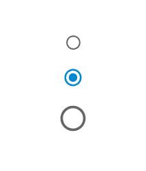
In this example, we have changed the radio buttons sizes using the "size" prop. The size prop changes the radio buttons to various sizes including small, medium, and large.
import { Radio, RadioGroup } from "@mui/material";
import * as React from "react";

const App = () => {

   return (
      <div>
         <RadioGroup>
            <Radio
               size="small"
               color="success"
               value="Male"
               name="radio-buttons"
               inputProps={{ "aria-label": "Male" }}
            />
            <Radio
               size="medium"
               color="info"
               value="Female"
               name="radio-buttons"
               inputProps={{ "aria-label": "Female" }}
            />
            <Radio
               size="large"
               color="info"
               value="Others"
               name="radio-buttons"
               inputProps={{ "aria-label": "Others" }}
            />
         </RadioGroup>
      </div>
   );
};
export default App;
Output
Example
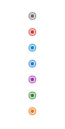
In this example, we have changed the radio buttons color using the "color" prop. The color prop changes the radio buttons to various colors including, info, primary, success, secondary, error, warning, and default.
import { Radio, RadioGroup } from "@mui/material";
import * as React from "react";

const App = () => {

   return (
      <div>
         <RadioGroup>
            <Radio
               size="medium"
               color="default"
               value="A"
               name="radio-buttons"
               inputProps={{ "aria-label": "A" }}
            />
            <Radio
               size="medium"
               color="error"
               value="A"
               name="radio-buttons"
               inputProps={{ "aria-label": "A" }}
            />
            <Radio
               size="medium"
               color="info"
               value="A"
               name="radio-buttons"
               inputProps={{ "aria-label": "A" }}
            />
            <Radio
               size="medium"
               color="primary"
               value="A"
               name="radio-buttons"
               inputProps={{ "aria-label": "A" }}
            />
            <Radio
               size="medium"
               color="secondary"
               value="A"
               name="radio-buttons"
               inputProps={{ "aria-label": "A" }}
            />
            <Radio
               size="medium"
               color="success"
               value="A"
               name="radio-buttons"
               inputProps={{ "aria-label": "A" }}
            />
            <Radio
               size="medium"
               color="warning"
               value="A"
               name="radio-buttons"
               inputProps={{ "aria-label": "A" }}
            />
         </RadioGroup>
      </div>
   );
};
export default App;
Output
Example
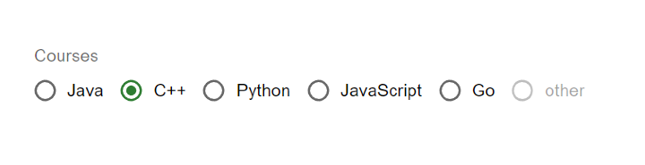
In the given example, we have created the radio buttons grouped within the RadioGroup component to change the direction of all the radios. By default, if there are two or more radio's then they are in column wise direction, but by using the ?row? prop, it changes its direction to row.
import { Radio, RadioGroup } from "@mui/material";
import * as React from "react";
import FormControlLabel from "@mui/material/FormControlLabel";
import FormControl from "@mui/material/FormControl";
import FormLabel from "@mui/material/FormLabel";

const App = () => {
   return (
      <div>
         <FormControl>
            <FormLabel>Courses</FormLabel>
            <RadioGroup row aria-labelledby="label-courses" name="rg-courses">
               <FormControlLabel
                  value="Java"
                  control={<Radio color="info" />}
                  label="Java"
               />
               <FormControlLabel
                  value="C++"
                  control={<Radio color="success" />}
                  label="C++"
               />
               <FormControlLabel
                  value="Python"
                  control={<Radio color="warning" />}
                  label="Python"
               />
               <FormControlLabel
                  value="JavaScript"
                  control={<Radio color="error" />}
                  label="JavaScript"
               />
               <FormControlLabel
                  value="Go"
                  control={<Radio color="primary" />}
                  label="Go"
               />
               <FormControlLabel
                  value="disabled"
                  disabled
                  control={<Radio />}
                  label="other"
               />
            </RadioGroup>
         </FormControl>
      </div>
   );
};

export default App;
Output
Conclusion
In summary radio buttons are a part of user interfaces. Help users make a single choice from a set of options. Throughout this article we've explored how to customize the size, color and orientation of radio buttons. These modifications have made them widely used in applications, like web forms, preference settings, surveys and filtering tasks. By presenting users with a predefined list of options and allowing them to select one radio buttons simplify decision making. Improve the overall user experience.

2K+ Views
