
Article Categories
- All Categories
-
 Data Structure
-
 Networking
-
 RDBMS
RDBMS
-
 Operating System
-
 Java
Java
-
 MS Excel
-
 iOS
iOS
-
 HTML
HTML
-
 CSS
CSS
-
 Android
-
 Python
-
 C Programming
-
 C++
C++
-
 C#
C#
-
 MongoDB
-
 MySQL
MySQL
-
 Javascript
-
 PHP
PHP
-
 Economics & Finance
How to handle errors in Radio Button in Material UI?
Generally, it is advisable for radio buttons to have a default selected value. If this condition is not met, you can present an error message if no value is chosen upon submitting the form. In this article, we will delve into the process of managing errors in radio buttons within the Material UI.
What is Error Handling?
Handling errors, in radio buttons involves managing and giving feedback to users when they interact with radio button inputs within a form. There are two considerations when it comes to error handling, for radio buttons
Validation It is essential to validate that the user has made a selection before they can proceed with submitting the form. If no option is chosen an error message should be displayed, prompting the user to make a selection.
Feedback When a user interacts with a radio button they should receive feedback indicating the selected option.
Steps to Handle Errors in Radio Buttons
Below, we have outlined the complete steps to handle errors in radio buttons
Step 1: Create a New React App and Install MUI
First, let's start by creating a React app and installing Material UI. Follow these steps
Open your terminal and run the command
npx create react app projectname
After the project is created, navigate to the project directory by running
cd projectname
Install Material UI and its dependencies by running
npm install @mui/material @emotion/react @emotion/styled
Step 2: Import the Required Components into React
Now, when the new React app is created, in the src folder there is a main App.js file. Open it and import the required components.
import React from "react";
import { Radio, RadioGroup } from '@mui/material

export default function App() {
   return (
      <RadioGroup>
         <Radio />
         <Radio />
      </RadioGroup>
   )
}
Step 3: Handling Errors
Handling errors in radio buttons is a very simple task. To handle errors, we use the useState() in react and create an if-else statement along with the radio buttons.
const [val, setVal] = useState(" ");
const [error, setError] = useState(false);

const handleRadioChange = (e) => {
   setVal(e.target.value);
   setError(false);
};

const hdlRadio = (e) => {
   e.preventDefault();

   if (val === "Correct Value") {
      setError(false);
   } else (val === "Incorrect Value") {
      setError(true);
    }
    ?
};
Radio API
<Radio> This API is used to add radio buttons to the react project using Material UI.
Props
checked This prop is used to check the component when it is true.
checkedIcon This prop is used to display the icon when it is true.
classes This prop is used to override or add styles to an element.
color This prop is used to add color to the floating action buttons. It includes primary, secondary, success, info, error, warning, etc.
disabled This prop is used to disable the FAB.
disableRipple This prop is used to disable the FAB ripple effect.
icon This prop is used to show icon when the radio is not checked.
id This prop is used to provide an id to the radio component.
inputProps This prop defines the attributes applied to the radio.
inputRef This prop is used to pass a ref to input or radio component.
name This prop is used to add a name to the radio.
onChange This prop is used to trigger a callback function when an input is changed.
required This prop defines that if true, the input must be provided.
size This prop is used to change the radio button size.
sx This prop is used to add custom styles to the material UI components.
value This prop is used to give a value to the component.
Example
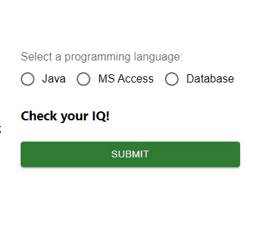
In this example, we have handled the errors in the radio buttons. First, we have created three radio buttons with some values and a button to choose the correct option. Now, when the user tries to choose any incorrect option, the user sees an error as "Sorry, incorrect answer!" and if the chosen option is correct, another message is displayed. So, error handling in radio buttons is easy by managing the state in React.
import { Button, Radio, RadioGroup } from "@mui/material";
import * as React from "react";
import FormControlLabel from "@mui/material/FormControlLabel";
import FormControl from "@mui/material/FormControl";
import FormLabel from "@mui/material/FormLabel";
import { useState } from "react";

const App = () => {

   const [val, setVal] = useState('');
   const [error, setError] = useState(false);
   const [option, setOption] = useState('Check your IQ!');

   const handleRadioChange = (e) => {
      setVal(e.target.value);
      setOption(' ');
      setError(false);
   };

   const hdlRadio = (e) => {
      e.preventDefault();

      if (val === 'Java') {
         setOption('You are correct!');
         setError(false);
      } else if (val === 'MS Access') {
         setOption('Sorry, incorrect answer!');
         setError(true);
      } else if (val === 'Database') {
         setOption('Sorry, incorrect answer!');
         setError(true);
      } else {
         setOption('Choose any option.');
         setError(true);
      }
   };

   return (
      <div>
         <form onSubmit={hdlRadio}>
            <FormControl sx={{p: 10}}>
               <FormLabel>Select a programming language:</FormLabel>
               <RadioGroup value={val}
               onChange={handleRadioChange} row aria-labelledby="label-pl" name="rg-pl">
                  <FormControlLabel
                     value="Java"
                     control={<Radio color="info" />}
                     label="Java"
                  />
                  <FormControlLabel
                     value="MS Access"
                     control={<Radio color="success" />}
                     label="MS Access"
                  />
                  <FormControlLabel
                     value="Database"
                     control={<Radio color="warning" />}
                     label="Database"
                  />
               </RadioGroup>
               <h3>{option}</h3>
               <Button sx={{ mt: 1, mr: 1 }} type="submit" color="success" variant="contained">
                  Submit
               </Button>
            </FormControl>
         </form>
      </div>
   );
};

export default App;
Output
Example
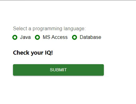
In this example, we have handled the errors in the radio buttons. Here also, we have created three radio buttons, but these radios are customized with the help of the material ?styled? component. Here, we have created some options using radios and a button to choose the correct option. Now, when the user tries to choose any incorrect option, the user sees an error as "Sorry, incorrect answer!" and if the chosen option is correct, another message is displayed. So, error handling in radio buttons is easy by managing the state in React.
import { Button, Radio, RadioGroup } from "@mui/material";
import * as React from "react";
import FormControlLabel from "@mui/material/FormControlLabel";
import FormControl from "@mui/material/FormControl";
import FormLabel from "@mui/material/FormLabel";
import { useState } from "react";
import { styled } from "@mui/material/styles";

const MyRadioButton = styled((props) => (
   <Radio
      icon={<div className="MuiRadioUnchecked" />}
      checkedIcon={<div className="MuiRadioChecked" />}
      disableRipple
      color="default"
      {...props}
   />
))(() => ({
   "& .MuiRadioChecked": {
      backgroundColor: "lightgreen",
      borderRadius: "50%",
      height: 8,
      width: 8,
      boxShadow: `0 0 0 4px green`,
   },
   "& .MuiRadioUnchecked": {
      border: `4px solid green`,
      borderRadius: "50%",
      height: 8,
      width: 8,
   },
}));

const App = () => {
   const [val, setVal] = useState("");
   const [error, setError] = useState(false);
   const [option, setOption] = useState("Check your IQ!");

   const handleRadioChange = (e) => {
      setVal(e.target.value);
      setOption(" ");
      setError(false);
   };

   const hdlRadio = (e) => {
      e.preventDefault();

      if (val === "Java") {
         setOption("You are correct!");
         setError(false);
      } else if (val === "MS Access") {
         setOption("Sorry, incorrect answer!");
         setError(true);
      } else if (val === "Database") {
         setOption("Sorry, incorrect answer!");
         setError(true);
      } else {
         setOption("Choose any option.");
         setError(true);
      }
   };

   return (
      <div>
         <form onSubmit={hdlRadio}>
            <FormControl sx={{ p: 10 }}>
               <FormLabel>Select a programming language:</FormLabel>
               <RadioGroup
                  value={val}
                  onChange={handleRadioChange}
                  row
                  aria-labelledby="label-pl"
                  name="rg-pl">
                  <FormControlLabel
                     value="Java"
                     control={<MyRadioButton />}
                     label="Java"
                  />
                  <FormControlLabel
                     value="MS Access"
                     control={<MyRadioButton />}
                     label="MS Access"
                  />
                  <FormControlLabel
                     value="Database"
                     control={<MyRadioButton />}
                     label="Database"
                  />
               </RadioGroup>
               <h3>{option}</h3>
               <Button
                  sx={{ mt: 1, mr: 1 }}
                  type="submit"
                  color="success"
                  variant="contained"
                  >
                  Submit
               </Button>
            </FormControl>
         </form>
      </div>
   );
};
export default App;
Output
Conclusion
In this article, we have learned how to handle errors in Radio buttons in Material UI using React.

1K+ Views
