
Article Categories
- All Categories
-
 Data Structure
-
 Networking
-
 RDBMS
RDBMS
-
 Operating System
-
 Java
Java
-
 MS Excel
-
 iOS
iOS
-
 HTML
HTML
-
 CSS
CSS
-
 Android
-
 Python
-
 C Programming
-
 C++
C++
-
 C#
C#
-
 MongoDB
-
 MySQL
MySQL
-
 Javascript
-
 PHP
PHP
-
 Economics & Finance
How to create a slider with input in Material UI?
React developers can easily add or use sliders in React thanks to the Slider component provided by Material UI. In the Material UI, apart from using normal sliders, we may also define an input to provide a custom value that can be entered by users manually. In this article, we are going to learn how to create sliders with input in Material UI.
What is a Slider with Input?
A user interface element called a Slider with an input field combines two input techniques for choosing a numerical value from a predetermined range. Usually, it has a slider element and an input field right next to it. Users of the input field can manually enter a specific value, whereas those of the slider can visually and interactively adjust the value by dragging a handle along a track.
API used
<Slider> This API is used to create the slider component, allowing the users to make selections in a different range of items in React MUI
Props
aria-label This prop is used to add the slider label.
aria-labelledby This prop is used to add id of the element having slider label.
aria-valuetext This prop is used to add a name to the value of the slider.
classes This prop is used to override or add styles to component.
color This prop is used to add different colors to slider component.
components This prop is used to add components for each slider slot.
componentsProps This prop is used to add props for slot components.
defaultValue This prop is used to add defaut value.
disabled This prop is used to disable the slider component.
disableSwap This prop allows you to not swap the slider when moving pointer over a thumb while dragging another thumb.
getAriaLabel This prop is used to add a function returning the name of the slider label.
getAriaValueText This prop is used to add a function returning the current value of the slider label.
marks This prop is used to add predetermined value to the slider.
max This prop is used to add the max value to a slider.
min This prop is used to add the min value to a slider.
name This prop is used to add the name of hidden input.
onChange This prop is used to add a callback function when slider value is triggered.
orientation This prop is used to change slider component orientation.
scale This prop is used to change slider scale.
size This prop is used to change the size of the slider.
slotProps This prop is used to add different props inside the slider.
slots This prop is used to add componen inside the slider.
step This prop is used to add the steps in the sliders.
sx This prop is used to add styles in Material UI.
track This prop is used to add different tracks to a slider.
value This prop is used to add a value to the slider.
valueLabelDisplay This prop is used to control the displayed value of label.
Steps to create sliders with input
Below are the steps for creating sliders with input in Material UI, with their respective syntaxes
Step 1: Create a react application
Before we move further to create sliders, we must have a React application. To create a new React app, run the below commands in your terminal
npx create react app sliderproject
Once the project is created, navigate to its directory by running
cd sliderproject
Step 2: Install the material UI
Once you have created the react app, it's time to install the Material UI into the react application. To install MUI, run the following command
npm install @mui/material @emotion/react @emotion/styled
Step 3: Import and define the slider
Now, let?s import and define the slider component in the main App component.
import React from "react";
import Slider from "@mui/material/Slider"
const App = () => {
   function valuetext(val) {
      return `${val}`;
   }
   return (
      <div style={{
            padding: 40,
            width: '50%'
         }}>
         <Slider value onChange/>
         <Input
            value={value}
            onChange={handleInputChange}
            inputProps={{
               step: 5,
               min: 0,
               max: 50,
            }}
         />
      </div>
   );
};

export default App;
Step 4: Run the Project
To run the react MUI application, run the below command in the terminal
npm run start
That?s all about the creation of sliders with input. Now, let?s see some examples of different approaches.
Example
In this example, we have created a basic slider with input in Material UI. The use of an input field helps the user easily jump to their desired selection point and also makes the user interface clean and organized.
import React from "react";
import Slider from "@mui/material/Slider"
import Input from '@mui/material/Input';

const App = () => {
   const [val, setVal] = React.useState(48);
   const handleSliderInput = (e, newValue) => {
      setVal(newValue);
   };
   const handleInputChange = (e) => {
      setVal(e.target.value === '' ? '' : Number(e.target.value));
   };

   return (
      <div style={{
            padding: 40,
            width: '50%'
         }}>
         <Slider
            value={typeof val === 'number' ? val : 0}
            onChange={handleSliderInput}
            aria-labelledby="slider-with-input"
         />
         <Input
            value={val}
            size="small"
            onChange={handleInputChange}
            inputProps={{
               step: 5,
               min: 0,
               max: 50,
               type: 'number',
               'aria-labelledby': 'slider-with-input',
            }}
         />
      </div>
   );
};

export default App;
Output

Example
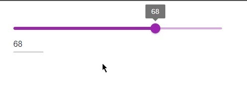
In this example, we've designed a slider that includes labels that are always visible, in Material UI. To ensure the display of the labels, we can utilize the valueLabelDisplay property. Set its value to 'on'. Once this property is defined and the user selects a value, it will be shown above the slider.
import React from "react";
import Slider from "@mui/material/Slider"
import Input from '@mui/material/Input';

const App = () => {
   const [val, setVal] = React.useState(68);
   const handleSliderInput = (e, newValue) => {
      setVal(newValue);
   };

   const handleInputChange = (e) => {
      setVal(e.target.value === '' ? '' : Number(e.target.value));
   };

   return (
      <div style={{
            padding: 40,
            width: '50%'
         }}>
         <Slider
            value={typeof val === 'number' ? val : 0}
            onChange={handleSliderInput}
            aria-labelledby="slider-with-input"
            valueLabelDisplay="on"
            color="secondary"
         />
         <Input
            value={val}
            size="small"
            onChange={handleInputChange}
            inputProps={{
               step: 5,
               min: 0,
               max: 50,
               type: 'number',
               'aria-labelledby': 'slider-with-input',
            }}
         />
      </div>
   );
};

export default App;
Output
Conclusion
In conclusion, this article covers the process of creating a slider with an input field in Material UI using React. To achieve this, we make use of the Input component provided by Material UI. The article outlines stepbystep instructions, for creating sliders with input. Also provides examples and corresponding outcomes.

1K+ Views
