
Article Categories
- All Categories
-
 Data Structure
-
 Networking
-
 RDBMS
RDBMS
-
 Operating System
-
 Java
Java
-
 MS Excel
-
 iOS
iOS
-
 HTML
HTML
-
 CSS
CSS
-
 Android
-
 Python
-
 C Programming
-
 C++
C++
-
 C#
C#
-
 MongoDB
-
 MySQL
MySQL
-
 Javascript
-
 PHP
PHP
-
 Economics & Finance
How to add best fit line/curve and formula in Excel
Consider an example that you are researching the relationship between the purchases and the prices. Now you want to keep this data in an Excel workbook with the best fit curve of the data. You can add the best fit line or curve to your data using an Excel workbook and it?s easy to do.
Adding best fit line/curve and formula in Excel
Kindly note this mentioned can be used in Excel 2013 or the latest versions.
Consider you have given your data of purchases and prices in an Excel workbook. It is possible to add the best fit line or curve to a series of experimental data in Excel, figure out its equation (formula), and calculate it.
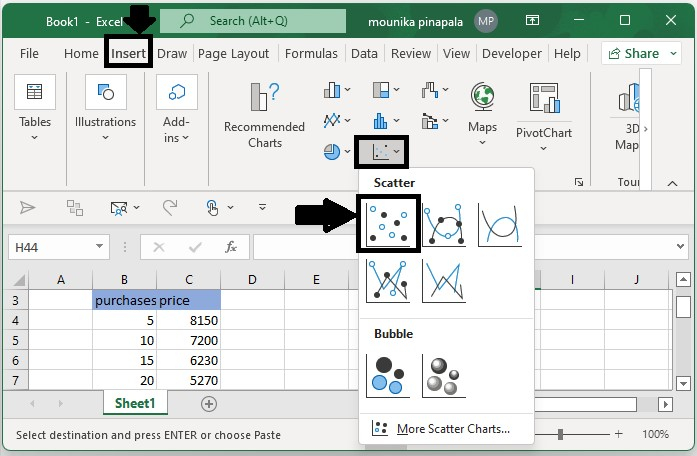
Step 1
Select the data available in the Excel workbook, Now click on Insert and then select the Bubble chart and then Scatter on the insert tab.
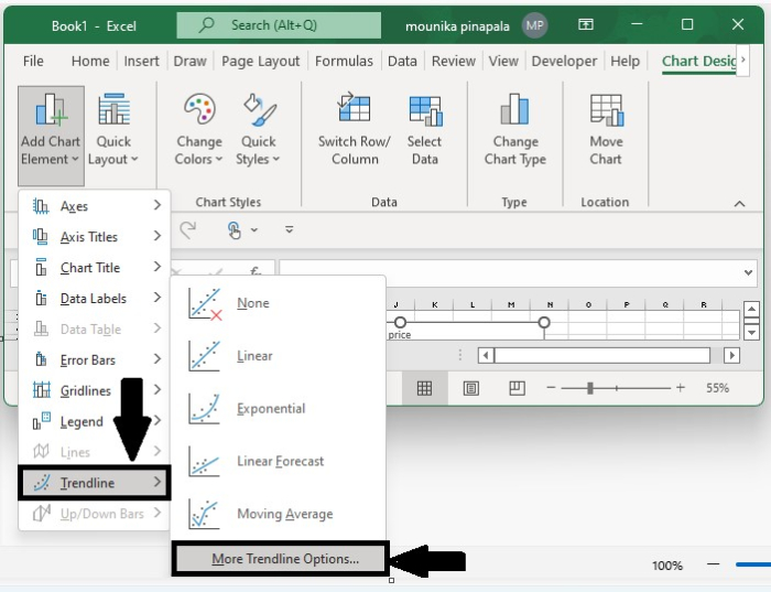
Step 2
Once you select the Scatter chart, click on the Add Chart Element and then select Trendline, in that choose More Trendline options on the Design tab.
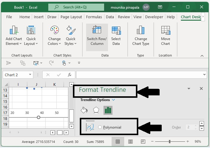
Step 3
Now in the opening Format Trendline pane, select the Polynomial Option, and then adjust the order number in the Trendline options section and then select the Display Equation on the chart option.
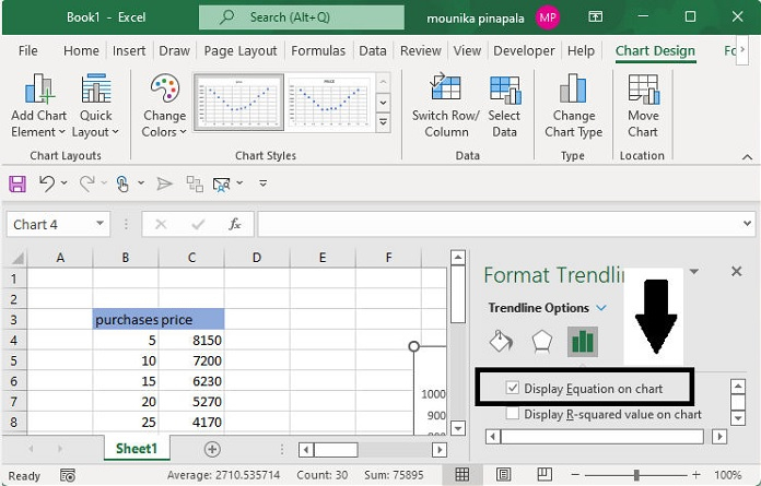
Now you will get the best fit line or curve as well as its equation in the scatter line.
Add Best fit line/curve and formula in Excel 2007 and 2010.
It is important to note that Excel 2007/2010 and Excel 2013 have some differences when it comes to adding best-fit lines or curves and equations.
Step 1
Select the same data original data from the Excel workbook, and then click on Scatter in the Insert tab.
Step 2
Now select the new add scatter chart and then click on Tradeline and then select more Trendline options from the layout tab.
Step 3
From the Trendline dialog box, select the polynomial option and then specify the order number based on your data and select the Display Equation on the chart option.
Step 4
Click on the close button to close the dialog box.

3K+ Views
