
Article Categories
- All Categories
-
 Data Structure
-
 Networking
-
 RDBMS
RDBMS
-
 Operating System
-
 Java
Java
-
 MS Excel
-
 iOS
iOS
-
 HTML
HTML
-
 CSS
CSS
-
 Android
-
 Python
-
 C Programming
-
 C++
C++
-
 C#
C#
-
 MongoDB
-
 MySQL
MySQL
-
 Javascript
-
 PHP
PHP
-
 Economics & Finance
How to add horizontal benchmark/target/base line in an Excel chart?
It is possible to finish the challenge by plotting two distinct kinds of data points on the same graph. Let's imagine you've made a column chart in Excel to display the quantity of sales made by four different teams. But now you want to include a horizontal benchmark line in the chart; how do you think you should go about doing that? This post will provide three potential options for you to consider.
Draw Horizontal Benchmark/Target/Base Line
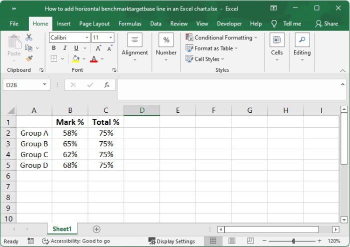
You are keeping track of students' grades using a simple Excel spreadsheet. you need to add a horizontal baseline to this chart so that the user can understand how close they are getting to their total score. If you follow this advice, you should be able to get the desired outcome.
Step 1
You also have a column labelled "Group," as well as another one labelled "Mark." You have also created a simple chart using the two columns as data sources.
Step 2
Choose the data from its source, making sure to include the Total column (A1:C5)
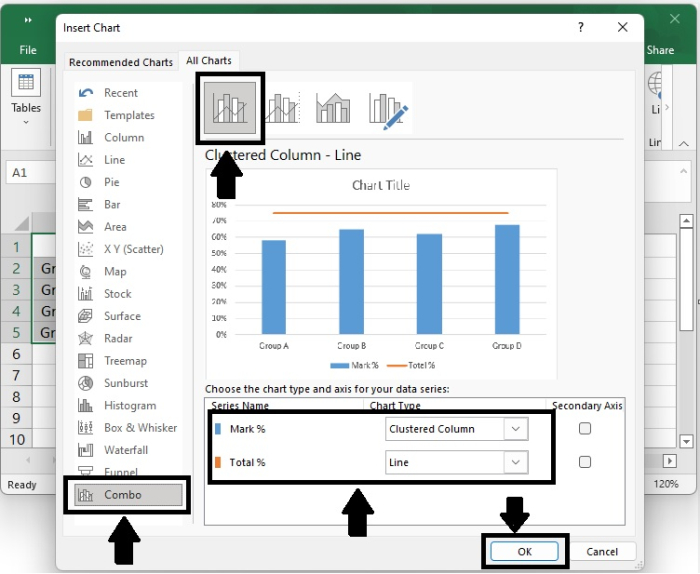
Click Recommended Charts by going to the Insert tab that is found on the Charts group.

Step 3
Click the All Charts tab, then choose the Clustered Column ? Line template, and then click the OK button.
If none of the standard combination charts meet your requirements, you may pick the Custom Combination type (the final template with the pen icon), and then choose the appropriate type for each of the data series.
Step 4
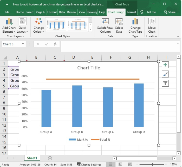
You can now see what the Total percentage looks like in relation to your data set thanks to the addition of a horizontal line that has been shown in the graph.
Conclusion
Including a goal line or a benchmark line in your graph is an even more straightforward process. Instead of using a formula, put your desired results in the very last column, and then place the Clustered Column ?Line combo chart, as shown here.
If none of the standard combination charts meet your requirements, you may pick the Custom Combination type (the final template with the pen icon), and then choose the appropriate type for each of the data series.

6K+ Views
