- SAP Lumira Tutorial
- SAP Lumira - Home
- SAP Lumira - Overview
- SAP Lumira - Data Sources
- SAP Lumira - Data Acquisition
- SAP Lumira - Editing Acquired Data
- SAP Lumira - Viewing Connections
- SAP Lumira - Working with Excel Files
- SAP Lumira - Working with CSV Files
- SAP Lumira - Connecting HANA Views
- SAP Lumira - Download from HANA
- SAP Lumira - Universe as a Data Src
- SAP Lumira - Using Query with SQL
- SAP Lumira - Working Modes
- SAP Lumira - Prepare Phase
- SAP Lumira - Visualize Phase
- SAP Lumira - Compose Phase
- SAP Lumira - Share Phase
- SAP Lumira - New Document
- SAP Lumira - Creating Charts
- SAP Lumira - Chart Types
- SAP Lumira - Conditional Formatting
- SAP Lumira - Preparing Data in Tab
- SAP Lumira - Editing Data
- SAP Lumira - Numbers & Dates
- SAP Lumira - Enriching Data
- SAP Lumira - Working with Datasets
- SAP Lumira - Visualizing Data
- SAP Lumira - Legend Colors
- SAP Lumira - Creating Stories
- SAP Lumira - Slideshows
- SAP Lumira - Customizing Stories
- Lumira - Charts, Stories & Datasets
- SAP Lumira - Publishing Datasets
- SAP Lumira Useful Resources
- SAP Lumira - Questions Answers
- SAP Lumira - Quick Guide
- SAP Lumira - Useful Resources
- SAP Lumira - Discussion
SAP Lumira - Visualizing Data
Creating Charts
In SAP Lumira, a chart can be created by dragging measures and dimensions to the Chart Canvas in the central area in Visualize tab.
To create a chart, there should be at least one measure. When a dimension is added to the chart, it shows values based on the measures.
Adding a chart in Chart builder
To add a chart follow the steps given below.
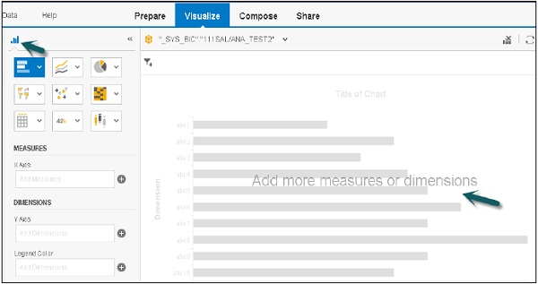
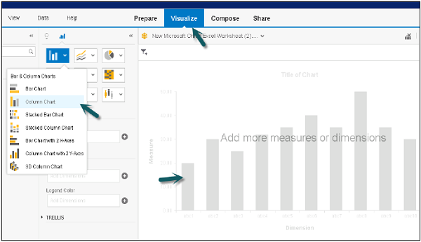
Step 1 − In the Visualize tab, go to Chart Builder.
Step 2 − Select a chart type that you want to use in the Chart Builder. Bar Chart is the default chart type, but you can select any chart from the list.
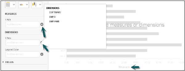
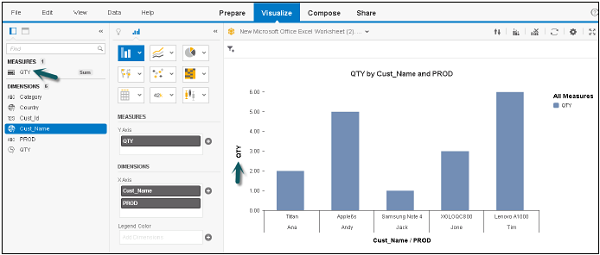
Step 3 − The next step is to choose a measure and drag it to an axis on the Chart Canvas. You can check in chart where to add dimensions and measures. You can click on ‘+’ sign to add a dimension or measure to a chart.
Step 4 − Select a dimension and drag it to the Chart Canvas. Text in the chart body guides you to the correct axis for the dimension.
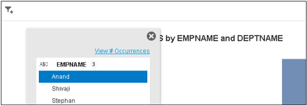
Step 5 − You can also add a filter to the chart by clicking the Filter option at the top.
Step 6 − Select the dimension to which you want to apply a filter and click OK.
Creating a Chart Directly using Chart Builder
In Lumira, you can quickly create a chart by dragging the objects directly to chart area. To create a chart, the dataset should contain at least one measure value.
When you create a chart in SAP Lumira, it can be used in compose and Share tab for the current session.
Step 1 − If you want to save the chart as document to use it permanently you have to go to File → Save.
Step 2 − Go to Visualize tab → Select a chart type from the list of available charts and add to chart builder.
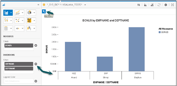
Step 3 − Drag the Measures and Dimensions on axis of the chart. The text written in the chart helps you to find out which object is to be dragged to which axis.
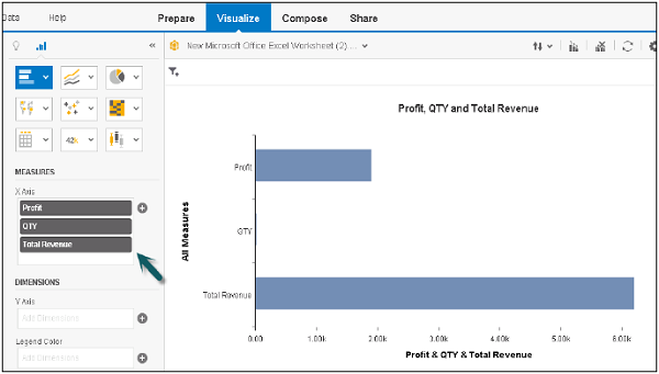
Plotting Measures as a Dimension in a Chart
You can also add measures as a dimension in SAP Lumira. To do this, add two or more measures as dimensions in the chart. This can be used to check how data is spread over multiple axis in a single chart.
Step 1 − Go to Visualize tab → drag measure to measure panel.
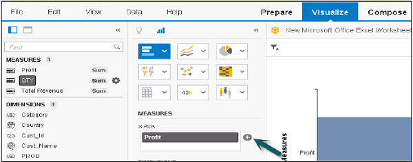
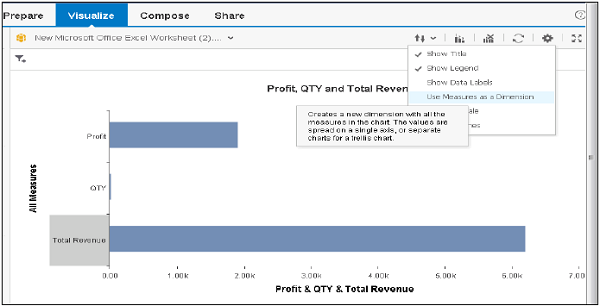
Step 2 − Go to Settings and click use Measures as dimensions option.
Once you select this option, measures are displayed as new measure dimension in Dimension panel.
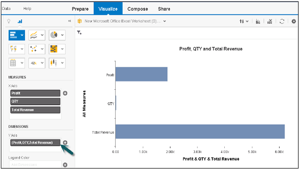
Step 3 − Now you see the Dimension axis, measures will be added to the dimensions panel.
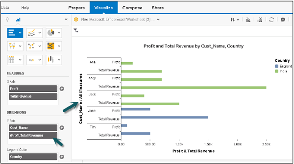
Example
Let us add a dimension to this chart and see how it works.
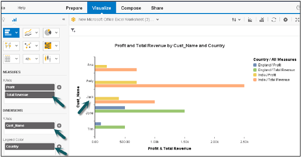
Now, if you go to settings and select measures as dimension option as mentioned above, it will divide the measures as per dimensions in separate charts.