
- SAP Lumira Tutorial
- SAP Lumira - Home
- SAP Lumira - Overview
- SAP Lumira - Data Sources
- SAP Lumira - Data Acquisition
- SAP Lumira - Editing Acquired Data
- SAP Lumira - Viewing Connections
- SAP Lumira - Working with Excel Files
- SAP Lumira - Working with CSV Files
- SAP Lumira - Connecting HANA Views
- SAP Lumira - Download from HANA
- SAP Lumira - Universe as a Data Src
- SAP Lumira - Using Query with SQL
- SAP Lumira - Working Modes
- SAP Lumira - Prepare Phase
- SAP Lumira - Visualize Phase
- SAP Lumira - Compose Phase
- SAP Lumira - Share Phase
- SAP Lumira - New Document
- SAP Lumira - Creating Charts
- SAP Lumira - Chart Types
- SAP Lumira - Conditional Formatting
- SAP Lumira - Preparing Data in Tab
- SAP Lumira - Editing Data
- SAP Lumira - Numbers & Dates
- SAP Lumira - Enriching Data
- SAP Lumira - Working with Datasets
- SAP Lumira - Visualizing Data
- SAP Lumira - Legend Colors
- SAP Lumira - Creating Stories
- SAP Lumira - Slideshows
- SAP Lumira - Customizing Stories
- Lumira - Charts, Stories & Datasets
- SAP Lumira - Publishing Datasets
- SAP Lumira Useful Resources
- SAP Lumira - Questions Answers
- SAP Lumira - Quick Guide
- SAP Lumira - Useful Resources
- SAP Lumira - Discussion
SAP Lumira - Overview
SAP Lumira is known as a visual intelligence tool to create and visualize stories on dataset. It was earlier known as Visual Intelligence tool where you could visualize data and create stories to provide graphical details of the data.
Data is entered in Lumira as data set and you can apply filters, hierarchies, calculated columns to build documents on Lumira. You can choose various charts like Bar charts, Pie charts, etc. to visualize the data effectively.
Example
You can put multiple charts on a story page to create presentation and can add images and text fields in these pages.
These stories can be published to other platforms using the publish option in the application −
- SAP Business Object BI Platform
- SAP Business Object Explorer
- SAP Lumira Server
- SAP HANA
- SAP Community Network(SCN)
Features of Lumira
The key features of Lumira are as follows −
It allows you to predict future outcomes and forecast as per the changing market situations.
You can create data visualizations and stories from multiple data sources.
It helps you to adapt data to organizational needs to create stories with visualizations.
You can share the visualizations on different platforms like SAP HANA, BO Explorer, Business Objects BI Platform, etc.
Key Terms of SAP Lumira Data Set
Data is entered in Lumira as dataset and it contains Attributes/Dimensions and Measures.
Measure − Measures are defined as numerical data types. Example − Quantity sold, Revenue, Unit Price, Average cost, etc.
Attributes/Dimensions − Data containing details about the measures is called Attributes or Dimensions in dataset. This represents the object on which analysis is done. Example − Customer, Product, Order, Time, Region, etc.
Hierarchies − Hierarchies are used for drilling the data to sub levels and defines a parent-child relationship. Example − Time Hierarchy, Region hierarchy.
Custom Calculations − You can create custom calculations in Lumira data Visualization, which are not available in data set or at database level. Example − You have a "Salary" column in the data set, you can add a new calculated column with name "Bonus" and can apply a calculation on Salary to get the value of this column.
SAP Lumira – User Interface
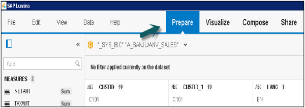
When you login to Lumira Data visualization tool, there are four tabs at the top −
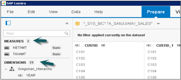
Prepare
Prepare is used to import data set in SAP Lumira. Data is cleansed and converted into appropriate measures or attributes for the reports. You can add new custom calculations here.
Visualize
Visualize tab is used to add graphs and charts on the data that has been imported and organized in Prepare tab. You can add different attributes and measures to the Label axis.
Compose
The Compose tab is used to create stories and presentations, including background colors, titles, pictures, and text.
Share
The Share tab is used to publish your visualizations to different platforms or with different set of users in the BI Repository.