- SAP Lumira Tutorial
- SAP Lumira - Home
- SAP Lumira - Overview
- SAP Lumira - Data Sources
- SAP Lumira - Data Acquisition
- SAP Lumira - Editing Acquired Data
- SAP Lumira - Viewing Connections
- SAP Lumira - Working with Excel Files
- SAP Lumira - Working with CSV Files
- SAP Lumira - Connecting HANA Views
- SAP Lumira - Download from HANA
- SAP Lumira - Universe as a Data Src
- SAP Lumira - Using Query with SQL
- SAP Lumira - Working Modes
- SAP Lumira - Prepare Phase
- SAP Lumira - Visualize Phase
- SAP Lumira - Compose Phase
- SAP Lumira - Share Phase
- SAP Lumira - New Document
- SAP Lumira - Creating Charts
- SAP Lumira - Chart Types
- SAP Lumira - Conditional Formatting
- SAP Lumira - Preparing Data in Tab
- SAP Lumira - Editing Data
- SAP Lumira - Numbers & Dates
- SAP Lumira - Enriching Data
- SAP Lumira - Working with Datasets
- SAP Lumira - Visualizing Data
- SAP Lumira - Legend Colors
- SAP Lumira - Creating Stories
- SAP Lumira - Slideshows
- SAP Lumira - Customizing Stories
- Lumira - Charts, Stories & Datasets
- SAP Lumira - Publishing Datasets
- SAP Lumira Useful Resources
- SAP Lumira - Questions Answers
- SAP Lumira - Quick Guide
- SAP Lumira - Useful Resources
- SAP Lumira - Discussion
SAP Lumira - Quick Guide
SAP Lumira - Overview
SAP Lumira is known as a visual intelligence tool to create and visualize stories on dataset. It was earlier known as Visual Intelligence tool where you could visualize data and create stories to provide graphical details of the data.
Data is entered in Lumira as data set and you can apply filters, hierarchies, calculated columns to build documents on Lumira. You can choose various charts like Bar charts, Pie charts, etc. to visualize the data effectively.
Example
You can put multiple charts on a story page to create presentation and can add images and text fields in these pages.
These stories can be published to other platforms using the publish option in the application −
- SAP Business Object BI Platform
- SAP Business Object Explorer
- SAP Lumira Server
- SAP HANA
- SAP Community Network(SCN)
Features of Lumira
The key features of Lumira are as follows −
It allows you to predict future outcomes and forecast as per the changing market situations.
You can create data visualizations and stories from multiple data sources.
It helps you to adapt data to organizational needs to create stories with visualizations.
You can share the visualizations on different platforms like SAP HANA, BO Explorer, Business Objects BI Platform, etc.
Key Terms of SAP Lumira Data Set
Data is entered in Lumira as dataset and it contains Attributes/Dimensions and Measures.
Measure − Measures are defined as numerical data types. Example − Quantity sold, Revenue, Unit Price, Average cost, etc.
Attributes/Dimensions − Data containing details about the measures is called Attributes or Dimensions in dataset. This represents the object on which analysis is done. Example − Customer, Product, Order, Time, Region, etc.
Hierarchies − Hierarchies are used for drilling the data to sub levels and defines a parent-child relationship. Example − Time Hierarchy, Region hierarchy.
Custom Calculations − You can create custom calculations in Lumira data Visualization, which are not available in data set or at database level. Example − You have a "Salary" column in the data set, you can add a new calculated column with name "Bonus" and can apply a calculation on Salary to get the value of this column.
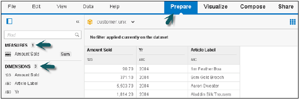
SAP Lumira – User Interface
When you login to Lumira Data visualization tool, there are four tabs at the top −
Prepare
Prepare is used to import data set in SAP Lumira. Data is cleansed and converted into appropriate measures or attributes for the reports. You can add new custom calculations here.
Visualize
Visualize tab is used to add graphs and charts on the data that has been imported and organized in Prepare tab. You can add different attributes and measures to the Label axis.
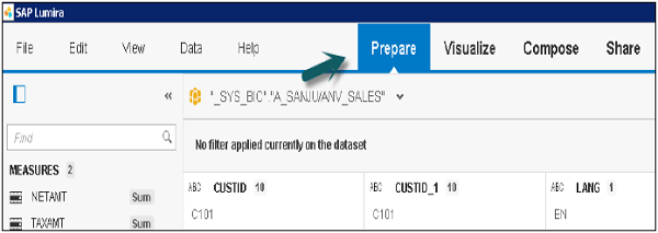
Compose
The Compose tab is used to create stories and presentations, including background colors, titles, pictures, and text.
Share
The Share tab is used to publish your visualizations to different platforms or with different set of users in the BI Repository.
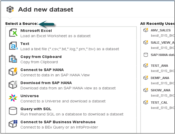
SAP Lumira - Data Sources
You can use different data sources with SAP Lumira to create a data set. A data source can be an Excel file, text file, clipboard, HANA Information Models, Universe created in IDT/UDT, SQL query, connected to a BEx Query or an info provider.
Once you open SAP Lumira, go to File → New Data set
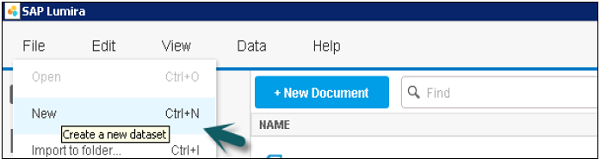
You can select from various Data sources to create a new data set.
SAP Lumira - Data Acquisition
The key steps in Data acquisition are as follows −
For data acquisition in SAP Lumira, create a new document that will contain the data and visualization of acquired data.
Next is to connect to a data source, which contains data for visualization.
Acquire the data to create a data set.
Data acquisition can be done from multiple compatible data sources to use in a single visualization or data analysis.
Once data is acquired, it comes under the Prepare tab.
Select a Data Source. Enter the system details from where the data is to be acquired and click Next.
Select a Data source like SAP HANA View and click Next.
Select Dimensions and Measures and click Create.
SAP Lumira - Editing Acquired Data
Let us learn how to edit the acquired Data. Follow the steps given below.
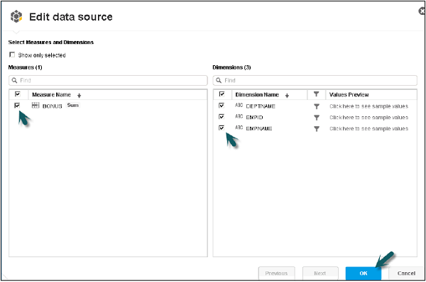
Step 1 − To edit data in SAP Lumira, go to the Data tab and click Edit Data Source from the menu.
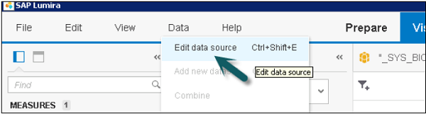
Step 2 − It will take you to Edit Data Source window, where you can again select Measures and Dimension.
Step 3 − You can check or uncheck any of the attributes and measures to add to data set and click the OK button.
SAP Lumira - Viewing Connections
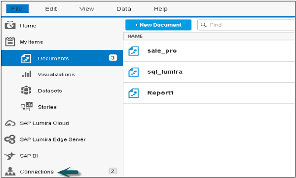
In SAP Lumira, you can check all the connections for an existing application and document associated with each connection and you can change the data source for an existing connection.
To view existing connections, close all the data set.
Step 1 − Click New and close the Add new data set window. In the left pane, it will show you the Connections option.
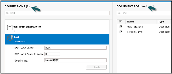
Step 2 − A new window will open with a list of all the existing connections and associated documents. Click a connection and you can change the target data source.
SAP Lumira - Working With Excel Files
You can use an Excel file to create data set in SAP Lumira.
Follow the steps given below.
Step 1 − Go to File → New (Create a data set).
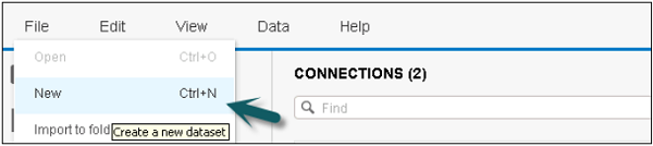
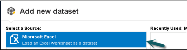
Step 2 − Select a Source − Load an Excel worksheet as a dataset and click the Next icon at the bottom.
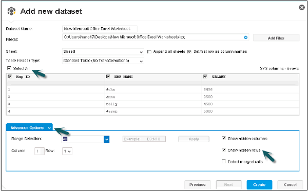
Step 3 − Browse the path of .xls file. You have an option to choose the first row as column names. You can hide a particular column from .xls by selecting the Select All option.
Step 4 − You can click the Advance option to select a custom range. You can also include hidden rows and columns. Once correct options are selected, click the create button at the bottom.
Step 5 − All the data with integer values appear under Measures and all the columns appear under Dimensions. This data will come under the Prepare tab.
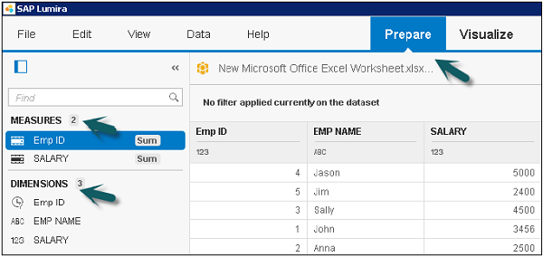
Step 6 − Go to the Visualize tab at the top to create the visualization on top of the data set.
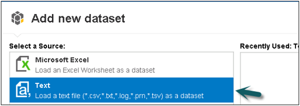
SAP Lumira - Working with CSV Files
You can use a Text file as a data set like .csv file, .txt file, .log file, .prn file, .tsv file.
The following steps explain how to use a text file as a data set.
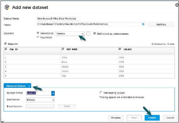
Step 1 − Go to File → New → Add New Dataset → Next.
Step 2 − Select the path of csv file, for example an Excel file. You can set the first row as column names. Select the separator as comma, tab, etc.
The Advance option can be used to select the Number and Date format. Click the Create button to enter the data in the Prepare tab.
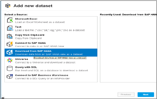
SAP Lumira - Connecting SAP HANA Views
You can connect to SAP HANA Modeling Views in SAP Lumira. This can be done in the following two ways −
- Connect to SAP HANA
- Download from SAP HANA
Connect to SAP HANA
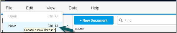
step 1 − Go to File → New
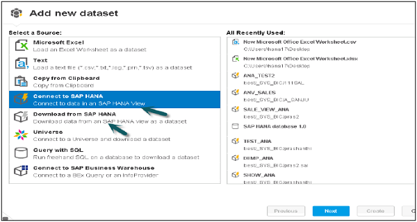
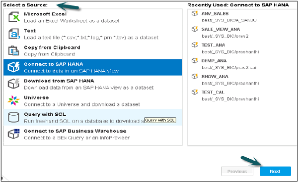
Step 2 − It will show you all the HANA Modeling Views that have been recently used. Click the Next command button after selecting the option "Connect to SAP HANA". This will allow you to access the data in read mode and you can visualize the data in the form of charts.
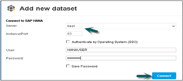
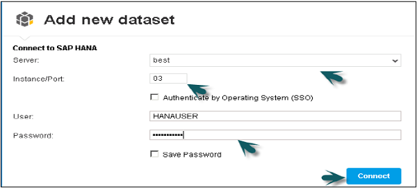
You should know the details of HANA system i.e. Host Name, Port Number, User Name and Password.
Step 3 − Click the Connect button.
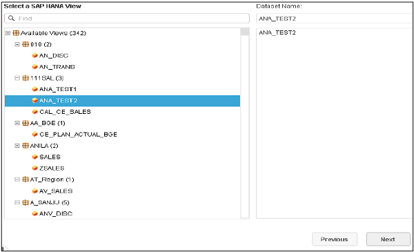
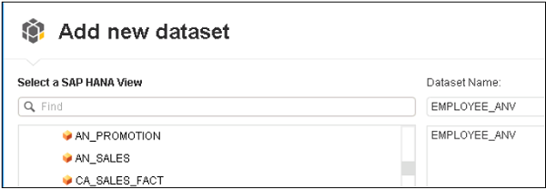
Step 4 − Select a SAP HANA view and then Click Next.
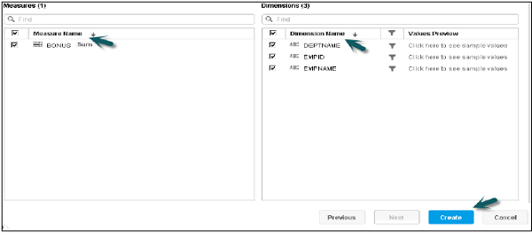
Step 5 − Select Measures and Dimensions you want to add to the data set and click the Create option.
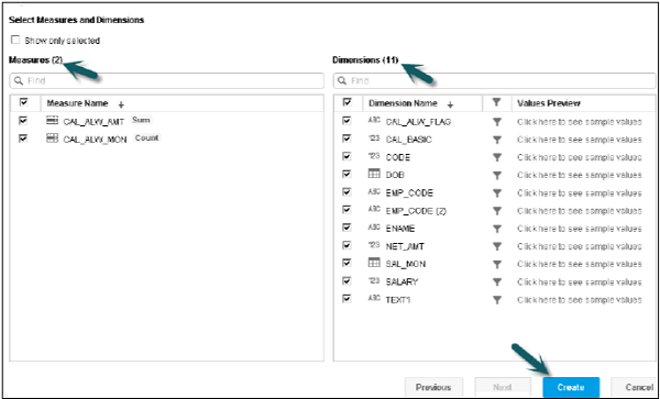
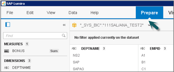
Step 6 − The data will be added to the Prepare tab.
SAP Lumira - Download from SAP HANA
The SAP Lumira – Offline option allows you to copy the data locally and edit and manipulate the data to visualize in the charts.
Step 1 − Go to File → New
The Add new Dataset window will open. On the right pane, most recently used HANA Views, in Lumira data set, will be displayed.
Step 2 − You should know the details of HANA system i.e. Host Name, Port Number, User Name and Password. Click Connect.

Note − You can connect via SSO. Select the Authenticate by Operating System (SSO) check box and click Connect.
Step 3 − Select a SAP HANA View and Click Next.
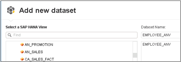
Step 4 − Select Measures and Dimensions you want to add to the data set and click Create.

The data will be added to the Prepare tab in SAP Lumira for visualization.
Specifying values for SAP HANA variables and input parameters
If you have used input variables while creating HANA Modeling Views that will be imported to Lumira data set, you can specify a constant value for user parameter or a range of values.
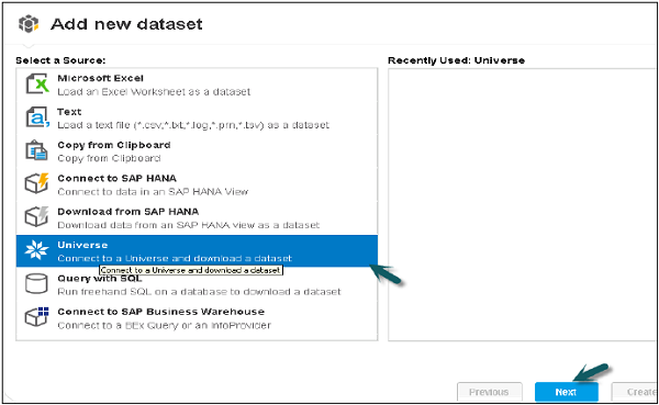
SAP Lumira - Universe as a Data Source
You can use SAP Business Objects Universe as data source in Lumira. The various Universe that are created with .unx extension using Information Design Tool and .unv files created in UDT and published to BI repository can be used as data source in SAP Lumira.
Connecting to a Universe Data Source
The following steps demonstrate how to connect to a Universal Data Source.
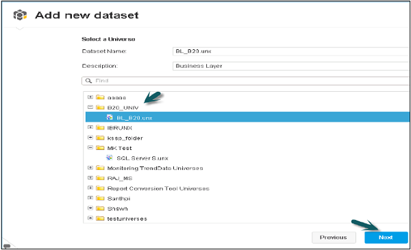
Step 1 − Go to File → New. Select the option Universe to connect to and download a dataset.
Step 2 − Enter the Credential details for Universe i.e. Host name, User Name, Password, Authentication Type. Click the Connect command button.
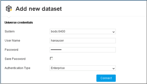
Step 3 − It will show you all Universe created in Information Design Tool. Select the Universe you want to use as a dataset in Lumira and click Next.
Step 4 − A new window will open. In this window, you can add the result objects and filters, which can be applied on the dataset as shown below. Click the Next button at the bottom. If you want to delete any of the object, click the cross icon in front of the object.
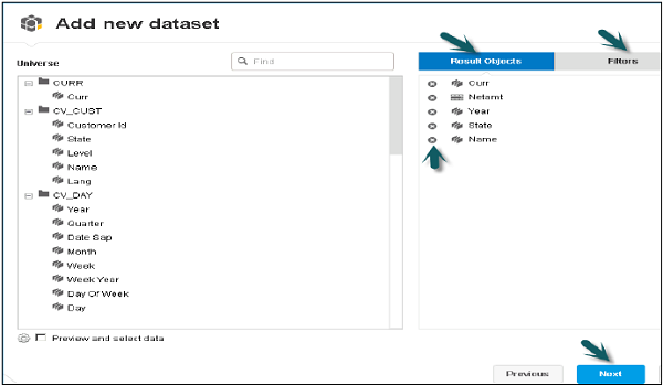
Step 5 − Acquired dataset will come under Prepare tab in SAP Lumira with Dimensions and Measures defined at the Universe level.
SAP Lumira - Using Query with SQL
SAP Lumira allows you to create dataset by using SQL query for target data source, manually. You can specify the source tables, columns, procedures, and functions to acquire data in SAP Lumira.
You can use JDBC drivers for typical databases like Oracle, SQL Server, IBM DB2, Sybase, Teradata.
| Database | JDBC Driver Name |
|---|---|
| Oracle | ojdbc14.jar |
| Microsoft SQL Server | sqljdbc4.jar |
| Teradata | terajdbc4.jar and tdgssconfig.jar |
| Sybase | jconn4.jar |
| IBM DB2 | db2jcc.jar or db2cc.jar and db2jcc_license_cu.jar for versions earlier than 9.5 |
| IBM Netezza | nzjdbc.jar |
Connecting to a Query with SQL Data Source
To connect to a database using SQL query to acquire data, you should have a good understanding of your database and good command over SQL.
You should have correct database drivers installed for your middleware, which allow the client application to connect to middleware and to database.
JDBC drivers have to be installed for database middleware for using SQL query. The access driver is the .jar file. You can download this file from the vendor site and copy to the driver folder in application path.
Given below are the steps to connect to a query with SQL Data Source.
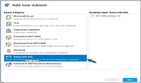
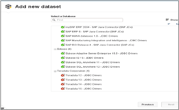
Step 1 − To use SQL query to create dataset, go to File → New.
Select the option Query with SQL to download a dataset and click Next.
Step 2 − Select SQL query. All queries in green represent the drivers, which are installed properly for middleware.
Step 3 − Select database middleware for target database and click Next.
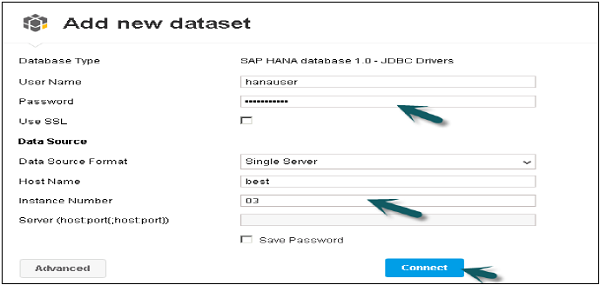
Step 4 − Enter the Login Credentials, like host name, Instance number, User name and Password and click Connect as shown below.
Step 5 − In the left pane, it will show you all the Schemas and tables in the target database.
Select the target table and add to the Query panel. You can click the Preview option to see the data preview.
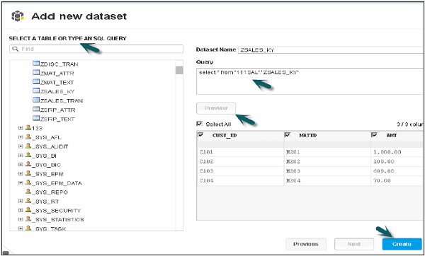
Step 6 − You can use the SELECT statement only in the SQL editor to acquire data from database tables. Click Create to add the dataset to the Prepare tab. You can also use “Select All” option, if you want to use all the columns or uncheck the box to remove any columns to dataset. Click Create.
Specifying Query with SQL connection properties
Using SQL Query option also allows you to create your own data provider, by manually entering the SQL for a target data source to acquire table data.
While using Query with SQL, connection information for the target database should be entered and various connection properties can be used.
User Name − To connect with target database
Password − To connect with target database
Server and Port name − of the target database
Database − Name of the database
You can select Advance options like −
Connection Pool Mode − To keep connection active
Pool timeout − Time duration to keep connection active in minutes.
Array Fetch Size − to determine number of rows to fetch from target database.
Array Bind Size − Larger bind array, more number of rows will be fetched.
Login Timeout − Time before a connection attempts a timeout.
JDBC Driver Properties
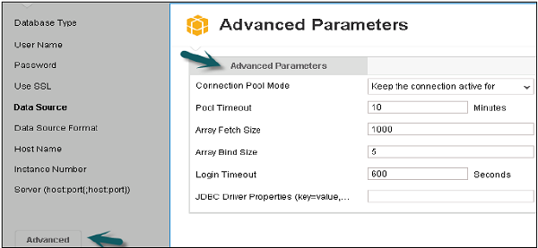
These are various connection properties, which can be defined while using query with SQL option in creating Lumira dataset.
SAP Lumira - Working Modes
You can use SAP Lumira for data visualization, creating charts and stories. Visualizations that are created in Lumira can be kept as private or you can also share with others.
The following functions can be performed in SAP Lumira, once the dataset is created −
Prepare the data for visualizations
Visualize data as charts and stories
Share visualizations and data sets
We will discuss these pages in the next three subsequent chapters.
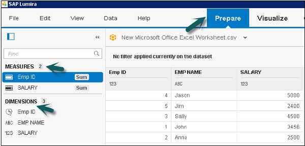
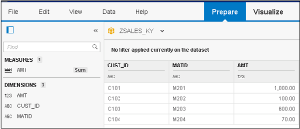
SAP Lumira - Prepare Phase
Once data set is acquired, it appears in Prepare tab. This data needs to be formatted before charting and visualizations. Different types of formatting can be done on acquired data set −
- Data Cleansing
- Create New Measures
- Create Formula
- Add New Dataset
Prepare tab has different panels that can be used to perform these functions.
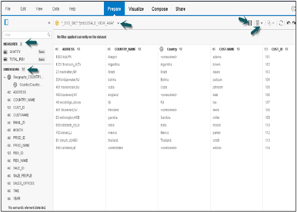
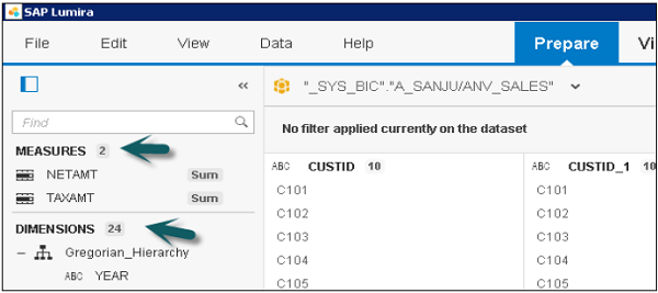
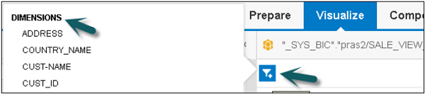
Dimension and Measure Panel
It contains a list of all the dimensions and measures acquired in the data set. The number in front of each object represents its data type.
You can use different tools in this panel to edit the data objects and to add hierarchies.
Dataset Selector
You can select between multiple datasets or you can also acquire a new dataset using this option.
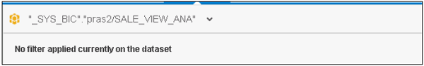
Filter Bar
This represents filter applied to any dimension in dataset. To add a filter click on the icon in front of dataset and click on Filter.

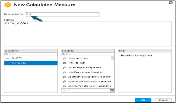
How to add a new Calculated Measure
Go to the following screen, as shown here.
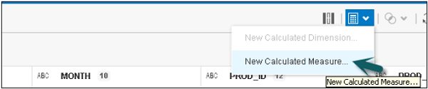
- Enter the new Measure name.
- Enter the formula
- Use function, if required, and click OK.
New Calculated Measure will get added under measures tab in dimension and measure panel.
SAP Lumira - Visualize Phase
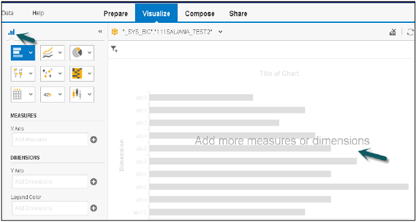
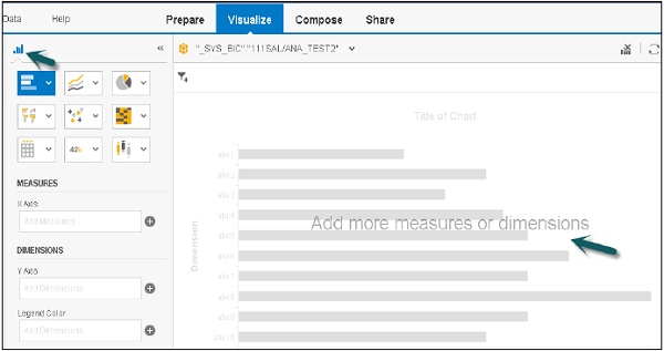
This is used to create different type of charts and visualizations on the dataset available in Prepare tab. Main areas under Visualize tab are −
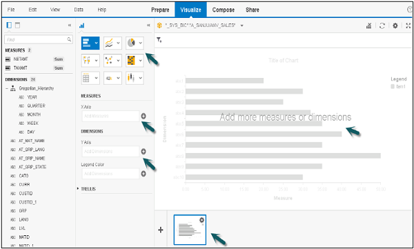
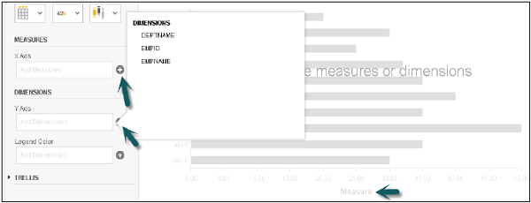
Dimensions and Measures Panel
On the left side, you have the dimensions and measures acquired in the dataset and are available to create visualizations.
You can directly drag the objects from this panel to the chart pane to create the charts on X and Y axes. At the top, you have Horizontal and Vertical Orientation to change the display of objects in this panel.

Chart Canvas
This is used to create or modify a visualization. You can directly drag attributes and measures to chart canvas or can add to chart builder.
You can add various tools like −
- Sorted by Dimensions
- Add or Edit a ranking by measures
- Clear Chart
- Fit chart to frame
- Reprompt
- Refresh
- Settings
- Maximize
- Undo
- Redo
Visualization Tools
Let us see the various tools used for visualization.
Step 1 − Go to File → Preferences → Charts → Charts Canvas Layout
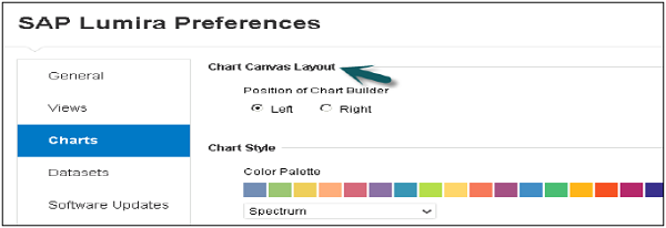
Step 2 − You can select Chart Style, Template, Font Zoom, etc.
Chart Picker
You can select different types of chart from this panel. You have an option to select various types of charts in Lumira.
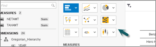
Chart Shelves
Chart Shelves are used to add measures and dimensions to a visualization.
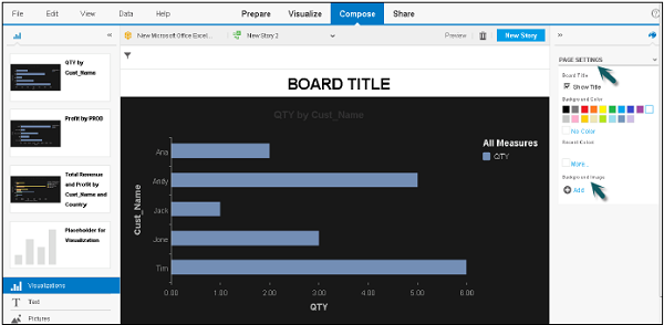
SAP Lumira - Compose Phase
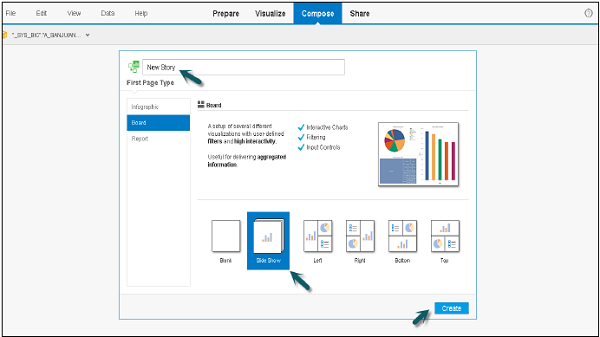
You can create different stories in SAP Lumira, in a presentation-style document using visualization, graphics and other customizations that have been applied to the dataset.
You have to customize the compose tab once and you get multiple options to select an Infographic, Board or a Report.
Enter the name of the Story and click Create. You have different panels in Compose tab as shown in the screenshot.
Content Panel
The left panel contains different types of content that you can add to the story page. You can select any item and drag it to a section on the story page.
- Dataset Selector
- Story Selector
- Preview
- Filter Bar
- Add Page and Delete Page
- Page Settings, Etc.

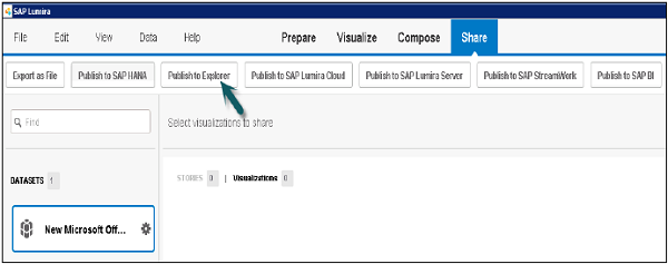
SAP Lumira - Share Phase
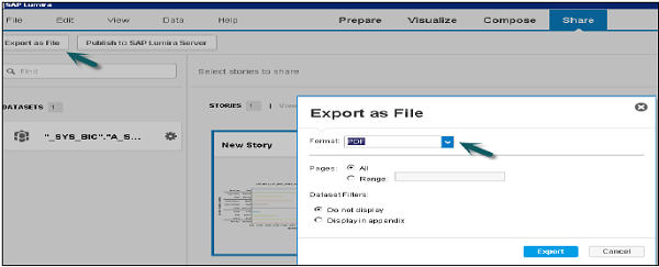
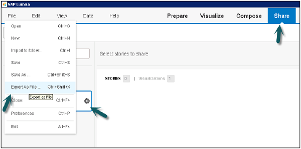
Once you are done with datasets, visualizations and stories, there is an option to export, print or publish them.
You have the following options to export datasets.
Export as File: you can save dataset as .csv or. xls file.
Publish to SAP HANA.
Publish to Explorer.
Publish to BI platform.
Exporting Stories
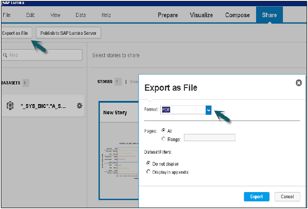
You can export a story in PDF format.
Exporting Visualizations
You can export to a printer or can also send in an email to a user.
SAP Lumira - New Document
Let us see how a document is created and saved in SAP Lumira.
To create a new document, go to File → New.
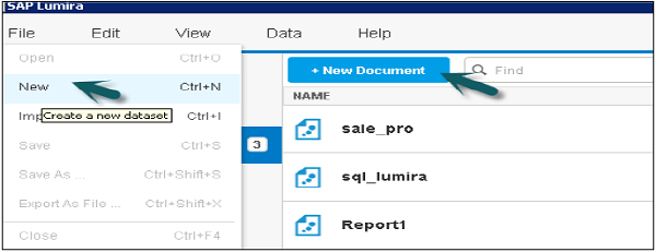
Select a Source to acquire the dataset or from recently used and click Next.
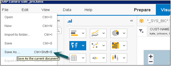
Saving Documents
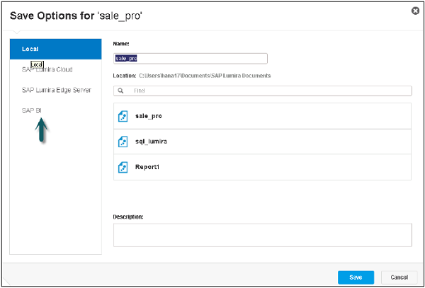
After creating datasets, visualizations and stories in SAP Lumira, you can save a document locally. When you save a document, all the objects are saved with the document.
You can also save a document to Lumira Cloud, SAP Lumira Edge server or SAP BI platform.
To save a document follow the steps given below.
Step 1 − Go to File → Save As.
SAP Lumira - Creating Charts
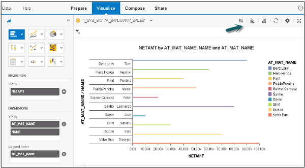
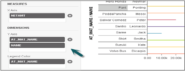
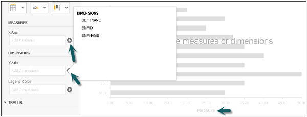
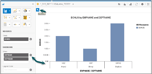
In SAP Lumira, a chart can be created by dragging measures and dimensions to the Chart Canvas in the central area under the Visualize tab.
To create a chart, there should be at least one measure. When a dimension is added to the chart, it shows values based on the measures.
Adding a chart in Chart builder
Follow the steps to add a chart.
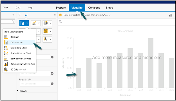
Step 1 − In the Visualize tab, go to Chart Builder.
Step 2 − Select a chart type that you want to use in the Chart Builder. Bar Chart is the default chart type, but you can select any chart from the list.
Step 3 − The next step is to choose a measure and drag it to an axis on the Chart Canvas. You can check in chart where to add dimensions and measures.
Step 4 − You can click on ‘+’ sign to add a dimension or measure to a chart.
Step 5 − Select a dimension and drag it to the Chart Canvas. The text in the chart body guides you to the correct axis for the dimension.
Step 6 − You can also add a filter to chart by clicking on filter option at the top.
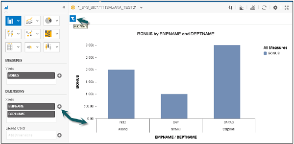
Step 7 − Select the dimension on which you want to apply a filter and click OK.
SAP Lumira - Chart Types
There are different types of charts available in Lumira.
Comparison − These chart types are used to compare the difference between values. Common comparison-type charts are −
- Bar Chart
- Column Chart
- Radar Chart
- Area Chart
- Heat map
Percentage − These are used to show percentage of parts in a chart. Common Percentage-type charts are −
- Pie Chart
- Donut Chart
- Tree
- Funnel Chart
Correlation − These are used to show the relationship between different values. Common chart types are −
- Scatter Plot
- Bubble Chart
- Network Chart
- Numeric Point
- Tree
Trend − These are used to show the data patterns or possible patterns. Common chart types are −
- Line Chart
- Waterfall Chart
- Box Plot
- Parallel Coordinates Chart
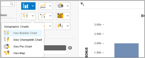
Geographic − These are used to present the map of a country or globe present in the analysis. Common chart types are −
- Geo Bubble Chart
- Geo Choropleth Chart
- Geo Pie Chart
- Geo Map
SAP Lumira - Conditional Formatting
It is used to mention the critical data points in a chart by different values meeting certain condition. Multiple conditional formatting rules can be applied on measures or dimensions.
Conditional formatting can be applied on −
- Bar and Column charts (except 3D column charts)
- Pie chart
- Donut chart
- Scatter chart
- Bubble chart
- Cross tab
Creating a Conditional Formatting Rule
To define a conditional formatting in a chart, it should have a measure value added to it.
The procedure is given below.
Click the new Conditional formatting icon. It will open the rule editor box. Enter the name of rule editor.
Select Based on list to add a measure or a dimension. You can set multiple conditional formatting rules on a single measure or dimension.
The next step is to select an operator and add one or more values for condition.
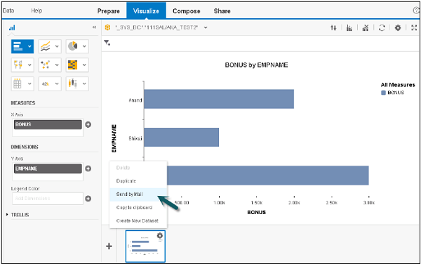
Saving Charts
You can save a chart by clicking the Settings button. The available options are displayed.
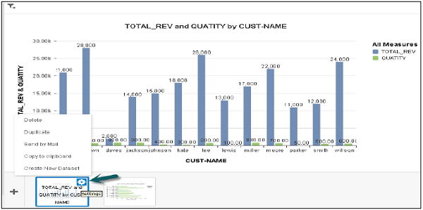
The various options available are −
- Copy to Clipboard
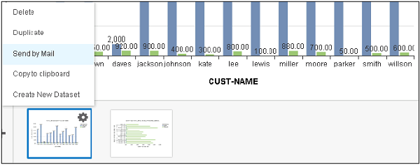
- Send by Mail
- Duplicate
Copy to Clipboard − You can use the copy to clipboard option. Select the Export size and click OK.
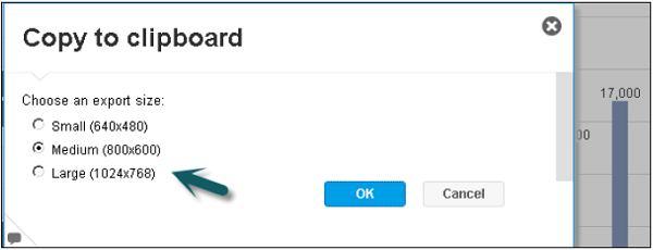
You can paste this chart in any Document file, Paint, etc.
Send by mail − Select an Export size → OK. It will attach the chart in the mail and you have to enter the recipient email id.
Duplicate option will create a copy of the chart in same Visualization tab.
SAP Lumira - Preparing Data in Prepare Tab
Once data set is acquired, it appears in Prepare tab. This data needs to be formatted before charting and visualizations. Different types of formatting can be done on acquired data set −
- Data Cleansing
- Create New Measures
- Create Formula
- Add New Dataset
Prepare tab has different panels that can be used to perform these functions −

Dimension and Measure Panel
It contains a list of all the dimensions and measures acquired in the data set. The number in front of each object represents its data type.
You can use different tools in this panel to edit the data objects and to add hierarchies.
Dataset Selector
You can select between multiple datasets or you can also acquire a new dataset using this option.
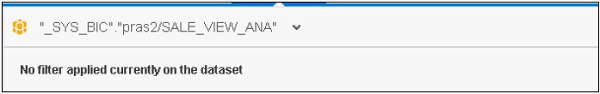
Filter Bar
This represents a filter applied to any dimension in dataset. To add a filter, click the icon in front of the dataset and select the option Filter.
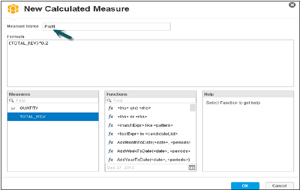
How to add new Calculated Measure?
Step 1 − To add a new Calculated Measure, Select New Calculated Measure.
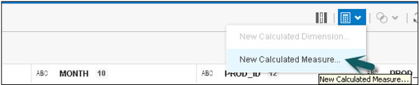
Step 2 − new Measure name.
Step 3 − Enter the formula.
Step 4 − Use a function if required and click OK.
A new Calculated Measure will be added under the measures tab in dimension and measure panel.
SAP Lumira - Editing Data
Go to the options tab in front of each object and select the Edit option you want to perform.
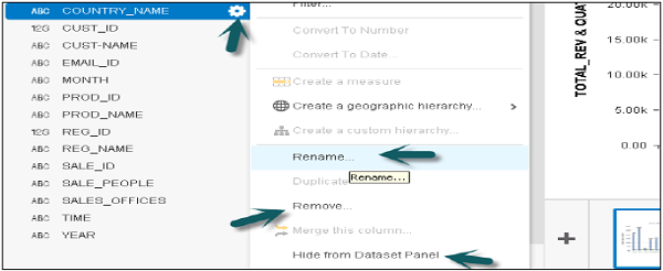
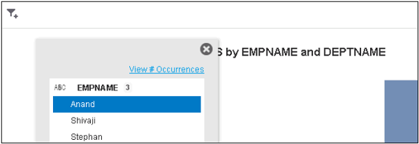
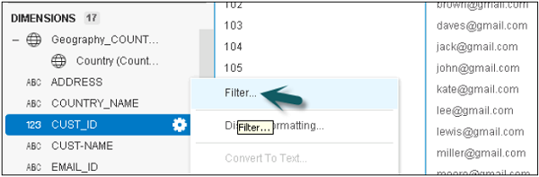
Filtering Data in Columns and Charts
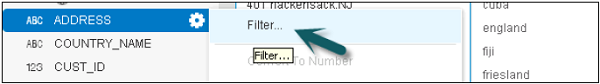
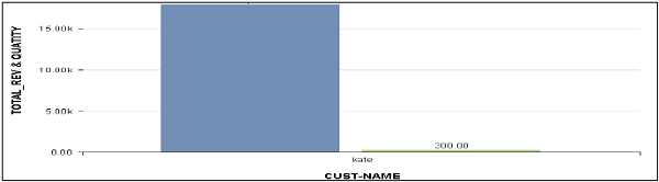
To filter a value in the Prepare tab, you can click the Options tab in front of any object.
Step 1 − Go to Filter.
Step 2 − In the filter option, you can select keep only or Exclude values for a particular value.
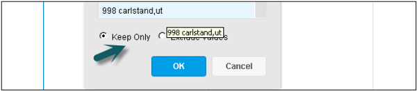
Step 3 − Here, only one value is selected. Accordingly, the visualization changes under the Visualize tab.
Step 4 − Once filter is applied, it will come in filter panel in the Prepare tab.
Step 5 − It can be removed by clicking the x button in front of the filter. In a similar way, you can apply filter on a chart in Visualize tab.
Step 6 − Click Add filter and select a dimension or a measure to add a filter to the chart. (No keep only or Exclude values option while applying filters in a chart).
SAP Lumira - Formatting Numbers & Dates
You can display numbers, date, time and different data types in multiple formats in SAP Lumira. You can also add a custom symbol as prefix or suffix to any object.
To set the numbers and date follow the steps given below −
Step 1 Go to Prepare tab → Dimension and Measure Panel → Options → Display formatting
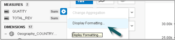
You have multiple options −
- Select a Value format
- Choose a Display format
- Select a Custom Symbol
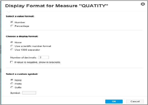
Step 2 − In case of prefix or suffix, maximum number of characters is 256. You can also convert data type into another.
Step 3 − In Prepare tab → Go to column heading → Options.
SAP Lumira - Enriching Data
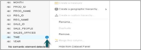
Creating Hierarchies
This option can be used if the acquired dataset contains data that can be converted to hierarchies like Time hierarchy or Region hierarchy.
Hierarchies are used to display data at different granularity level and you can drill up/down at different levels for better understanding of relationship between objects.
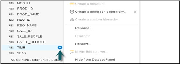
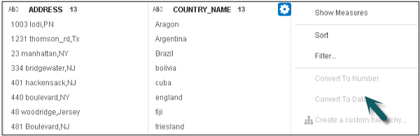
Creating a Geography hierarchy
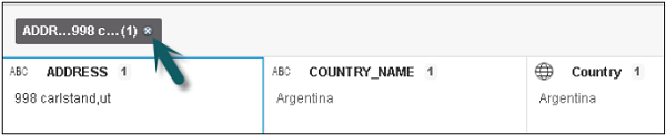
When the data is acquired, the application looks for dimension containing location and present with an icon.
Step 1 − Click the icon in front of a dimension. From the available options, select Create a Geographic hierarchy → By Names (this option is available only for string dimensions).
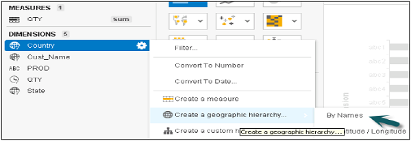
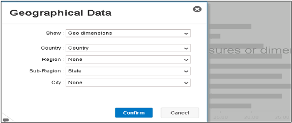
Step 2 − A new window will open with the name Geographical data → select the dimension to map to hierarchy. Click Confirm.
Example −
| Country | Cust_Name | QTY | PROD | State |
|---|---|---|---|---|
| India | Jack | 1 | Phone | Haryana |
| England | Jone | 3 | Tab | Durham |
| India | Andy | 5 | Phone | Punjab |
| India | Ana | 2 | Watch | Chennai |
| England | Tim | 6 | Tab | Kent |
Step 3 − If Region does not apply to the dataset, select None from the list.
Step 4 − It will show you, a list of all the analyzed values, Solved and Not Found. For all the solved values, it will create a hierarchy. Click Done.
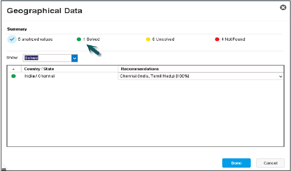
You will observe the following −
Locations mapped exactly are marked with green.
Locations with more than one possible match (for example, if more than one city named London was found) are marked with yellow.
Locations not found in the geographic database are marked with Red.
Hierarchy will be added under Geographical data.
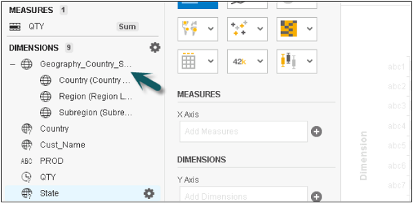
Step 5 − To use this chart, select any Geo chart like Geo Bubble chart.
Step 6 − Add Country to Geography and Measure to the chart. Select the value in the chart and you will get a drill option to the next level.
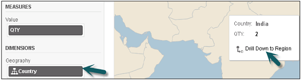
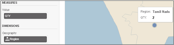
Step7 − If you click the Drill option, you will go to the next level and so on.
In a similar way, you can apply Time hierarchy.
Creating a Custom Hierarchy
You can create hierarchies using any available combination of dimensions in acquired dataset.
Example
Category → Product Line → Product
| Country | Cust_Name | QTY | PROD | PROD Category |
|---|---|---|---|---|
| India | Jack | 1 | Samsung Note 4 | Phone |
| England | Jone | 3 | XOLOQC800 | Tab |
| India | Andy | 5 | Apple6s | Phone |
| India | Ana | 2 | Titan | Watch |
| England | Tim | 6 | Lenovo A1000 | Tab |
Follow the steps given below −
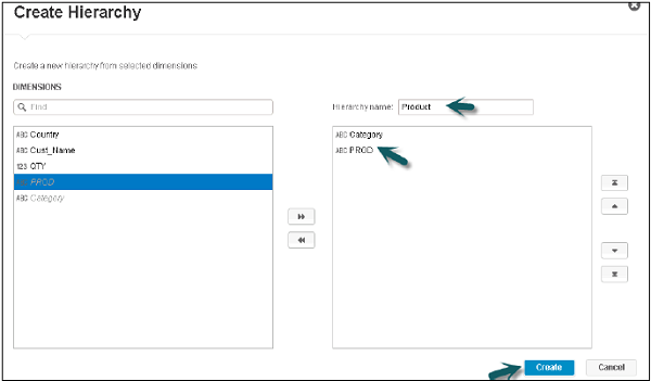
Step 1 − Select Category → Options → Create a Custom hierarchy
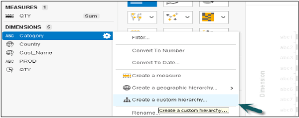
Step 2 − A new window will open. Enter the name of the hierarchy and select the other dimensions to add to the next levels. Click Create. The arrows can be used to change the level.
Step 3 − The Product hierarchy will be added under the Dimensions tab.
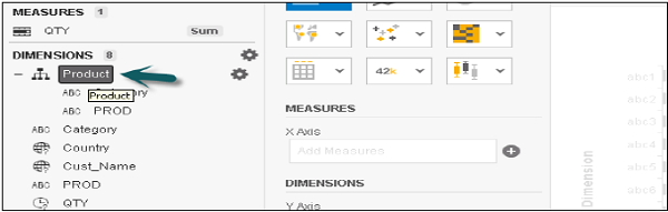
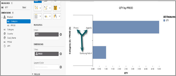
Step 4 − Add a Bar chart and then Add Category and QTY to measures.
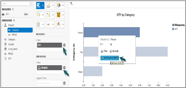
Once you click the Category option, you will get an option to drill down to the next level (PROD).
SAP Lumira - Working with Datasets
Adding Datasets
You can open multiple datasets in a single document and add dataset to a document.
The following steps will explain you how to add a data set.
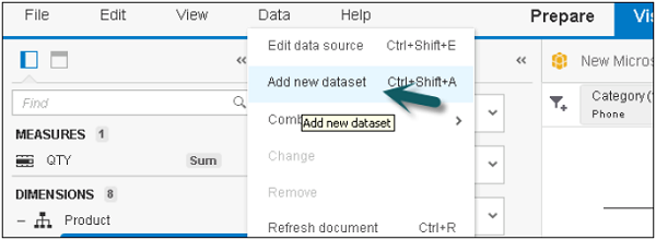
Step 1 − Go to the Data pane at the top and select Add new Dataset.
Step 2 − A new Dataset window will open. Select a Source and click Next.
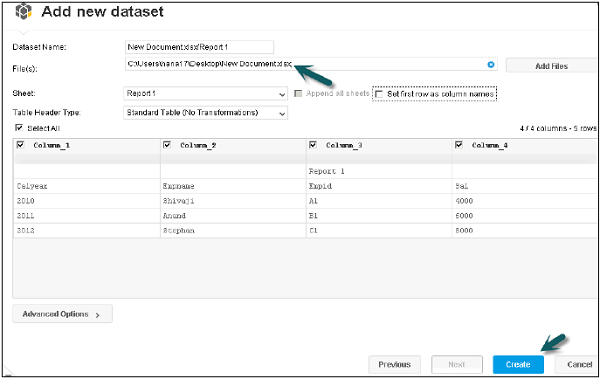
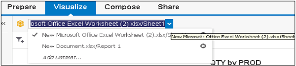
Step 3 − Click the Create button to add the dataset. To switch between the dataset, Click the drop down button and select the dataset you want to work on.
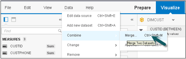
Merging Dataset
You can also merge two datasets by using the Join operator.
Step 1 − Go to the Data pane at the top → Combine → Merge.
To merge, note that −
- They should have the same key column.
- Column with the same data type can be merged.
- All columns can be merged.
Step 2 − Once you click on Merge, it will show new window and compatible data type. Select Merge type and click Merge.
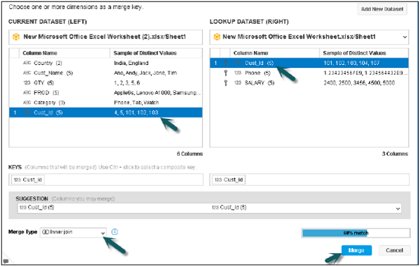
All the columns will be merged and added to the measure and dimension panel.
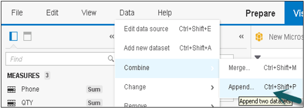
SAP Lumira – Appending Datasets using Union Operator
You can use a Union operator to append two datasets.
Step 1 − Go to Data → Combine → Append.
Step 2 − A new window will open with Append data. To use append, both the tables should contain the same number of columns and compatible data types. Only compatible data types can be appended.
Step 3 − Select different source dimension to apply a Union with target dimension.
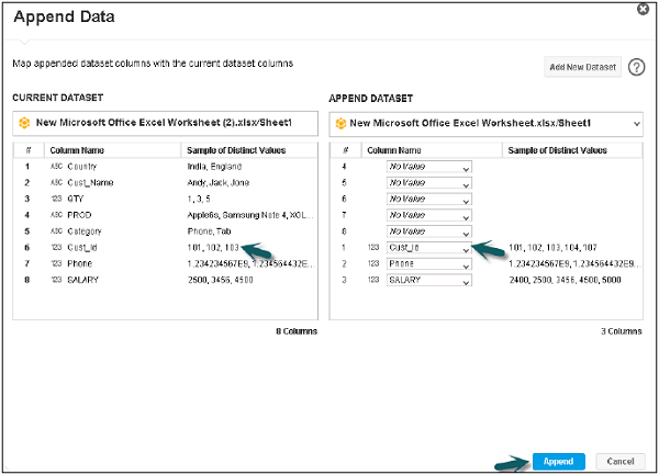
If the selected dimension contains compatible data type, the dimension can be appended. If both, the source and the target dimensions are different, a message appears, “Union cannot happen”.
Step 4 − Once you click Append, both the datasets are combined and this combined dataset contains the name of the original dataset.
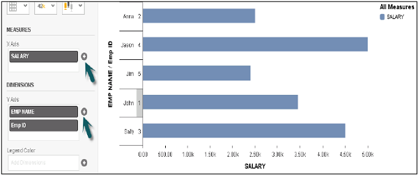
SAP Lumira - Visualizing Data
Creating Charts
In SAP Lumira, a chart can be created by dragging measures and dimensions to the Chart Canvas in the central area in Visualize tab.
To create a chart, there should be at least one measure. When a dimension is added to the chart, it shows values based on the measures.
Adding a chart in Chart builder
To add a chart follow the steps given below.
Step 1 − In the Visualize tab, go to Chart Builder.
Step 2 − Select a chart type that you want to use in the Chart Builder. Bar Chart is the default chart type, but you can select any chart from the list.
Step 3 − The next step is to choose a measure and drag it to an axis on the Chart Canvas. You can check in chart where to add dimensions and measures. You can click on ‘+’ sign to add a dimension or measure to a chart.
Step 4 − Select a dimension and drag it to the Chart Canvas. Text in the chart body guides you to the correct axis for the dimension.
Step 5 − You can also add a filter to the chart by clicking the Filter option at the top.
Step 6 − Select the dimension to which you want to apply a filter and click OK.

Creating a Chart Directly using Chart Builder
In Lumira, you can quickly create a chart by dragging the objects directly to chart area. To create a chart, the dataset should contain at least one measure value.
When you create a chart in SAP Lumira, it can be used in compose and Share tab for the current session.
Step 1 − If you want to save the chart as document to use it permanently you have to go to File → Save.
Step 2 − Go to Visualize tab → Select a chart type from the list of available charts and add to chart builder.
Step 3 − Drag the Measures and Dimensions on axis of the chart. The text written in the chart helps you to find out which object is to be dragged to which axis.
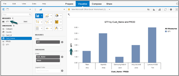
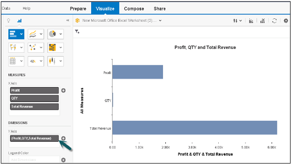
Plotting Measures as a Dimension in a Chart
You can also add measures as a dimension in SAP Lumira. To do this, add two or more measures as dimensions in the chart. This can be used to check how data is spread over multiple axis in a single chart.
Step 1 − Go to Visualize tab → drag measure to measure panel.
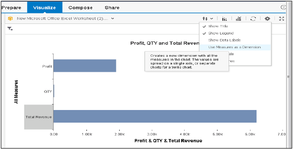
Step 2 − Go to Settings and click use Measures as dimensions option.
Once you select this option, measures are displayed as new measure dimension in Dimension panel.
Step 3 − Now you see the Dimension axis, measures will be added to the dimensions panel.
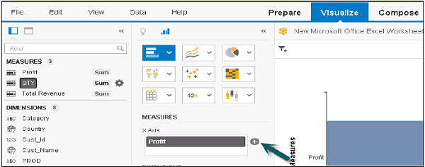
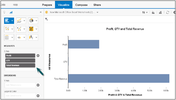
Example
Let us add a dimension to this chart and see how it works.
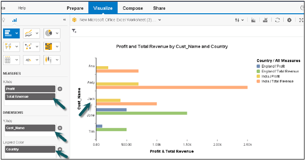
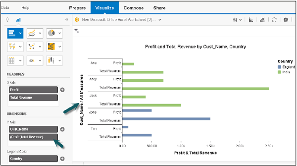
Now, if you go to settings and select measures as dimension option as mentioned above, it will divide the measures as per dimensions in separate charts.
SAP Lumira - Legend Colors
You can change the color of charts in SAP Lumira. Follow the steps given below.
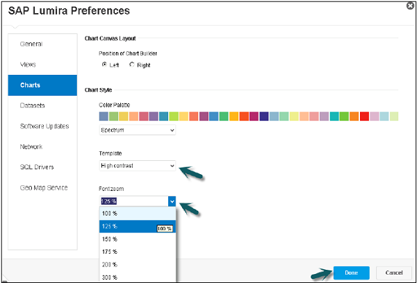
Step 1 − To change the colors, Go to File → Preferences.
Step 2 − A new window will open. Go to charts and you can select different colors as per the requirement.
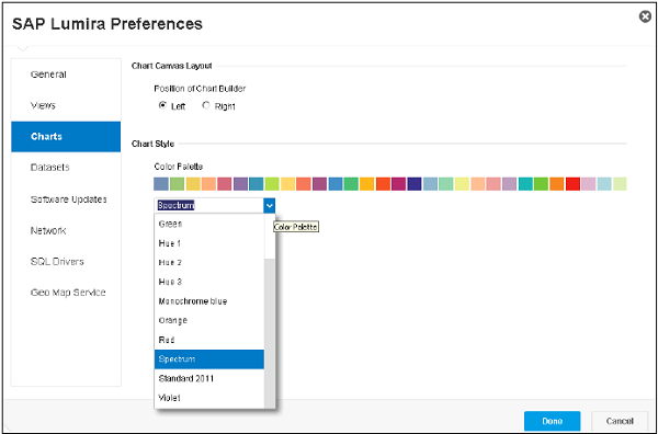
Step 3 − You can also change the font zoom and template attribute as shown in the screenshot below. Once you complete all the settings, click Done and the relevant changes will be applied to the chart in Chart builder.
Adding Custom Charts
To add custom charts in SAP Lumira, you can use SAP Lumira software development kit SDK. You can add custom charts in SAP Lumira using VizPacker and these charts will be added to list of available charts in canvas.
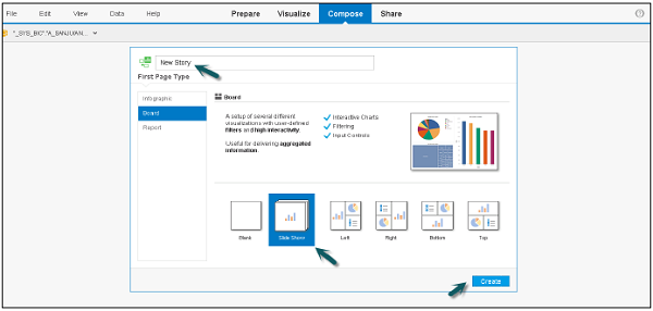
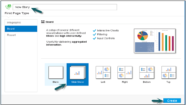
SAP Lumira - Creating Stories
You can create different stories in SAP Lumira in presentation-style document using visualization, graphics and other customizations that have been applied to the dataset.
You have to customize the compose tab once and you get multiple options to select an Infographic, Board or a Report.
Enter the name of the Story and click Create. You have different panels in Compose tab as shown in the screenshot.
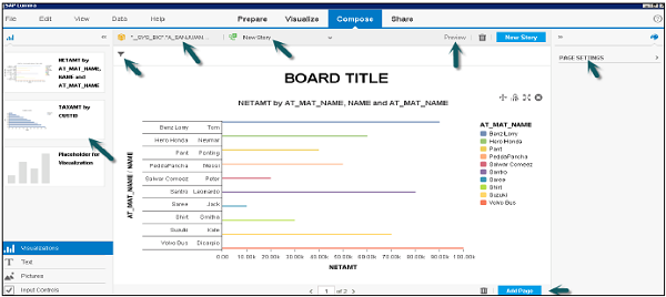
Content Panel
The left panel contains different types of content that you can add to the story page. You can select any item and drag it to a section on the story page.
- Dataset Selector
- Story Selector
- Preview
- Filter Bar
- Add Page and Delete Page
- Page Settings, Etc.
Creating Stories with Charts and Data
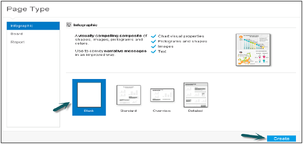
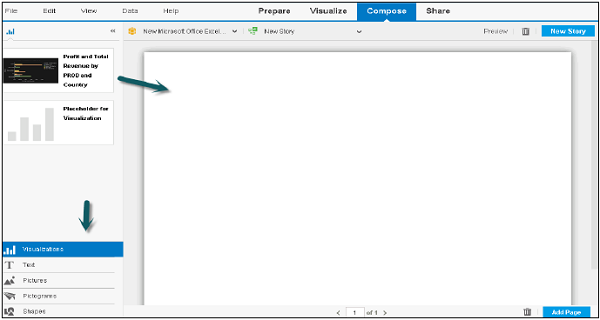
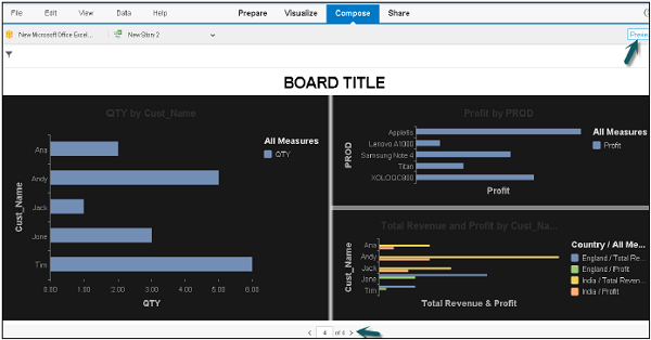
Step 1 − To create stories using chart, go to Compose and select a Blank Infographic. Click the Create button as shown in the screenshot below.
In the left panel, you will get options to add Visualizations, Text, pictures, pictograms, etc.
Step 2 − To add multiple visualizations in a story, just click on the + sign at the bottom pane.
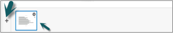
Step 3 − Drag a chart you want to add, to the story.
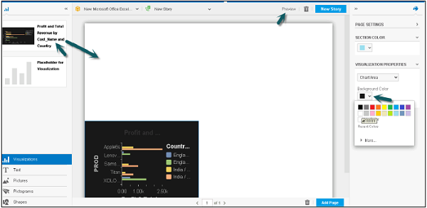
Step 4 − Suppose you want to add two charts in your Lumira story. One by the Customer and other by the product. Drag one chart to Story area.
Step 5 − You can also do page settings, Back ground color, etc.
Step 6 − To add another chart, go back to the Visualize tab and make changes to the Chart Dimension and measure panel.
Step 7 − Go to Compose tab and select the next chart to be added. All Visualizations in Visualize tab will be shown under the left panel. You can create multiple visualizations to create stories.
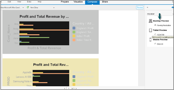
Step 8 − At the top, you have an option to preview the story in desktop preview, tablet preview and mobile device. Click the Preview icon. To go back, click the Preview icon again.
SAP Lumira - Slideshows
You can also create slideshows in SAP Lumira. To create a slide show follow the steps given below.
Step 1 − Go to Compose → Slide Show → Create. You can select different types of charts Left, Right, Bottom, Top, etc.
Step 2 − Once you select the Slide show, it will add all the Visualizations in slide show automatically. You can also drag the Visualization from left panel and add to the slide show.
Step 3 − On the right side, you can do Page settings like background color, background Image, etc.
Step 4 − You can click the Preview tab to see the preview or Add Page to add a page to this story.
SAP Lumira - Customizing Stories
You can also create customized stories in SAP Lumira. To create customized stories, you can add different types of pages in a story.
Step 1 − To add a page click Add Page and select a page you want to add to story.
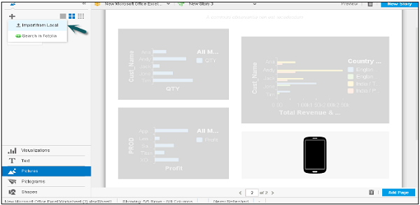
Step 2 − Drag the Visualization from left panel to the story. There are inbuilt images that can be used in a story.
Step 3 − Go to Pictogram on the left side and it will show you all the available pictograms that can be used in a story.
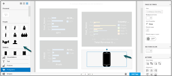
Step 4 − You can also add images from local machine. Go to Pictures and click the + sign.
Step 5 − Select Import from local. Add the path of the image you want to import and click Open.
Lumira - Charts, Stories & Datasets
Once you are done with the datasets, visualizations and stories, there is an option to export, print or publish them.
Export Dataset as File
Step 1 − You can save dataset as .csv or. xls file.
Step 2 − To do this, go to the Share tab and select the dataset from the left panel. Go to File → Export As.
You will get an option to save it as a .xls or .csv file.
Exporting Stories
You can export a story in PDF format. You can also select all pages to export or number of pages in range option.
Exporting Visualizations in Email or Print
You can export to a printer or can also send in an email to a user.
Step 1 − Go to options in a Visualization and click on Send by mail.
Step 2 − Choose an Export Size, Small, Medium or Large and Click OK.
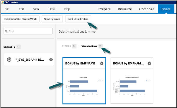
Step 3 − To Print a Visualization, go to the Share tab → Select Visualizations and you will get an option to Print Visualization at the top.
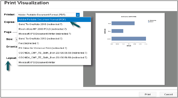
Step 4 − You will get options under Printer like PDF, Send to One Note, etc.
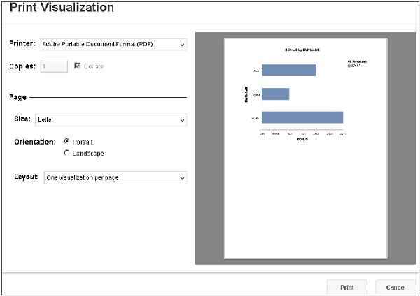
Step 5 − You can also select the Copies, Page, Size, Orientation and Layout under Print Visualization.
SAP Lumira - Publishing Datasets
To publish datasets to SAP HANA follow the procedure given below.
Step 1 − Go to the Share tab and select the dataset to be published. Once you select the dataset, you will see all the options as shown in the screenshot given below.
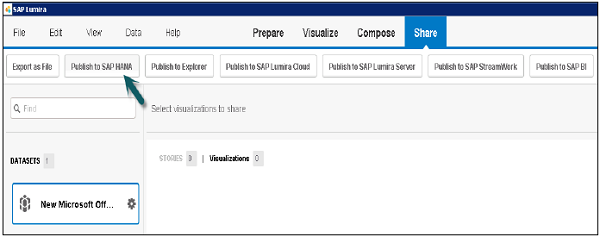
Step 2 − To publish to HANA, you have to note that the only dataset is published to HANA server and not visualizations. Enter the details of HANA system i.e. Server, Instance, User Password and click Connect.
You have an option to select a new Package and a View.
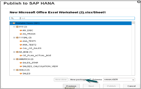
The dataset is published as new Analytic view.
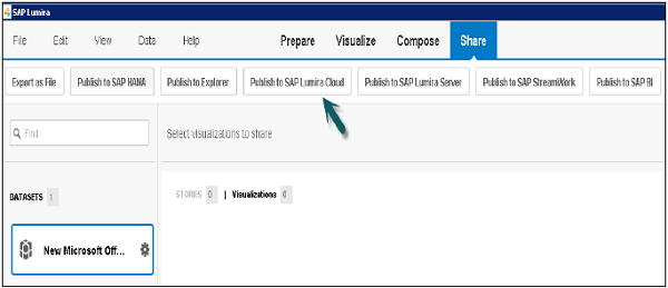
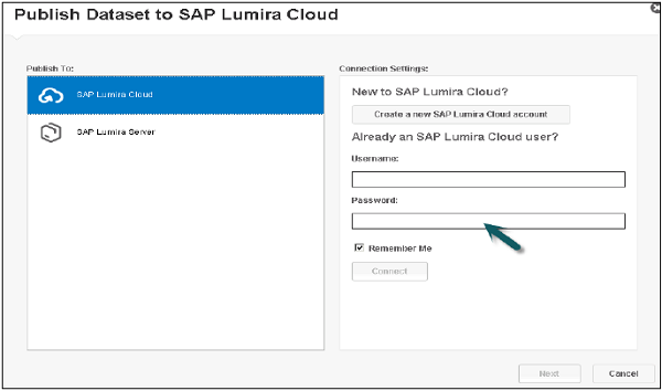
Publishing to the SAP Lumira Cloud
Step 1 − Go to Compose → Select the Dataset → Publish to SAP Lumira Cloud.
Step 2 − Enter the user name and password and click Next.
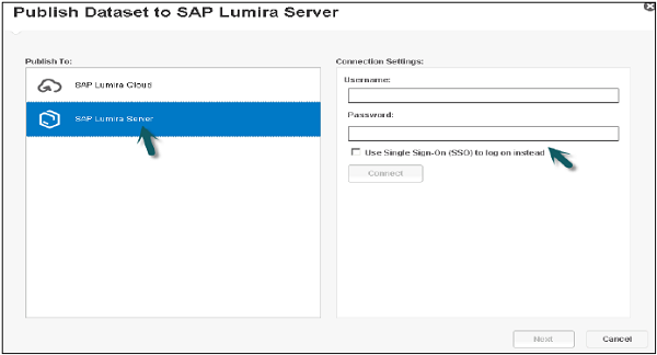
Publishing to the SAP Lumira Server
Step 1 − Go to Compose → Select the Dataset → Publish to SAP Lumira Server.
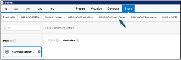
Step 2 − Enter the Lumira Server Details i.e. User name and password and click Next.
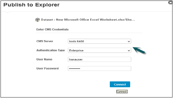
Publishing Datasets to Explorer
Step 1 − Go to Compose → Select Dataset from Left panel → Publish to Explorer.
Step 2 − Enter the details such as CMS server, User name and password and click Connect.
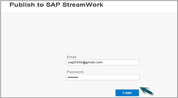
Publish to SAP Stream work
Step 1 − Go to Compose → Select Dataset from Left Panel → Publish to SAP Stream work.
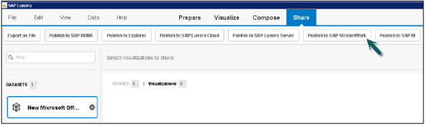
Step 2 − Enter email and password and Click the login button.