- PyGTK Tutorial
- PyGTK - Home
- PyGTK - Introduction
- PyGTK - Environment
- PyGTK - Hello World
- PyGTK - Important Classes
- PyGTK - Window Class
- PyGTK - Button Class
- PyGTK - Label CLass
- PyGTK - Entry Class
- PyGTK - Signal Handling
- PyGTK - Event Handling
- PyGTK - Containers
- PyGTK - Box Class
- PyGTK - ButtonBox Class
- PyGTK - Alignment Class
- PyGTK - EventBox Class
- PyGTK - Layout Class
- PyGTK - ComboBox Class
- PyGTK - ToggleButton Class
- PyGTK - CheckButton Class
- PyGTK - RadioButton Class
- PyGTK - MenuBar, Menu & MenuItem
- PyGTK - Toolbar Class
- PyGTK - Adjustment Class
- PyGTK - Range Class
- PyGTK - Scale Class
- PyGTK - Scrollbar Class
- PyGTK - Dialog Class
- PyGTK - MessageDialog Class
- PyGTK - AboutDialog Class
- PyGTK - Font Selection Dialog
- PyGTK - Color Selection Dialog
- PyGTK - File Chooser Dialog
- PyGTK - Notebook Class
- PyGTK - Frame Class
- PyGTK - AspectFrame Class
- PyGTK - TreeView Class
- PyGTK - Paned Class
- PyGTK - Statusbar Class
- PyGTK - ProgressBar Class
- PyGTK - Viewport Class
- PyGTK - Scrolledwindow Class
- PyGTK - Arrow Class
- PyGTK - Image Class
- PyGTK - DrawingArea Class
- PyGTK - SpinButton Class
- PyGTK - Calendar Class
- PyGTK - Clipboard Class
- PyGTK - Ruler Class
- PyGTK - Timeout
- PyGTK - Drag and Drop
- PyGTK Useful Resources
- PyGTK - Quick Guide
- PyGTK - Useful Resources
- PyGTK - Discussion
PyGTK - RadioButton Class
A single RadioButton widget offers functionality similar to CheckButton. However, when more than one radio button is present in the same container, then a mutually exclusive choice is available for the user to choose from one of the available options. If every radio button in the container belongs to the same group, then as one is selected, others are automatically deselected.
The following is a constructor of the gtk.RadioButton class −
gtk.RadioButton(group = None, Label = None, unerline = None)
In order to create a button group, provide group=None for the first Radio button, and for the subsequent options, provide the object of the first button as group.
As in case of ToggleButton and CheckButton, the RadioButton also emits the toggled signal. In the example given below, three objects of the gtk.RadioButton widget are placed in a VBox. All of them are connected to a callback function on_selected(), to process the toggled signal.
The callback function identifies the label of source RadioButton widget and displays it on the label put in the VBox.
Example
Observe the following code −
import gtk

class PyApp(gtk.Window):

   def __init__(self):
      super(PyApp, self).__init__()
      self.set_title("Radio Button")
      self.set_default_size(250, 200)
      self.set_position(gtk.WIN_POS_CENTER)
      vbox = gtk.VBox()

      btn1 = gtk.RadioButton(None, "Button 1")
      btn1.connect("toggled", self.on_selected)
      btn2 = gtk.RadioButton(btn1,"Button 2")
      btn2.connect("toggled", self.on_selected)
      btn3 = gtk.RadioButton(btn1,"Button 3")
      btn3.connect("toggled", self.on_selected)

      self.lbl = gtk.Label()
      vbox.add(btn1)
      vbox.add(btn2)
      vbox.add(btn3)
      vbox.add(self.lbl)
      self.add(vbox)
      self.connect("destroy", gtk.main_quit)
      self.show_all()

   def on_selected(self, widget, data=None):
      self.lbl.set_text(widget.get_label()+" is selected")
if __name__ == '__main__':
   PyApp()
   gtk.main()
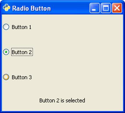
The above code will generate the following output −