- PyGTK Tutorial
- PyGTK - Home
- PyGTK - Introduction
- PyGTK - Environment
- PyGTK - Hello World
- PyGTK - Important Classes
- PyGTK - Window Class
- PyGTK - Button Class
- PyGTK - Label CLass
- PyGTK - Entry Class
- PyGTK - Signal Handling
- PyGTK - Event Handling
- PyGTK - Containers
- PyGTK - Box Class
- PyGTK - ButtonBox Class
- PyGTK - Alignment Class
- PyGTK - EventBox Class
- PyGTK - Layout Class
- PyGTK - ComboBox Class
- PyGTK - ToggleButton Class
- PyGTK - CheckButton Class
- PyGTK - RadioButton Class
- PyGTK - MenuBar, Menu & MenuItem
- PyGTK - Toolbar Class
- PyGTK - Adjustment Class
- PyGTK - Range Class
- PyGTK - Scale Class
- PyGTK - Scrollbar Class
- PyGTK - Dialog Class
- PyGTK - MessageDialog Class
- PyGTK - AboutDialog Class
- PyGTK - Font Selection Dialog
- PyGTK - Color Selection Dialog
- PyGTK - File Chooser Dialog
- PyGTK - Notebook Class
- PyGTK - Frame Class
- PyGTK - AspectFrame Class
- PyGTK - TreeView Class
- PyGTK - Paned Class
- PyGTK - Statusbar Class
- PyGTK - ProgressBar Class
- PyGTK - Viewport Class
- PyGTK - Scrolledwindow Class
- PyGTK - Arrow Class
- PyGTK - Image Class
- PyGTK - DrawingArea Class
- PyGTK - SpinButton Class
- PyGTK - Calendar Class
- PyGTK - Clipboard Class
- PyGTK - Ruler Class
- PyGTK - Timeout
- PyGTK - Drag and Drop
- PyGTK Useful Resources
- PyGTK - Quick Guide
- PyGTK - Useful Resources
- PyGTK - Discussion
PyGTK - CheckButton Class
A CheckButton widget is nothing but a ToggleButton styled as a checkbox and a label. It inherits all properties and methods from the ToggleButton class. Unlike ToggleButton where the caption is on the button's face, a CheckButton displays a small square which is checkable and has a label to its right.
Constructor, methods, and signals associated with gtk.CheckButton are exactly the same as gtk.ToggleButton.
Example
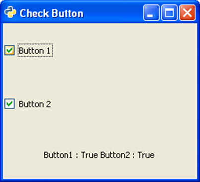
The following example demonstrates the use of CheckButton widget. Two CheckButtons and a Label are placed in a VBox. The toggled signal of the first CheckButton is connected to the on_checked() method which sets the state of the second button to True if that of the first is false and vice versa.
Observe the code −
import gtk

class PyApp(gtk.Window):

   def __init__(self):
      super(PyApp, self).__init__()
      self.set_title("Check Button")
      self.set_default_size(250, 200)
      self.set_position(gtk.WIN_POS_CENTER)

      vbox = gtk.VBox()
      self.btn1 = gtk.CheckButton("Button 1")
      self.btn1.connect("toggled", self.on_checked)
      self.btn2 = gtk.CheckButton("Button 2")
      self.btn2.connect("toggled", self.on_checked)
      self.lbl = gtk.Label()

      vbox.add(self.btn1)
      vbox.add(self.btn2)
      vbox.add(self.lbl)

      self.add(vbox)
      self.connect("destroy", gtk.main_quit)
      self.show_all()

   def on_checked(self, widget, data = None):
      state = "Button1 : "+str(self.btn1.get_active())+"
         Button2 : "+str(self.btn2.get_active())
      self.lbl.set_text(state)
if __name__ == '__main__':
   PyApp()
   gtk.main()
The above code will generate the following output −