- MicroStrategy Tutorial
- MicroStrategy - Home
- MicroStrategy - Overview
- MicroStrategy - Environment Setup
- MicroStrategy - Desktop
- MicroStrategy - Architecture
- MicroStrategy - Importing Data
- MicroStrategy - OLAP Services
- MicroStrategy Objects
- Configuration Objects
- MicroStrategy - Public Objects
- MicroStrategy - Schema Objects
- MicroStrategy - Report Objects
- MicroStrategy Basic Reporting
- MicroStrategy - Report Types
- MicroStrategy - Slicing
- MicroStrategy - Dicing
- MicroStrategy - Pivoting
- MicroStrategy - Drilldown
- MicroStrategy - Rollup
- MicroStrategy - Creating Metrics
- MicroStrategy - Nested Metrics
- MicroStrategy Advanced Reporting
- Creating Derived Metrics
- MicroStrategy - Metric Comparison
- MicroStrategy - Creating Filters
- MicroStrategy - Advanced Filters
- Shortcut & Embedded Filters
- MicroStrategy - Refreshing Reports
- MicroStrategy - Intelligent Cubes
- MicroStrategy Dashboards
- Creating a Dashboard
- Formatting a Dashboard
- MicroStrategy - Graph Visualizations
- MicroStrategy - Grid Visualizations
- Heat Map Visualization
- MicroStrategy - N/W Visualization
- Visualization with Multiple Datasets
- Filtering Data in Dashboard
- MicroStrategy - Adding Web Content
- MicroStrategy Office
- Conditional Formatting
- MicroStrategy - Custom Groups
- MicroStrategy - Report Cache Flow
- MicroStrategy - Data Marts
- MicroStrategy - Predictive Models
- MicroStrategy Useful Resources
- MicroStrategy - Quick Guide
- MicroStrategy - Useful Resources
- MicroStrategy - Discussion
Visualization with Multiple Datasets
So far we saw reporting with one source of data as the source. But we can also add more than one data source to the same report. In such case, we can use the attributes and metrics from both the sources in creating the visualization. The result appears as if we are dealing with one source of data. This happens because MicroStrategy combines both these sources and internally treats them as one.
Following are the steps to combine two source data sets and create a visualization.
Step 1
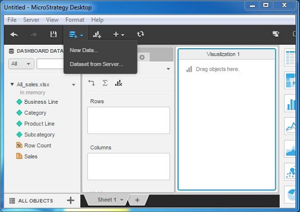
Create a report with one source of data. We will use All_sales.xlsx in the example. Next, click the New Data menu as shown in the following screenshot.
Step 2
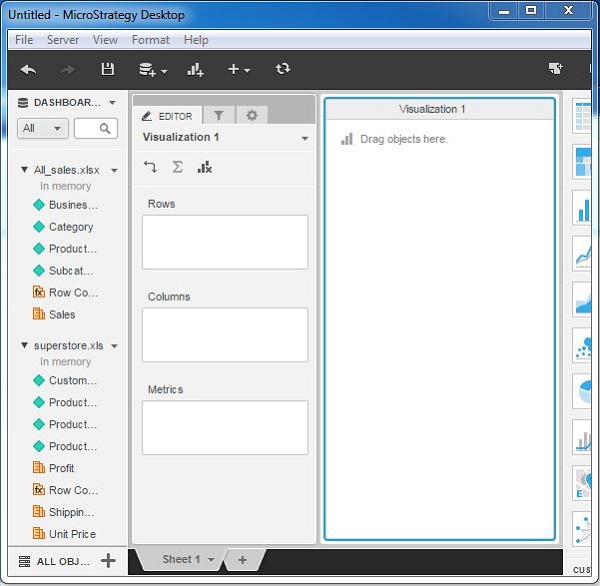
Now you can see both the data sources available under the Dashboard. The attributes and metrics of both of these sources are available under their respective names.
Step 3
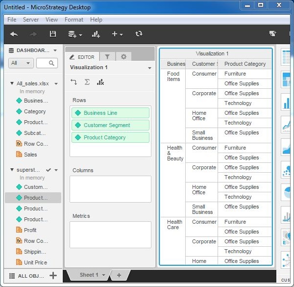
Next, drag the attribute “Business Line” from All_sales.xlsx to the rows box. Drag the attributes “customer segment” and “Product Category” from the second data set to the rows box. The grid visualization appears showing data from both the data sets.