- MicroStrategy Tutorial
- MicroStrategy - Home
- MicroStrategy - Overview
- MicroStrategy - Environment Setup
- MicroStrategy - Desktop
- MicroStrategy - Architecture
- MicroStrategy - Importing Data
- MicroStrategy - OLAP Services
- MicroStrategy Objects
- Configuration Objects
- MicroStrategy - Public Objects
- MicroStrategy - Schema Objects
- MicroStrategy - Report Objects
- MicroStrategy Basic Reporting
- MicroStrategy - Report Types
- MicroStrategy - Slicing
- MicroStrategy - Dicing
- MicroStrategy - Pivoting
- MicroStrategy - Drilldown
- MicroStrategy - Rollup
- MicroStrategy - Creating Metrics
- MicroStrategy - Nested Metrics
- MicroStrategy Advanced Reporting
- Creating Derived Metrics
- MicroStrategy - Metric Comparison
- MicroStrategy - Creating Filters
- MicroStrategy - Advanced Filters
- Shortcut & Embedded Filters
- MicroStrategy - Refreshing Reports
- MicroStrategy - Intelligent Cubes
- MicroStrategy Dashboards
- Creating a Dashboard
- Formatting a Dashboard
- MicroStrategy - Graph Visualizations
- MicroStrategy - Grid Visualizations
- Heat Map Visualization
- MicroStrategy - N/W Visualization
- Visualization with Multiple Datasets
- Filtering Data in Dashboard
- MicroStrategy - Adding Web Content
- MicroStrategy Office
- Conditional Formatting
- MicroStrategy - Custom Groups
- MicroStrategy - Report Cache Flow
- MicroStrategy - Data Marts
- MicroStrategy - Predictive Models
- MicroStrategy Useful Resources
- MicroStrategy - Quick Guide
- MicroStrategy - Useful Resources
- MicroStrategy - Discussion
MicroStrategy - Graph Visualizations
MicroStrategy Desktop provides 10 standard graphs which are readily available to be plotted with a data source. Each of them gives a different view of the data depending on the number of attribute or metrics we are going to use. The coloring features in each of them will make it easy to understand the different chunks of data present in a single data visualization.
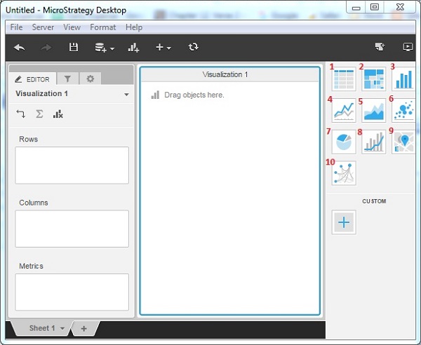
Visualization Gallery
In the right most window of MicroStrategy Desktop, there is a visualization gallery, which shows options for 10 different graph types.
Grid − Represents data in the form of data grid as rows and columns.
Heat Map − Shows rectangles of different colors showing a range of values.
Bar Chart − Presents vertical bars of different length showing the strength of the parameter measured.
Line Chart − Shows the lines indicating variation of value of one variable with respect to another.
Area Chart − Shows areas of different colors corresponding to different values.
Pie Chart − Shows the slices in a circle, with the size of the slice corresponding to the value of the variable measured.
Bubble Chart − Represents many bubbles corresponding to the range of the value of the variable.
Combo Chart − Combines Bar chart and Line chart into one visualization.
Map − Displays data as map markers on an interactive map.
Network − Used to identify relationships between related items and clusters of values.
The following screenshot shows different Graph Visualizations.