- ggplot2 Tutorial
- ggplot2 - Home
- ggplot2 - Introduction
- ggplot2 - Installation of R
- ggplot2 - Default Plot in R
- ggplot2 - Working with Axes
- ggplot2 - Working with Legends
- ggplot2 - Scatter Plots & Jitter Plots
- ggplot2 - Bar Plots & Histograms
- ggplot2 - Pie Charts
- ggplot2 - Marginal Plots
- ggplot2 - Bubble Plots & Count Charts
- ggplot2 - Diverging Charts
- ggplot2 - Themes
- ggplot2 - Multi Panel Plots
- ggplot2 - Multiple Plots
- ggplot2 - Background Colors
- ggplot2 - Time Series
- ggplot2 Useful Resources
- ggplot2 - Quick Guide
- ggplot2 - Useful Resources
- ggplot2 - Discussion
ggplot2 - Multiple Plots
In this chapter, we will focus on creation of multiple plots which can be further used to create 3 dimensional plots. The list of plots which will be covered includes −
- Density Plot
- Box Plot
- Dot Plot
- Violin Plot
We will use “mpg” dataset as used in previous chapters. This dataset provides fuel economy data from 1999 and 2008 for 38 popular models of cars. The dataset is shipped with ggplot2 package. It is important to follow the below mentioned step to create different types of plots.
> # Load Modules
> library(ggplot2)
>
> # Dataset
> head(mpg)
# A tibble: 6 x 11
manufacturer  model   displ   year   cyl   trans       drv   cty   hwy  fl   class
<chr> <chr> <dbl> <int> <int> <chr> <chr> <int> <int> <chr> <chr>
1 audi        a4      1.8     1999   4     auto(l5)    f     18    29   p    compa~
2 audi        a4      1.8     1999   4     manual(m5)  f     21    29   p    compa~
3 audi        a4      2       2008   4     manual(m6)  f     20    31   p    compa~
4 audi        a4      2       2008   4     auto(av)    f     21    30   p    compa~
5 audi        a4      2.8     1999   6     auto(l5)    f     16    26   p    compa~
6 audi        a4      2.8     1999   6     manual(m5)  f     18    26   p    compa~
Density Plot
A density plot is a graphic representation of the distribution of any numeric variable in mentioned dataset. It uses a kernel density estimate to show the probability density function of the variable.
“ggplot2” package includes a function called geom_density() to create a density plot.
We will execute the following command to create a density plot −
> p −- ggplot(mpg, aes(cty)) +
+  geom_density(aes(fill=factor(cyl)), alpha=0.8)
> p
We can observe various densities from the plot created below −
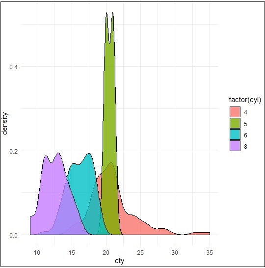
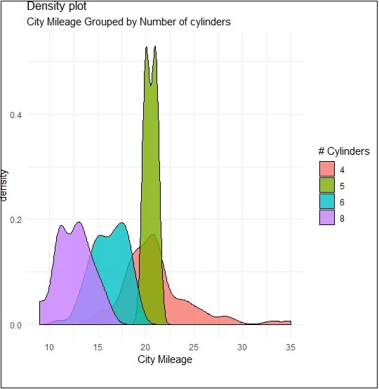
We can create the plot by renaming the x and y axes which maintains better clarity with inclusion of title and legends with different color combinations.
> p + labs(title="Density plot",
+    subtitle="City Mileage Grouped by Number of cylinders",
+    caption="Source: mpg",
+    x="City Mileage",
+    fill="# Cylinders")
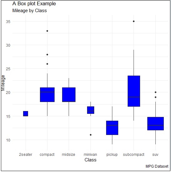
Box Plot
Box plot also called as box and whisker plot represents the five-number summary of data. The five number summaries include values like minimum, first quartile, median, third quartile and maximum. The vertical line which goes through the middle part of box plot is considered as “median”.
We can create box plot using the following command −
> p <- ggplot(mpg, aes(class, cty)) +
+  geom_boxplot(varwidth=T, fill="blue")
> p + labs(title="A Box plot Example",
+    subtitle="Mileage by Class",
+    caption="MPG Dataset",
+    x="Class",
+    y="Mileage")
>p
Here, we are creating box plot with respect to attributes of class and cty.
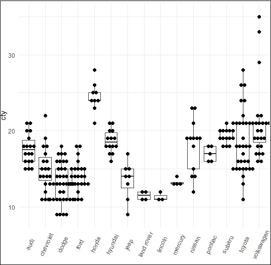
Dot Plot
Dot plots are similar to scattered plots with only difference of dimension. In this section, we will be adding dot plot to the existing box plot to have better picture and clarity.
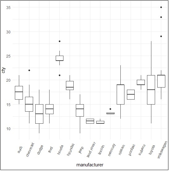
The box plot can be created using the following command −
> p <- ggplot(mpg, aes(manufacturer, cty)) +
+    geom_boxplot() +
+    theme(axis.text.x = element_text(angle=65, vjust=0.6))
> p
The dot plot is created as mentioned below −
> p + geom_dotplot(binaxis='y',
+    stackdir='center',
+    dotsize = .5
+    )
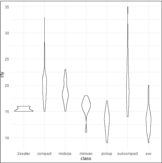
Violin Plot
Violin plot is also created in similar manner with only structure change of violins instead of box. The output is clearly mentioned below −
> p <- ggplot(mpg, aes(class, cty))
>
> p + geom_violin()